

Closed (fixed)
Project:
Drupal core
Version:
9.1.x-dev
Component:
Claro theme
Priority:
Normal
Category:
Task
Assigned:
Unassigned
Issue tags:
Reporter:
Created:
5 Jul 2019 at 08:24 UTC
Updated:
28 Oct 2020 at 00:29 UTC
Jump to comment: Most recent, Most recent file


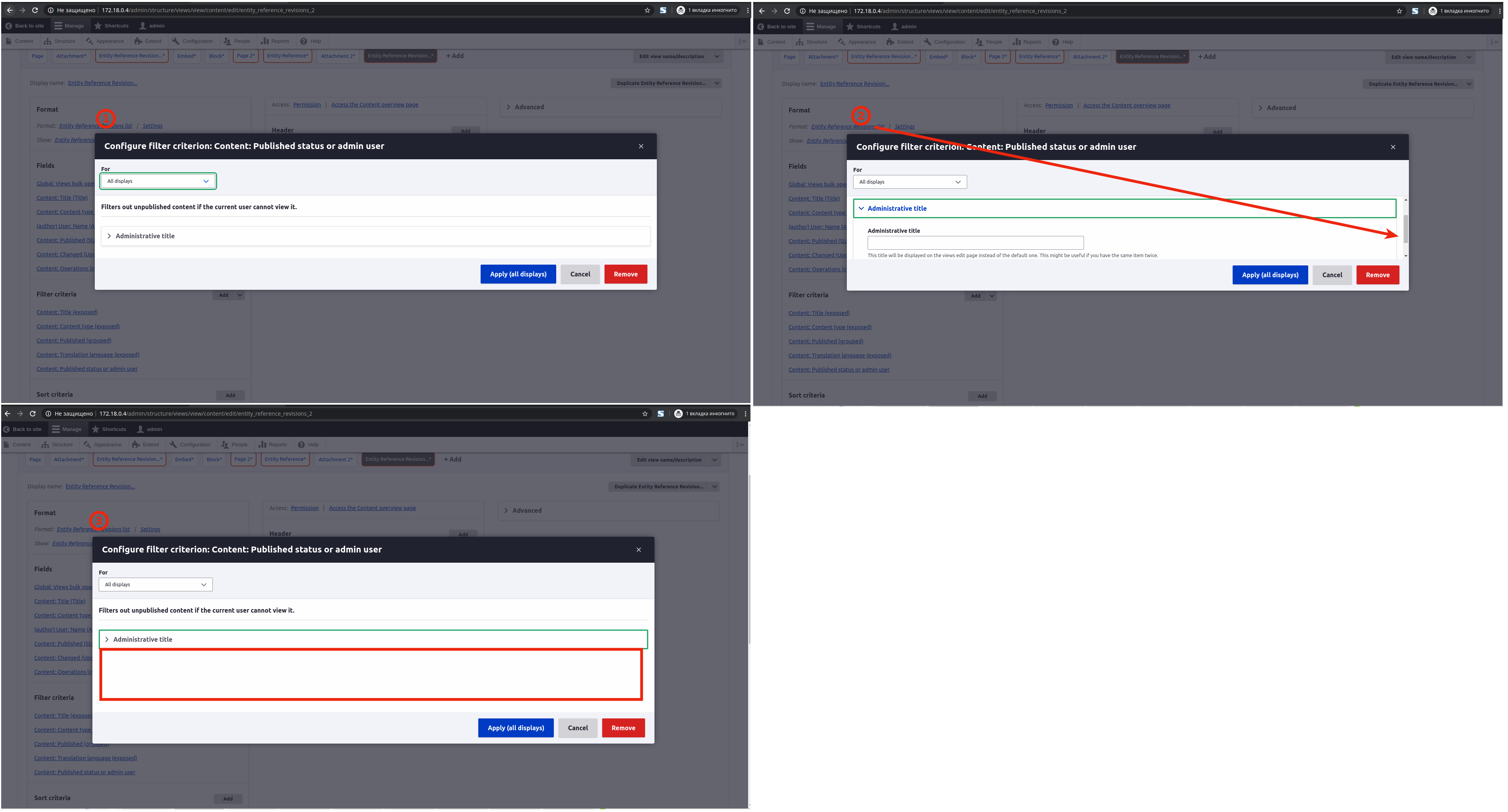


Comments
Comment #2
ckrinaComment #3
ckrinaPostponing this until the design is done.
Comment #4
huzookaComment #5
antonellasevero commentedI am attaching a series of screenshots from views in Seven that seem to give an example of different types of layouts and tried to capture all distinct formats. They are attached below numbered 1a through 6d.
Screens include:
1a-views-seven-home-enabled-table
1b-views-seven-home-disabled-table
2a-views-seven-add-view
2b-views-seven-add-view-options-displayed
2c-views-seven-add-view-options-displayed
2d-views-seven-add-view-error-msg
3a-individual-view-main-display
3b-individual-view-preview-section
4a-individual-view-popup
4b-individual-view-popup-configure filter criterion
4c-individual-view-popup-configure sort criteria
4d-individual-view-popup-page style options
4e-individual-view-popup-page menu item entry
4f-individual-view-popup-page pager options
5a-Settings-basic
5b-Settings-advanced
6a-duplicate-view
6b-delete view
Comment #6
saschaeggiComment #7
saschaeggiComment #8
webchickJust re-titling slightly so this doesn't look weird in the list of core issues. :)
Comment #9
ckrinaComment #10
saschaeggiMaybe as inspiration this is how the Views UI currently looks currently in Gin:

Comment #12
bnjmnmThis is the views redesign that @lauriii and I worked on for the past week. A few screenshots are attached but it's better to test drive the patch as this patch touches pretty much every part of views.
While evaluating keep in mind that the modal dialog styles are getting a nice restyle in #3023311: Modal dialog style update, so the titlebar and buttonpanes of dialogs will be taken care of there. The contents of the dialog, however, are in-scope for this issue.
Comment #13
KondratievaS commentedComment #14
bnjmnmUpdated issue summary to reflect the iterative process.
@KondratievaS - I'm switching this back to unassigned as a large patch would benefit from getting as many reviewers as possible on it, and doesn't need to be assigned to a single contributor right now. If you were intending on doing something other than review, that should wait until people have had an opportunity to weigh in on the proposed designs in #12. I look forward to you being part of those reviews!
Comment #15
KondratievaS commentedTested patch from #12 and I found several bugs for desktop and mobile display (adding other screenshots without bugs as archive):
Comment #16
KondratievaS commentedComment #17
bnjmnmGreat finds @KondratievaS! This addresses everything in the screenshots other than the lower left. That issue extends well beyond view, is being worked on here: #3068696: Tables overflow on mobile, and seems pretty close to complete.
This also:
Comment #18
KondratievaS commentedTested patch from #17. Bugs reported in #16 are fixed, but there are 2 more issues now
1. Displays are not aligned
2. Length of filed is too small
3. Checkbox and label is not centered
Comment #19
KondratievaS commentedComment #20
komalk commentedComment #21
bnjmnmThese reviews are very helpful @KondratievaS, it's hard to find everything in something as complex in Views.
This addresses item 1 and 2 of #18. I couldn't reproduce item 3, though. If it's still happening, any additional details regarding how to reproduce or any CSS that seems to be causing it would be great.
The patch is#20 is appreciated but unfortunately won't work because
This doesn't appear to fix anything and causes a problem when the checkbox is focused - the focus ring overlaps with the label.
This is a very broad change that impacts a variety of use cases outside of views. Any solutions should be views-specific. There was a followup created a few comments ago to explore how this style is applied to tables.
So this patch is built on #17
Comment #22
KondratievaS commentedTested patch from #21
Bugs 1 and 2 reported in #18 are fixed. About bug #3 - i can not reproduce anymore
Leave task in "Need review" status for more deep review from devs
Comment #23
indrajithkb commentedreview of patch #21 three bugs found fixed.
Thanks @bnjmnm for the #21
Comment #24
indrajithkb commentedComment #25
bnjmnmMade a change to the tab row with display name/view page based on feedback from @ckrina at Claro weekly check-in.
Also fixed stylelint errors.
Comment #26
lauriiiNitpick: Extra space inside the function arguments.
Can we expand this to include explanation on why?
Let's update these to say that these are theme overrides.
Could this lead to invalid markup because the closing tag is in different condition?
Comment #27
bnjmnmAddresses #26
Comment #28
priyanka.sahni commentedComment #29
priyanka.sahni commentedVerified and tested by applying the patch#27.It looks good to me.Can be moved to RTBC.RTBC +1.
Steps to test -
1. Go to the admin site.
2. Go to /admin/appearance.
3. Install and enable the Claro theme.
4. Go to /admin/structure/views/view/content.
5. Verify the UI of different views Ui.
After Patch -

Comment #30
lauriiiRerolled #27
Comment #31
lauriiiComment #32
KondratievaS commentedTested patch from #31 and found one more issue:
Popin changes his height when tab closes. Steps to reproduce:
1. Open Filter settings
2. Click on tab to open -> height is not changed
3. Click on tab to close -> height is changed
Comment #33
KondratievaS commentedComment #34
bnjmnmThe test fail in #31 was an unrelated Media Library test that is known for failing randomly.
The feedback in #32 is evidence of a thorough review, which is very appreciated. However, I was able to reproduce the exact symptoms in 9.0.0, which confirms that the issue was not caused by this patch. I was also able to recreate the symptoms with Seven, so it's not a Claro issue, either. It would be great if you filed a followup issue in the JavaScript component that details your findings.
Comment #35
katherinedI found a few things while testing the patch in #31.
1. Under Filter Criteria -> Content: Published, the options are in a fieldset and not in a .views-group-box div, so they lack padding and the arrow overlaps. This also applies to Content: Promoted and Content revision: Sticky at the top of lists.
2. When configuring Content: [field] filter criteria, choosing a NULL or NOT NULL operator results in an extra empty form item.
For comparison, this is how the same thing looks in Seven.
3. After rearranging filter criteria, which displays the “and” operator, removing the last criteria leaves behind an “and” that should not be there. Removing an item from the middle works as expected.
Comment #36
lauriiiOpened new issue to address #35.1 #3161199: Remove $no_operator = TRUE from Views BooleanOperator.
Comment #37
lauriiiFiled #3161207: Operator labels are not redrawn on filter removal for #35.3.
Comment #38
bnjmnmThis patch addresses #35.2 and also changes some variable names to be consistent with another issue in progress #3083256: Create smaller variations for form elements
Comment #39
katherinedI confirmed that the patch in #38 fixes the second issue in #35 as shown below:
But in the process, some operator icons elsewhere have gone missing. To reproduce, see the "Recipes" view in the Umami profile. Check the "Content: Published (= Yes)" filter or "Content: Content type (= Recipe)" filter.
For reference, this is the "Content: Content type (= Recipe)" filter with the patch in #31 applied.
Comment #40
bnjmnmI believe this addresses #39. I've tested with as many combinations of adding/editing filters as I can think of, but due to the versatility of Views there may be a use case I didn't consider. Good reviewers like @katherined are particularly important in this case 🙂.
Comment #41
katherinedThis addresses all the issues I've found, and your approach is as good as any I could come up with, so it looks great to me!
Comment #42
katherinedI've gone through this more carefully, tracking down the actual use of selectors and manually deactivating/testing extensively, tested in Chrome, Firefox, and IE, and I've tried many views config options, and tested each dialog. All that I could find at this point is:
1. This border isn't quite right in IE. Reproduce by looking at the Content: Published filter on the recipe view in Umami, for example.
2.
This could use a comment just for abundant clarity.
3.
Are these used? I couldn't find them.
4.
I'm not sure these are necessary.
Comment #43
phenaproximaOkay, so I read the PHP parts and skipped over the rest because CSS is not my main area of expertise. I trust @bnjmnm's CSS knowledge, and it looks like @katherined has a solid handle on those aspects of this patch.
I had one overarching question -- a lot of the PHP side seems concerned with removing float-related stuff (like clearfix) in favor of flexbox. Why not simply do these things in Views UI itself, since our minimum supported browsers all support flexbox? @lauriii confirmed for me that this is something we could do in a follow-up, since it's easier to get these changes done in Claro first, then migrate them into modules later. Therefore, tagging this issue for that follow-up.
With that in mind, some of my suggested refactorings here (like a utility function to remove clearfix and other classes) probably aren't super compelling, so take them with a grain of salt. Overall these changes look good to me; it seems they're being thoroughly verified visually by @katherined, and quite frankly, if it looks good on the front-end, that's what matters most here and it's okay if the code is not perfect. (Which is not to say it's bad code -- Views UI is beyond complex and therefore it makes sense that anything which wants to alter its interface would have to deal with some really fiddly stuff.)
We should pass TRUE as the third argument to in_array().
Pro tip:
isset()is variadic and only returns TRUE if every argument is set. So unless the coding standards say we can't, this can beisset($element['extra_actions'], $element['tabs'], $element['add_display']).Pro tip:
unset()is variadic as well. ;) But a bigger question is: why are we setting these array keys only to immediately unset them?This seems awkward. Couldn't we just use array_diff() to remove
clearfix?This reads a little strangely -- $top is either a reference or an array-by-value, but I can't really tell which it might be, because I don't know what kind of precedence the & modifier has. Maybe there's a more straightforward way to do this that doesn't involve modifying the element by reference?
Could we use array_diff() here?
Same question here.
&$form should be type hinted as an array.
So as I read through this patch, I'm seeing we're doing a lot of clearfix-removing. I wonder if this should be a utility function in Claro, which takes an arbitrary render array and just recursively removes clearfix from every level of it, indiscriminately, in
$element['#attributes']['class'],$element['#prefix'], and$element['#suffix']. Maybe it could accept an arbitrary class to remove, instead of hard-codingclearfix.Dear lord, I cannot wait for PHP 8 and
str_contains()to arrive.Do we need an isset() check here around $form['options']['value']['#prefix']?
&$form should have the array type hint.
array_diff() here?
I assume these are placeholders for later work?
Comment #44
bnjmnmWhile addressing feedback I noticed that the display tabs were not justifying properly in IE11. I added a fix for that. This results in a slightly different experience in IE11 (the actions button it in its own column), but that experience matches Views UI when using Seven so this could be classified as graceful degradation.

#42.1 The effort required to get this looking right in IE11 is difficult to justify, especially since this styling is not present in Seven. I removed this in IE11 only, so the end result matches the experience in Seven, so this can be classified as graceful degradation - IE11 doesn't have a diminished experience, but non-IE browsers will have an improved one
#42.2
Comment added
#42.3
Was part of an early iteration and no longer needed. Removed.
#42.4
Those styles are definitely not needed as the elements they target are set to
position: static;. Removed#43.1,2
yep
#43.3
Looks like that was an artifact of an approach that was not used, removed.
#43[4-8]
yep
#43.9
The helper function sounds cool - I'm not sure there's quite enough instances of this removal to justify a utility that could potentially take a while to implement, but it may be worth exploring as a core utility function. Would there be performance concerns with this due to the recursion and it happening on non-cached preprocess functions? (genuinely don't know, not the kind of thing I've ever benchmarked).
#43[10-13]
yep
#43.14
This is from the PostCSS build, any .pcss.css file that has an
gets all the comments from that file added to the top of the compiled .css file.
Comment #45
lendudeNice!! Awesome awesome effort!
Just clicking around there are some things I see, these might not be in scope so feel free to ignore
Views wizard shows 'Loading...' when it's not
With the bigger focus border, the border flows into/over any prefix and suffix text making it a little hard to read
When there are multiple types of errors there is a lot of whitespace between the two types, much more then there is in Seven
.views-group-box .form-item puts some items 3px out of line with parent items. If that is on purpose it probably needs a little more to make it clear that it is a group, or it needs less to just be aligned with the items above it.
Comment #46
bnjmnmRe #45.
#1 The "loading" message to be addressed in #3166068: Autocomplete "loading" message not properly hidden in inline forms. (I just created this one)
#2 Focus overlap to be addressed across two issues: #3029675: Add support for the inline variation of form elements, #3082672: Form prefix/suffix redesign in Claro
#3 The issue for messages occupying considerable space is #3082679: When multiple messages present, a large amount of content is pushed below the fold
#4 Surfaced an entire views CSS file that was still being loaded from core, mostly containing styles that are not needed in Claro. This is overridden with a copy of that file, but with the unnecessary rules removed.
A few additional changes can be seen in the interdiff that address issues that were made apparent by the not-yet-overridden CSS file, specifically some elements that should only be visible when JS is enabled.
Comment #47
bnjmnm@katherined pointed out on slack some thing that weren't quite rights with the claro.theme changes in #46
Comment #48
katherinedAwesome! It works as intended now, and all the css refactoring makes sense to me. I don't see any further issues to comment on, so marking as RTBC.
Comment #49
katherinedI take it back, but only for one tiny thing.
typo: its
Comment #50
bnjmnmNuked the nit.
Comment #51
katherinedThank you!
Comment #52
lauriiiFew more things I was able to catch when I was taking screenshots for the issue summary:
Is this how messages inside Views dialogs should look like?

For some reason the bottom of the page is rendered under the button pane.

Comment #53
lauriiiComment #54
bnjmnmThe hidden-behind button pane issue is pre-existing and not specific to Claro:
#3161840: Modal dialogue Views Messages breaks form usability
That issue also has screenshots demonstrating that this messages inside views dialogs behavior is not really specific to Claro either.
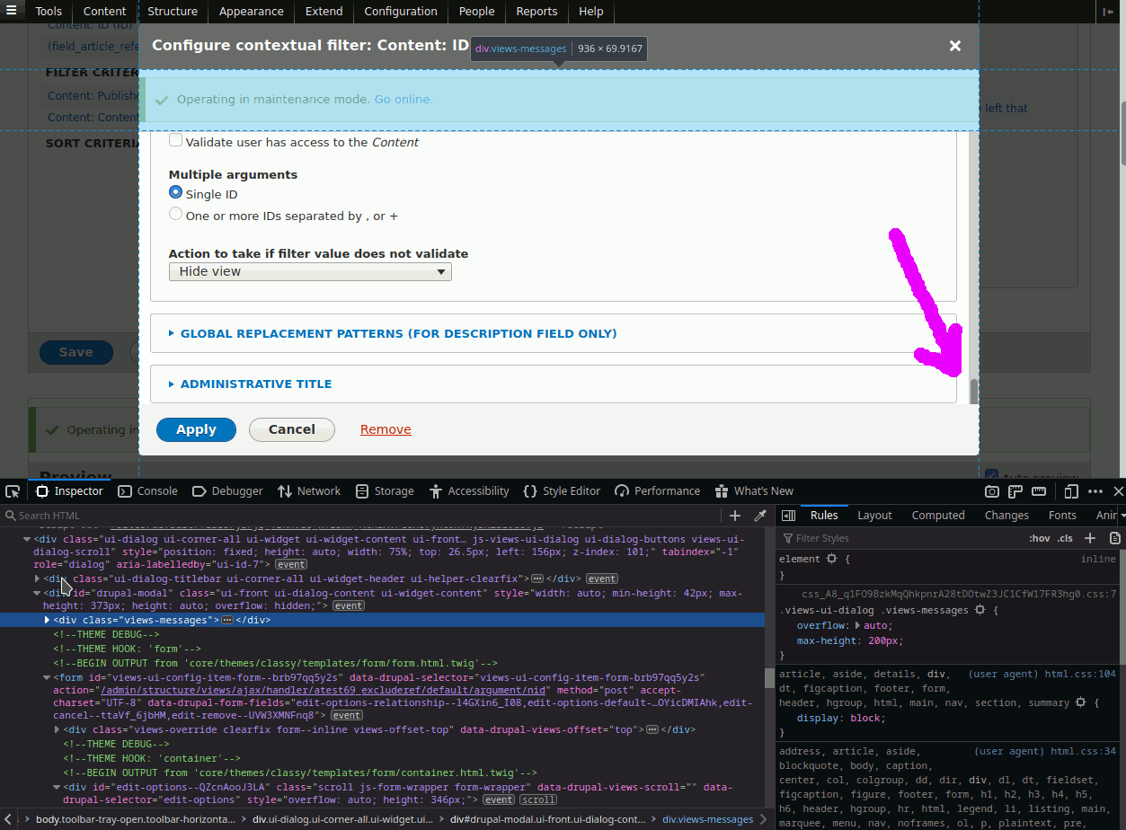
If it can be improved I think it can be scoped to another issue, but I'll let @lauriii make the final call on that instead of switching back to RTBC myself.
Comment #55
lauriiiThe bug is slightly worse in Claro because of the message consume more vertical space, but I still think it's probably out of scope as a pre-existing bug. Moving back to RTBC
Comment #56
lauriiiRerolling after #3171366: Comments from variables.pcss.css create nonuseful noise in compiled css.
Comment #57
bnjmnmReroll
Comment #58
effulgentsia commentedAdjusting issue credits.
Comment #59
effulgentsia commentedAdding credit to @saschaeggi for multiple design reviews that happened during Claro meetings and informed the work here.
Comment #60
effulgentsia commentedThese changes were needed to satisfy spell checking and coding standards. Please review this to make sure these changes are correct.
Comment #61
lauriiiLooks good except I improved the way one of the comments was broken down to multiple lines.
Comment #63
anmolgoyal74 commentedLooks like unrelated failure.
Running the test again.
Comment #64
anmolgoyal74 commentedComment #65
effulgentsia commentedThanks! Back to RTBC per #61.
Comment #67
effulgentsia commentedThis patch looks great! Pushed to 9.1.x. It's great to see Views UI looking good in Claro now!