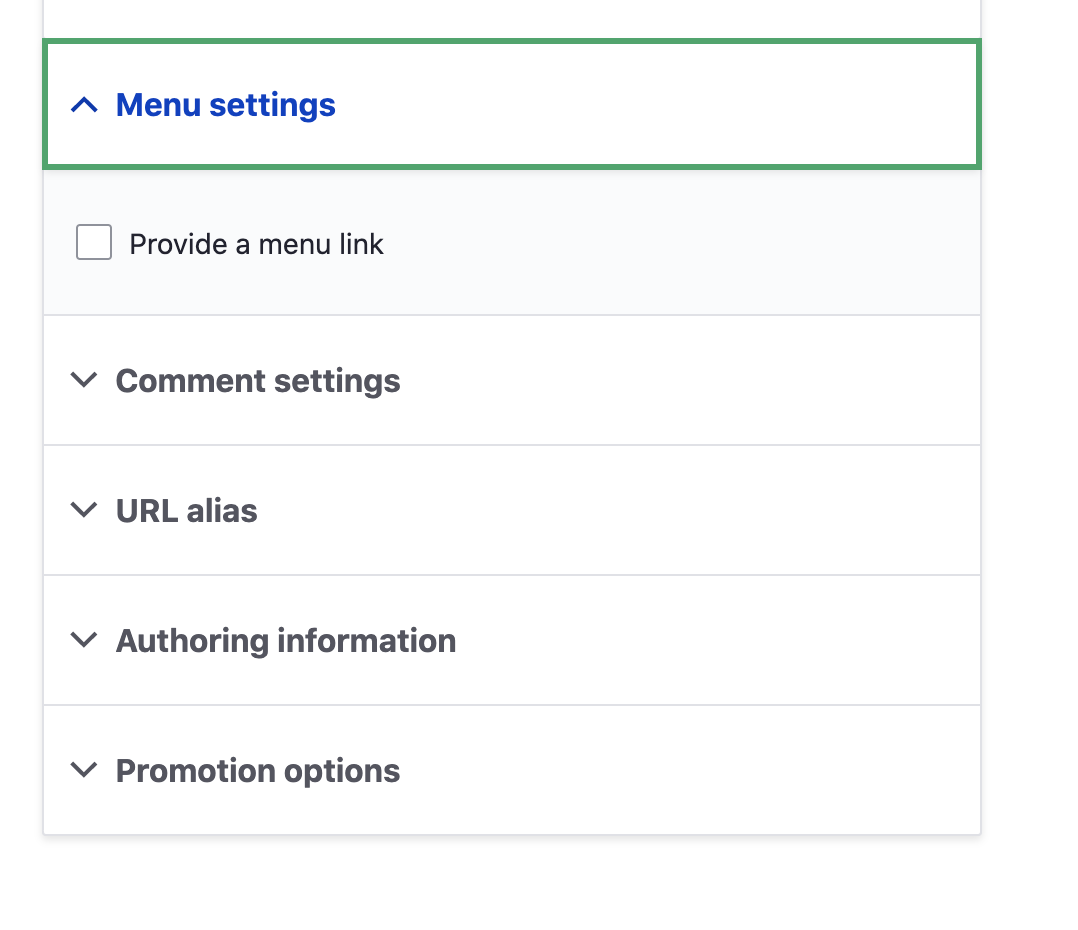
The new design looks great, but why change the arrow orientation for closed-state?
As seen in the evolvingweb blog:

The new arrows seem to try follow the logic of the arrows for accordions in the content area. But as is standard in menus, being placed right vs. left.

This takes some meaning out of the right-pointing closed-state arrow i think, because it points away from the box, giving some "forward", or "go somewhere" notion, as it is present in the Navigation-PAGES:

Sometimes menu designs use up-down arrows, sometimes down-up arrows, so there's quite some inconsistency, non-standardness on how to use arrows.
Why did you dismiss the logic from before?
Did you also considerk the + - (or + x)scheme? Seems this has less ambiguity and more logic to it (increase/decrease no. of menu items).




Comments
Comment #2
ckrinaThanks for your feedback @sirtet! It's really useful and we'll definitely take this into account. Probably it will be difficult to prioritize this on the MVP to have a beta release soon (so the next 1-2 months), but definitely we'll need to work on this because you made really good points and proposed really good alternatives.
We're trying to follow an approach where we launch an MVP and later we improve it, so this is a really good thing to take into account for incremental improvements over the next months.
Comment #3
ambient.impactI very much agree with @sirtet on this, and hope to see it addressed. I personally feel that the default toolbar chevrons that point down when closed (indicating a sub-menu can be opened downwards), and pointing up (when sub-menu is open, indicating it will close up) make the most sense, but others may feel differently.
One issue that also bugs me is the use of the chevrons on the navigation pages that just link to an admin section - Seven also does this, so you may have just been following their precedent. I feel the chevrons on those should be replaced with a different icon or shape that doesn't use a chevron/arrow, to avoid confusing users.
Anyways, keep up the awesome work!
Comment #4
andrewmacpherson commentedUnless we can find a way to make the front-end theme load the admin theme's toolbar CSS, then I think this should be postponed.
The original design outlook for the toolbar styling was that it should have a unified look on the front and back end. If the toolbar icons look different depending on whether you are looking at the front end or admin theme, then that's potentially very confusing. Particularly if the directions of the arrow are different. It could be a failure of WCAG success criterion 3.2.4 "Consistent Identification". (That success criterion is a fairly broad, and none of the example scenarios quite match this problem, so that's just my interpretation.)
Comment #5
huzookaComment #6
ambient.impact@andrewmacpherson I definitely agree that the toolbar should be consistent between themes, as it could potentially become confusing for users, and really just feel inconsistent from a design point of view. In my opinion, the toolbar is overdue for a rework/redesign, but that feels out of scope of the Claro theme in addition to the issues you mention.
This brings up an interesting issue that I've been thinking about recently: while Drupal has a relatively robust theme system that allows an awesome amount of flexibility and variation between themes, anything that has to exist in multiple themes - such as the toolbar or contextual links - are in a weird grey area where they have to rely on aggressive CSS resets to come close to behaving like they're not affected by the current theme, and even then, the theme's CSS can sometimes still break that. That's more of an issue with how CSS works and possibly an argument for the Shadow DOM, but I felt it was worth thinking aloud.
Comment #8
ckrinaComment #9
komalk commentedComment #10
KondratievaS commentedTested patch from #9 for desktop and mobile and result is OK
Comment #11
KondratievaS commentedComment #12
lauriiiI discussed this with @ckrina and she mentioned that we should have a designer work on this. One of the ideas she had was to use plus and minus icons instead of the arrow.
Comment #13
dyannenovaI think that the up/down chevrons are the most commonly used pattern, ex. they're used by AEM and IBM's Carbon.
Plus/minus might be clear enough, although I just did a quick test with a content editor and she was confused by the plus, thinking that it would allow her to immediately add content to the site.
Comment #14
lauriiiI looked at the IBM Carbon and it seems like they are using the arrow for indicating collapse status. A key difference was that they were consistently pointing the arrow downwards when the element could expanded, and upwards when the element could be collapsed. We are pointing the arrow to right in Toolbar and details element when the element could be expanded. Could that be one of the reasons it could be considered confusing? Maybe we should point the arrow downwards?
The second problem is that we use the same arrow for indicating links on the menu, even though the menu items cannot be expanded. If we make the Toolbar and details element arrow point downwards, maybe this problem is solved too. Then we have up and down pointing arrows when an element can be expanded, and if the arrow is pointing right, it has another meaning (highlighting links on the menu, backward and forward on pagination etc.).
Comment #15
dyannenovaI agree. I think downward and upward pointing arrows are less confusing than the current sideways/down. If we are consistent in using those for expanding components, and using sideways pointing arrows as an affordance for other interactions, like pagination or moving forward in some way, that should be clearer.
Comment #16
ckrinaOk, It looks like even Nielsen is assuming this (up and down) is the proper position for arrows, so I guess all components should be updated to this.
Comment #17
yoroy commentedIt's a good idea to follow existing practices here. I personally also think the up/down position is the better, less unambiguous design.
Setting to "needs work" for the actual impementation.
Comment #18
bnjmnmImplemented. I think details (including high-contrast equivalents) is the only place this needs to be changed.
Comment #19
lauriiiWould be great if someone could also update the designs in Figma 🥳
Comment #20
dyannenovaI've updated the component in Figma.
Comment #21
lauriiiComment #22
boulaffasae commentedI couldn't apply patch #18, i created a new patch #22.
Comment #23
lauriiiThanks for the reroll!
Comment #25
sd9121 commentedComment #26
sd9121 commentedPlease review this patch.
Thanks!
Comment #27
bnjmnmThis is looking good on standard contrast/English! Spotted two things that need to be adjusted for specific use cases:
Comment #28
sd9121 commentedComment #29
sd9121 commentedPlease review this patch.
Thanks!
Comment #30
bnjmnmThanks @sd9121!
Tested on every OSX browser + Windows standard + high contrast in Edge, IE11 and Firefox. In each instance the disclosure icon points and animates in the correct direction, per the requirements of this issue.
I did notice that in Windows high-contrast Firefox, the disclosure icons have insufficient contrast, but that is also an issue in HEAD, and I have reported it in the meta issue regarding high contrast in Claro: #3080100: Assess accessibility of Claro in High Contrast AKA forced colors mode
Comment #31
lauriiiIt seems like as a result of this patch, the arrow is not positioned correctly in relation to the summary in IE 11 high contrast:
Comment #32
katherinedI think this takes care of it.
Comment #33
bnjmnm#32 makes the issue less glaring, but now the arrow is too low when it is pointing down. It looks like the underlying problem is due to how the "arrow" for high-contrast mode is created: adding a border to the top and right sides of an element and rotating that element so the borders point up/down. The axis of rotation is in the center of that element, not taking into account the 2px borders on 2/4 of its sides. To ensure a good rotation center, it would work better to have a 2px border on all sides, and make the previously-0px borders set to color: transparent. This will result in a rotation center that behaves as one would expect. It may be necessary to tweak the size of the element after doing this.
Comment #34
katherinedThanks, @bnjmnm! Now that you point that out, I think altering the border and then only applying the top margin to the open state gets the arrow where it needs to be, more confined to the text's line height, and rotating as expected.
Patch 32
Patch 34
Comment #35
katherinedComment #36
bnjmnmI like to encourage accompanying each !important with a comment explaining why it was needed. I took a look to see why it was needed here and was pleased to see it is avoidable.
The !important being used here to get priority over a rule that occurs a bit further down in the same file. Just changing that rule eliminates the need to introduce it here with an !important
Comment #37
bnjmnmComment #38
katherinedAh, yes. It is right there. :)
Comment #39
bnjmnmLooks good!

High contrast mode was the only thing that needed addressing since it was last RTBC'd, and since that is good now, it is back to RTBC.
Comment #41
lauriiiCommitted 7982e4a and pushed to 9.1.x. Thanks!