
Closed (fixed)
Project:
Drupal core
Version:
8.8.x-dev
Component:
media system
Priority:
Normal
Category:
Feature request
Assigned:
Unassigned
Issue tags:
Reporter:
Created:
9 Dec 2018 at 19:54 UTC
Updated:
3 Apr 2019 at 16:49 UTC
Jump to comment: Most recent, Most recent file


Comments
Comment #2
seanbThe design progress can be viewed in Figma (work in progress!): https://www.figma.com/file/VNkUIvfbcGr9Jmez3iRXJBjb/Media-widget-field
A proof-of-concept was started to make it easier to discuss some of the changes. Dropping the progress so far as a patch, plus a short video to give an impression of what it looks like.
Comment #3
seanbThe designs and PoC were discussed in the weekly UX meeting on 2018-12-11:
https://www.youtube.com/watch?v=W2rFglOW65Q
We made a list of assumptions while creating the designs. Mostly copied this over from #2834729-100: [META] Roadmap to stabilize Media Library. Feedback on the designs and assumptions is very welcome.
-----------------------
While sprinting on the media library in Barcelona, the team decided to discuss our assumptions regarding the UX and designs, and make them explicit. So here they are, in no particular order:
Overall, we want to build a terrific media library that offers an excellent out-of-the-box experience for relatively simple use cases. Media management is a very complicated problem space, and it's impossible to build something that will please everyone and work for every situation. Complicated use cases, then, will probably need contrib solutions like Entity Browser, and we're comfortable with that; the points above, then, are what we believe constitutes a "relatively simple" use case, and what we intend to optimize for.
Comment #4
marcvangendGood to see your designs and thoughts, thanks for sharing! A couple of questions/remarks came up while looking at the Figma link.
Comment #5
seanbThanks Marc!
I agree! Good point.
A case was brought up where someone could upload the wrong file by mistake containing sensitive information. In this case it seems quite important to immediately be able to correct that mistake.
For the rest I think you raise valid points and we should make sure we get this right. Deletes are permanent so it is extremely important users instinctively know what it means to delete something here. We should at the very least have a confirmation step where you see all the items you are about to delete stating these will be deleted everywhere in the system, not just the reference in this piece of content.
Comment #6
marcvangendOK, I see the point. Still I don't think that warrants a delete option the way it is designed now, allowing users to also delete existing media that is already referenced from other content. If it's only about the (edge) case above, I guess the modal where newly added media is edited (https://www.figma.com/proto/VNkUIvfbcGr9Jmez3iRXJBjb/Media-widget-field?...) would be appropriate. If we add a delete link (or icon) to each new media item, it would be much clearer to the user what they are deleting. Since we can be pretty sure that we are not breaking references and the user still has the source file on their computer, a confirm step wouldn't even be needed.
Here's a quick mockup of what it could look like with delete-icons:


Clicking the icon would mark a media item for deletion; the deletion can be handled when the Save button is clicked.
Comment #7
seanbI like the idea in #6. We already have a screen where you can review what you have just created and fill the required metadata, so using this screen to be able to remove anything you didn't mean to add sounds like a good idea.
Knowing the difference between changing the canonical media item or changing metadata for the specific instance/usage is a hard concept and we might make it easier if we remove changing / deleting canonical media items. I'd love to hear more opinions on this though!
Comment #8
dennis cohn commentedI think this is because normally you only see an upload field on the first screen right? You have to switch tabs to see the media library.
We can change this by open the media library instead.
Then editors will see all the images and maybe they will look for an image that the can use.
But I also think the in the most cases you want to upload new media.
I don't like the idea that we have an upload area/dropzone AND the media library in one display. The modal is not so big so if we put the dropzone and the library in one display it's so tiny/small not so useful in my opinion.
Also I don't see the benefits of the vertical tabs on the left. I need to click on the left on, for example, remote video, and then I see only the remote video's in the library? Isn't this where the filter is for? And again, the modal is not so big so if we put vertical tabs on it, the library gets even smaller.
In my opinion, we need just one dropdown button to add media. When you click on it you can select the media type that you want to display. When you selected the media type that you wanted to add, you will get a new display with all necessary fields for this type of media. whether it's a dropzone, or only an url field for the youtube url...you name it..
You can have a better error handling cause you know which type of media you must upload... if you make one magical upload field like some other screens in Figma, this would be hard.
I've added some fast mockups to explain my idea better.

Also I moved the filters, grid/list switch on the same height as the add new media button. This will also save us some space! :)
Comment #9
seanbThanks Dennis. I think #8 also looks really nice.
There are a couple of reasons we introduced the tabs:
That being said, we probably need more people to weigh in on this. Do we want to use the precious screen real estate to optimize for re-use or do we optimize for new media? Do we want to optimize the number of clicks and show a lot of options, or do we initially hide some things behind a button? These are important decisions to make.
We also talked about having a tab with all media. At least for this 'All' tab, the dropbutton would definitely make sense imho.
One last thing.
When you drag something over the modal the whole modal should be the drop area, so the initial dropzone area is just to show the user it is possible. The drop area is actually much bigger, so that would hopefully make this easier to use.
Comment #10
dennis cohn commentedIn my opinion you shouldn't combine these in one very small modal form.
If we asume that editors will most likely want to add new images, let's focus on that part and make a nice clear button to use exising media item from the library. Or ask something like: 'Add new media' or 'Use existing media'. Which take you to the upload form/dropzone or to the media library. (ofcourse with the posibility to 'Add new media' if you're in the media library and 'Use existing media' if you're in the upload new media screen.
I don't mind clicking one time extra if I get a clear/nice way to add some new media/re-use media after that.
I don't think people will understand this. Yeah, we, developers/designers will know that. But most editors are still looking for a button "add media'. I've worked with a lot of editors and they're not really familiar with a 'fancy' dropzone.
It's hard... I think the experienced people will understand that you can drop your files there... but will the unexperienced people also understand that?
But if you already decided that the dropzone and media library happens in the same modal form... What's do we need to decide now?
Comment #11
seanb@Dennis Cohn, thanks for the feedback. I think you make a valid point that there might be some value in not trying to offer tabs, the 'add media' form AND the existing items in the same screen. That is basically the thing we are currently struggling with. Do we have a separate screen for that, which means extra clicks, or do we go for the current design where we proposed having everything directly visible?
I don't think we have actually made a decision on this. Every solution has its own advantages and disadvantages. I think we need more opinions before we can make a decision.
Comment #12
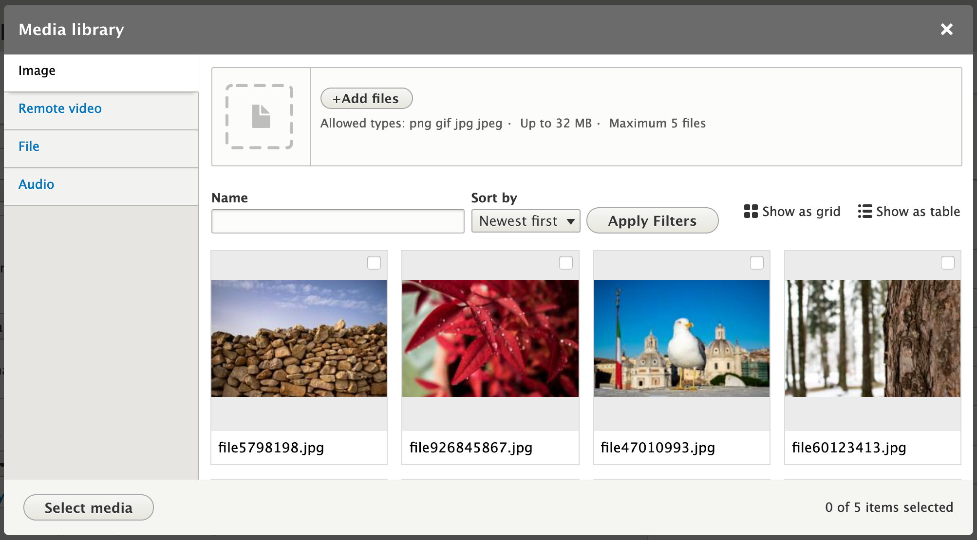
seanbAttached a new video and screenshots. Also updated the IS.
Comment #13
seanbComment #14
marcvangendWow, this is looking really slick, thanks Sean. I'm very happy with how the delete option turned out, easy to find when you need it, but subtle enough to get out of the way when you don't.
Comment #15
leo pitt commentedIn my experience it's not at all unusual for media items to have more than one field, and quite easy to envisage scenarios where a media item could have multiple fields. E.g. image file, alt text, caption, link.
In my opinion it's important that the solution allows for media bundle configs that are a bit more complex. While I guess we are aiming for an MVP here I'd be concerned that otherwise there's a risk that it just won't be flexible enough for a lot of scenarios...
Comment #16
jonathanshawI think that often an editor will not be sure whether they need to add a new media or reuse an existing one; therefore it is really good how you've done it: they are not forced to choose between those options prematurely, but instead there is a prominent way to add new media right in the place where existing media are displayed.
The most problematic thing I see is the filters for the existing media. These are complicated and poorly labelled, as well as relatively unimportant. I think the best solution might be to collapse them initially behind a 'Filters' link, or to have them in the left column under the tabs.
Comment #18
webchickCurious if any of the folks here giving great feedback have feedback on this aspect of the behaviour #3041147: Preserve the selected items across multiple uses of the media library.
Comment #19
phenaproximaWell, folks...the Media Library is UI-complete in Drupal 8.7.0, and therefore the designs we came up with in this issue have been implemented. I discussed this with @seanB and @Gábor Hojtsy and we agree that this case is pretty well closed. If we need to make UI changes in the future, we can deal with those in other issues.
But as for the complete redesign...it is done! Let's close this one out, and a big thanks to everyone who participated!! Congratulations to all; we really delivered on this one. :)