On this page
- Prerequisites:
- Building a new landing page in a Section you maintain
- Remember
- Editing an existing Drupal.org Section landing page
- Instructions:
- From the landing page in question
- To add new content:
- Drupal.org Front Page Design System
- Hero
- Hero - Persona
- Goal
- Text
- Graphic list
- DrupalCon
- Sponsor
- Focus
- Infographics
- Highlights
- To edit existing content:
- To move content:
- To delete content:
- To restore an older version of the page:
Managing landing pages
This documentation needs work. See "Help improve this page" in the sidebar.
Prerequisites:
- You must be have the 'Maintainer' role for the Section that contains the landing page you are editing.
- You must have two-factor authentication enabled on your Drupal.org account to receive this elevated role.
- If you intend to work on a page in an unpublished state, you also need the 'Content Moderator' role or higher.
To get set up with any of this access, please contact the Drupal Association engineering team at: help@drupal.org
Building a new landing page in a Section you maintain
Remember
The section itself can also be a landing page, so if you simply want to edit the top-level section, skip to the instructions below for editing an existing page.
-
Firstly you'll need to add a new page to the section you are a maintainer of. Go to the main section landing page, and find the 'Add Content' links. Use these to add a new 'Page' to the section.

-
Next, you'll need to do some basic configuration of your page.
-
Give your page a title.
-
If you have the permissions, make sure the page is 'unpublished' while you're working on it.
-
You can also provide a menu link within the section:
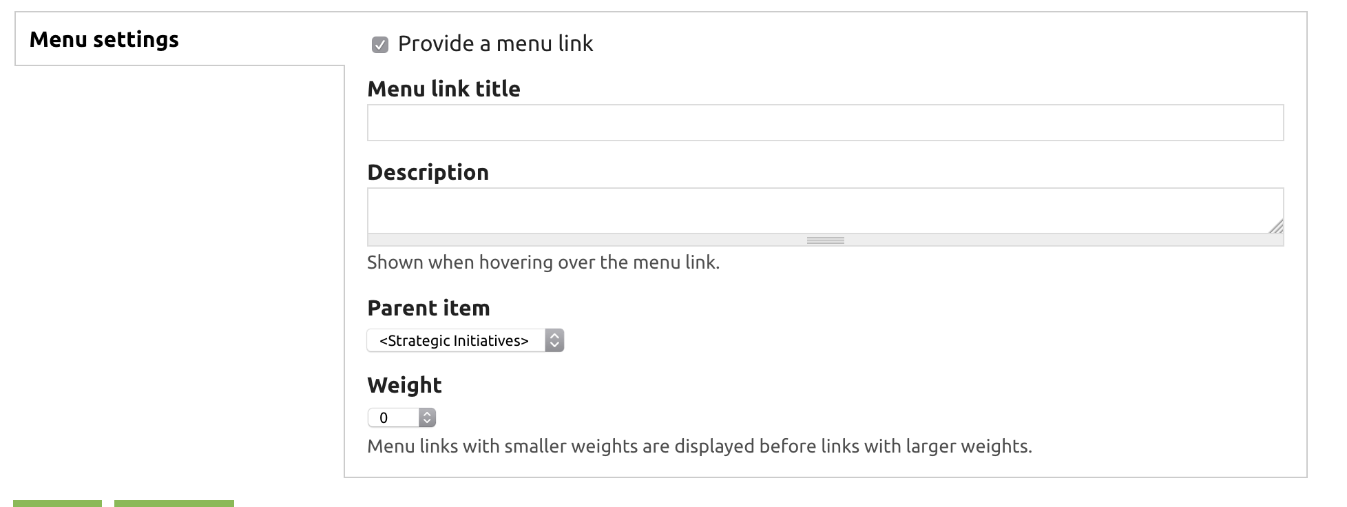
-
Click save
NOTE: you will NOT edit the content from the 'edit' tab with these tools, you'll only use the 'edit' screen to edit things like the url, redirects, and the 'publish' state of the page.
-
-
The resulting page will be pretty empty- don't worry!

-
Use the instructions below to:
- Add new content
- Move content
- Edit content
- Delete content
- Restore an older version of the page, if you accidentally screw up.

Editing an existing Drupal.org Section landing page
Instructions:
From the landing page in question

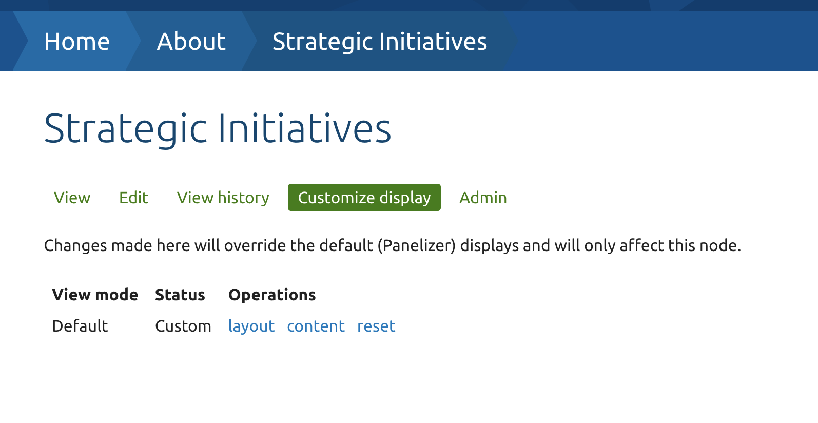
Click on 'Customize display' The page will change to the panelizer interface, as in this screenshot below:
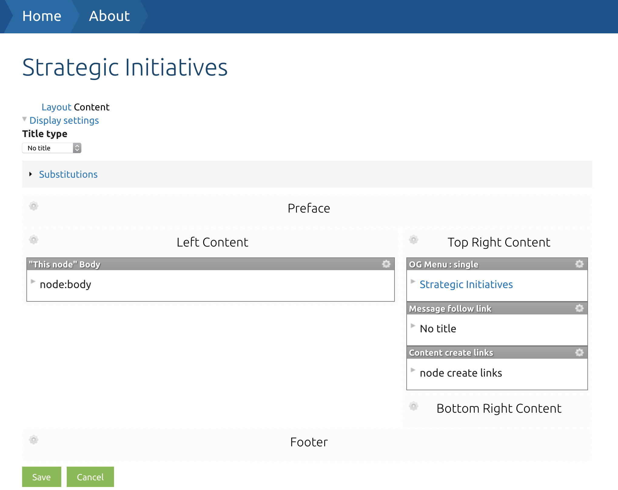
Then click on 'Content' to see the panels display:
Important: The first time you customize a landing page you need to first save the page in the panelizer interface, or else you will get an access denied warning when trying to change panes.
You may also want to remove any automatically created panes that you don't want to use. Such as the 'Body' pane or the 'OG menu: single' pane.
Within any given region on the page, you will see existing content panes, as well as icons you can use to add new panes:
The 
The 
The 
The 
The 
To save your changes use the  (save) button.
To cancel your changes, click  (cancel).
To add new content:
-
Click the
-
You'll see a content selector window:
-
-
Click on the "Drupal.org" category in the sidebar.
-
Click on the "CTA" content pane.
-
The CTA content pane will be used for 95% of all content on these landing pages. If you need something different, it's time to ask the DA engineering team for help.
-
-
You'll see a series of fields to be filled out:
-
The first fields to change are actually the two at the bottom!
-
The style field will let you choose the layout you want to use for your content pane:
-
Full width
-
The standard content pane with a title, a body, a primary cta button, and an optional secondary cta button
-
Full width panes can have a graphic which will be displayed on the right side of the text
-
Full width panes can have a background image.
-
-
Full width, mirrored
-
The same as a normal full width pane, but the text will be on the right, and the graphic on the left.
-
-
Full width, centered
-
The same as above except the graphic will be centered above the text.
-
-
Full width, stacked
-
The same as above except the content will stack.
-
-
Ribbon
-
A ribbon has only a title field, and a single cta button.
-
-
Card (generally only used on DA managed Drupal marketing pages)
-
Card content panes must be placed in the three-across content areas
-
They have body text (which can include a link), a graphic, and an optional background image which will be placed at the top of the card.
-
-
-
The secondary style field will let you choose the color scheme for the content pane, or designate it sponsored content.
-
Dark
-
The dark style will put light text on a dark background.
-
-
Light
-
The light style will put dark text on a light background.
-
-
Sponsor
-
The sponsor style will put a border around sponsored content, and is typically only used with the 'Card' primary style
-
-
-
Once you have selected the primary style and the secondary style, you can start filling in the rest of your fields - as appropriate to the style you chose.
-
Make sure to click the
(finish) button - or
(cancel) to cancel your changes.
-
Make sure the content is placed correctly - if you need to move it, you can drag it with the
-
Repeat this process to add as much additional content as you need.
-
When you're done adding content, don't forget to use the
(save) button!


Drupal.org Front Page Design System
In addition to the basic styles listed above, there are some additional styles which were created for the Drupal.org home page which you can use.
To use these components you must click the
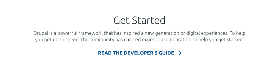
Hero

Pane type to use: CTA
Style › Full width, centered
Secondary style › Dark
Custom CSS class: d-hero
Hero - Persona
Pane type to use: CTA
Style › Full width, 2 col
Secondary style › Dark
Custom CSS class: d-hero-persona
Goal

Pane type to use: : CTA
Style › Full width, centered
Secondary style › Light
Custom CSS class: d-goal
Text
Pane type to use: : CTA
Style › Full width, centered
Secondary style › Light
Custom CSS class: d-text
Graphic list
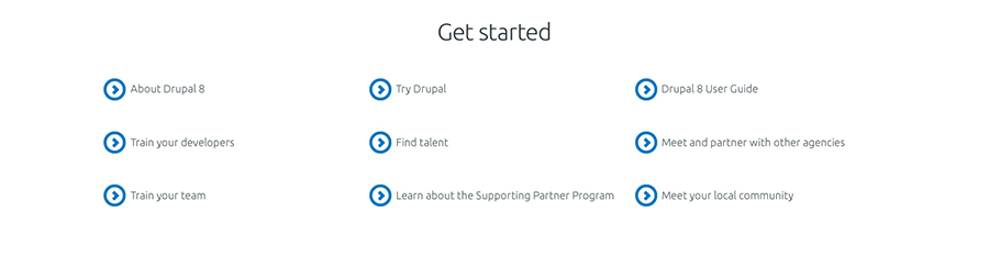
Pane type to use: : CTA
Style › Full width, no graphic
Secondary style › Light
Custom CSS class: d-graphic-list
DrupalCon

Pane type to use: : CTA
Style › Full width
Secondary style › Light
Custom CSS class: d-dcon
Sponsor

Pane type to use: : CTA
Style › Full width, no graphic
Secondary style › Sponsor
Custom CSS class: d-sponsor
AD Specs:
Header: 40 characters max.
Body copy: 135 characters max.
CTA button: 35 characters max.
Image: horizontal image with transparent background (format: svg/png) - max width: 400px (height will be proportional)
Focus

Pane type to use: : CTA
Style › Full width, centered
Secondary style › Dark / Light
Position: Focus pane must be placed in a region without other panes and must alway be two element (left and right).
Custom CSS class: d-focus d-focus-[custom]
[custom] should be replaced based on the position:
d-focus-left / d-focus-right

Pane type to use: CTA
Style › Full width, centered
Secondary style › Dark
Custom CSS class: d-opensource
Infographics
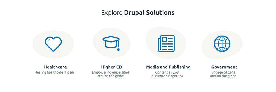
Pane type to use: CTA multiple
Custom CSS class: for 3 columns: not necessary - for 4 columns: d-4col
Informations:
Row can have a maximum of 4 elements for row. If more, they will be displayed in a new row (desktop version). Background shape will be added only if an icon is added (field: Graphic). If a link is present, icon and shape will also be animated.
Informations:
This component is variant of Infographic. Images must be uploaded using field Featured image
Highlights
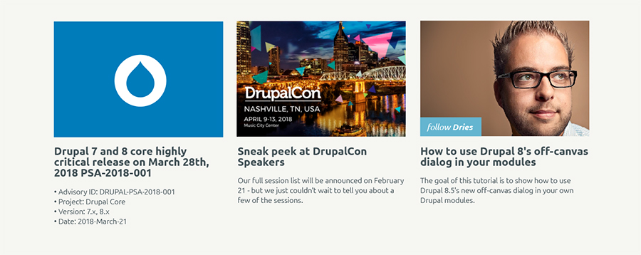
Pane type to use: CTA multiple
Custom CSS class: d-highlights
To edit existing content:
-
Click the
-
You'll see an editing window like the following:
-
Note that not every field will be used for every content block. When editing existing content, you should simply be able to compare the fields on the edit screen with what you see on the page—and change what needs changing.
-
-
Once you finish editing a particular block of content click the
-
Then, you can edit any other blocks on the page.
-
Once you've finished editing all the blocks you intend to change, don't forget to click
(save) for the page as a whole, or (cancel) if you've changed your mind about making the change.-
Your changes will not go live until you hit 'save'.
-
-
After hitting save, use the
(refresh) button in your browser to see the page as it now appears.
To move content:
-
Click on the
-
There are a few things to note about our content regions:
-
'Full width' or 'ribbon' content panes should go in full width regions, such as "Primary" "Secondary" "Quaternary" etc..
-
'Card' style content panes must go in the "Tertiary First.. Second.. Third" or "Nonary First.. Second.. Third" regions.
-
Unfilled regions will not be displayed, though administrative users will be able to see gaps where that content could go.
-
Finally the "Header" region is a special region that receives an increased font size.
-

To delete content:
-
Click on the
-
Confirm your change in the dialog window that appears:

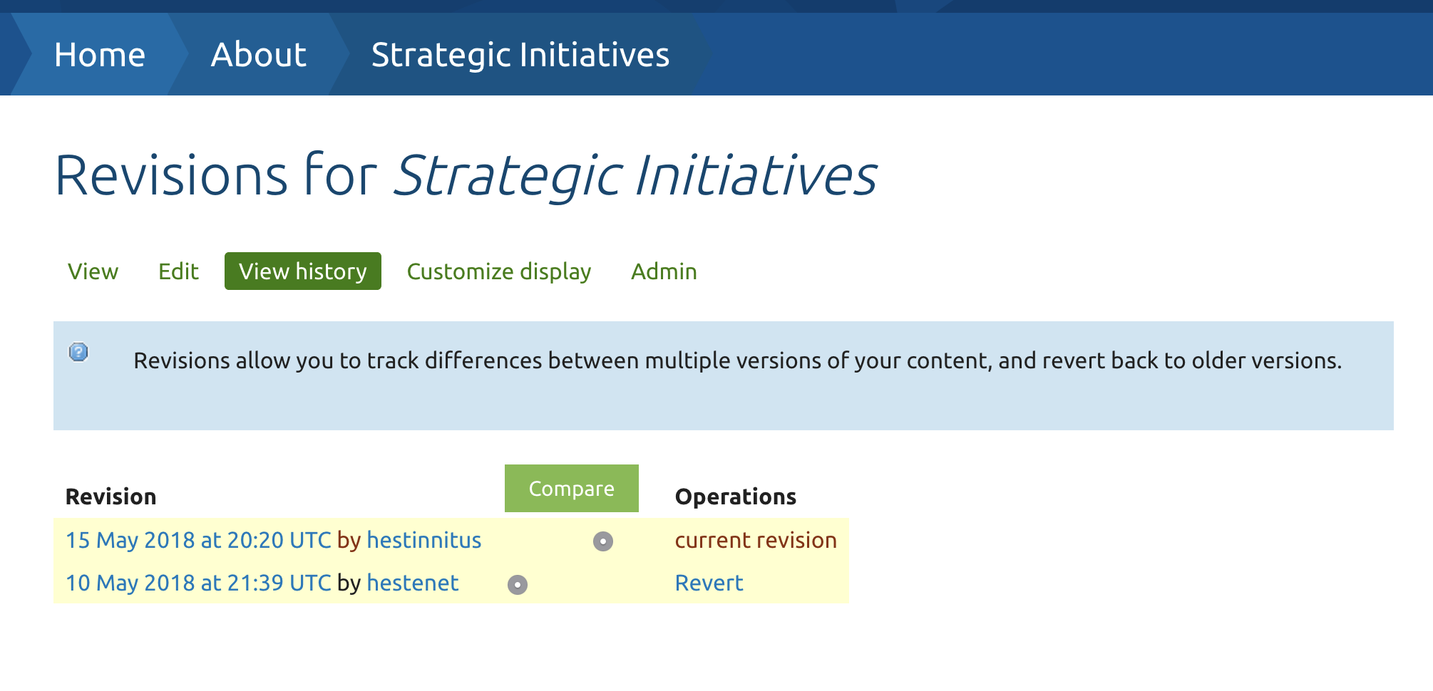
To restore an older version of the page:
If you make a mistake and need to restore an older version of the page:
-
Click on the View history link at the top of the page
-
You will see a window which summarizes all the edits that have ever been made to the page:
-
Right click on the timestamp of the revision you'd like to restore to, and select 'open in a new tab'
-
You'll see a preview of what the page looked like at the time, with a message at the top:
-
-
If that is the correct revision that you want to restore, go back to the (View History) window and click on "Revert"
-
You'll be asked to confirm the change:
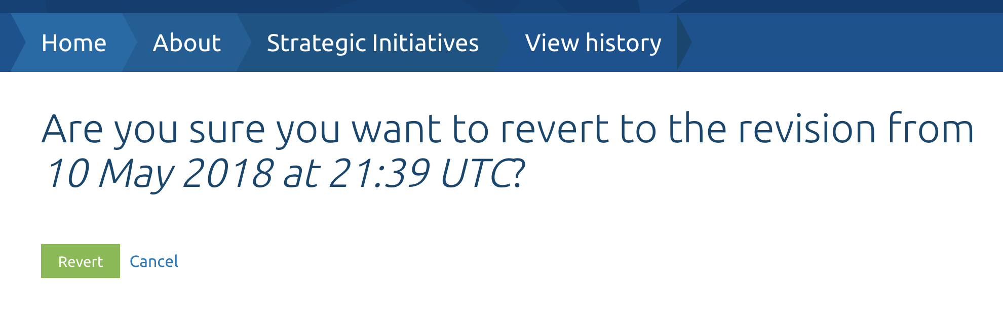
-
-
Once you click (Revert) the older version of the page will be restored.
Help improve this page
You can:
- Log in, click Edit, and edit this page
- Log in, click Discuss, update the Page status value, and suggest an improvement
- Log in and create a Documentation issue with your suggestion

