
 Come together with the global Drupal community in Rotterdam, 28 Sept – 1 Oct 2026. Sessions, contribution, connection, and Early Bird savings until 8 June.
Problem/Motivation
When using the modal display with a view of elements, for example, we currently have the main submit button buried down at the very bottom of the modal contents.
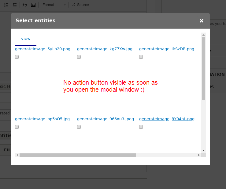

UX would be improved if that button was always visible
Other similar forms in core have a bottom bar always visible, maybe we could copy some of that styling:
(Note: Settings this to 8.x-2.x, but could/should be also backported to 8.x-1.x as well, IMHO)
Proposed resolution
Remaining tasks
User interface changes
API changes
Data model changes
| Comment | File | Size | Author |
|---|---|---|---|
| other_modals_in_core.png | 35.4 KB | marcoscano |
Issue fork entity_browser-2946829
 Show commands
Start within a Git clone of the project using the version control instructions.
Or, if you do not have SSH keys set up on git.drupalcode.org:

Comments
Comment #2
samuel.mortensonI wonder if instead of doing this in CSS (like File Browser, floating the actions at the bottom of the iframe), we could make a custom jQuery UI dialog button that will trigger a click inside the iframe. I feel like that's the best UX.
Comment #3
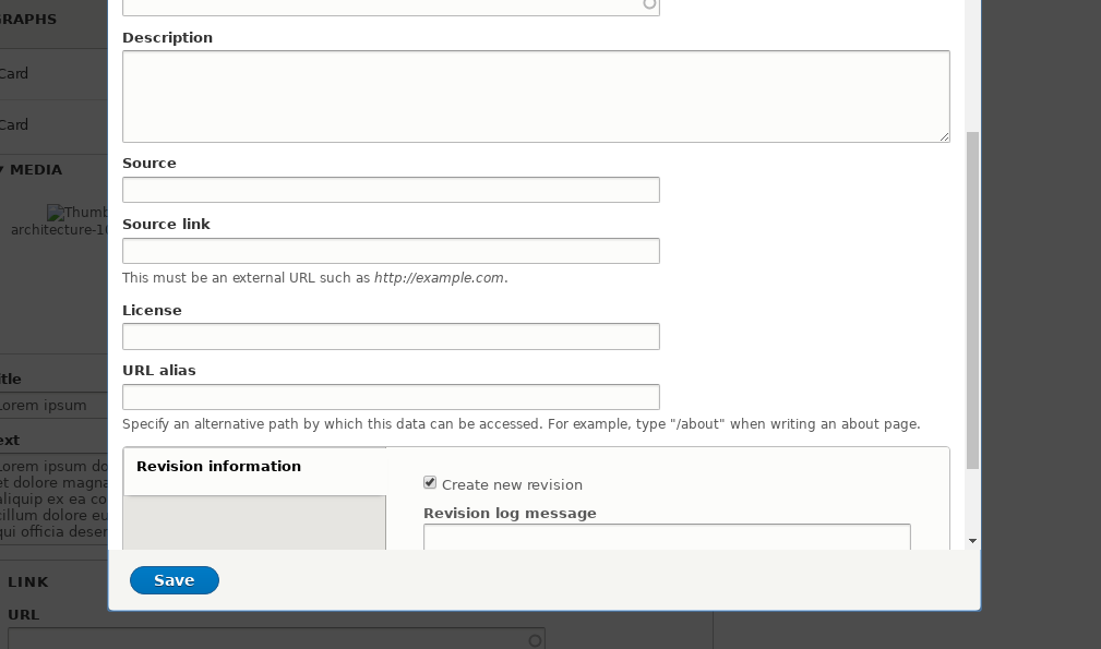
sokru commentedCopied the styles from file_browser module. This might not be working with all themes, so would need manual testing and change records if people have themselves fixed this issue on theme.
Comment #4
sokru commentedEarlier patch didn't contain margin for view content and left pagination behind the form-submit wrapper. The margin value is tested with Seven theme.
I agree that correct solution would be to use jQuery UI dialog buttons, but that would require much more time to spend on the patch.
Comment #6
Pooja Ganjage commentedHi,
I am creating a patch for issue occurs in #4 comment.
Please review the patch.
Thanks.
Comment #7
Pooja Ganjage commentedComment #8
driskell commentedI'm testing this out at the moment but looking at the code I wonder if this is working around a larger issue.
The Drupal dialogs normally automatically collect submit buttons into the jQuery UI - if that could be made to work it would actually then work for all admin themes as I would expect them to have all styled up that container. Issue appears to be the dialog contains an iframe. So instead of opening a dialog with a form - it is opening a dialog with the existing iframe that would have been used for iFrame display. This creates a double request where the open dialog request just returns an iframe that then needs to load.
Potentially returning the form rather than the iframe might even make things faster in the modal - but I guess I would then worry that might break some dependents if they rely on loading in an iframe. Maybe this is the best intermediate for now - but I guess code wise - a new Modal (native) display that can be chosen that actually returns the form rather than an iframe would ensure the modal implementation is fully in line with what Drupal expects (as well as faster modal displays - it would open populated rather than ending up with a second serial loader)
Comment #9
anybodyComment #10
anybodyComment #12
anybodyComment #13
anybodyI agree with #8 but also thing we should try that as follow-up.
Tests need to be fixed with the new container, as it seems.
Comment #14
anybodyThis generally works nice, but besides the failing tests, now contents of the view are hidden, e.g. the pager. They are overlayed by the actions area and can't be reached.
Comment #20
thomas.frobieterOkay, the form actions are docked on the regular entity browser forms. Not the multistep forms, as this require additional work.
Thoughts on the multistep forms:
Comment #21
anybodyThank you @thomas.frobieter simple and effective and clear UX improvement!
RTBC+1 but I'll wait for other feedback as I also had my hands in...