

Closed (fixed)
Project:
Views Bootstrap
Version:
8.x-3.x-dev
Component:
Grid
Priority:
Normal
Category:
Bug report
Assigned:
Unassigned
Reporter:
Created:
28 Apr 2017 at 08:32 UTC
Updated:
19 Dec 2018 at 16:43 UTC
Jump to comment: Most recent, Most recent file



Comments
Comment #2
per commentedThe patch in #1 is working properly. Thank you, we had a problem with this. The patch solved it for us.
Comment #3
bondd commentedThank you, Per, for testing this patch.
I hope the developers will include it to the next dev release.
Comment #4
zenimagine commentedThe patch does not work for me. I always have empty spaces.
Comment #5
zenimagine commentedComment #6
jon pollard commentedPatch isn't working for me either. As a work around, if you set your grid to 4, 4, 2, 1 for the various breakpoints it works OK. It's only when you introduce a 3 column option that it stops working. Not entirely sure what it's doing, but maybe that helps diagnose the underlying problem.
Comment #7
jon pollard commentedMessing around more with the view settings, if I set this up as:
Number of columns per row - all
Number of columns (col-xs) - 1
Number of columns (col-sm) - 2
Number of columns (col-md) - 3
Number of columns (col-lg) - 4
It renders correctly across all screen sizes. I had previously had the first option set to 4. I suppose I had never really understood what this first option was for!
Comment #8
zenimagine commentedThank you.
Can you explain what "Number of columns per row" is used for?
Have you applied the patch?
Comment #9
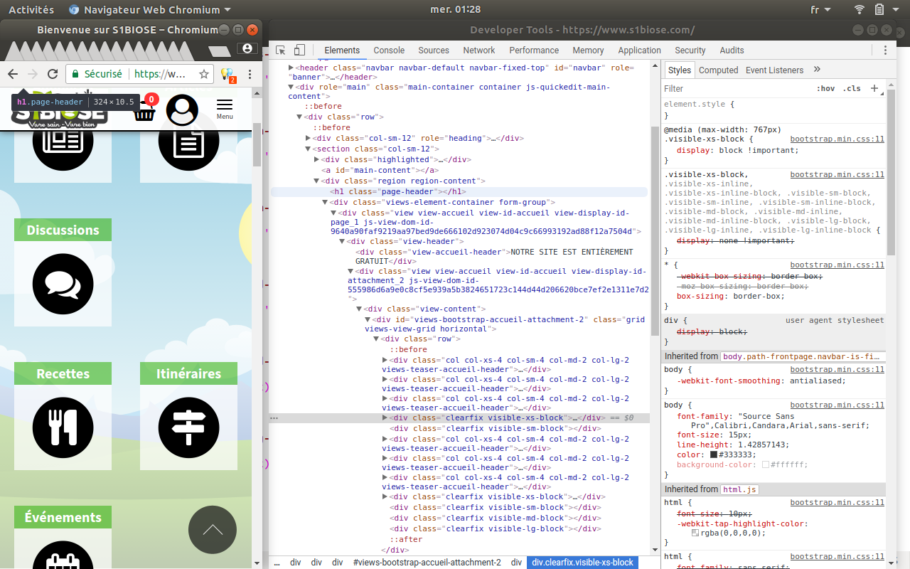
zenimagine commentedOn my homepage, I always have a gap in my grid.
Do you have any idea of the problem ?
See screenshot.
Comment #10
aburrows commentedLink to website please
Comment #11
zenimagine commenteddelete
Comment #12
aburrows commentedThere are 2 clearfix divs - which is breaking the float
Comment #13
zenimagine commentedThank you. Is this a patch problem or my css ?
How can I fix it ?
Comment #14
aburrows commentedAppears to be a problem with your code, can't replicate how you're getting the clear div
Comment #15
aburrows commentedComment #16
zenimagine commentedI remove the patch, it works but the grid is no longer lined up
Comment #17
aburrows commentedIs it using masonry?
Comment #18
zenimagine commentedIf I apply the patch:
- The grids are correctly aligned.
- But it does not work on my homepage (there is an offset in the grid).
If I do not apply the patch:
- The grids are not aligned.
- But the grids of the home page are properly aligned.
How can I fix the problem ?
Comment #19
zenimagine commentedIt works by adding the following code in my css :
Hopefully this patch will be added to the dev version
Comment #20
philsward commentedWhy isn't grid for D8, taking the same input as the grid from D7? By being able to set "Number of columns per views row" to "Single Row" in D7, it wraps all of the columns in a single row.
Between this setting and "Clear columns per device size", it solved all of my problems on D7 with grids showing up funky.
These settings just need to be ported over to 8 and it "should" fix all of our issues... Couldn't believe those settings are missing from the D8 version.
Comment #21
damban commented#7 worked for me.
And wow did it take a long tome to find this solution.
Comment #22
aburrows commented@philsward it was an entire rewrite for 8.x but we can look into amending it. I'm using it on a few of our clients and encountering this complexity so either can explain in more detail how it works or a better approach to doing it.
Comment #23
aburrows commentedSo I have removed the column request at the top of the form, this appears to cause some confusion and was causing issues with the output in the twig file. Therefore it relies just off the various screen sizes to add the col sizes.
Please test this so we can get this into the latest release.
Comment #24
philsward commented@aburrows patch makes things line up a lot better. Hope we can get some other testers to confirm.
EDIT: I say that... you have to set 'min-height' in order for it to layout properly.
The way D7 does it, hides columns based on the viewport. Might spin up a copy on D7 and take a look at the page html source code for a better idea of what the settings do.
Comment #25
bunthorne commentedMy grid displayed 8 items well with 4 columns in col-lg (4-4), but 3 cols in col-lg churned out 3-1-3-1 (single columns in middle).
I applied both patches.
Comment #26
per commentedI can confirm that the patch in #23 works. But as #24 says you have to set a "min-height" in css. I don't think this is a user friendly solution for our problem. For me the first patch works better. It still needs some work to be perfect.
Comment #27
per commentedComment #29
aburrows commentedComment #31
Christopher Riley commentedThis issue should not be marked fixed as options are not being set correctly as I have discovered per https://www.drupal.org/project/views_bootstrap/issues/3018627