Problem/Motivation
Drupal has always had a full-width interface. This made its way into Seven from Garland, as this was a user preference and acceptable solution at the time resolutions where 1024/1280. However times have changed, higher resolutions are much more common.
On a high level we have three arguments for this change:
- Form elements, descriptions and boxes now span across the full width. This makes them harder to read (due to line length issues). However scanning is mostly impounded as many elements stretch their structural parts (e.g. the border around a fieldset) much beyond its functional purpose. Actually having it on full-width reduces the effectiveness of these structural elements (borders, backgrounds) as the visual containment requires more effort to see where they start and end.
- From a typographic perspective, line length is used as an ideal comfortable measure for scanning and reading text (e.g. the elements of web typography). Although we do not have "article" type content in our screens, we do have descriptions and often long descriptions. Reducing the size of this, will enable users to scan it more easily.
- From an aesthetic perspective (opinions will differ on this) we believe this creates more breathing room for our elements and therefore will make the composition of Seven more balanced and more in line with its original design intent. By setting an upper limit on the width we prevent the screen elements from becoming uncohesive.
This change will likely require a bit of getting used to but once settled in we think it will be an actual improvement.
Proposed resolution
Introduce a max-width that uses the Seven highest defined breakpoint.
Remaining tasks
- Fix the max-width of the modal to match the page layout
- Make sure padding is maintained at all widths, including when the vertical toolbar is enabled
User interface changes
This adds a max-width to the Seven theme. This changes the user interface by making it less wider on higher resolutions. All our interfaces are built to fit a 1024px screen width. This means that this change does not break any of the existing interfaces.
API changes
None
Beta phase evaluation






Comments
Comment #1
Bojhan commentedComment #2
sqndr commentedI'm working on this.
Comment #3
sqndr commentedBasic patch that sets a width based on the wide breakpoint from
seven.breakpoints.yml. The navigation is now outside this container, so that needs work. Also, lets discuss if we need more breakpoints or not.Comment #4
lewisnymanComment #5
lewisnymanI could only find one issue which is the border along the tabs.
Comment #6
Bojhan commentedWow, this looks good :)
Comment #7
Bojhan commentedComment #8
lewisnymanI tweaked the media query so we don't lose the padding when the viewport becomes narrower than the max width. I changed the position of the tabs border so it always spans the width of the viewport.
Comment #9
Bojhan commentedComment #10
Bojhan commentedAdded beta evaluation and a bit of argumentation.
Comment #11
Bojhan commentedThis needs some further testing (I did validate most interfaces) and screenshots of those interfaces (I am thinking Blocks, Views, Content creation, entity listing).
Comment #12
Bojhan commentedComment #13
yoroy commentedComment #14
yoroy commentedI think this is a good idea. Even a complex UI like Views will benefit from keeping the screen components together, keeping things cohesive.
Would be great to see some screenshots from very large screens, we're all on our laptops here at drupalcon :-)
Comment #15
sqndr commentedCan we fix the tabs in #1999182: Dream mark up for tabs
Comment #16
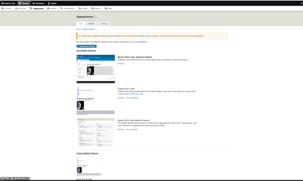
heatherwoz commentedHere are a few screenshots with the patch applied (working on this at the mentored sprint at DrupalCon LA).


Comment #17
yoroy commentedThanks! Did you maybe screenshot only a part of the screen? I think we want to see it with the black toolbar so that we can see how that looks in relation to the centered content.
Comment #18
Bojhan commented@sqndr Nope, we are fixing the tabs here. We are now in release mode, any change we add to core - should allow us to release. Unless its big.
Comment #19
adriancotter commentedreviewed and tested at DrupalConLA
Comment #20
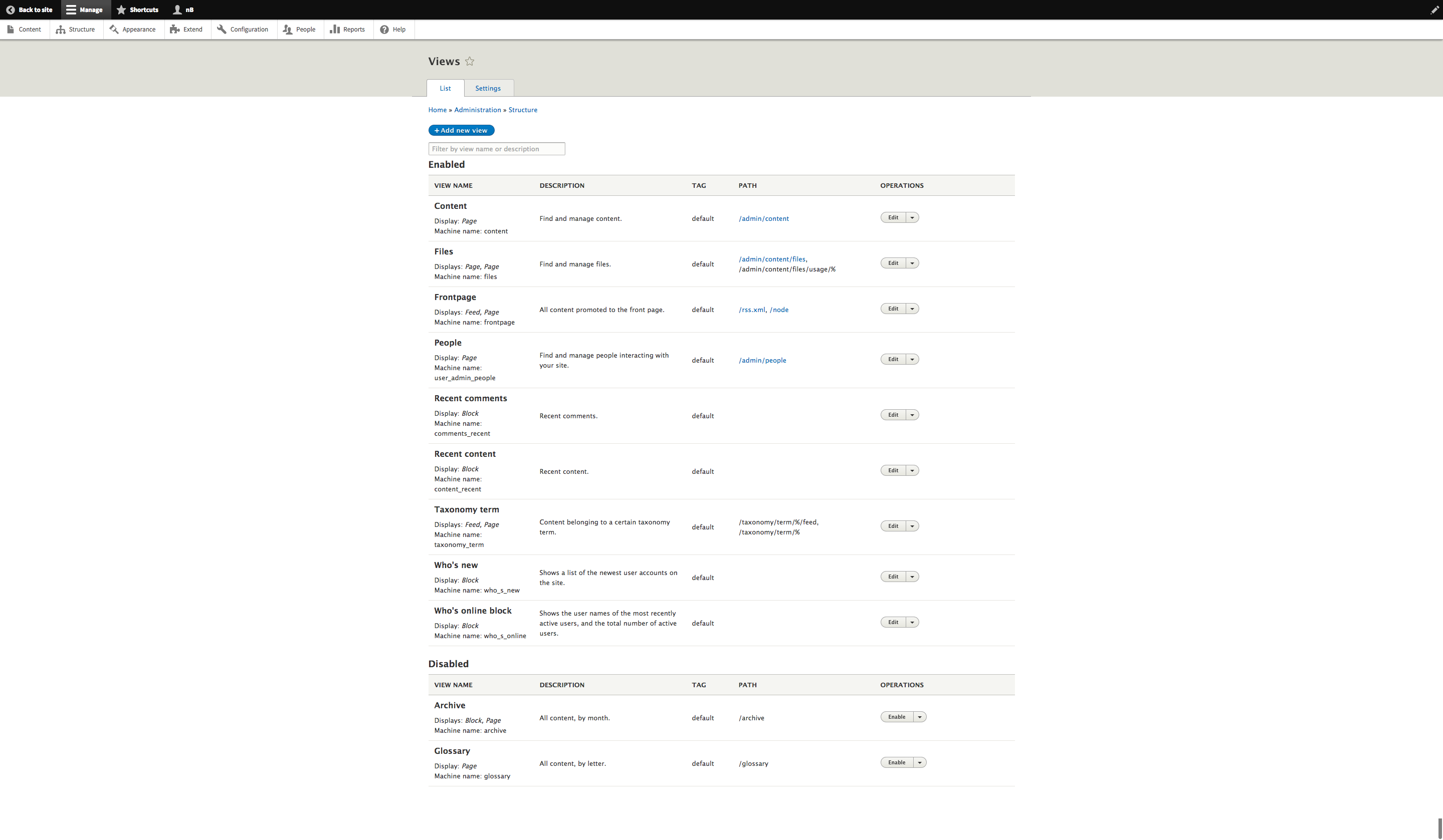
nateb commentedAlso here at DrupalCon LA. Attached are a few screencaps from this 2880x1800 MBP Retina Display per the request in comment #14
Comment #21
sqndr commentedThanks for screenshots everyone! As of #18, we can't RTBC unless we fix the tabs. So I'm changing the status to Needs work again.
If anyone one to jump in and fix the tabs … feel free. :)
Comment #22
sqndr commentedComment #23
yoroy commentedThanks for additional screenshots. I'm not sure why the line for the tabs does not extend to full width there. I tested the latest patch on simplytest.me and there it looks ok.
Comment #24
sqndr commentedStrange. simplytest.me uses beta10. Can we provide screenshots from the patch applied against the latest 8.0.x branch? If that done, if feel like we can set this RTBC.
Comment #25
sqndr commentedI'm sorry. Lewis fixed this. Marking as RTBC now.
Comment #26
sqndr commentedComment #27
alexpottCommitted a70a74f and pushed to 8.0.x. Thanks!
Thanks for adding the beta evaluation to the issue summary.
Comment #29
wim leersWow, awesome work everyone!
Comment #30
tim.plunkettThis doesn't play nicely with the vertical toolbar.
Take for example the views listing. There used to be a nice margin around it, it's now gone (maybe it needs padding instead)?
See https://www.drupal.org/files/issues/screencast-2015-05-20.mp4
And within the views UI, it now forces it into a much smaller space than before. And now after #2489884: Give the views modal window a larger width, the modals are often bigger than the underlying UI!
Comment #32
xjmDrat -- I think we need to fix those regressions in the patch here, so reverted for now. Thanks @tim.plunkett for catching the regressions (and of course for everyone who's worked on this already).
Comment #33
xjmSo when we update this patch, we should test manually with both the Views UI and the vertical-mode toolbar, on narrow windows and adjusting the window size I think. Adding tags as well because I've now rendered the summary out of date.
Comment #34
sqndr commentedI'll try to improve this later today. Thanks for reporting this!
Comment #35
rudraram commentedTweaked #8 patch to fix the vertical toolbar layout issue. Patch and interdiff attached. Attaching a video adjusting window size on Views-UI and admin configuration pages shortly.
Comment #36
rudraram commentedScreencast attached showing the window re-sizing with vertical toolbar.
Comment #37
sqndr commentedOr not :)
Comment #38
Bojhan commentedWhy, some regressions get a revert and others don't is a total mystery to me.
I think we might need a bit of padding on the list but frankly not much. The shown issues are not really that big, honestly. They are at large an effect that is inherent to having a max-width.
Regarding the modal - we might need to adjust that one, but its also unavoidable I think since you make it bigger - it will cover more and more on the less wide resolutions.
Comment #39
davidhernandezI'd just like to extend some kudos for these mp4s.
Comment #40
manjit.singhComment #41
manjit.singhadmin/structure/menu have still a scroll at
615pxPlease find attached.
Comment #42
lewisnymanThis isn't a problem that is introduced in this issue, this is a problem being dealt with in #2280035: Add another responsive tables solution that doesn't hide content
I tested the latest patch for the spacing issue reported in #30 and it appears to be fixed.
The modal can be fixed to have the same max width as the rest of the UI in Seven's
dialog.theme.css, so setting to needs work.Comment #43
manjit.singhComment #44
manjit.singhComment #45
lauriiiComment #46
nathanlawsn commentedPatch to set max-width of modal to 1170px.
Before: Modal at 75% of screen width
After: Modal set to max-width of 1170px
Comment #47
lewisnymanThe most recent patch is missing the changes from the previous patch
Comment #48
bill richardson commentedDoes not look that good on 27" screen ---- worst offender is when editing views ( looks very compressed ).
Comment #49
manjit.singhmerging changes in both #46 and #35. @lewis Please review.
Comment #50
lewisnymanThanks. I manually tested this patch and I confirm that all the reported issues have been fixed. This will take a little bit of getting used to but I think it's for the best.
Comment #51
alexpottWhat about the horizontal toolbar - this seems to assume that as a screen gets bigger that the it should be left aligned. I guess the problem here is that this needs to look good in both front and back end so moving around is not an option. Toolbar is special.
For me the biggest issue with this change are pages like
admin/structure/viewson large resolutions because there is no edge so the left alignment looks really really odd. See screenshot attached.Comment #52
lewisnyman@alexpott I remember discussing this in person at Drupalcon. Ultimately it's more important for the toolbar to be consistent across front and back rather than changing. #2539992: Move theme toolbar CSS to the Seven theme Will help with this.
It does feel odd, but it's hard to tell if this is just because we're used to the previous layout. I don't imagine that we would add a wrapper around the container, it doesn't fit with the Seven guidelines.
Comment #53
tim.plunkettBreaking my d.o hiatus while on vacation to says: please don't commit this patch, please just mark it works as designed, because it does.
The last time this was committed I needed to revert it to get any work done on my 27" monitor. There is no justification given in the issue for why we would every want this. Please just leave the width well enough alone.
Comment #54
davidhernandezThe issue summary literally says,
Comment #55
lewisnymanThis issue fixes basic usability problems on every other admin page.
Comment #56
tim.plunkettI disagree with all three points.
Comment #57
alexpottLooks like this needs a product manager perspective.
Comment #58
davidhernandez@Tim, disagreement is fine, but please make counter arguments to the points listed. I have no strong opinion, but considering that this issue was initiated, and worked on, by both UX maintainers and the Seven maintainer, simply saying you disagree is not a compelling argument. And I'm confident you can do so in a more respectful manner than telling people you'll deal with the mess they make later.
Comment #60
tim.plunkettAll of the points in the issue summary seem completely valid, but for a front end theme.
Restricting the admin theme like this is Seven telling me that it thinks it knows what's best.
If I find the UI to be too stretched out on my 27" monitor, I can RESIZE MY BROWSER. I have the power!
Conversely, if this is committed, I need to write a subtheme or a module to override the CSS to make Seven sane again.
Won't fix, please!
Comment #61
bill richardson commented+1 for tim.plunkett comments above --- on a large screen restricting seven width does not look good.
Comment #62
Bojhan commentedThe point of design is to make some decisions about what is best. We decide that, having tabs makes sense, having an sans-serif instead of serif font makes more sense, similarly we think its best to have a smaller width on many of the resolutions we aim for. If you disagree with any of these defaults, we think are best - writing a sub-theme is a great way of fixing your usecase.
Your welcome to include a breakpoint for much larger screens though, although I think with all screen sizes there is a limit in efficiency when it comes to the width of elements.
I am going to push this to @webchick to decide, as I think all our design arguments are solid and this design decisions supports a significant part of our audience, albeit not all.
Comment #63
tim.plunkettWhy not use sane breakpoints then? Why blindly restrict widths after a certain point?
The patch essentially codifies that screen sizes above 1170px are unimportant, and hampers the administration of Drupal 8 on external monitors.
Once again, this makes sense for a front-end theme. It makes no sense for an admin theme, and can be considered a regression.
Comment #64
webchickIt does seem a bit odd in the age of "right content on the right device at the right time" that we would intentionally ignore widths > 1170px.
That said, I've read before and am familiar with the standards / best practices in the first two bullets of the issue summary, and those best practices were developed after thousands of websites and thousands of users over years of time. So simply ignoring them and saying we know better doesn't really make sense to me, esp. when it's all design-y people in here saying we should do this.
That said (again), Tim does raise an interesting point that because Seven is an *admin* theme, generally aimed at doing specific, complex tasks, it may make sense for it to be exempt. The studies upon which the UX guidelines are based are generally-speaking around front-end websites (I think).
I need more info here to make a call. Specifically:
Feel free to re-assign once that information is gathered.
Comment #65
Bojhan commentedLets look into other research around this. I've done some searching on this in the past, and couldn't come up with reasonable material that is not website focused. The N required for valuable research around this is typically enterprise focused, e.g. intranets (e.g. reports from NNG) and therefor doesn't touch upon web applications in such large screen sizes.
I am interested in exploring the "big size" pattern. @tim any ideas what would be best there?
Comment #66
chi commentedAnyone has tested how Seven looks on ultra wide monitors like this one? I suppose Seven is quite inconvenient there because of extended form elements. Why not to introduce a max-width setting to please anybody? I just did it for Seventeen theme.
Comment #67
Asacolips commentedI would agree with Tim on this being a usability regression. Because Seven is an administrative theme, is a wide variety of information displayed under it. Much of that information would be dense administrative content, such table displays of content containing many fields. For example, the default content list could be modified with Views Bulk Operations to display title, created date, updated date, author, edit/delete links, image thumbnails, and any other number of fields. The permissions page in particular can become a very wide table once you've added 6+ or more roles, which isn't an uncommon need for client sites. By restricting the main display to 1700px or some arbitrary amount, this could easily reduce the usability of the admin interface for a variety of use cases. Ultimately, there isn't a huge payoff in adding a max-width either, because the user can resize their browser to whatever size is most comfortable for them.
An alternative solution would be to try and resolve the specific issues mentioned in the original description. For example, if fieldset wrappers and descriptive paragraphs are excessively wide, then perhaps those elements should have a maximum width and font-size increase applied. This is already happening to a degree, such as with size attributes on text inputs.
Overall, I think setting a maximum width on Seven would only serve to restrict the administrative interface for the very users that are likely to use it beyond that restriction. As of today, the average user would not likely have a monitor larger than 1920px wide due to a prohibitive cost. Meanwhile, power users and professionals with large monitors who would be able to take advantage of the interface at that size would be restricted from doing so.
Comment #68
Bojhan commentedComment #70
lewisnymanI'm glad we didn't ship with this, as there's loads of UI instances in contrib that we haven't accounted for. The node edit page is a good example of a situation where there is limited space due to a new design and contrib modules like inline entity form commonly run out of horizontal space even without the max-width.
Maybe we should allow modules to override the max width on specific pages? It's better to acknowledge the exceptions.
Comment #71
emma.mariaRemoving the Novice task as this issue is now in a state where it needs clear direction and decisions before any more work can take place.
Comment #72
karolus commentedMany valid points here, and also uncovering an often-overlooked detail:
Admin UX is of considerable importance. Many of us contributing here have years of experience working with Drupal, and have become accustomed to its quirks. In doing so, we may have forgotten how challenging some processes can look for someone unfamiliar with platform (even if skilled with other CMFs).
Good interface guidelines can help greatly in making things more coherent, and convey vital points more quickly. Sadly, admin UX is often left out of this discussion. Sure, there are some opinions that need to be set, but can be confirmed valid if tested in solid UX research.
As others have noted above, there are edge cases where a design decision may need to be overridden, but a general improvement to the admin UX could help greatly in everyday use for site editors and admins.
Comment #86
komalk commentedPatch #49 failed to apply to 9.1.x.
Review the patch attached screenshot for the reference.
Comment #88
vikashsoni commentedApplied patch #86 working fine sharing screenshot ....
Comment #89
djsagar commentedPatch #86 applied and working as accepted, i just changed layout-container width 95% to 100%. and rolling up patch with interdiff.
Please review.
Comment #90
ranjith_kumar_k_u commentedFix for custom command fail.
Comment #91
djsagar commentedRe uploading patch with interdiff as patch #89 is Custom Commands Failed.
Comment #92
gauravvvv commentedMax-width is set to 1170 for screen sizes above 1200px.
Adding an after-patch screenshot for reference.
Comment #93
gauravvvv commentedComment #94
lauriiiThis change is potentially disruptive to modules and themes extending Seven. Seven is internal so technically we would be allowed to introduce changes like this. Since this issue has potential side effects that would require work to address, and we are moving focus to working on Claro, I think it would be better to close this issue.