
 Support for Drupal 7 is ending on 5 January 2025—it’s time to migrate to Drupal 10! Learn about the many benefits of Drupal 10 and find migration tools in our resource center.
It has become apparent from the work in #1493324: Inline form errors for accessibility and UX that Bartik does not have it's own form item error styling, it only uses what Core gives it.
The current styles do a basic job but it would be great to improve them.
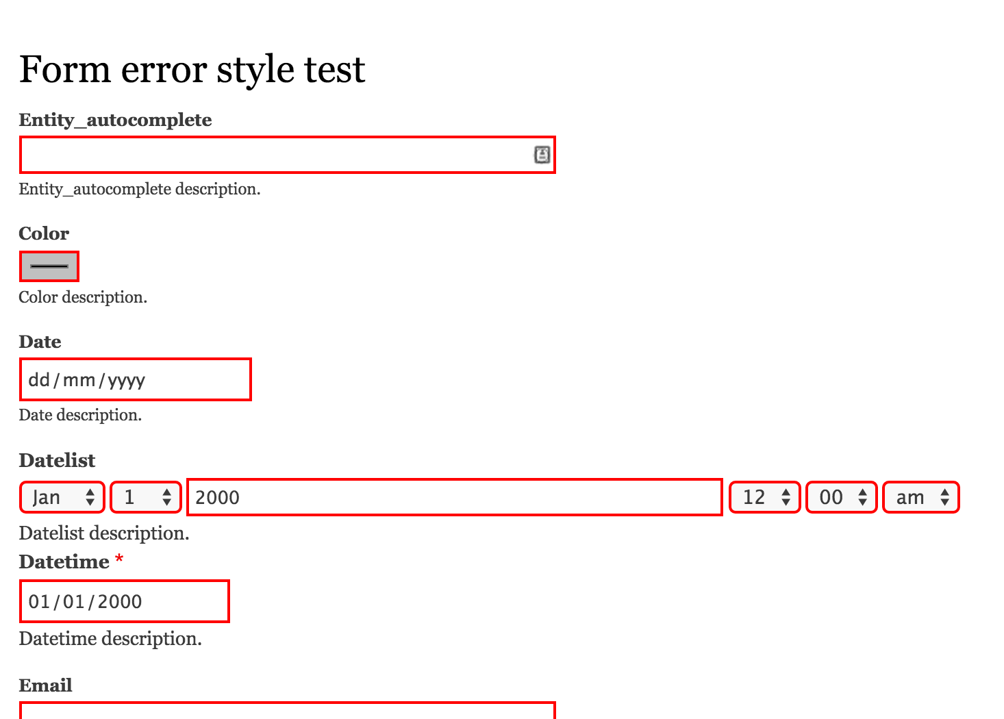
For example, errors show as a 2px red border on all form items. But when you focus on the element the focus colour is blue and the text prints in black. You would think at least the focus would be red.

Looking at Seven it has really nice clear error styles on form elements that consider usability and accessibility for the user.
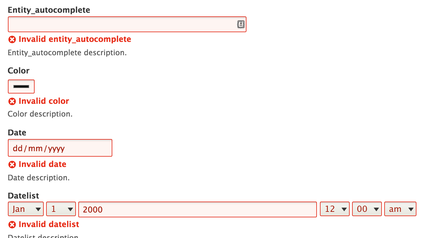
Error background colours, text colours and focus styles have been added.
The styles of the form elements in Seven have been even more improved within #1493324: Inline form errors for accessibility and UX.
How to manually test this issue
Pull 8.2.x HEAD and apply the latest patch
Install Drupal
Log in as user 1
Download and install dmsmidt's Errorstyle module from GitHub https://github.com/dmsmidt/errorstyle (forked from vijaycs85's original)
Choose your preferred theme from /admin/appearance
Go to /error-style/form
Submit the form
See all the errors.
| Comment | File | Size | Author |
|---|---|---|---|
| #44 | Screen Shot 2023-01-12 at 12.04.20 pm.png | 64.2 KB | pameeela |
| #44 | Screen Shot 2023-01-12 at 12.04.15 pm.png | 64.06 KB | pameeela |
| #21 | interdiff-2476439-6-7.txt | 773 bytes | david.hughes |
| #20 | interdiff-2476439-7-17.txt | 1.68 KB | david.hughes |
| #17 | add_form_item_error-2476439-17.patch | 1 KB | david.hughes |


Comments
Comment #1
Bojhan CreditAttribution: Bojhan commentedComment #2
emma.mariaThe screenshots will now be different after #1493324: Inline form errors for accessibility and UX was committed. I will update and tag with #Novice.
Comment #3
david.hughesAt Barcelona Sprint with mentor Gregg Marshall
Comment #4
david.hughesI've taken the styles used for the error focus by the Seven theme and added them to the Bartik theme to achieve a similar box-shadow. I've noticed this has some minor issues on the user edit form, for example. Patch to follow.
Comment #5
david.hughesComment #6
david.hughesComment #7
ckaotikBased on David's patch this one now applies the background to all error input fields and adds the red glow only to focussed errored fields.
Comment #8
david.hughesI'll take a look at this. For convenience, here's the module I'm using which has a simple form to test this patch (and any that may follow).
Comment #9
david.hughesI've checked your patch on OSX Yosemite with Chrome and Firefox (both latest versions, 25th Sept). Looks good. Attaching latest version of the module which has a select field & textarea.
Edit: For reference, the form this module creates lives at /example_form
Comment #10
greggmarshallhelping our table as the mentor.
Comment #11
arled CreditAttribution: arled commentedAdded radio buttons to the example form. DrupalCon Barcelona 2015.
Comment #12
vimokkhadipa CreditAttribution: vimokkhadipa as a volunteer commentedTried patch using sample module.
After clearing cache works! tested using chromium versión 45 on linux mint debian 2
Comment #13
arled CreditAttribution: arled commentedApplied and reviewed patch #7 during DrupalCon Barcelona 2015.
Browsers covered:
- Chrome
- Safari
- Firefox
Comment #14
Mirroar CreditAttribution: Mirroar at werk21 commentedI also took a look at this in IE 11. Looks good to me, without the patch there is actually no focus style for fields with errors, so this is definitely an accessibility improvement. Much better with the patch in #7.
RTBC+1 from Barcelona :)
Comment #15
david.hughesTested #7 in IE9, think this is good to go!
Comment #16
david.hughesHaving got this far, I'm wondering if this is something we should move back into the Classy theme instead? This would improve accessibility for D8 all around for any theme based off either Bartik, Seven or Classy rather than just the first two.
Working on a patch for consideration.
Comment #17
david.hughesThis patch moves the CSS into the Classy so that all themes using it as a parent will inherit this more accessible styling. Attached screenshots of how this looks on Chrome (missed checking the focus state in these screenshots so this will need testing).
Comment #18
emma.mariaThanks for all of the work on this. I'm setting this back to 'Needs Review' whilst I and the usability maintainers check over the solutions above.
Comment #19
emma.mariaAlso @david.hughes and @ckaotik, can you please create interdiff files along with patches to help us see the changes you individually have added to the patches you post. It makes reviews a lot easier and clearer. Thanks!
Documentation for creating an interdiff — https://www.drupal.org/documentation/git/interdiff.
Comment #20
david.hughesThanks Emma, I've created interdiffs for @ckaotik's patch in #7 (compared with my patch in #6 as well as one for my new patch in #17 which moves these changes into Classy (compared to #7).
Comment #21
david.hughesMissed diff between #6 and #7
Comment #22
Bojhan CreditAttribution: Bojhan commentedLooks OK to me.
Comment #23
emma.mariaComment #24
emma.mariaI have added how to manually test this issue using the same method that #1493324: Inline form errors for accessibility and UX used.
It provided a module that provides every form element.
Hopefully this still works with Drupal 8.2.x!
Also we need to review the patch in comment #7!!!
We cannot make changes to the Classy theme post-launch of Drupal 8.
Comment #25
SidneyGijzen CreditAttribution: SidneyGijzen as a volunteer commentedI will be reviewing this in the coming days as part of my core mentoring program.
Comment #26
SidneyGijzen CreditAttribution: SidneyGijzen as a volunteer commentedThis is a great idea. Thank you for the work already done in this issue!
I followed the instructions in the issue summary, and was able to install the 'error style test module' in the latest Drupal dev (8.2.x HEAD).
I tested the patch in comment #7, and it still applies cleanly.
Compared to the same form in Seven, my findings are:
Tested in browsers:
Comment #27
SidneyGijzen CreditAttribution: SidneyGijzen as a volunteer commentedUnassigning myself as I'm not working on a patch at the moment.
Comment #28
emma.mariaThanks @MF82 your findings are super useful :-)
I'm going to take a look at these things and add some screenshots and possible actions for further additions to the work so far.
Comment #29
SidneyGijzen CreditAttribution: SidneyGijzen as a volunteer commentedThanks @emma.maria for your feedback. Let me know if I can help you with anything.
Comment #41
John Cook CreditAttribution: John Cook at Annertech commentedTesting on 9.4.0-dev, the patch no longer applies. Also, the changes need to be replicated in more locations (eg
core/themes/bartik/css/classy/components/form.css).It looks like the original testing was done on Chrome. Since then, Chrome has changed it's default focus styling; it is now a solid blue outline. Because the browser default has changed, this now makes a disconnect between the element with and without errors. To properly unify this, there will need to be a default focus style for all form elements, with an override for the elements with an error.
There will need to be tests done on other browsers as they all have different default focus styles, and they will all need to be check for consistency between the standard and error focus states. With Safari, Firefox, and Chrome, they all use a "blue" (the shade is different) outline as an indicator. Safari and Firefox show this outside the border, but Chrome overlaps it (hiding the border).
Comment #44
pameeela CreditAttribution: pameeela commentedKeeping this with Bartik because it is handled properly in Olivero. But it is still the case in Bartik that the focus state on an error has the blue outline.
No focus:

Focus:
