

Closed (fixed)
Project:
Drupal core
Version:
8.0.x-dev
Component:
Seven theme
Priority:
Normal
Category:
Bug report
Assigned:
Unassigned
Issue tags:
Reporter:
Created:
8 Apr 2015 at 11:41 UTC
Updated:
19 May 2015 at 21:44 UTC
Jump to comment: Most recent, Most recent file



Comments
Comment #1
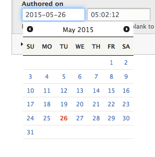
googletorp commentedI'm not a designer, but added some styles that at least adds some improvements.
• I added background on the datepicker so it's easier to see what is going on.
• I fixed hover bug on the month prev/next icons so they don't "jump" on hover
• I made it easier to see which date is currently selected.
• I tried to follow the existing look and feel / styles
I've attached a screenshot of how the datepicker looks with the new styles.
Note: Core will use datepicker as fallback, but this is not added yet - for testing see with datepicker fallback see #2467351: Add jQuery UI datepicker for the Date element of the datetime field
Comment #2
googletorp commentedComment #3
googletorp commentedComment #4
lewisnymanNice, thanks for catching this. I will review the patched styles when I get a chance.
Comment #5
googletorp commented@Lewis That sounds great.
Normally there is a border around the datepicker, but in the initial styles present, this was removed, so I didn't add it.
I do think that it would look nice, with a border around and make it more clear that it's a separate element. Since I'm not a designer mostly do backend, I just went with what was there already. But we might consider improving the design a little.
Comment #6
lewisnymanOk here's my version of the styling, using the colors and general principles of the Seven theme.
Annoyingly I had to overrride a lot of datepicker.css stuff but I think replacing it completely might introduce too many issues. I commented where I've had to override for later.
We can replace the icons in a follow up issue as well.
Comment #7
googletorp commented@Lewis the patch looks very nice.
I re-added a thing you removed, which makes the icon still on hover. I also added styles for the cursor on icon hover.
Comment #8
lewisnymanOk great, now we just need someone else to review the styling before this is marked RTBC
Comment #9
Anonymous (not verified) commentedThe selected date could be bit more visible, as the bold only is quite hard to spot.
Comment #10
googletorp commentedThis can easily become an opinion based discussion on which color is best. How is this best resolved?
I personally think current patch is good as is and that it follows the look and feel of Seven.
Comment #11
lewisnyman@b0unty I think your screenshot looks different to mine in #6? The styling has a background color and is bold. Maybe it was your cache?
Comment #12
Anonymous (not verified) commented@LewisNyman on your screenshot you have the current date selected, if you select any other date than the current date the situation happens as on my screenshot.
Comment #13
lewisnymanOk true, we need to update the styling so
ui-state-activestyling is switched with.ui-state-highlightComment #14
lewisnymanComment #15
Anonymous (not verified) commentedComment #16
Anonymous (not verified) commentedAnd the patch itself with an interdiff
Comment #20
googletorp commented@b0unty The patch and interdiff you made is reversed, can you fix this and update the patch?
Comment #21
Anonymous (not verified) commentedwoops, re-try
Comment #22
Anonymous (not verified) commentedComment #23
Anonymous (not verified) commentedComment #24
gaëlgThis patch just works, thanks.
Comment #25
alexpottI manually tested the patch and it looks much better than HEAD. Committed 3289027 and pushed to 8.0.x. Thanks!
Thanks for adding the beta evaluation to the issue summary.
Comment #26
googletorp commented@alexpott The link is broken and I don't see the patch in core. Did something happen during commit?
Comment #28
googletorp commentedSo I caught up with webchick and Alexpott in IRC, so all is good now.