Problem/Motivation
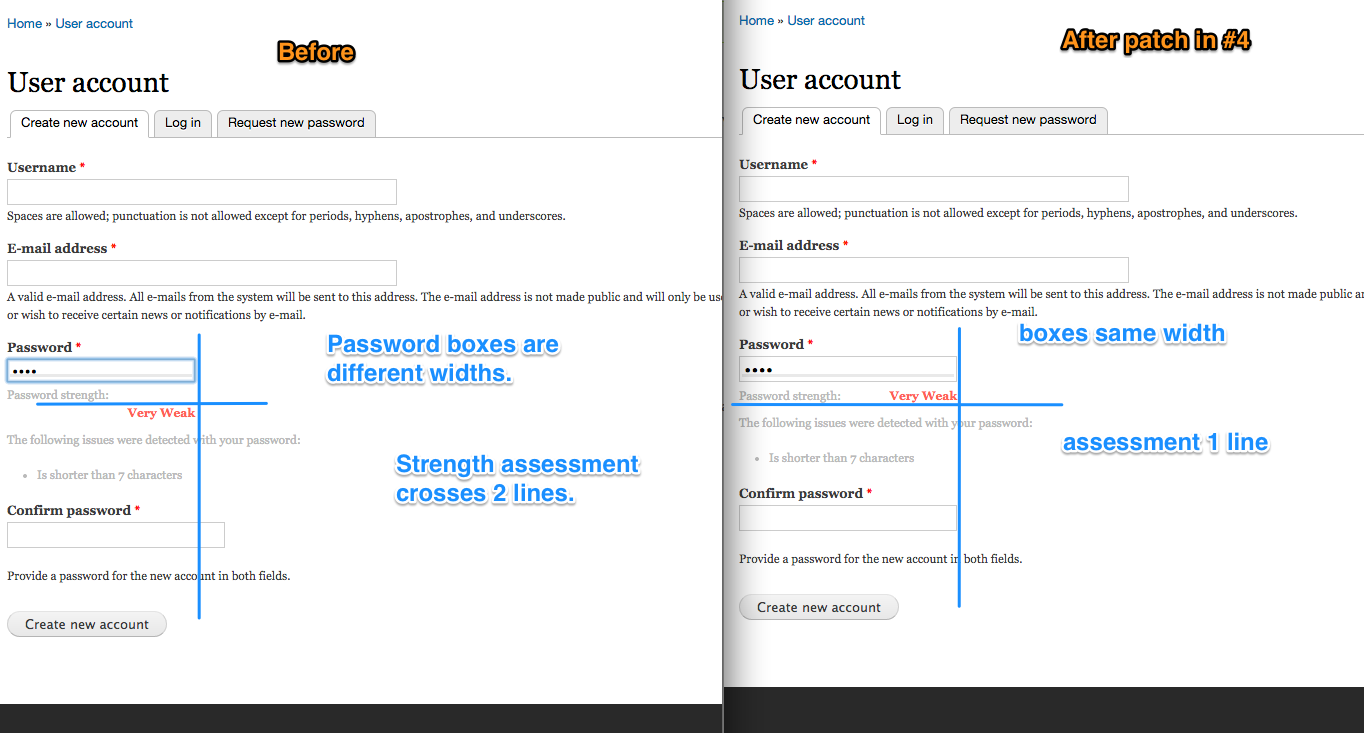
The current code assumes that that input box is quite wide (240px), at least wider than the style in Drupal 7 core (182px). As a result, the text for the password strength (e.g. Password strength:Very Weak) gets broken down into 2 lines.

Proposed resolution
Maybe don't restrict the width of the text, and don't do any right align?
Remaining tasks
* The progress bar overlays the field in an odd way on admin/config/system/password-strength and the password strength words wrap a line
* In the "Seven" admin theme, when editing users, the progress bar overlays the field too much and the strength words wrap a line
User interface changes
API changes




Comments
Comment #1
scor commentedComment #2
scor commentedComment #3
coltrane(moving to Password Strength project)
Comment #4
gregglesOK, I think this css fixup gets 2 bugs (demonstrated in the attached screenshot).
Basically the problem is that the font-size was being applied at too high of a wrapper level. Which might override with the font-size associated with the password input which might then make that box have a narrower width.
Comment #5
coltraneThe CSS changes look good on account registration form but not on the user edit form or the Password Strength configuration form.
The strength only appears inline on user edit form when it's level "weak". All others are not lined up.
Configuration form starts with strength meter over the form input when empty.
The strength level is also not lined up once displayed.
Comment #6
coltraneActually I was able to see the user edit and config form oddities without this patch applied so I think its an overall styling issue and not something caused by this patch.
The config form meter bar appears over the field whenever the collapsible fieldset is collapsed which happens when the default strength is > 0.
Comment #7
gregglesI've updated the issue summary to discuss those remaining issues under the "remaining tasks".
In my testing this patch doesn't cause any regressions to the layout of the fields.
I believe that the attached patch fixes the registration form and editing an account for non-admins. I suggest committing it as-is since it fixes the most important case (user-facing display). The other items can be followup tasks.
Comment #8
gregglesRather this.
Comment #10
coltraneCommitted #4 patch. Will leave open to look into remaining issues.
Comment #11
scor commentedFor the strength to be in one line, we're just going to have to increase the length of the password from 16em to 20em, which is included in this patch.
I've also fixed the strength bar. The additional margin was caused by additional pixels added in the javascript.
Comment #12
gregglesCan you post before/after screenshots?
Comment #13
scor commentedSure!
Comment #14
scor commentedI made a 1 pixel adjustment.
Comment #17
coltraneCommitted. Thanks!
Comment #18
scor commentedmoving to 6.x to make sure all patches were committed there too.
Comment #19
scor commentedD6 needs a bit of extra CSS love.
Comment #20
scor commented