
 Come together with the global Drupal community in Rotterdam, 28 Sept – 1 Oct 2026. Sessions, contribution, connection, and Early Bird savings until 8 June.
Problem/Motivation
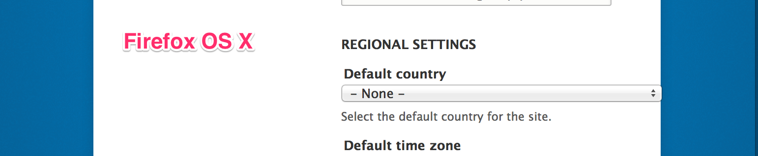
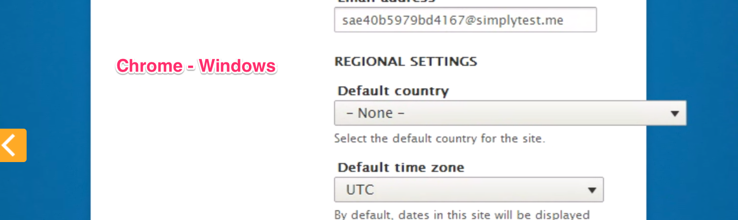
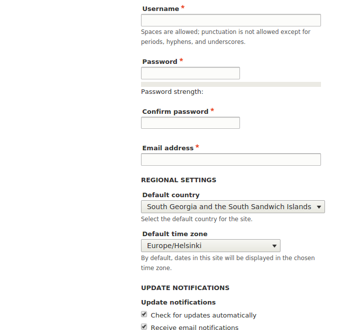
During installation in all browsers the "Default country" dropdown element overflows or is wider than other elements and touches the edge of the installer container. This occurs at 769px and up, until the dropdown element "fits" in the install container.
See the following screenshots, I have annotated them with browsers and operating systems they belong to.


Proposed resolution
Create a fix to contain the dropdown element in the installer box and keep it inline with the widths of other elements on the page.
Take into consideration that some countries have a long length and that we do not know if longer country names will be added in the future.
Remaining tasks
Review the most recent patch in this issue.
Does it fix the problem? What do really long country names look like?
Fix patch - Remove changes in the patch not relevant to this issue.
Manual testing of pages with select boxes - the patch affects select boxes everywhere in Seven.
Add screenshots to show any visual regressions or if everything is fine.
Add a review comment to this issue.
User interface changes
Not applicable
API changes
Not applicable
Original report by krueschi
When installing the system asks for website information and admin user information.
The fieldsets therefore run out the light colored foreground into the blue background on the right.
Up until now I've testet only the installer in German.
Beta phase evaluation
| Issue category | Bug because long select inputs escape their containers width |
|---|---|
| Unfrozen changes | Unfrozen because it only changes layout presentation |
| Comment | File | Size | Author |
|---|---|---|---|
| #62 | IE9-3.png | 311.05 KB | emma.maria |
| #62 | IE9-2.png | 279.87 KB | emma.maria |
| #62 | IE9.png | 307.69 KB | emma.maria |
| #62 | firefox-2.png | 629.45 KB | emma.maria |
| #62 | firefox.png | 328.62 KB | emma.maria |

Comments
Comment #1
krueschi commentedTested the install process in (untranslated) English and the fields are to long too.
Comment #2
krueschi commentedSome more testing done and this issue seems to be only relevant for Firefox 28 (on Windows and maybe older versions).
Not affected:
So maybe it's not a Drupal bug?
Comment #3
lauriiiFor some reason input's doesn't have any effect when using max-width property. I applied a patch to Firefox issue queue ( https://bugzilla.mozilla.org/show_bug.cgi?id=988965 ).
Comment #4
krueschi commentedThanks.
Do you think we can close this issue as "works as designed" (as the error is not Drupal but FF specific) ?
Comment #5
lauriiiI dont know if we should create a workaround for this. Inputs on Firefox does respect width setting, so should we use that on the installation form?
Comment #6
krueschi commentedI'm curious about that its not occuring on the db settings form. Only the website config form elements are not properly sized.
Comment #7
rajendar reddy commentedfieldsets are overlapping into the blue color background because input elements are missing the width property. If I set the width to the input elements issue is resolved. I am facing this issue even in Chrome 33 when device width is 768px. We have to override the input elements in this form( i.e., install-configure-form) except password type.
Comment #9
rajendar reddy commentedSubmitting the patch again.
Comment #10
emma.mariaComment #11
emma.mariaComment #12
dervishmoose commentedAt this breakpoint what if we do a width:50%, rather than removing the width?
This is addition introduces another issue at smaller screen size where the screen is less than 600px.
Comment #13
dervishmoose commentedComment #14
jimlockett commentedI tested with Firefox 29.0.1 in (untranslated) English there was no problem with the fieldsets right margin
Comment #15
dervishmoose commentedComment #16
frankfarm commentedIn Chrome 35.0.1916.114 and in Firefox 29.0.1 and in Firefox 28.0 on Mac 10.9.3 when testing the patch in #9 in English this problem does not appear at screen widths of 320px, 480px, 640px, 768px, and 1024px. (See attached screenshots.)
In all of these browsers on Mac 10.9.3, at all the aforementioned browser widths, the inputfields have width:100%. However, at 768px wide the element called main has width:65% and this container constrains the widths of the inputfields enough to prevent the problem.
It's not clear to me that this issue needs more work, so I'm changing this from needs work to reviewed and tested by the community. Do we need to test older than Firefox 28? Do we need to test other languages?
Comment #17
frankfarm commentedAdded issue summary
Comment #18
frankfarm commentedAdded sample image of Firefox 28.
Comment #19
frankfarm commentedRealized that image embed doesn't work with weird characters, so I had to reupload one image with a different filename.
Comment #20
alexpott#12 seems to suggest there are issues with the patch and manually testing has revealed a regression on the account edit screen.
Comment #21
alexpottSo needs work.
Comment #22
jamesquinton commentedAssigning myself.
Comment #23
jamesquinton commentedFixes #20 and tested the install screen with the latest Firefox which is OK - the password indicator bumps down under the field and does not break the layout.
Comment #24
jamesquinton commentedUpdated patch for layout fix at 600px breakpoint - password indicator was nudging against password input.
Still an issue at 995px for around a 10px range, where the the password indicator bumps down, but it is still floating right (screenshot attached). This container can't be any smaller, or the indicator copy will spread onto 2 lines.
So I guess the options are:
Comment #25
DickJohnson commentedIt could be also smaller than 24. 18 it's about same size than what it looks like in Chrome or other browsers.
After changes there's still a visual bug with Firefox. When field has something to notice the shadow around the box is not showing on left. Issue has been created #2297889: On configure site form fieldsets should have small padding
As attachment patch with stuff from #24 and changed field size.
Comment #26
DickJohnson commentedStarted to think if most of stuff from #24 should be moved to install-page.css instead of style.css?
Comment #27
emma.mariaYes the install page styles need to be in install-page.css where the existing styles are.
I am going to do some fresh testing, the styling of things like the password strength have radically changed since this issue was last worked on.
Comment #28
emma.mariaComment #29
DickJohnson commentedJust ran test on "configure site" page with Firefox, Chrome, Safari and IE. It's looking relatively nice on mobile, pad and normal screen. There's few minor issues.
Default country between 699px and 705px on Firefox is not staying inside the white area. On Safari that's something like between 698px and 715px.
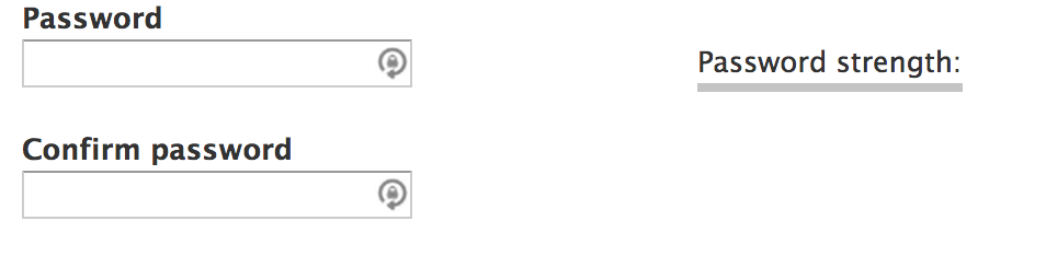
The password strength colour bulk is full width between 699px and 920px when it's same width with the password box in all other widths.
Browsers used:
Chrome Versio 36.0.1985.125
Safari Versio 7.0 (9537.71)
Firefox Versio 31.0
IE 10
Comment #30
DickJohnson commentedForgot images. On first Safari Default country at 700px. Seond is Password strength on 915px and last on 925px.
Comment #31
ByronNorris commentedI also noticed the progress bar css triggered between (max-width: 1010px) and (min-width: 48em) shifts the progress bar to 100% when working on "Password strength: Strong" wraps onto a second line. I've attached a patch to the seven theme to fix the progress bar.
Comment #32
DickJohnson commentedPatch on #31 is fixing the issue with progress bar. Tested with IE, Firefox, Chrome and Safari.
The issue with "default country" is a bit trickier as width for the box is based on longest country name which is "South Georgia and the South Sandwitch Islands". I think we could drop few letters away by theming as everyone should understand it anyways. Or?
Comment #33
seiplax commentedComment #34
seiplax commentedConfirming that the patch in #31 works as intended on Chrome, FF and Safari. It also has moved the CSS to install-page.css as mentioned in #27
The default country bug also exists on Chrome.
Talked with emma.maria and lewis.nyman about changing the breakpoint, but when testing this the new breakpoint would be 831px - up from current 768px. This is still not a guarantee that some country names with translations will not need a different breakpoint.
We decided to go with a max-width on the select element anywhere it is displayed so that it would behave the same way everywhere, as this then prevents the need to fix it in multiple locations.
Submitting patch for testing that also contains a merge of the patch in #31.
Comment #35
ericxb commentedComment #36
ericxb commentedConfirmed issue exists in Safari 5.7.1 on Windows.
Could not repeat issue in Chrome 37.x.
Attempted to apply patch, but paths in
themes/seven/csshave changed since patch #34 was submitted.hunk 1 should now be applied to
themes/seven/css/theme/install-page.csshunk 2 should now be applied to
themes/seven/css/components/form.cssComment #37
lewisnymanComment #38
rootworkQuick reroll.
Comment #39
rootworkBoo bad tabs.
Comment #40
jhedstromAre folks here agreed on this approach?
Comment #41
emma.mariaComment #42
emma.mariaComment #43
emma.mariaThe original issue is still occurring in Safari 5 on PC see screenshot.
Also the most latest patch only has changes for select elements and not inputs as well. It looks like the patches have lost focus as there are 3 different ones in this issue focusing on different things.
I will update the issue summary with a plethora of screenshots tonight and clearly show what needs to be fixed where so we can create 1 patch and fix this issue finally.
Comment #44
lewisnymanI don't think we need to support Safari 5 anymore, Apple doesn't update Safari on PC anymore
Looks like we need to update the issue summary to show we are only fixing the select box.
Comment #45
Vally79 commentedI'm making screenshots on ubuntu 14.04 LTS.
Comment #46
Vally79 commentedWorking fine on Chromium 39.0.2171.65 and Firefox 33.0 before patch on 1366x768, 1024x768 and 800x600.
Wrongly displaying the "email adress" text and not showing the box at all only on Firefox 1024x768 after applying the last patch.
Comment #47
emma.mariaLet's get this issue organised!
I am testing:
Mac - Chrome, FF, Safari
Windows - Chrome, FF, IE9
and creating screenshots for the browsers that have bugs.
I will update the issue summary and title to reflect what I find.
The FF issue in #46 with the email address title happens on every OS but only in Firefox. It's not linked to what this issue is trying to be so I am going to split it out here... #2392487: The email address field title moves up next to password fields at 768px to 1010 px - Firefox only.
Comment #48
emma.mariaComment #49
emma.mariaReview of patch in #39.
The most recent patch in #39 contains a fix for the Default country element which works well and was agreed by others in #34 that we should go about it in that way.
This patch does also removes code for the password fields which I think should not be part of the patch anymore? Second opinion needed!
I applied the patch and took screenshots for all the browsers that I used to find the before patch bugs in the Issue Summary, here are my findings.
It looks good everywhere!
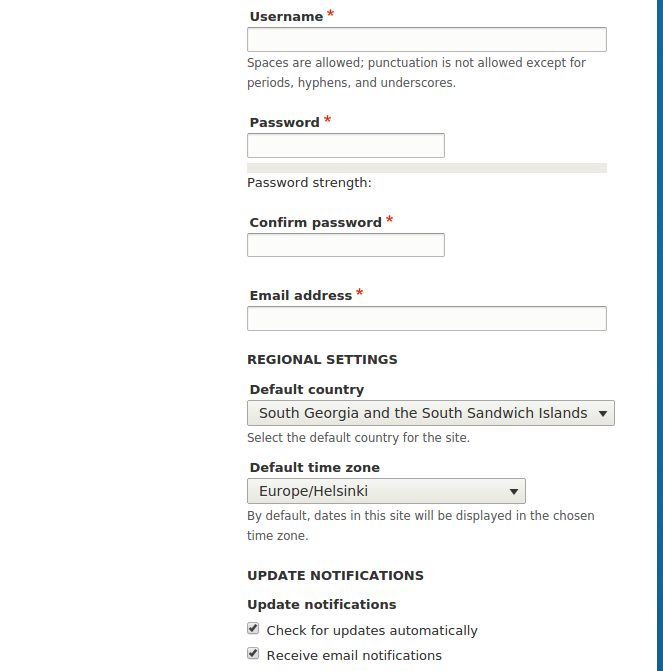
The dropdown element now stays at a consistent max width and matches the sizes of elements below and above it.
I used the longest country in the list to demonstrate that it keeps it's width.
The country name selected in the box is cut off in extreme cases. But I think this is OK, nothing is selected in the dropdown when the page is loaded and you can easily view the whole length of the countries in the dropdown list in any browser see below...
I think this is acceptable usability. Tagging with +Needs usability to get further opinions.
Comment #50
emma.mariaComment #51
DickJohnson commentedI think this is the best approach around, as other options are changing the width of whole layout or trying to put the country name to two lines. Two lines does not really compute on this kind of element and changing whole layout because of one country with extraordinary long name sounds like too much of work.
Comment #52
lewisnymanGood work! Almost there.
Because this code affects every select element in Seven, we need to verify that it doesn't break any other pages. A few suggestions of complex uses of slect elements would be field formatter settings in the field ui and exposed filters in the content listing view.
These lines don't affect select elements, so I don't think we should remove them here.
Comment #53
DickJohnson commentedNo issues on content listing page on on field formatter page. Field formatter page has some issues when were on firefox and screen that is below 500px, but that exist also without the patch.
Few screenshots as attachments. Tested on OSX with Safari, Chrome and Firefox.
Comment #54
emma.mariaComment #55
DickJohnson commentedNew patch around, with the changes LewisNyman suggested.
Comment #56
emma.mariaComment #57
Jill LComment #58
Jill LI tested across several browsers...looks great in all of them. Screenshots are attached.
I tested in*
Chrome 39.0.2171.99
Firefox 29.0.1
Safari 7.1
Opera 26.0.1656.60
IE 9
IE 10
IE 11
Comment #59
Jill LI'm not sure what the next step is here. RTBC?
Comment #60
joelpittetThank you @Jill L, I think the next step would be to put a helpful comment above the css, as it's not clear that this selector is meant to fix that kind of problem and may be accidentally removed if nobody knows what it does.
Other than that, RTBC, yes:)
Comment #61
emma.mariaThanks @Jill L the screenshots are fab.
The code in this fix targets every select in the theme so it's important to check we are not breaking other things elsewhere. Therefore we need to add screenshots of other select elements elsewhere to be sure and then this issue can be set to Rtbc :)
Comment #62
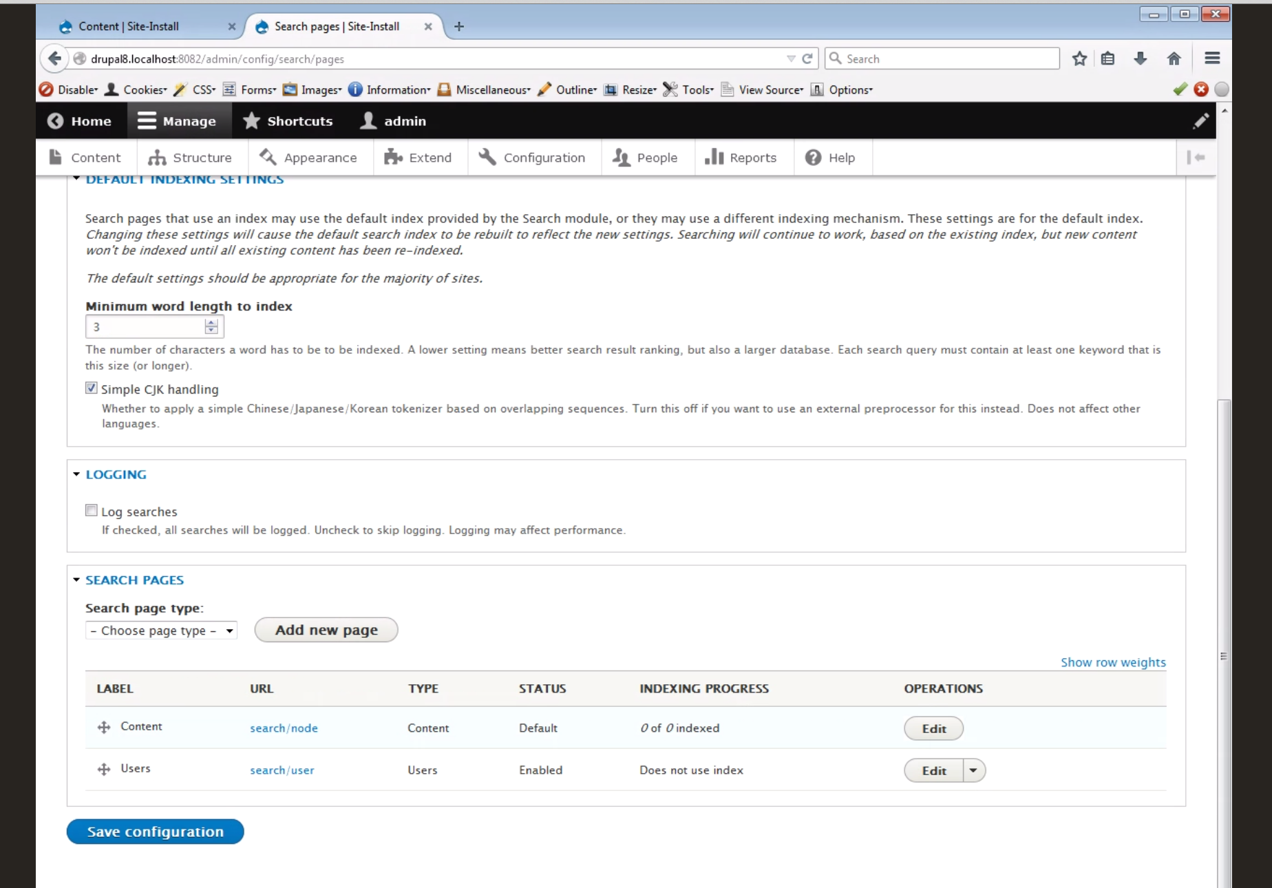
emma.mariaI went through Seven and found instances of Select elements in the following places...
/admin/config/regional/settings
/admin/config/services/rss-publishing
/admin/content/comment
/admin/content/
/admin/config/search/pages
/admin/config/development/logging
/admin/config/media/file-system
/admin/config/development/performance
/node/add/page
/admin/config/system/cron
None of them looked broken. They all had the width of the longest item they contained, nothing was cut off. None of them relied on a set width bigger than 100%.
I ran CSS regression tests for all of these pages to check between head and the patch applied, which you can look at in the attached file.
I also took a look at these pages in IE9 and Firefox and found no issues.
Here are some examples...
Firefox
IE
I also went through other pages of the installer containing selects and found no issues.
I have added the comment to the CSS file.
Phew a big review for one line of code! The work in the patch in #55 is RTBC as far as I can see, I just need someone to RTBC the comment I added.
Also note the screenshots for the install page for the country select item are found in #58.
Comment #63
joelpittet@emma.maria, sometimes the smallest changes effect the most things. Thank you for the comment explaining it's purpose so it doesn't get regressed easily and checking in other places.
I'm confident this change does what is needed.
Comment #64
alexpottCSS changes are not subject to beta evaluation. Committed 64042b0 and pushed to 8.0.x. Thanks!
Comment #67
yesct commentedchanging to the more commonly used tag, so I can delete the one lesser used