
 Come together with the global Drupal community in Rotterdam, 28 Sept – 1 Oct 2026. Sessions, contribution, connection, and Early Bird savings until 8 June.
We are adding a grouped search component to Seven in #2160545: Create search/filter component and it seems like it would suit Bartik's search form as well.


| Comment | File | Size | Author |
|---|---|---|---|
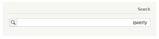
| #43 | before-search.png | 24.77 KB | neerajpandey |
| #43 | before-mobile-search.png | 16.93 KB | neerajpandey |
| #43 | before-mobile-form.png | 21.17 KB | neerajpandey |
| #43 | before-form.png | 33.28 KB | neerajpandey |
| #43 | after-search.png | 23.66 KB | neerajpandey |

Comments
Comment #1
lewisnymanComment #2
lewisnymanI had a play around with this just to see how it would look. I'm not in love with it to be honest but it would be nice to get some other opinions. I think it would look less out of place in the site header.

Comment #3
lewisnymanComment #4
emma.mariaHow did this go unnoticed all this time? I think this looks great and not out of place with Bartik's design.
Tagging to try and get further opinions and more testing of this.
Comment #5
emma.mariaThis patch needs a reroll, leaving the +Needs usability review tag to get some design eyes on at least the screenshot from @LewisNyman.
Comment #6
amitgoyal commentedRe-roll of #2.
Comment #7
emma.mariaComment #8
Bojhan commentedI am not sure about the roundness do we do that on any other forms? Combing sounds fine to me
Comment #9
lewisnymanNow, I think this is taking influence from the default browser styling and common styling of frontend frameworks like Bootstrap input groups. What do you think?
Comment #10
Bojhan commentedI am actually not so sure, because that often is in alignment with a very special position on the page. In our case, its simply in a block and can often be placed close to other forms.
Comment #11
emma.mariaI tried to show the search block next to the login block to see if the different form styling was an issue but turns out the patch re-roll did not go to plan. See screenshot...
Comment #12
emma.mariaComment #13
emma.mariaPushing this to 8.1.x as we are all far too busy fixing things to do the fun design tasks right now :)
Comment #15
emma.mariaYay we can open this again
Comment #16
emma.mariaComment #17
syamnath commentedHi I just played around with the search button. Here is my suggestion. It will be better if we go with a full width searchbox. I t will also be very handy when considering responsiveness.

In Large displays
Kindly advice
Comment #18
emma.mariaHi @syamnath_zyxware. Thanks for the mockup! I am going to ping @yoroy, who is one of the Usability maintainers for Drupal 8 core to get some feedback for you :-)
@yoroy Please can you give any advice or feedback for this issue and the idea in #17?
Thanks!
Comment #19
yoroy commentedSorry for the delay. Thanks for working on this @syamnath_zyxware. I think his looks great! I agree full width would be useful to do as well. Go for it :)
Comment #20
emma.mariaYay! :-)
Comment #21
syamnath commentedComment #22
syamnath commentedHi I have created a patch making the search the same design as above. It has been did in the rtl also. needs review
Comment #23
syamnath commentedComment #24
ckrinaIt looks great in all sizes, but I've found a really small thing: on small devices the text inside the input is partially hidden in the bottom (the descenders only). Since the text size is increased to 16px for small devices (form.css, line 83), the padding
padding: 4px 0 4px 0;plus theheight: 16px;are not enough. It's just a matter of 1px.Comment #25
kostyashupenkoComment #26
kostyashupenko@ckrina, i've found this small thing too via FF and fixed it. Screens below
Before #26:

After #26:

Comment #27
yoroy commentedThanks all, this looks good to go!
Comment #28
emma.mariaI will take a look at this today. I've also noticed there are no screenshots of the search form on the search page either so will check it out.
Comment #29
emma.mariaThe search component is definitely used in the main content region on a search result page and the block can also be placed in *any* region. Therefore we cannot assume that it should span full width of the container. See below.


Also placing the block in other regions produces a broken search component, see below.
We put a lot of work into the search component to make it reusable wherever it is placed plus only using one set of component CSS. I don't want that progress to go too far backwards.
Comment #30
kostyashupenkoI will check
Comment #31
kostyashupenko@emma.maria, with the patch #26 we can't keep the same styles (and correct) everywhere. That's why i've restyled a lot of things in my patch. Please check screens and test it. For now we have static sizes for loupe-icon for all resolutions. Looks ok i guess. Waiting for your feedback


Comment #32
ckrinaHi @kostyashupenko, I'm afraid I've found some issues with that last patch. On some places the class
.form-itemadds margins to the input group element so the absolute position in the submit button causes it to be above the text input.Comment #33
yoroy commentedComment #34
kostyashupenkowill check
Comment #35
kostyashupenko@ckrina, issue fixed in this patch

Comment #37
ashish_nirmohi commentedI have changed the version to 8.2.x-dev from 8.3.x -dev , as patches are being submitted on 8.2.x-dev.
Comment #38
ckrinaI've just seen one issue on smaller devices (smaller than 600px):

It's the line 310 in form.css that adds this 10px as top margin:
Comment #39
ckrinaComment #40
ckrinaJust checked it and it was the bottom margin from the general inputs in form.css who was creating this misalignment. I overrided it just for this component in small devices, but maybe it's not the best approach.
Comment #41
ckrinaComment #42
ckrinaComment #43
neerajpandey commentedTested. Everything work fine for patch #40, but the alignment of the search-form-submit-button in mobile devices is not proper.
Screenshots has been attached for all and have pointed out the issue on the screenshot using an arrow. Rest is fine.
Issue on : after-mobile-form.png
Comment #44
neerajpandey commentedComment #45
MaskyS commentedI think we should close this issue since this has already been implemented into Bartik both in 8.2.x dev and 8.3.x.