
Problem/Motivation
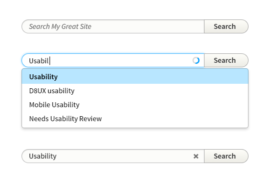
The search field is rounded both as another opportunity to introduce friendliness into the UI, but also follows a tendency for search fields to be rounded in some browsers and operating systems.
Grouping the single text field and the submit button together simplifies the component and implies a one-to-one relationship between the two. There is also an opportunity to create a bootstap-style input group component.
The dropdown menu is intentionally designed as a distinct component (see the section Dropdowns and Popovers) for modularity of the design and code reusability. Visually and in terms of implementation, merging or joining the search field with the drop down is both awkward and not strictly necessary for usability.
API changes
Some mark up changes
| Comment | File | Size | Author |
|---|---|---|---|
| #18 | win7_chrome_small_screen.png | 41.25 KB | Nikolay Shapovalov |
| #17 | win7_ie.png | 17.95 KB | Nikolay Shapovalov |
| #17 | win7_chrome.png | 19.69 KB | Nikolay Shapovalov |
| #13 | 2160545-search-component-13.patch | 3.71 KB | emma.maria |
| #10 | search-form-shadow-nocut.png | 13.96 KB | tompagabor |


Comments
Comment #1
LewisNymanComment #2
LewisNymanComment #3
LewisNymanHere are a few examples of pages that use single input search/filter forms:
Comment #4
LewisNymanComment #5
dawehnerInteresting to have a common approach for all those forms.
Can you please remove the last example? This is just wrong, given that this is no search functionality.
Comment #6
LewisNymanSure thing.
Comment #7
LewisNymanComment #8
LewisNymanComment #9
LewisNymanHere's a proposal patch implemented on the module page. You have to apply it alongside #1986418: Update textfield & textarea style
The submit button doesn't do anything yet and we'll have to override it with JS.
Comment #10
tompagabor CreditAttribution: tompagabor commentedAdd a newy patch, because overflow: hidden, and overflow: auto cut box-shadow, on the left side.
Used position relative/absolute, instead of floating.
Comment #12
LewisNymanComment #13
emma.mariaPatch re-rolled :)
Comment #14
LewisNymanThis is looking good, is it a good idea to have a set width like that? What if people need it to be shorter or wider than 200px?
Comment #15
Nikolay ShapovalovComment #16
Nikolay ShapovalovComment #17
Nikolay ShapovalovI have tested the patch #13 on windows 7.
There are several bugs:
IE 11:


Google Chrome:
Comment #18
Nikolay ShapovalovAbout pacth #13
There is semicolon required at the end after position:absolute.
Also there is an issue with submit button width on mobile device.

Google Chrome:
Comment #19
Nikolay ShapovalovComment #20
sqndr CreditAttribution: sqndr commentedPicking up this issue. I ended up with some css that looked like this:
Looked good in chrome ... but then I opened Firefox, and there were some layout issues again. Seems like this still needs some work. Maybe we can look into Bootstrap and see how the form group is styled there?
Chrome:
http://cl.ly/image/12083J023x3k
http://cl.ly/image/431k410n0h0S
http://cl.ly/image/183b082e0216
Comment #21
sqndr CreditAttribution: sqndr commentedComment #22
Bojhan CreditAttribution: Bojhan commentedComment #23
LewisNymanI think we can take a new approach with this and specify the component similar to Bootstrap:
Then we don't have to assume a specific element is the special case.
Comment #24
emma.mariaComment #38
markconroy CreditAttribution: markconroy at Annertech commentedLet's move this to the theme system queue. Looks like it's relevant to Drupal rather than just Seven theme.