
 Support for Drupal 7 is ending on 5 January 2025—it’s time to migrate to Drupal 10! Learn about the many benefits of Drupal 10 and find migration tools in our resource center.
Related to #1751606: Move published status checkbox next to "Save" and #1510532: [META] Implement the new create content page design
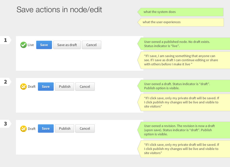
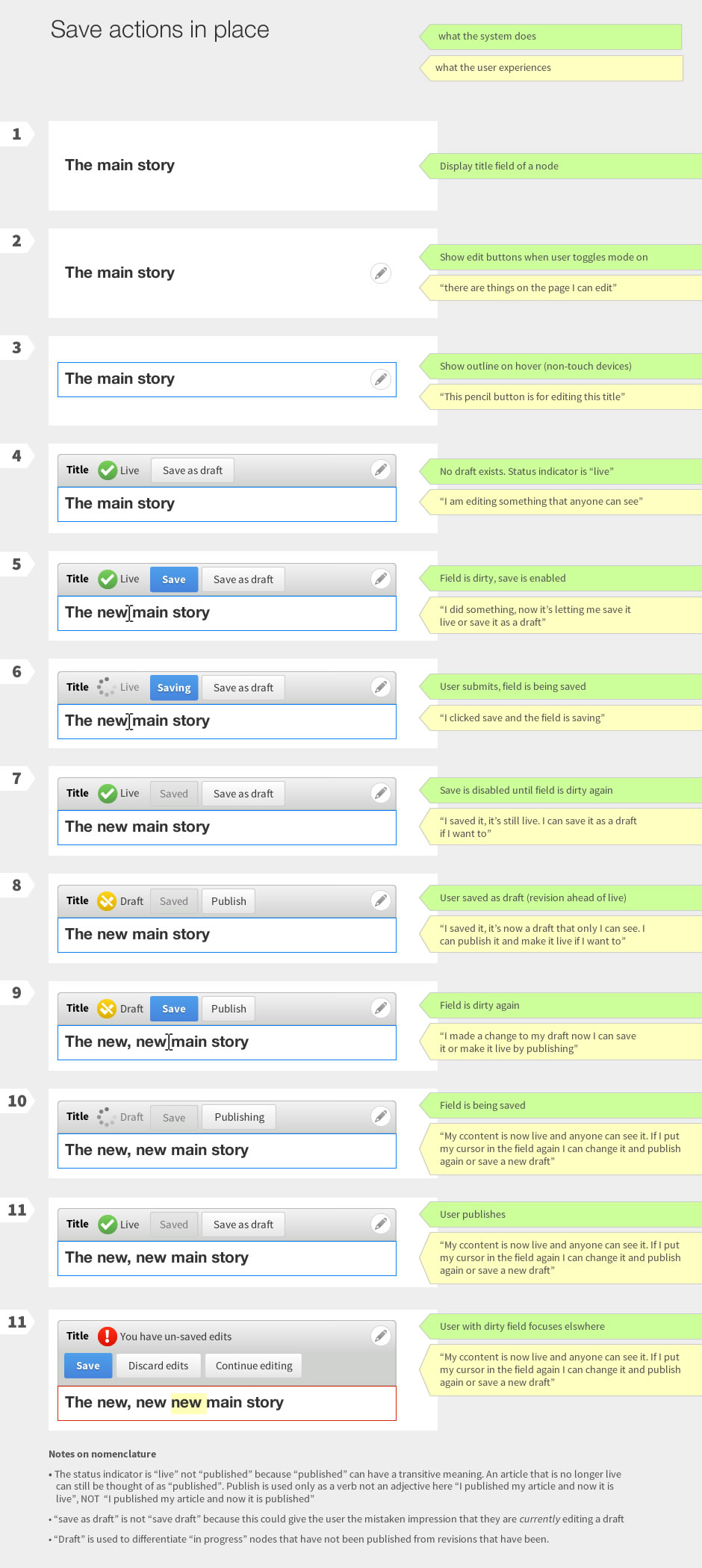
The main user story is:
1) "as a content author I am confused by the different options that appear when I am editing content in place vs. when i am editing content in the administrative interface. I want them to have the same options."
Secondary user stories are:
2) "As a content author I don't know whether the thing I am editing is the live version or a draft"
3) "As a content author I want a way to switch from the live version of my content to a draft when I am editing in place."
4) "As a content author I want to open a draft created by another user and edit it"
5) "As a content author I *don't* want another user to open my draft while I am working on it and overwrite my changes"
Below are designs that address these user needs

| Comment | File | Size | Author |
|---|---|---|---|
| #17 | draft.png | 7.97 KB | John Pitcairn |
| #11 | workflow.jpg | 138.98 KB | tkoleary |
| #11 | save actions in place draft.jpg | 271.97 KB | tkoleary |
| #11 | save actions in place.jpg | 281.4 KB | tkoleary |
| #11 | save actions in the node edit form.jpg | 119.36 KB | tkoleary |


Comments
Comment #1
webchickTagging usability to get this on the UX team's radar.
Comment #2
webchickAaaand Spark.
Comment #3
jessebeach CreditAttribution: jessebeach commented"Meta" to "[Meta]" in the title.
Comment #4
jessebeach CreditAttribution: jessebeach commented"Meta" to "[Meta]"
Comment #4.0
jessebeach CreditAttribution: jessebeach commentedLinked other issues
Comment #5
tkoleary CreditAttribution: tkoleary commentedAttaching revised images here so I can reference them in the summary.
Comment #5.0
tkoleary CreditAttribution: tkoleary commentedrevised attached images
Comment #5.1
tkoleary CreditAttribution: tkoleary commentedUpdated images
Comment #6
tkoleary CreditAttribution: tkoleary commentedRevised again
Comment #6.0
tkoleary CreditAttribution: tkoleary commentedrevised images
Comment #7
Bojhan CreditAttribution: Bojhan commentedShouldn't we be discussing this at http://drupal.org/node/1678002 ? Seems directly related, this should probably be closed as duplicate.
I spend today with WimLeers going over many of the spark related stuff, we went over the assumptions and ideas behind this. First of all I want to thank you for diving into this, its really a whole lot and its quite tricky. However this is at core at most of the larger drupal websites, content workflow. This is a quick review, since we have to go over a whole lot more.
My first impression are:
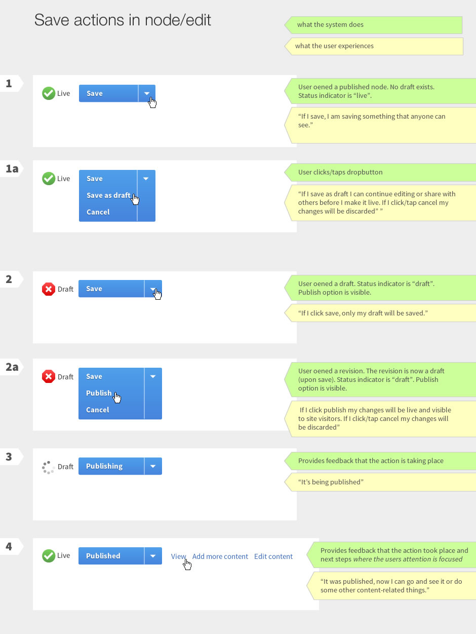
To make this less overwhelming I think one of the key iterations we need to do, is reduce the amount of things happening. One way that we did this before is having one button for all saving (save & publish, save as draft, save for review, save as unreviewed etc) instead of having two buttons, that have some level of interdependency between the two. Tempstore introduces a number of complexities, perhaps we can battle that by assuming the user always wants to see his own temp version, and not offer methods to switch to other revisions (if they want that, they would go to node/edit).
I understand the ideas for node/edit for both Publish and, publish states. I am not sure though why we would want to deviate from the drop button idea, I always thought that was a nice solution to the problem of many states but still clicking save. I would love to know why you would not want to do that.
Notes on specific screens:
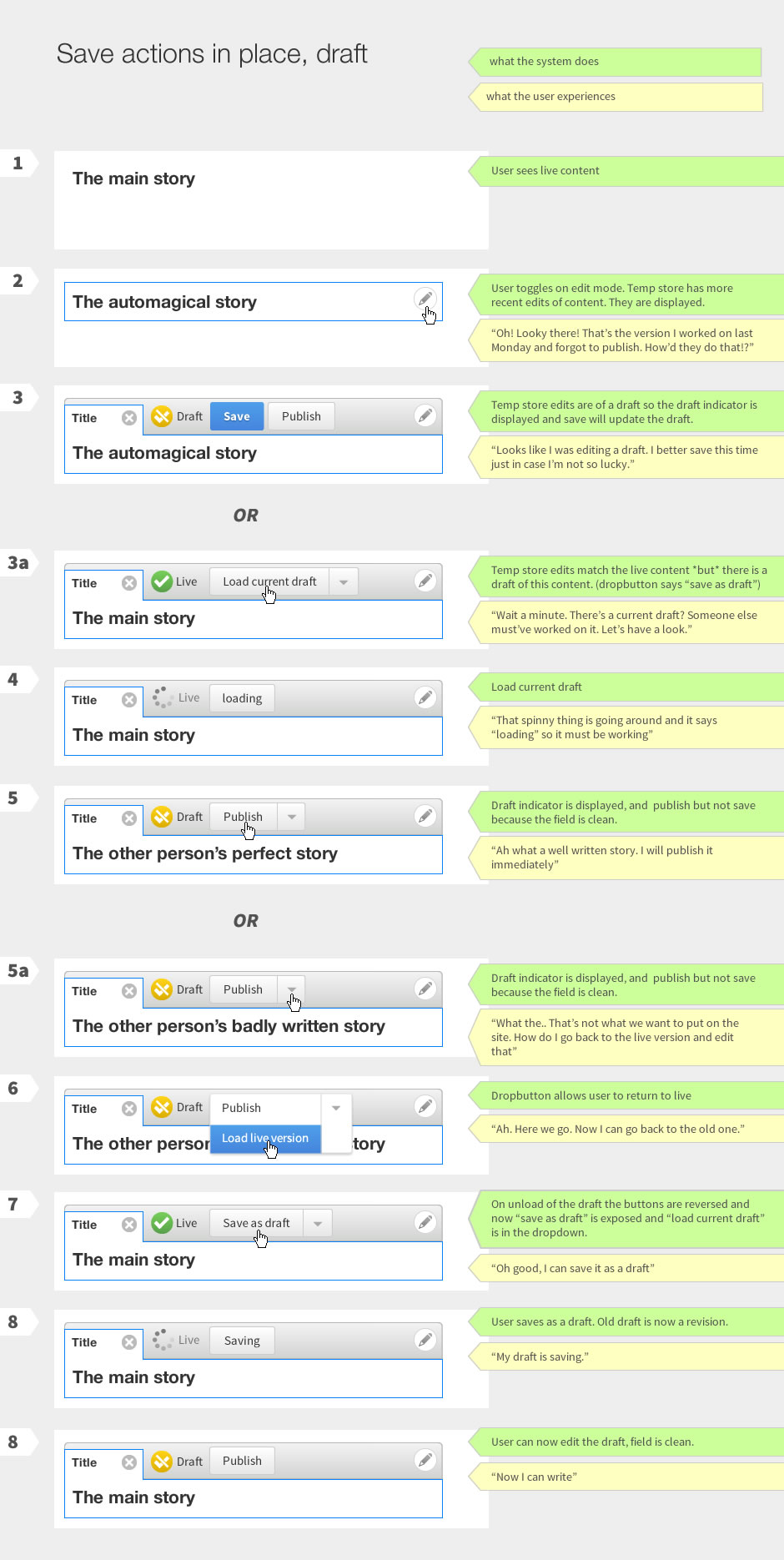
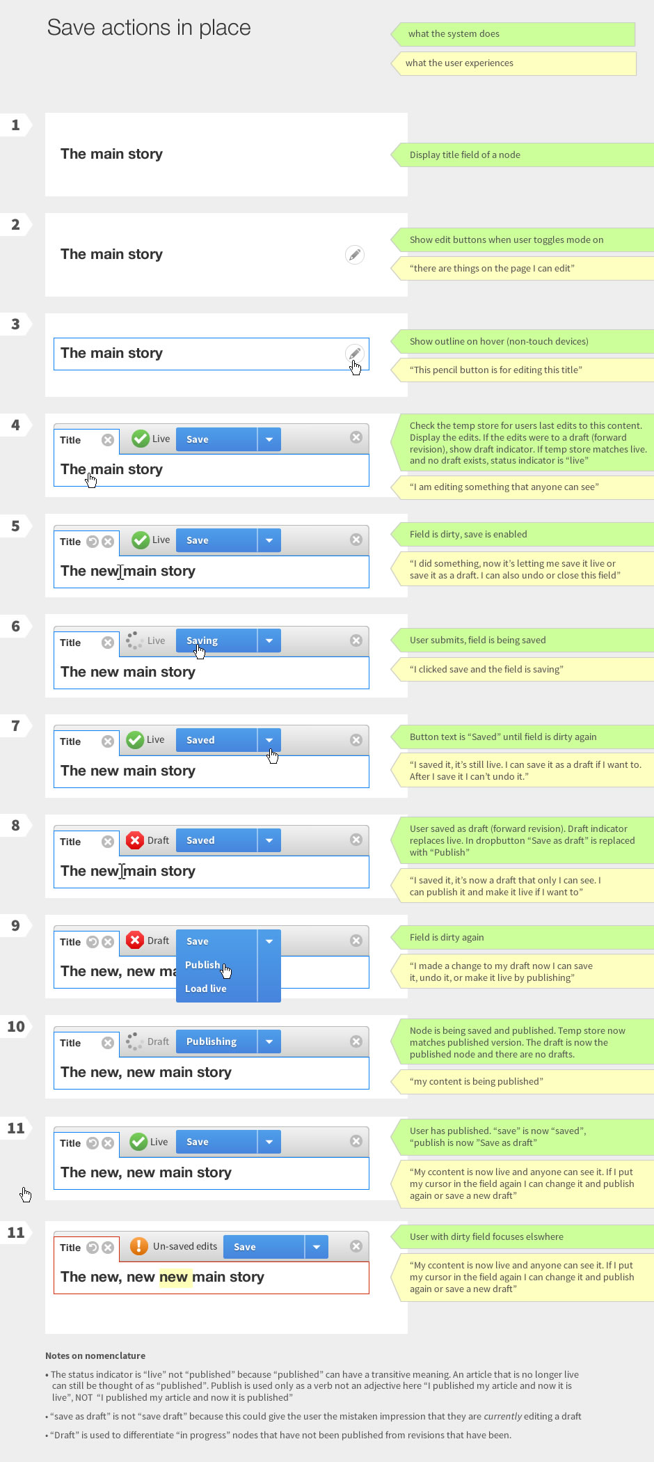
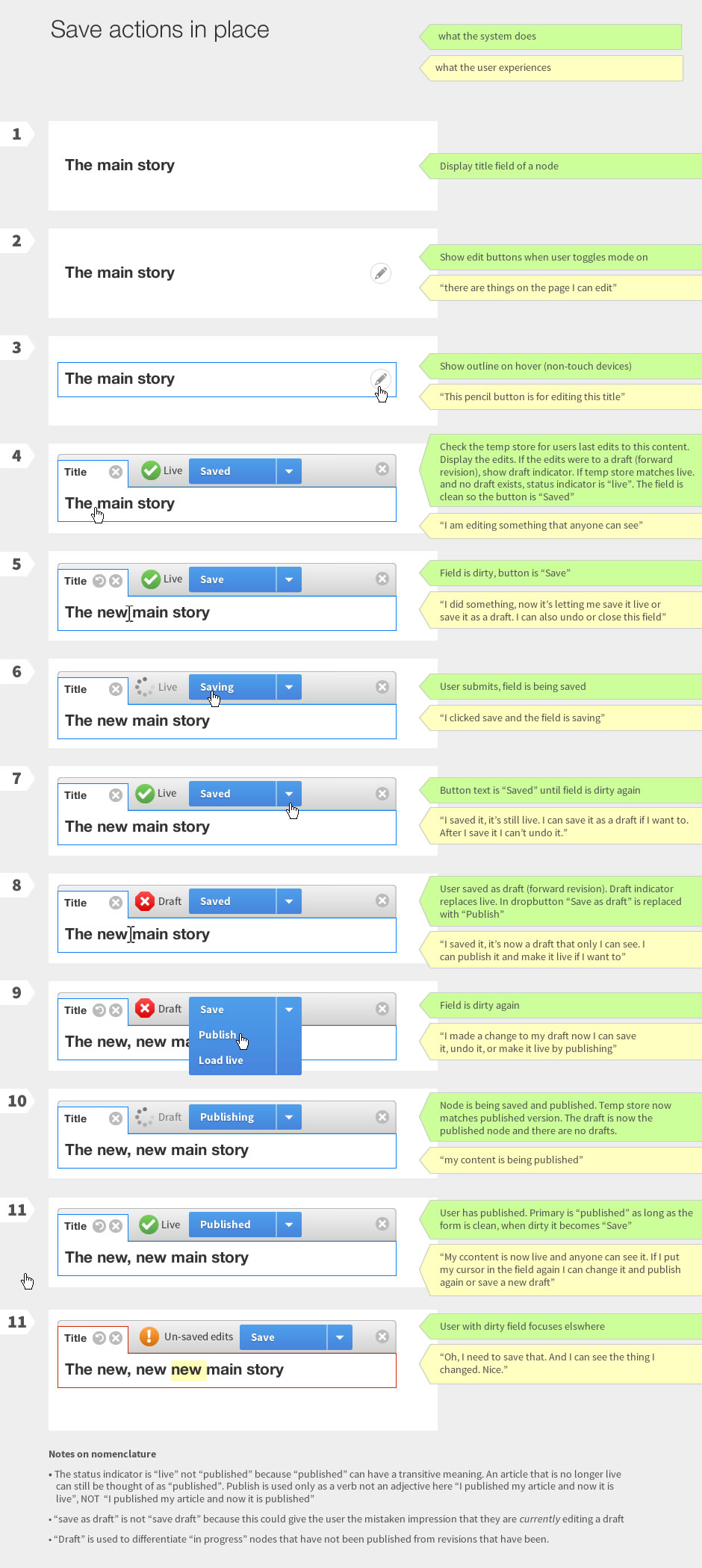
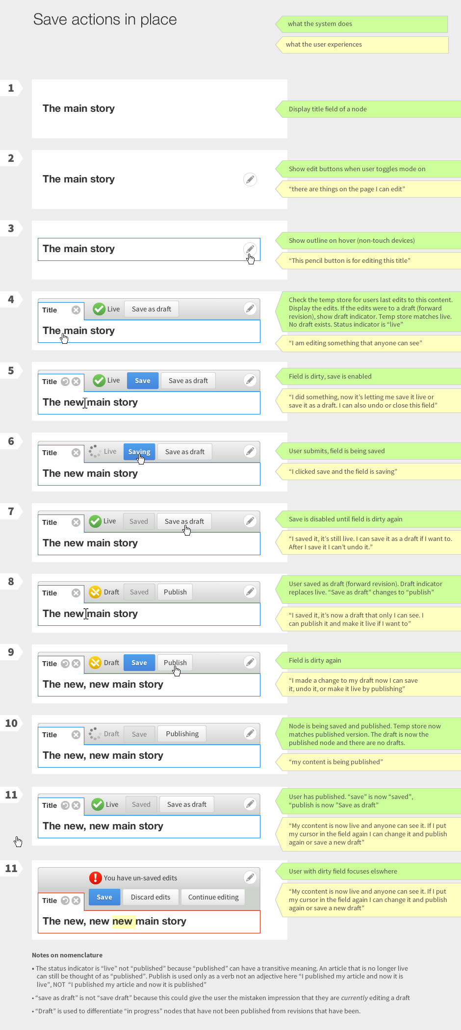
Save actions in place - 5) Strange when you edit a field, it still shows as "live" - while the last revision might be live, the thing I am looking at is not live. Its not really clear to me why you would need the "undo" button. Its not something we really have elsewhere, e.g. per field undo on node/edit.
I dont fully understand the whole "permanent" moving with you entity toolbar, it feels very much like its attached to each field.
An idea to radically reduce the amount of buttons/states, lets just couple all the save actions under one button. Remove undo, remove cancel (plausible), move the save and "status" indicator further from each other.
Comment #8
Gábor HojtsyI totally agree with this statement and have been pointing this out when we initially reviewed this internally. I think it will be tricky but we should try to take a look and figure out what should be supported to cover a simpler notion of workflow whereas the full node edit would be able to provide a fuller system. It is hard to imagine editors would use this in-place editing system to review and accept proposed changes (that would need *even more* UI affordances to indicate which pieces of the entity changed, and if anything changed at all to prompt the editor to reload, etc). It quickly becomes scary :)
Comment #9
tkoleary CreditAttribution: tkoleary commented@bojhan:
Angie felt that this belonged in a separate meta issue since it covers in-place editing, node/edit and workflow.
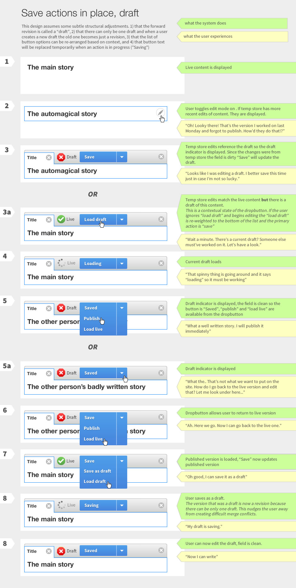
I think that this stems from the fact that this flow shows everything at once. Each individual button/animation makes sense in the context that the user is in at that point and the user never sees more than three buttons and one status indicator at one time. Having said that there are probably a few things here that can be simplified further.
Well perhaps some of the things that are not in dropbuttons could be, however I think that it would be essential to be able to dynamically sort the order of the options in the dropbutton so that the primary option shifts based on context. For instance in 3a where if the load draft option is not visible the user may create a new draft that conflicts with an existing draft just beacause they did not realize another draft existed.
I think there is some confusion about how this works. Tempstore is completely invisible to the user. All it does is ensure that if the user is working on something (whether it is a Draft (forward revision) or a published node and something happens, (crash, loss of connection etc,), when the user returns to the page, tempstore will remember a) which version the user was editing, and b) any edits that were made to that version but not saved to the database.
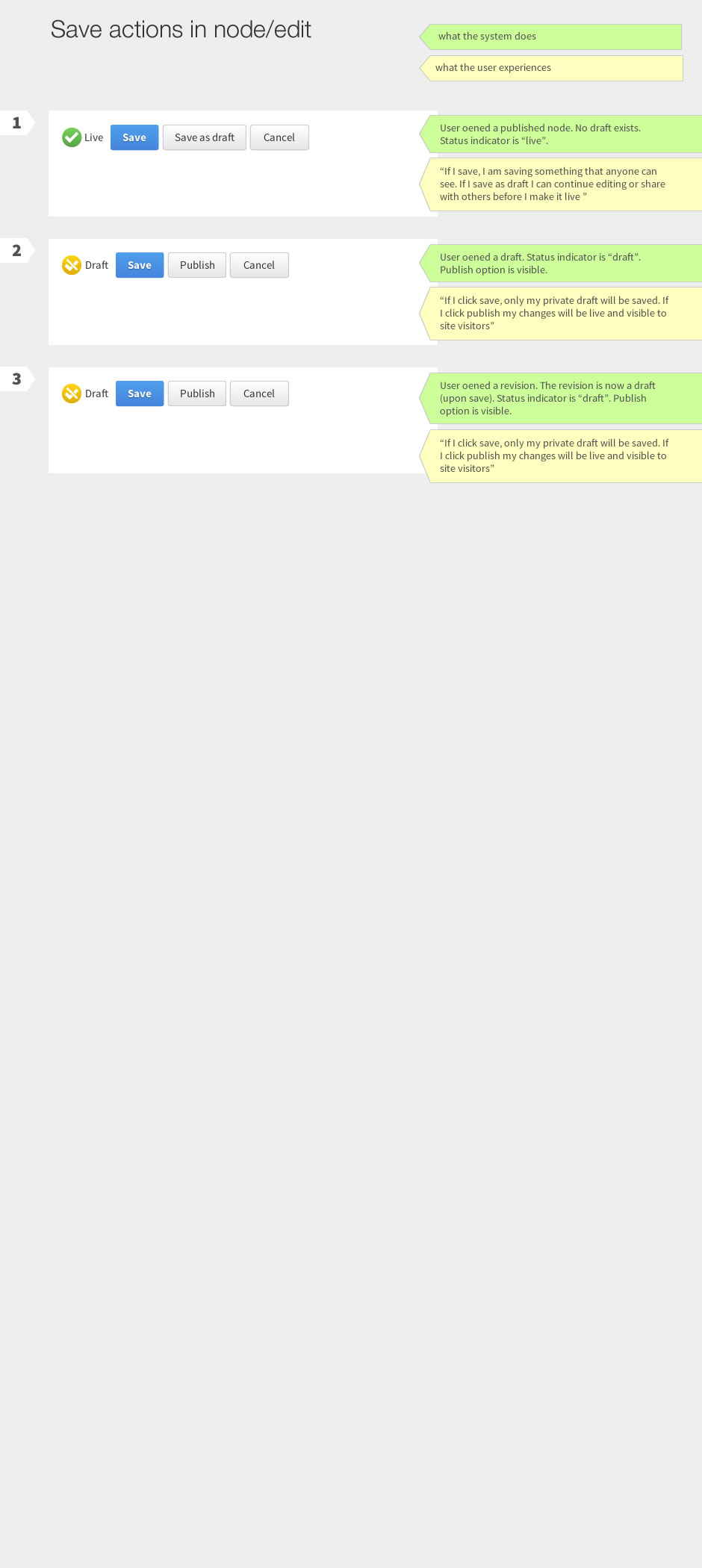
The user has only two options for editing: 1) edit live and 2) edit draft. Per discussions internally editing multiple drafts was considered unnecessary complexity. Any former drafts become revisions which that user can revert to from the revision queue if need be.
The live/draft indicator shows the status of the content you are editing. Just as in the node/edit form where when you are editing a published node and you make changes in several fields your "published" checkbox does not automatically change to "not published". So it's the "status" of the content—draft vs live—that is being indicated, not the state of the content—saved vs. not-yet-saved. This may be confusing to users but we should not assume that absent testing.
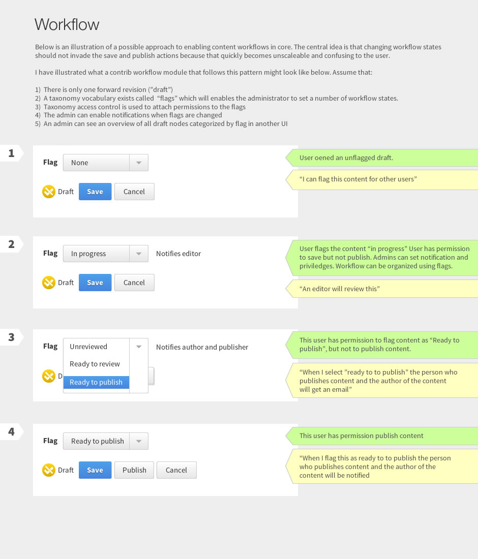
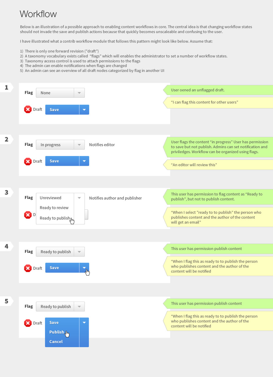
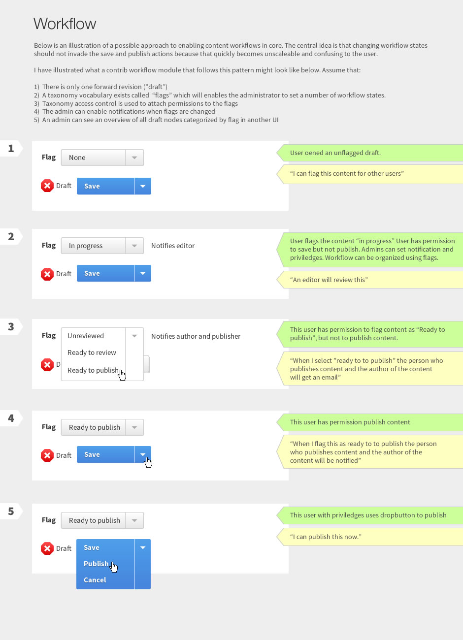
The proliferation of these "save as [something]" options is why I suggest abstracting the workflow states into flags in the last design. I'm ok with having just the essential ones (save, save as draft, publish)
I think the actual behavior of this will make it clear. It will be very similar to Aloha's floating toolbar, so:
This gives the user the clear impression that "these fields are different things but they share the same toolbar, therefore they belong to a bigger thing". The next question of "what happens when i have multiple entities on a page" should be avoided (as it is now) by giving the user the option to navigate to the page where that node lives in order to edit it in place.
Why? The status indicator positioned next to the buttons clarifies the context of the action ie. "the status is "draft" clicking "save" will update my draft", or "the status is live, clicking save will update my live content."
Comment #10
tkoleary CreditAttribution: tkoleary commented@Gabor
I agree that the interaction needs to be more explicit with regard to what is getting saved and what the user can cancel/undo/reload etc. I will spend some time revising that.
Comment #11
tkoleary CreditAttribution: tkoleary commentedHere are revisions of the designs incorporating feedback from the UX meeting as well as input from the Spark team. I am prototyping this right now for Dharmesh to test.
Comment #12
tkoleary CreditAttribution: tkoleary commentedRevised images
Comment #13
tkoleary CreditAttribution: tkoleary commentedBrowsing related issues I just realized that none of the designs above have preview as an option in the dropbutton. That's an oversight. I will add it to the prototype. Also I have not mocked up how this would all look in the revision queue. I will add that as well.
Comment #14
tkoleary CreditAttribution: tkoleary commentedAnd just a note on the "x" as draft icon. I did an exhaustive search on this type of icon across other systems and decided to change it to the x in red octagon because it is much more universally known as draft/offline/not live/not published. I am aware that there is a visual conflict with the close "x" but the red and the octagon differentiate IMO.
Comment #15
Bojhan CreditAttribution: Bojhan commentedQuick thought, I didnt review it all - but isnt the icon you are using for draft, the one we use for errors? Will that cause confusion?
Comment #16
tkoleary CreditAttribution: tkoleary commented@bojhan
Yes it will. The error icon needs to be changed. :)
The more universal icon for error is "!" in a triangle.
Comment #17
John Pitcairn CreditAttribution: John Pitcairn commentedMy understanding is that error is an "X" in a red stop-sign (octagon), and the "!" in a yellow triangle is a warning or notice.
The draft "X" also has too much similarity with the close icon, and red is too much like an error.
How about something like an exclamation mark in an orange circle:
Comment #18
tkoleary CreditAttribution: tkoleary commented@John Pitcairn
You are correct. That is the current Drupal iconography. I am proposing a change here to bring it more into conformity with common usage (thus more usable).
IMHO the conflict between the x icons is resolved by size (close icon is smaller), context (position on the page), color (red vs gray), Labeling (it is accompained by the label "draft"), and shape (octagon vs. circle). But if there's still doubt, Dharmesh will be testing this very soon so if user confusion arises we will know.
Comment #19
sunNeither of both proposals really makes sense.
1) The X, especially in combination with the violent red, is a visualization for an error state/condition. It signifies that something is very very wrong. Not invented here.
2) The white/orange exclamation mark indicates a warning. (very close to yellow, and emphasizing that attention is required by an exclamation mark)
IMHO, we're focusing a bit too much on making the unpublished state a terrible thing that users must be aggressively warned about. What's wrong with unpublished?
Unpublished just means that it is not published. Is that a reason for cluttering the UI with heavy icons? I don't think so.
Let's also bear in mind that if you're using an emphasized, visual iconic language for ordinary, regular states, then the user will no longer be able to differentiate the ordinary communication from the actual warning/error communication that absolutely needs his/her attention.
In short, this is about a Boolean state, of which one value represents "OK, live", and the other represents "still OK, but not live."
That inherently leads to:
1) Green icon + "Live".
2) Grey icon + "Not live". (or "Draft" if you assume that's better)
[The grey icon is the green icon, just without the green.]
Comment #20
sunFurthermore, looking through this once more — why does this live/draft icon exist in the first place?
As a user, I'm heavily inclined to click on it, as it appears in line with actual buttons that can be clicked.
And alas, that state indicator duplicates what the buttons should already communicate? Why did we spend so much time on #1751606-87: Move published status checkbox next to "Save" to figure out the appropriate button language, and now ignore + duplicate that communication with yet another interface concept that users need to learn...?
The move from a single + simple "Save" button to multiple different button states/labels (which you have to read very closely, before you're able to click on something) made the interface considerably more complex already. Now we're adding even more complexity with a completely different set of buttons, plus additional visual language, but which factually are for one and the same operation, for which the other concept exists already.
Color me confused? ;)
Comment #21
John Pitcairn CreditAttribution: John Pitcairn commented@Sun: ++
Yup, lose the icons that aren't clickable and just indicate the state with text. "Draft" and "Live" labels need no icon. Though "Live" could perhaps be bold?
Comment #22
tkoleary CreditAttribution: tkoleary commented@sun
After posting the designs above *and* after talking to Angie about this I have changed the icon again and prototyped the design for Dharmesh to test. It is here: http://invis.io/7QBVSUBG Keep in mind that this is a prototype of static images so there is no hover, clicking in a field automatically updated text "as if" you had typed something, not all buttons are clickable, and the throbber must be clicked on to advance to the completed state (no animated gifs).
On the the x icon for draft I *sort of* see your point in the concern about possible confusion with the error state in DSMs and with the idea that it indicates "something is wrong". I have had some misgivings about that icon and have now changed it several times*.
In the end I did some extensive research on commonalities across other platforms (should not be the sole determinant but worthy of heavy weight because ubiquity establishes user expectations) I found that for "not live", "Not published", "Draft", "offline" the most common icon is the x and the most common color is red.
On the warning nature of red, I think in this context red has another meaning, which is "stopped", underscored by the fact that the inverse is green, "go". So the users understanding is "The green check is live. That means the content is actively being pushed to the public" or "The red x is draft, I have stopped what I am working on from being pushed to the public".
Another thing to consider is the important difference in personas here. The user that will most often come in contact with the x error message is the site owner or site developer whereas the primary user of the the content creation form (both in place and in admin) is the content author. It is arguable that a content author in a well constructed Drupal site should *never* see an error DSM, and in the reverse direction it is unlikeley that the icon will cause confusion for the site owner.
*it began as a page icon, changed to a pencil then an exclamation point, then the check but crossed out and finally the x.
Comment #23
tkoleary CreditAttribution: tkoleary commented@sun
Also you will notice that I changed the icons to make them less "buttony" per comments from Angie and Bojhan.
@ John Pitcairn
The icons are not decorative or redundant, they are indispensable as a tool for maintaining a constant level of feedback on the the current status of the entity as distinct from actions the user can perform on the entity.
Comment #24
tkoleary CreditAttribution: tkoleary commented@Bojhan
I think the change in the prototyped design addresses this. However after researching common iconography of error/wrning/status, I'm inclined to propose a change to error for core as well. The most common icon for error is
@Sun
See: https://www.youtube.com/watch?feature=player_embedded&v=OqQQBSJj5yc#t=3s On the "not invented here" cognitive bias.
Comment #25
effulgentsia CreditAttribution: effulgentsia commentedThis looks more like UI cleanup than new features, so reclassifying as a task.
Comment #26
webchickTagging as something we're currently working on.
Comment #27
Wim LeersI think this is obsolete because we've now taken a different direction at #1678002-38: Edit should provide a usable entity-level toolbar for saving fields…?
Please confirm, then we can close this issue :)
Comment #28
Bojhan CreditAttribution: Bojhan commentedYes. That other issue was kinda duplicate, but given that we have a solid direction there I'd like to move forward.
Comment #29
tkoleary CreditAttribution: tkoleary commentedYes, we can close this one
Comment #30
Wim Leers.
Comment #30.0
Wim LeersUpdated first image