Updated: Comment #66
Problem/Motivation
The color module allows users to change the color scheme within compatible themes. Choosing foreground and background color combinations which have a low contrast could make content inaccessible to users.
Proposed resolution
Detect low contrast background/foreground color combinations chosen using the color module and then warn users when they choose color combinations that have low contrast. The following luminosity algorithm can be used for the detection: http://splitbrain.org/blog/2008-09/18-calculating_color_contrast_with_php
(The W3C provides a recommendation for minimum accessible color contrast values here: http://www.w3.org/TR/2012/NOTE-WCAG20-TECHS-20120103/G18.)
To make this applicable to all themes and not just the default core theme, every theme should be able to specify which of their color field combinations should be tested for contrast (not all themes will have the same color fields, e.g. “Header background top” or “Footer background”). It was suggested that a way to make this dynamic would be to use an “luminosity_test” array of palette background:foreground color combinations that need to be tested. For example:
'luminosity_test' => array(
'titleslogan' => 'top',
'text' => 'bg',
'link' => 'bg',
)
would specify that the color values for the fields ‘titleslogan’ and ‘top’ should be tested against each other for luminosity. ‘text’ and ‘bg’, and ‘link’ and ‘bg’ will also be tested.
Perhaps this array should be placed within the $info array in the theme’s color.inc file, although in comment #60 @mgifford suggests “Theme name to _color_luminosity_test” for storing the array of colors to test (I’m not sure how one would decide what’s better).
Note on terminology and how theme information for the color module is specified:
Themes can specify any number of default fields to which colors can be applied (this set of fields is called a palette). These ‘fields’ are described in an $info array in the theme's color.inc file with a key mapping to a human readable label. Color schemes or palettes (also arrays) then define the default colors that should be applied to each field using the same key. Here is the start of Bartik’s $info array which specifies this information:
$info = array(
  // Available colors and color labels used in theme.
  'fields' => array(
    'top' => t('Header background top'),
    'bottom' => t('Header background bottom'),
    'bg' => t('Main background'),
    'sidebar' => t('Sidebar background'),
    'sidebarborders' => t('Sidebar borders'),
    'footer' => t('Footer background'),
    'titleslogan' => t('Title and slogan'),
    'text' => t('Text color'),
    'link' => t('Link color'),
  ),
  // Pre-defined color schemes.
  'schemes' => array(
    'default' => array(
      'title' => t('Blue Lagoon (default)'),
      'colors' => array(
        'top' => '#0779bf',
        'bottom' => '#48a9e4',
        'bg' => '#ffffff',
        'sidebar' => '#f6f6f2',
        'sidebarborders' => '#f9f9f9',
        'footer' => '#292929',
        'titleslogan' => '#fffeff',
        'text' => '#3b3b3b',
        'link' => '#0071B3',
      ),
    ),
    'firehouse' => array(
      'title' => t('Firehouse'),
      'colors' => array(
        'top' => '#cd2d2d',
        'bottom' => '#cf3535',
        'bg' => '#ffffff',
        'sidebar' => '#f1f4f0',
        'sidebarborders' => '#ededed',
        'footer' => '#1f1d1c',
        'titleslogan' => '#fffeff',
        'text' => '#3b3b3b',
        'link' => '#d6121f',
      ),
    ),
    'ice' => array(
      'title' => t('Ice'),
      'colors' => array(
        'top' => '#d0d0d0',
        'bottom' => '#c2c4c5',
        'bg' => '#ffffff',
        'sidebar' => '#ffffff',
        'sidebarborders' => '#cccccc',
        'footer' => '#24272c',
        'titleslogan' => '#000000',
        'text' => '#4a4a4a',
        'link' => '#019dbf',
      ),
    ),
 ...
It was initially proposed that users be given the ability to switch between foreground and background colors. It was also proposed that users should be prevented from choosing color combinations with inaccessible contrast values, perhaps shifting to the closest accessible colors . It has been suggested that both of these proposals should not form part of this issue. Once the main issue identified has been committed, if required these should be made into separate issues. Although forcefully preventing users from choosing certain color combinations may not be the best idea.
Color contrast issues in core themes mentioned in early comments seem to be fixed.
Remaining tasks
- Make the changes suggested in comment #59
- Update the wording for the messages (see comments #63 and #64)
- Possibly include the contrast warnings in the page preview (See comment #63)
- Unit test for the new helper function,
- Functional test for the messages.
- Usability review on the proposed message texts.
- Document the color module’s ability to test for contrast issues, and how themers can specify which color combinations should be tested.
User interface changes
There will now be warning text that notifies the user when inaccessible foreground/background color combinations are chosen. The exact messages are still to be finalised. There could also be an indication of this in the image preview, also still to be determined.
API changes
- There is a new function _color_luminositytest that tests contrast.
- Themers using the color module can specify an array of colors to test in the $info array.
Please note that both of these changes have not yet been confirmed, but once confirmed, the information should be updated here.
color.module should have the ability to prevent colors that do not have the minimum required contrast for color-blind folk to read properly either a) provide a warning or b) automatically shift to the closest color(s) that still provide enough contrast when 'accessibility' mode is on or something.
along these lines there should be a feature for 'white-on-black' vs. 'black-on-white' foreground/background colors. currently there's no way to, for example, set the header gradient to a dark color and the text over it to a light color--allowing the user to change it to the dark text on light background if they want.


Comments
Comment #1
aclight commentedAFAIK this feature request still applies, so moving version to head
Comment #2
mgiffordOk, just to nudge this along a but more.
This is how W3C suggests calculating this:
http://www.w3.org/TR/AERT#color-contrast
More rules:
http://html.cita.uiuc.edu/style/contrast/contrast-rules.php
And PHP code even:
http://www.splitbrain.org/blog/2008-09/18-calculating_color_contrast_wit...
So how to bring this into the color.module?
Comment #3
webchickComment #4
chiddicks commentedHere's a first crack at testing contrast. I've added a validation function that calculates the luminosity difference of the text and link colors vs. a presumed white background and informs the user. Herein lies the difficulty, as there's no easy way of finding the background color in use. There may be a way check it with javascript- anyone have any suggestions as to how this could be done? Is there a standard #id in the theme that could tell me?
The luminosity test is specified in the WCAG 2.0 standard. Interestingly, some of the default color schemes included with Garland fail to provide sufficient contrast.
Standard used: WCAG 2.0 http://www.w3.org/TR/WCAG20/
Luminosity algorithm from http://www.splitbrain.org/blog/2008-09/18-calculating_color_contrast_wit...
Comment #5
mgiffordI applied the patch to D7 and it seemed to work fine. Set them all to the same color and hit save and got these messages:
* The selected text color, when used with a white background, has a luminosity ratio of 4.5. The W3C WCAG 2.0 accessibility standard suggests this ratio must be a minimum of 4.5 and optimally at least 7.0 for the text to be readable by all.
* The selected link color, when used with a white background, has a luminosity ratio of 4.5. The W3C WCAG 2.0 accessibility standard suggests this ratio must be a minimum of 4.5 and optimally at least 7.0 for the links to be readable by all.
# The selected text color, when used with a white background, has a luminosity ratio of 14.6. The W3C WCAG 2.0 accessibility standard suggests this ratio must be a minimum of 4.5 and optimally at least 7.0 for the text to be readable by all.
# The selected link color, when used with a white background, has a luminosity ratio of 7.7. The W3C WCAG 2.0 accessibility standard suggests this ratio must be a minimum of 4.5 and optimally at least 7.0 for the links to be readable by all.
I tried with 'black', '#000', '#000000' too and got messages. Would be necessary to have a :
Added to the messages I think. Nobody wants to see the text if it's alright.
Also, looks like the assumption for the color module is a white background. Guess that's ok too.
Mike
Comment #6
mgiffordI've rerolled the patch here, but I can't seem to find the color picker in the theme config in D7..
I have looked at:
http://drupal.org/node/109457
Mike
Comment #8
mgiffordI've applied this patch to the new CVS (as of less than an hour ago you couldn't use this module at all).
I've also turned off the messages if the contrast is sufficiently high. I think this is a good compromise as we don't need to show users warnings if it isn't really required.
Comment #9
cliff+1. Mike, this is a great idea, especially since so many of the commonly used themes either have poor contrast or border on having poor contrast. For example, on this page, these items
fail[correction Dec. 2012: failed for the theme and design used in September 2009]:So we definitely need developers and themers to get more feedback about the contrast ratios of the color pairs they choose.
One suggestion: If only when the color pair fails at the AAA level, add something like this to the report output:
<p>To learn more about measuring color contrast, read <a href="http://drupal.org/node/464500">Color and Contrast</a> in the Drupal online documentation.</p>It might be a good idea to always include that statement and link, since it's impossible to determine all color pairs that might arise in a design. (Even if two colors with little contrast between them are used in the same design, there's no guarantee that they would be paired as foreground and background.)
Quite a valuable patch, Mike. Good work!
Comment #10
Everett Zufelt commented+1 applied this to head this morning and it is working really well. I like Clliff's comment in #9 to add a link to provide developers with more information on colors and contrast.
Comment #12
mgiffordNew patch to keep up with CVS.
Comment #13
Everett Zufelt commented@mgifford
Can you please provide an explanation of how the most recent patch differs from the prior patch?
Comment #14
mgiffordThere are no functional differences between patch 3 & 4 other than that the code around the patch changed breaking it. The bot complained (for good reason) and I rerolled the same patch to fit with the latest code.
Think we just need someone to RTBC this.
Comment #15
Everett Zufelt commentedApplied and tested the new patch. Looks good to me.
+1 / RTBC. Hoping that in a future iteration we can add functionality to display the error on page load, not on saving of the theme configuration.
Comment #16
mgiffordThis was first RTBC now over a months ago. - Bump!
Comment #17
webchickThis is a new feature, which was not ready prior to 9/1 (feature freeze). Bumping to Drupal 8 for consideration, though I am not convinced this validation really belongs in core. Luckily, it'd be trivial to add such validation to a "a11y_best_practices" contrib module for the D7 (and D6) cycle through hook_form_alter().
However, there's no way this could be committed as-is. The error message produced is:
"The selected link color, when used with a white background, has a luminosity ratio of 4.5. The W3C WCAG 2.0 accessibility standard suggests this ratio must be a minimum of 4.5 and optimally at least 7.0 for the links to be readable by all."
The average end user will have absolutely no idea what that means, nor how to go about fixing it. Furthermore, several of our default colour schemes for Color module break this spec. Core should not be generating errors out of the box, so this would need to be fixed as well.
Patches that adjust the default core colour schemes so that they pass this luminosity test, however, would still be on-topic for D7 as bug fixes.
Comment #18
mgiffordIt is certainly something that could be added in with a module like http://drupal.org/project/accessible
I don't agree that validation isn't something that should be in core, but I'm not sure how critical this particular issue is for now.
I don't know how long the color module is going to be supported in core. Guess as long as Garland is the central theme. However, not many themes use it from my brief surveys. It's a neat idea though.
Not sure how to convey the language in a human readable form. "It is recommended that you increase the contrast between your foreground & background colors for accessibility" is simple enough, but doesn't have enough context.
Core should definitely not be producing errors of any sort out of the box.
Blue Lagoon (Default) - Barely passes with a luminosity ratio of 4.5 - Suggest link color of #135684
Ash - Passes!
Aquamarine - Barely passes with a luminosity ratio 4.5 - Suggest text color of #565555
Belgian Chocolate - Passes!
Bluemarine - Barely passes with a luminosity ratio 6 - Suggest link color #294664
Citrus Blast - Fails with a luminosity ratio of 4.2. - Suggest link color #5e4f09
Cold Day - Passes
Greenbeam - Barely passes with a luminosity ratio 5.5 - Suggest link color #0d4e06
Mediterrano - Passes
Mercury - It's deadly both text & link color fail - Suggest link color #315061 & text color #585858
Nocturnal - Barely passes with a luminosity ratio 5.7 - Suggested link color #46497f
Olivia - Fails with a luminosity ratio 3.3 - Suggested link color #41561b
Pink Plastic - Fails with a luminosity ratio 3.8 - Suggested text color #605454
Shiny Tomato - deadly tomato both text & link color fail - Suggest link color #7b0c0c & text color #393f39
Teal Top - Passes
But these should get passed by someone who has a better sense of color & then there should be a new issue made and a real patch applied to
themes/garland/color/color.inc & themes/garland/minnelli/color/color.inc
Comment #19
mgiffordAdded this issue to talk specifically about how to get better contrast into core without sacrificing the design.
#660576: Ensuring Proper Color Contrast for Garland
Comment #20
mgiffordCan this be brought into D7 using the Accessible Helper Module?
Comment #21
mgifford#12: color.module.validator-v4.patch queued for re-testing.
Comment #23
Everett Zufelt commentedI haven't been involved in this issue. Would someone more involved be willing to update the summary?
I don't like the concept of preventing colours from being used because of contrast, the WCAG warning as @Webchick states is not really appropriate to the users who will likely be using the module.
1. If the contrast is under 4.5 the message should just warn that the contrast between fore / back is low, and that this will make it difficult for some users to read the text.
2. If this module defines fore / back combos they should be 4.5+ by default.
3. Anything else, toggling fore and back, or putting restrictions on the ability to choose colours with a ratio under 4.5 should be follow-up feature requests or in contrib.
Comment #24
mgiffordJust running through the list here:
1) All default colors options provided as defaults in Drupal 8 should be run through Contrast-A as per http://drupal.org/node/464500
- at this point it's just running through Bartik's color.inc to verify that they comply.
2) Users who are selecting custom font combinations with the Color module should be given a user friendly warning if they select color combinations which are known to produce problems. Currently the patch says "The selected link color, when used with a white background, has a luminosity ratio of 4.5. The W3C WCAG 2.0 accessibility standard suggests this ratio must be a minimum of 4.5 and optimally at least 7.0 for the links to be readable by all." where something like "Some users may find this color combination hard to read, consider increasing the contrast for greater readability." might be more user friendly, especially if it included a link to our docs.
I think that covers it.
With the original summary, I do think we should take out "b) automatically shift to the closest color(s) that still provide enough contrast when 'accessibility' mode is on or something." as I think that would be confusing for many users. Would be an interesting contrib module option though to provide suggestions.
I do think that the Page Style module http://drupal.org/project/pagestyle does a good job on color contrast. I'm not sure if setting up core features for 'white-on-black' or 'black-on-white' foreground/background colors. I'm not sure what approaches could be done.
Just for reference
#660576: Ensuring Proper Color Contrast for Garland - Garland's being removed for D8
#740756: Ensuring Proper Color Contrast for Seven - Seven doesn't use the color module (though not sure why not)
#749290: Check for Color Contrast and Adjust to Improve Bartik's Accessibility - Known problems were fixed in Bartik
Comment #25
mgiffordTagging
Comment #26
mgiffordTrying to clarify the title.
This patch needs to be fixed certainly after the Drupal apocalypse.
Comment #27
mgiffordUpdating the patch.
Comment #28
mgifford#27: color.module.validator-v5.patch queued for re-testing.
Comment #29
mgifford#27: color.module.validator-v5.patch queued for re-testing.
Comment #30
mgifford#27: color.module.validator-v5.patch queued for re-testing.
Comment #31
mgifford#27: color.module.validator-v5.patch queued for re-testing.
Comment #33
rootworkSorry, newbie mistake. Updated below.
Comment #34
rootworkSorry, got confused in git.
Anyway, here's an updated version of the patch against HEAD.
Comment #35
rootworkRemoved a bunch of end-of-line spaces, sorry.
Comment #36
mgiffordThis looks great. Works fine in SimplyTest.me.
Will be great to have this accessibility educational piece in core.
Comment #37
rootworkTagging this as work done during the global sprint. Thanks mgifford for all your work moving this forward!
Comment #38
xjm#35: color.module.validator-v5.patch queued for re-testing.
Comment #39
xjmAwesome work, thanks @rootwork and @mgifford! There's just a few coding standards things to clean up here.
This should be just one line of 80 characters or fewer, and start with (e.g.) "Calculates." I'd suggest "Calculates luminosity ratio." (Reference: http://drupal.org/node/1354#functions) We can put additional information (including the w3c reference) in a subsequent paragraph. Also, let's use @link for the link. We also need to add documentation of the parameters and return value after that.
These should have a space between the // and the first letter of the comment, end in periods, and (in the case of the third one) wrap at 80 characters.
Are there linebreaks inside the t() here? if so, let's remove them. Also, the indentation is not quite correct.
as
The indentation here is off; while it's okay to wrap it for readability, the subsequent lines should be indented by two spaces only.
Also, I think we should also add automated tests for this. A unit test for the new helper function, and a functional test for the messages. Finally, let's get a usability review on the proposed message texts. They're kind of long.
Comment #40
mgiffordOk, this picks off all the easy stuff I think. Leaving:
1) unit test for the new helper function,
2) functional test for the messages.
2) usability review on the proposed message texts. That text is currently:
Comment #41
Bojhan commentedThis is really horrible help text, how is this understandable for non-accessibility people? Also why are we referring to "white background" I understand that from an a11y perspective, but people will go "but I dont have a white background selected!".
Can this be shorter, e.g:
"The combination of text color (#000) and background (#FFF), will be difficult to see (contrast ratio of 4.5)"
With "contrast ratio" linking to the standard. I am not comfortable using words like "luminosity ratio", and I dont see how thats useful. It's incredibly specific, hard to translate and the people that use this tool - will have no idea how to optimise based on that data.
Comment #42
xjm@mgifford Can you please provide an interdiff when updating patches? Thanks!
Comment #43
mgiffordHope this makes it easier to see. Done with Linux
interdiff old.patch new.patch > interdiff.txtComment #44
mgifford#40: color.module.validator-134359-40.patch queued for re-testing.
Comment #45
mparker17#40: color.module.validator-134359-40.patch queued for re-testing.
Comment #46
mparker17Code looks good to me, works fine.
Comment #47
mgifford@mparker17, I don't think this has addressed @Bojhan's concerns in #41.
I've re-rolled the patch with Bojhan's text changes and applied it here. This patch does just compare everything against white though which isn't enough.
The [top] needs to be compared with the [titleslogan]
The [bottom], [bg] & [sidebar] need to be compared to both [text] & [link]
I don't think you can change the text in the [footer] which I believe is hard coded at rgba(255, 255, 255, 0.65) & rgba(255, 255, 255, 0.8) for text & links respectively. Not sure how to best evaluate transparency here. The current tests don't deal with this at all.
Comment #48
rootworkThis looks great!
What about linking the words "contrast ratio" to some sort of resource or W3C page on accessibility? I think the language is great but it would be nice to provide documentation for people who aren't familiar with it. Something like this:
http://www.w3.org/WAI/GL/WCAG20/WD-WCAG20-TECHS/G18
There are several links listed there under resources. There's also Jonathan Snook's color contrast check:
http://snook.ca/technical/colour_contrast/colour.html
I'm just thinking that if people don't know what a good color contrast is, the only option will be for them to keep re-saving this page until the notice goes away. Providing a way for them to quickly check color combinations might be more useful.
Comment #49
mgiffordOk, this patch adds the links and also tests against something other than a white background:
Comment #51
mparker17Every single test failed? I think that means that Testbot is having a bad day. Lets try that again...
Comment #52
mparker17#49: color.module.validator-134359-49.patch queued for re-testing.
Comment #54
rootwork#49: color.module.validator-134359-49.patch queued for re-testing.
Comment #56
mgiffordThis patch applies nicely in SimplyTest.me - I really can't see how it would affect the testing infrastructure either.
Comment #57
mgifford#49: color.module.validator-134359-49.patch queued for re-testing.
Comment #58
mgifford#49: color.module.validator-134359-49.patch queued for re-testing.
Comment #59
markhalliwellThere's really no need to change this (see next item), it's really out of scope and if we can get away with creating another PHP variable in this function (performance reasons, allocating resources), I'd prefer it.
I am pretty sure these palette names are Bartik/core specific. In reality a theme can specific any new palette colors. So this really needs to be dynamic. Which also means we would need to introduce some sort of "luminosity_test" or "test" array in colors.inc (when defining palettes). An example of what I'm thinking is:
This should be a summary line with the extra text in paragraph below it. See: https://drupal.org/node/1354#drupal
I'd rather this function be named _color_luminosity_test for readability.
Not entirely sure the "standards" on how we deal referencing external code in inline comments, but I think we should credit the author (with name) of this code along with the link (using @see?).
A follow up issue needs to be created with Bartik and referenced here.
This issue also needs an issue summary update.
Comment #60
mgiffordGood review, thanks!
There was an issue for Bartik #908966: Bartik's default link color has inadequate contrast to background (WCAG 2.0 violation) but that didn't seem to include all of the issues identified by me in #18. Not sure why. It might need to be re-opened or a new issue started.
There is an issue of identifying foreground & background colors and which are where. For some elements it's quite easy to determine, but certainly not for others.
Not sure how to approach this generically now since every theme can have a different set of palette names... There must be an array of these for each theme.
Theme name to _color_luminosity_test would be fine.
Hopefully someone else will be able to get to this.
Comment #61
yoroy commentedLooking at the screenshot in #43 I wonder why some messages are in green, some in yellow styles. Some are more difficult to see?
Comment #62
mgiffordAgreed @yoroy that this isn't very clear. The idea is that we're aiming for AA compliance, but want to encourage folks to meet AAA if they can. So, if a combination doesn't meet AA (with the ratio of background/foreground of at least 4.5:1 (larger text, at least 3:1), then it will be marked as a warning.
I think the idea at the time was to leave the background green if the colour contrast didn't meet AAA compliance, with text having a ratio of at least 7:1 (larger text, at least 4.5:1).
But ya, this could be better documented inline
($serverity) ? 'status': 'warning'and more importantly the text needs to change in the error message.Thanks for pointing that out.
Comment #63
StuartJNCC commented#mgifford, I liked your suggestion for wording in #24, "Some users may find this color combination hard to read, consider increasing the contrast for greater readability."
Couldn't that be combined with the current patch, something like:
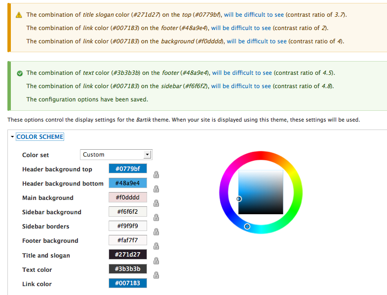
"Some users may find the color combination of the title slogan (#271d27) on the header background (#0779bf) hard to read. Consider increasing the contrast (which is only 3.7)."
I think that having some of these messages as warnings (yellow) and some green really doesn't work for me - especially showing some as green. If they are green then they are OK! So WTF?
There is already a page preview generated which updates dynamically as colours are selected. It would be really good if this could be extended in some way to indicate whether contrast was OK or not. Maybe tooltips if you mouse over the preview: something like "Contrast ratio: 3.7" with either a green tick (over 7), a yellow triangle (4.5-7) or a red cross (under 4.5). Or maybe put a box round any items with insufficient contrast and show the tooltip without requiring mouse over.
Comment #64
mgiffordSo what if this was orange:
"Some users may find the color combination of the title slogan (#271d27) on the header background (#0779bf) hard to read. Consider increasing the contrast (which is only 4.8)."
and this was red:
"The combination of text (#271d27) on the top of (#0779bf), will be difficult for many people to see (contrast ration of 3.7)"
Note the values are wrong....
I do like the tooltip idea.
But the bigger issue is that the patch needs to be re-worked so that no matter what the base theme is, we know what the regions are and which background/foreground colors interact.
There are some assumptions made in the patch that probably don't generalize all that well.
@StuartJNCC are you able to do up a new patch?
Comment #65
StuartJNCC commentedSorry, I am not a developer and wouldn't know where to start! The contribution I do feel I can make is in things like wording and user interface.
Comment #66
mgiffordAlways good to start where you are comfortable.. Lots of ways to move into the code if you have the time.
Comment #67
foxtrotcharlie commentedComment #68
foxtrotcharlie commented49: color.module.validator-134359-49.patch queued for re-testing.
Comment #70
foxtrotcharlie commentedI'm going to give this a shot. The last patch didn't apply to the latest 8.x so I have rerolled the last patch before I begin.
Comment #71
mgiffordComment #73
alexkb commentedHi everyone, I think @Mark Carver makes some very good points, so I've re-written @mgifford's patch to take most of these into account. The api docs state that displaying links in t() is ok though?
This patch includes changes to the bartik color.inc file (to define the luminosity tests as per Mark's suggestion) - should that kind of thing be done in a separate patch?
We still need to address @webchicks comment:
Comment #74
mgifford@alexkb Thanks for working on this Alex. Something is getting in the way of me switching to any other theme other than Blue Lagoon on admin/appearance/settings/bartik
We should be able to switch that.
Also, looking at the errors, I think we'd get better results if we just focused on what didn't meet AA.
So these are the errors I got:
But it mostly we want to be highlighting the ones that are under 4.5:1 which in this case is just Link color color (#0071B3) on the Header background bottom (#48a9e4).
That should be a warning clearly indicating that it doesn't meet the requirements. The other elements aren't really a concern.
Comment #75
mgiffordHere are three that should change as far as color combintations:
Firehouse:
Header background bottom: #cf3535 -> #d64e4e
Text color: #3b3b3b -> 888888
Ice:
Link color: #019dbf -> #016b83
Comment #76
Bojhan commentedI think the messages are fine now. Feel free to change the base themes at will, we should indeed not have faulty ones in core.
Comment #77
mgiffordThat's great. I'd like to move the color choices over to #2248405: Set Proper Contrast on the Color module's default colour scheme so that we can get that fixed quickly.
So then we just need to ensure that the module works properly..
Comment #78
alexkb commented@mgifford, good points. I've now adjusted the patch to only warn users when the color combinations don't meet AA (<4.5 ratio) (rather than the verbose inform when they're below or equal to 7).
I can't seem to reproduce the problem with not being able to select different color sets (away from Bartik). Perhaps that issue was related to something else which has now been fixed? If not, can you provide steps to reproduce the problem.
A side note, the AA standards also take into account text size. This might be a bit tricky to do, as it will involve reading CSS properties to get font sizes?
Comment #79
mgiffordThanks for re-rolling this. Just going to engage the bot.
I'll try to see if I can replicate the problem.
And ya, no easy way that I know to address small vs large font sizes.
Comment #82
mgiffordUseful to for helping to achieve ATAG 2.0.
Comment #83
rootworkJust wondering about the status of this. Personally I think this would be a neat thing to point to in a beta :)
It looks like the last patch (and the one before it) failed because luminosity_tests is only set in Bartik (bartik/color/color.inc), so if Bartik isn't the theme then it's undefined.
Comment #84
mgiffordIt would be nice to get in for sure..
If we could get a new patch to address that, then we might be able to finally get this in Core... It would be a nice example to be able to point out.
Comment #85
rootworkI wasn't sure about how to address the luminosity_tests definition. Can that be moved into the color module itself or was there a reason it was within Bartik? Unless I'm misreading the test failures and it's being rejected for some other reason.
Comment #86
mgiffordThe definitions:
are unique to the theme, so it really has to be done within the theme... Can't see any other way to do that..
Comment #87
alexkb commentedI've redone this patch to use the new form_state class object, so it's compatible going forward and should fix those PHP 5.4 notices in the tests. There was also a typo in the drupal_set_message and the tests for the bartik theme weren't correct either.
A separate thought, but should this kind of functionality be better communicated interactively? That is, instead of doing it on form validation, we do it at the javascript layer and advise the user there and then that the colors aren't ideal?
Comment #88
mgiffordLooks good to me.. What does the bot have to say?
EDIT: For a few more hours it can be accessed on install I set up on SimplyTest.me.
Comment #89
rootworkNot sure why there isn't a test bot report. Setting to needs work...
Comment #90
rootwork...and to needs review to trigger the testbot. (If there's another way to do this, someone tell me.)
Comment #94
foxtrotcharlie commentedComment #95
alexkb commentedGiven this is a feature change and we're now in beta, should this be moved to 8.1.x? Also as mentioned I think this functionality should be moved to client side rather than server side to avoid the inefficient round trip which isn't needed. Happy to work on this if others think it's also a good idea.
Comment #96
pravin ajaaz commentedComment #97
pravin ajaaz commentedComment #98
mgifford@alexkb - This is probably the best option at this point. I like the idea of moving this functionality to JS.
Comment #99
mgiffordComment #101
cmanalansan commentedCurrently at DrupalCon looking at this.
As a frontend developer, I looked at the warnings and they appeared to be redundant. I recommend only listing the W3C reference link once. Instead of:
Try something like:
Note: the "will be difficult to see" will be linked.
Comment #102
cmanalansan commentedComment #103
cmanalansan commentedReasons why the novice tag was removed:
Comment #104
CZ commentedWhy not a javascript validation (no user frustration) and for all color input forms?
My idea: the user or module developer defines text and background colors an the script print messages about color contrast immediately.
Comment #112
sim_1This patch is such a cool idea! I'm not sure how best to help move it along, but I'll start with a re-roll.
The next steps seem to be:
Comment #119
quietone commentedColor has been removed from core, #3270899: Remove Color module from core.