
 Support for Drupal 7 is ending on 5 January 2025—it’s time to migrate to Drupal 10! Learn about the many benefits of Drupal 10 and find migration tools in our resource center.
I create a singleframe image slideshow in front page,image present 300x200 pixel generated by imagecache.but when I resize the browser window,the slideshow image covered the right side pane(i have flexible layout,and image width not auto resize); how can I let images in slideshow scalable when window resizing;
thanks advanced!!!!
| Comment | File | Size | Author |
|---|---|---|---|
| #27 | responsive-slideshow.jpg | 309.07 KB | quantos |
| #9 | 2012-01-25_10-58-04.png | 184.51 KB | Danny Englander |
| screenshot.jpg | 69.53 KB | shoufeng.xi | |
| screenshot2.jpg | 56.48 KB | shoufeng.xi |


Comments
Comment #1
shoufeng.xi CreditAttribution: shoufeng.xi commentedIt's my first post in drupal.org, why there is no reply ?
Comment #2
redndahead CreditAttribution: redndahead commentedI don't work that fast. Patience is key here. I think the jquery cycle module would have to support that somehow. I'm not sure how that would happen, but is definitely something I will look at in the future. It won't be supported in the 2.x version of views slideshow though.
Comment #3
redndahead CreditAttribution: redndahead commentedComment #4
GreenSkunkHello Shoufeng.xi,
You don't always get a response with in the same day from the community ;)
I believe the easiest way to accomplish what you are trying to do can be done with some CSS magic.
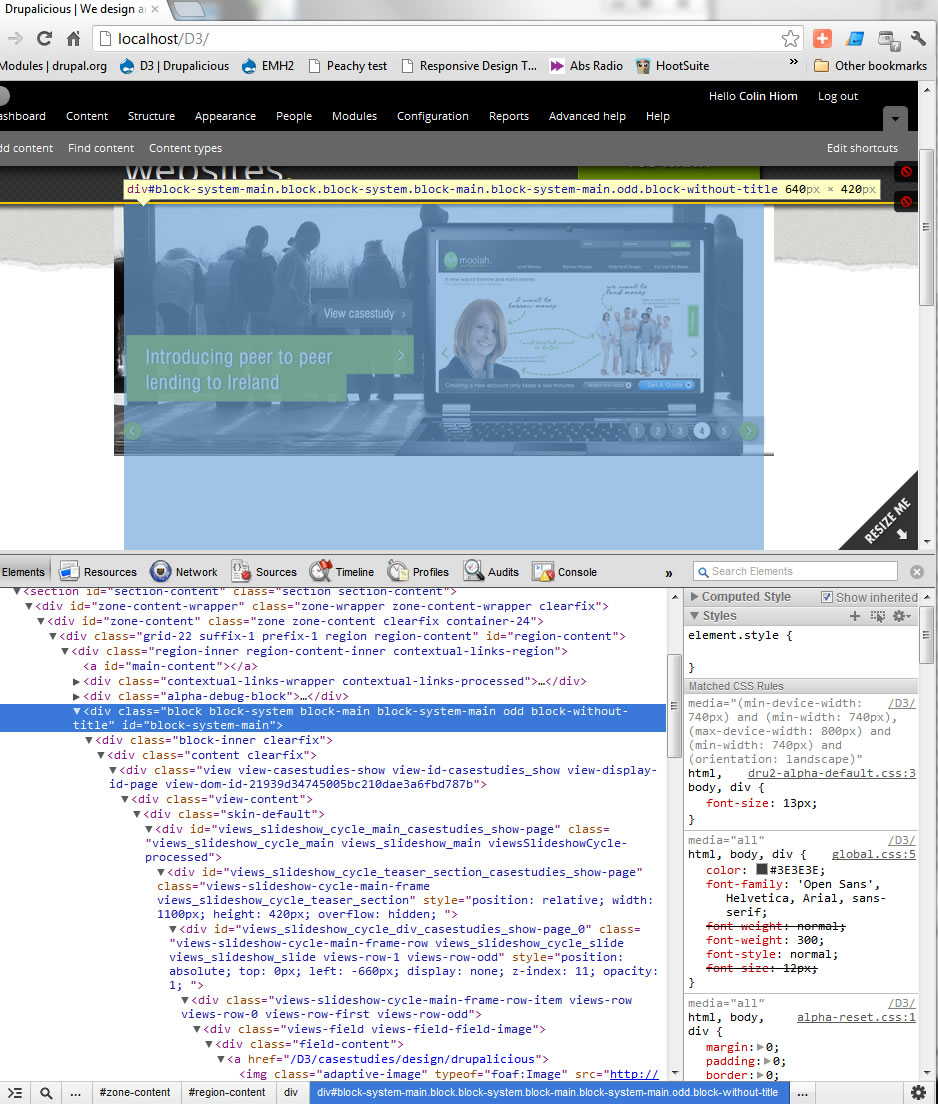
Lets say I have the following views_slideshow output in a block (the following lists off IDs & classes) and that block is contained within a *fluid* region on the page.
Create some CSS for your slideshow (this is if you haven't created a template to override your Views Slideshow template)
Example CSS for the above structure
Note: I've tested this through Web Developer Toolbar on a Drupal 6 Views Slideshow and the slideshow did scale when changing the block's width.
I've also found some posts on Drupal about scaling slideshows. These posts about full screen slideshows may help.
Reference
Full Screen jQuery slideshow - http://www.buildinternet.com/project/supersized/
Comment #5
redndahead CreditAttribution: redndahead commented@GreenSkunk thank you for helping out and responding.
Comment #6
shoufeng.xi CreditAttribution: shoufeng.xi commentedthank you very much GreenSkunk !
I will give a try, and response more later.
Comment #7
tigerfist CreditAttribution: tigerfist commentedI have been working on this problem for my own site over the last couple days. Just a word of advice for anyone else trying to make a fully scalable slideshow: use Firebug or similar (I personally like using the "inspect element" in google chrome), and search for any element above the img tag that is generating absolute positioning and fixed widths and heights, then write css codes to override them.
In my own case, I found that simply coding "position:relative" (in reference to GreenSkunk's ex. above) was not enough because, initially, the first slide would follow this rule, but would revert back to position:absolute and a fixed width and height based on the viewport dimensions when I clicked one of the pager buttons. So I had to add !important to position:relative, width, and height:
[autogeneratedelement] {
positon: relative !important;
width: 100% !important;
height: auto !important;
}
As of this moment, it's working in everything I've tested, but I'll add more if I find new solutions to new problems.
Comment #8
samwillc CreditAttribution: samwillc commented@tigerfist, could you post a link to the working slideshow as mine is being a pain in the a**e! Was responsive and fine, now is not.
One thing as well, are you using the advanced json2 options for yours?
Thanks if you can.
Sam.
Comment #9
Danny Englanderwow, #7 saved the day, thank you tigerfist!. Expanding upon this, I have uploaded a screen capture to illiustrate where the fix needed to be and the CSS I implemented.
Note that the above code is not perfect, I ended up taking out
height: auto !important;and then assiging various heights to my media query CSS as my theme was getting messed up otherwise.Comment #10
samwillc CreditAttribution: samwillc commentedHas anyone got a working example of a fully responsive views slideshow? The css to get this working is driving my nuts! I want a pager underneath the slideshow (3 slides), preferably centered. I use views results counter to get the numbered pager.
When I resize (decrease) broswer width I get one of either:
(a) a big gap appears between the image and the pager
(b) the pager disappears completely
In both cases, the image resizes fine but getting that pager to stay next to the slider is a mystery.
I can get it working perfectly with the pager above the slideshow but not below probably because of height issues or the pager is not clearing the image properly. Been at this for days! Does the lack of google results means not many have got this working well?
If someone could help before my (what's rest of my) hair falls out, that would be superb! Help here or even a private msg is fine, I can send you a link.
Sam.
Comment #11
samwillc CreditAttribution: samwillc commentedHair in one piece again! I was styling the .skin-default div with a height which caused the pager to disappear in decreasing resize. When styling only the divs around the image, and leave the pager to float down naturally on its own, everything is good again. So far... I will post again if anything breaks.
...also adder another media query for landscape mobile so my slide exists in 4 states. Normal > narrow > landscape mobile > portrait mobile.
Works ok in IE7/8/9, FF, Chrome and on my mobile. Will test further to make sure. Thanks for the replies above.
Sam.
Comment #12
quantos CreditAttribution: quantos commentedfollowing. Thanks Sam
Comment #13
redndahead CreditAttribution: redndahead commentedComment #14
samwillc CreditAttribution: samwillc commentedIf anyone wants any more help with this, feel free to PM me, I can't keep updating the css. :)
I have a few of these slideshows working live on different sites and they all resize nicely and use different pagers.
Sam.
Comment #16
dready2011 CreditAttribution: dready2011 commentedHey Sam,
would you mind posting the URLs of these slideshows? I am struggling to get it to work, and having a look at your slideshow might help me find the issue.
Thanks!
Comment #17
dready2011 CreditAttribution: dready2011 commentedHey Sam,
would you mind posting the URLs of these slideshows? I am struggling to get it to work, and having a look at your slideshow might help me find the issue.
Thanks!
Comment #18
samwillc CreditAttribution: samwillc commentedHi dready2011,
Emailed you the links.
Sam.
Comment #19
truyenle CreditAttribution: truyenle commentedI need the links too sam. Thanks
Comment #20
samwillc CreditAttribution: samwillc commentedSent :)
Sam.
Comment #21
dready2011 CreditAttribution: dready2011 commentedHi Sam,
thanks for your quick reply!
I was stuck in some other projects in the meantime, but now was able to work on this one again.
In the end, i ended up resizing the images using my own jquery scripts, cause I wasn't able to get a css solution working for both the width and height of the window.
Thanks again...
Stefan
Comment #22
BrightBoldThanks @tigerfist, @highrockmedia, and @samwillc! This works beautifully.
However, anyone who's copying and pasting this CSS should note that there's a typo that has persisted through all the comments above, and your code will work better if you put two "i"s in "position." =:) Here's the corrected code:
Comment #23
JohnnyX CreditAttribution: JohnnyX commentedShould css code be commited to project?
Comment #24
BrightBoldActually, now that I've posted the correction, I've found if you do have
{ position: relative; }on the Views row element, the slideshow doesn't behave properly — you get a flash during slide transitions where you can see both the current and upcoming slide one above the other (because you're overriding the absolute positioning which is essential to the slideshow operation). So I putposition: relativeonly on the slideshow block itself, although I can't tell that that is having any effect, positive or negative.So what I need is a different way to determine the height of the slideshow — because the slides are absolutely positioned,
{ height: auto; }causes the slideshow container to have no height, so a subsequent block of text falls underneath the slide. If I take out the{ height: auto !important; }line, then the height is generated properly for the size of the initial viewport, but when you resize the window, the slide itself changes height but the space allotted for it does not, leaving a big gap between the slideshow and subsequent text as the window gets smaller, and overlapping the text as the window gets bigger.How are other people handling this?
Comment #25
djbucci CreditAttribution: djbucci commentedhaving the exact same issue...and its driving me crazy trying to figure out.
Anyone?
UPDATE: If I edit the CSS for the containing div for the slideshow element (the display id of the views slideshow, in my case #views_slideshow_cycle_main_frontpage-attachment_3) to the following:
and then remove the position:relative properties from the row and slide classes, the slideshow transitioning goes back to normal. However, if I resize the page the image size remains the same until the page is refreshed.
As a sanity check, it looks like this altogether:
Comment #26
mstiThis worked for me: http://drupal.org/node/1510526#comment-6075772
Comment #27
quantos CreditAttribution: quantos commentedI agree with msti/#26 at http://drupal.org/node/1510526#comment-6075772. That fix does 95% of what I want but @djbucci your code doesn't re-scale my images.
@msti I'm about to look at this again but the one thing that doesn't fix for me is the height of the container divs. It's hard to tell which of them is causing the problems but effect is that the image res-scales great (when you re-size the browser) but the nested divs stay at the same height before resizing (either cropping off the image or leaving additional whitespace below the image.
I'm using FlexSlider on other projects meantime which seems to have the whole thing sorted - but has less configuration options than a Views slideshow (1.x series that is).
Q
Comment #28
supradhan CreditAttribution: supradhan commentedHey Sam, can you send me the link?
Thanks
Comment #29
GreenSkunkThe code I posted in #4 is for D6 but I have some Drupal7 Views Slideshow CSS for you. We have one site that does a fullscreen scalable slideshow using just the following:
When comparing the CSS from http://drupal.org/node/1510526#comment-6075772 to the above I see several additions and differences between the two. I do not have the time to create a test between both at this time but my interest is piqued.
Comment #30
msti@quantos Yes, I have a problem with the height of the container as well.
Comment #31
BrendanP CreditAttribution: BrendanP commentedHi Folks,
I found this solution worked for me (D7): http://drupal.org/node/1510526#comment-6075772
Cheers
Brendan
Comment #32
IWasBornToWin CreditAttribution: IWasBornToWin commented#4 works excellent, thanks!
Comment #33
samwillc CreditAttribution: samwillc commentedHi everyone, just my two pennies worth.
I have gone the css route before and it is infuriating! Yes it can be done and I managed it on a few views slideshows but I found by far the easier method is to use:
http://drupal.org/project/flexslider
PM me if you want a link to my site which uses it as a featured slider. All you do is set up a views slideshow and choose 'flex slider' (i.e. uses the jquery flexslider library) in views instead of 'cycle' in the dropdown and away you go, styling is pretty simple too. I am not 100% if it as flexible as views slideshow (i.e. with 'cycle' library) and custom fields as my usage is more straightforward.
Works a charm though.
Sam.
Comment #34
Kristina Katalinic CreditAttribution: Kristina Katalinic commentedHey guys,
excellent stuff :) and working for me except for one small problem... I have a bottom pager which contains images and I can't get those images to resize and maintain appearance, instead they move from displaying horizontally to displaying vertically :(
any ideas for css magic?
Comment #35
drupal_simply_amazing CreditAttribution: drupal_simply_amazing commentedyou can also use this css
.views-slideshow-cycle-main-frame{max-width:100%;width: 100% !important}