
Closed (fixed)
Project:
Commerce Core
Version:
7.x-1.x-dev
Component:
Checkout
Priority:
Normal
Category:
Feature request
Assigned:
Unassigned
Issue tags:
Reporter:
Created:
5 Apr 2011 at 18:45 UTC
Updated:
17 May 2012 at 20:24 UTC
Jump to comment: Most recent file

Comments
Comment #1
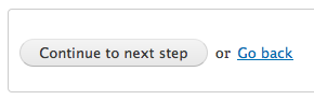
rszrama commentedI wonder if we should theme the "Cancel" / "Back" buttons to look like links? Perhaps they should even be located as #suffix to the main submit element as with the confirmation forms?
Comment #2
rfayThat would make sense to me. And the "Continue" button should come first, IMO.
Comment #3
Bojhan commentedYes, cancel should be link.
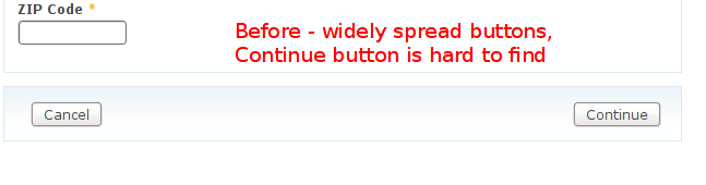
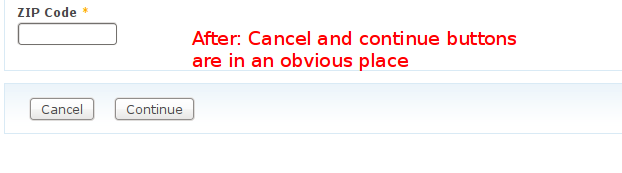
Visual orientation bug caused by lack of prominence in the visual design of the continue button.
Comment #4
rfayTook a look at making this a link. I was expecting it to be just a regular link-type behavior, but cancel actually is a FAPI behavior that uses $form_state, takes an action, and emits a log message. Not sure it needs to be that complex, but as it is, its normal state is as a button, FAPI wise. I'm not sure how to use CSS to change a button to visually look like a link, but gladly accept hints.
Comment #5
rszrama commentedYeah, sorry, I clarified this with Bojhan in IRC but didn't clarify here... it has to be a button b/c it's updating the order status and allowing for variable redirects when Back / Cancel is submitted. Acquia Prosper has an example of theming a button to look like a regular ol' link... I'm not sure what will work for us here. I know Seven has some code as well for differently themed buttons.
Comment #6
rszrama commentedWe'll need more than just the CSS change based on comments above.
Comment #7
mikejoconnor commentedMarking as a feature request. I definitely think it needs to be fixed, but its not really a bug.
Additionally, we should consider this. http://www.lukew.com/resources/articles/PSactions.asp
Comment #8
rszrama commentedAlrighty, finally nailing this one. I went with link styling, and though the "link" colors may not be right for every theme, they can be easily overridden. Also, the continue button is now the default button used when a user hits enter on the form. No more accidental cancellations.
Screenshots attached (although note that I changed it so underlining only shows on focus / hover).
Commit: http://drupalcode.org/project/commerce.git/commitdiff/aae3d5e
Comment #9
rfayNice! Thanks!
Comment #11
brianlp commentedCall me crazy, but I think the "proceed" item should be right and the "back" item to the left. Simply because intuitively forward is right and backwards is left. If I wanted to go forward, I would click the right side.
Comment #12
rszrama commentedThat was my gut feeling as well, but I can't argue with usability studies. They indicate that a single submit button on the far left is the first thing noticed by the eye when scanning down a form and filling in fields, with a visual de-emphasis on the "back" option best to prevent people from wasting time reading all the buttons when they really just want to go forward.
Comment #13
brianlp commentedYes it's probably a good idea to place them both to the left. What I meant is that the order of the buttons is inverted by adding the text.
Visual distinciton is clearly needed although I doubt that switching to button+text+link is ideal but makes it rather hard to capture. (But maybe it was part of the study findings.)
Two buttons indicating what's going on seems to me the most useful way by highlighting the "continue" part.
Comment #14
rszrama commentedHave you read the study linked in #4 above? It's not about visualizing forward / backward, it's about emphasizing the primary action - which most store owners would hope is "continue". : )
Comment #15
brianlp commentedOk I have overseen that link, thanks. I was curious about this study as you mentioned it. I'm very interested in this kind of stuff...