
Here's a patch for the current CVS version which adds the option to filter nodes by type on the node admin page.
Having built a few sites recently which make heavy use of flexinodes, the ability to filter out particular node types would have been extremely useful, so I hope this makes it to 4.5.0.
| Comment | File | Size | Author |
|---|---|---|---|
| #38 | node-filter.png | 27.38 KB | Dries |
| #35 | node-filter-wrap-v2.png | 14.23 KB | chrismessina |
| #32 | node-filter-wrap.png | 34.55 KB | Dries |
| #30 | node admin.png | 30.19 KB | Steven |
| #29 | node.admin.patch | 14.41 KB | Steven |


Comments
Comment #1
ixis.dylan CreditAttribution: ixis.dylan commentedThis would be a great feature.
Comment #2
ixis.dylan CreditAttribution: ixis.dylan commentedThis would be a great feature.
Comment #3
Bèr Kessels CreditAttribution: Bèr Kessels commentedI think we should really come up with a good solution for this screen. In the past, I went looking for such a solution and found that the various MP3 library tools might come to help.
They deal with large amounts of metadata, some of wch are important, other are not.
I summarise here what the UI could be like:
** The menu-based (tree) approach: Most mp3 collections use this idea. In a tree like structure on the side, you can make selections. The list in the main area will follow this selection. (Itunes: http://www.apple.com/itunes/playlists.html , Juk: http://developer.kde.org/~wheeler/images/juk-2.0/juk-2.png, finf/freeamp: http://www.zinf.org/images/zinf_mymusic_shot.png)
In drupal that would mean a menu-based filtering method. I once made a patch for that, but that was rejected: http://drupal.org/node/view/7766
The good thing here, is that it is virtually endless scalable. So in theory, flexinode coud add menu items to show only nodes where foo is bar.
|
- nodetype
| |- blog
| |= Flexinode
| | |=foo
| | | |=bar
| |- page
** The multiple selectlist UI: Another moethod is a extended method of what we have now: select items from select boxes and press submit. Above the main area one will find some selection UI where one can in- and exlude sertain criteria. (rhythmbox: http://www.rhythmbox.org/screenshots/Screenshot-Rhythmbox.png, and winamp http://www.winamp.com/player/walkthrough.php). Note that both still show some form of tree navigation.
In drupal that would mean multiple selects in three columns (rhytmbox and winamp show only two artist and album) For drupal we need three of thos blocks: one for node-types, one for node-settings (promoted, etc) and one for taxonomy terms. The node settings should be logical too: If a criteria is selected it it true, if not: false. That way we can also get rod of the annoying logic: "view posts that are not promoted" and the likes.
In both solutions the "perform batch action" needs to move somewhere else. I would plead for moving it to the bottom of the list. A lot of webmail cleints do it that way. The reason being simple: the steps you take to perform the update are:
1) select criteria (find nodes)
2) checkmark the chages (we need columns of checkboxes)
3) perform the update.
Logically the way you go through the UI is left->right, top-> down (not taking into consideration japanese/hebrew/arabs etc)
So all in all: i think indeed the UI needs serious work. I am willing to take this one me, bu I do need some consensus first. I am not willing to spend hours on a new UI (like the menu-based approach) to find the patch being rejected.Therefore I like some discussion up fron, rather than the " code first see later" approach.
Regards, Ber
Comment #4
Bèr Kessels CreditAttribution: Bèr Kessels commentedHere is a gimped mockup from what option 2) could look like.
WE could add a fouth box with users too, but I am not sure how that would go with permissions and the like. I need to do some thinking about selecatibility by users first.
Comment #5
Bèr Kessels CreditAttribution: Bèr Kessels commentedSorry for the spam: but I forgot to mention that there are a few issues:
The "perform action dropdown" should list stuff as: promote, demote, etc. But that list needs to be generated with the selection above in mind. So if you choose " published" the action list should not have "publish these nodes"
Also the action list could contain "recategorise" wich would need another screen after the one in the "ugly screendump-gimp-mockup", to be able to choose the categories in wich the selection should be placed.
And of course the delete these items with a confimation dialog. (http://drupal.org/node/view/7743#comment-11624)
Comment #6
Bèr Kessels CreditAttribution: Bèr Kessels commentedAfter a long discussion with Steven And gerhard, I designed the page in HTML, to let you all try it in some way.
Beware: the html is an ugly mock, It is meant as scetch, not as valid html.
Some notes on the page:
"View all nodes that are:" contains three differnet possibilities for searching. The first two (above the blank line) are there for simplicity, but they might confuse users, because they need a lot of text. The second idea uses a checkbox to enable the select next to it. The third one uses some ajvascript to improve useablity.
We should of course choose one of these three methods.
"View all nodes that are classified in:"
There are quite some people that have questions with whether or not we should include this selection aat all. Here is why I think it should definately go Because most sites have only one purpose and thus a lot of nodes of one type in one state. For example a personal blog site: 99% of the nodes are blogs. 99% are promoted. Only 1 or 2 are not promoted, not published or of type page.
Or take a photo-album-site. All posts will be images, the main difference is the classification (the galleries) I placed them in.
"any/all" There must be a way to choose whether the sected options should be an AND or an OR. I tried three different methods, each block has one method. We should choose one.
Please give me feedback, for I still have to decide whether or not to make this a contributed module or start lobby-ing to get it in core.
Comment #7
moshe weitzman CreditAttribution: moshe weitzman commentedlooking good, and really useful. a few small comments:
- consider upping the number of nodes that appear on this page. it is nearly pointless to use paging on this sort of UI
- i like the second idea of an 'enabled' checkbox, without the javascript. i think you can use 2 checkboxes, where the second one is called 'publish', 'promote', and 'has comments'
- I prefer the horizontal configuration of the 'Require: all any' radio buttons
- don't repeat 'the selected posts' in the choices for the bottom dropdown. perhaps use a title for that form_select() instead.
- the last choice in that dropdown is 'reclassify'. i don't see how this screen could support that. instead, use my taxonomy_multi_edit.module from contrib :)
i suggest making this a contrib module at first. it can be a tab off of the current page. thats how taxonomy_multi_edit.module appears.
Comment #8
Bèr Kessels CreditAttribution: Bèr Kessels commentedAbout that reclassify:
That was exactly my intention: using the taxonomy_muliti_edit module for that. All I wanted to do is pass a list of nids to your module and open a screen using that module with the previously selected nodes!
About the other comments: Yes upping the number of nodes might be a good idea. Anyone any idea what number would still be usefull. 10.000 nodes (on drupal.org) in one list is not a good idea, IMO, so some paging is needed.
indeed: repeatinf words in dropdowns is considered "bad UI design" thank you for pointing it out.
Regards, Ber
Comment #9
eafarris CreditAttribution: eafarris commentedhere is an updated version of this patch, syncing it with CVS HEAD. Also, i did change the functionality somewhat: previous versions of the patch asked the modules what node types were out there (via hook_node_name()). This version asks the node table what types are in there (via SELECT DISTINCT type FROM {node}). I find this more useful, because it's entirely possible that, over time, modules will be removed from the system, yet they still have rows in the node table. This method gives a more accurate view of the types of nodes on the system.
The new UI looks excellent, but this patch does not address it.
Comment #10
drumm-1
I applied and tested and it did not work at all for me. The type options selection only contains 's' and 'W', selecting one does not work. The list of types seems to come from the DB which is probably an unnecessary query.
Comment #11
eafarris CreditAttribution: eafarris commentedHere's a version of that patch that should work. Sorry.
I think that getting the types from the node table is necessary. The list of installed nodes is not the authority on what types of nodes are in the db; we should ask the db directly. It's a small query on one admin page; the result is that the dropdown has in it the most accurate information available. That's worth it, imo.
Comment #12
eafarris CreditAttribution: eafarris commenteds/list of installed nodes/list of installed modules/ . sheesh. teach me to post before my tea.
Comment #13
Bèr Kessels CreditAttribution: Bèr Kessels commentedI do not know where it weant, but my proposal had a HTML mockup. Attaching it here to see what i meant.
Comment #14
ñull CreditAttribution: ñull commentedNice filter options, but what I really miss it the possibility to select all checkboxes. Really boring job when you have to click the whole list one by one.
Comment #15
Bèr Kessels CreditAttribution: Bèr Kessels commentedI am not a big fan of those options in forms.
They more often break things than that thy fix them. Rahter use a bookmarklet r so for that: http://www.squarefree.com/bookmarklets/forms.html
Ber
Comment #16
Steven CreditAttribution: Steven commentedBased on some more IRC discussion, I came up with this (attachment). It is based on an earlier mockup.
It does use Javascript and doesn't degrade without script (yet), but I think it's worth considering. It can be implemented quite cleanly. The idea would be to have a filter like this initially, and after clicking 'Go', to show the current filter as well as the form again, allowing you to refine your search.
I haven't tested browser compatibility, but it should work on most browsers. The only ones I know for sure won't work are IE4 and NS4, which are old enough to ignore IMO: after all, this is admin only, and we can put some stricter browser requirements on that. Recent versions of other browsers should work (it only does a simple visibility toggle).
I like it because it's not an airplane cockpit, but still offers complex filtering options through refinement. It is also quite similar to the search/filtering UI in e.g. mail applications.
The question is of course, how to degrade it for people without Javascript. My suggestion would be to simply show all filter options, and put a radiobutton in front of each:
( ) Where type is [ blog | v ]
( ) Where published status is ( ) published ( ) unpublished
( ) Where category is [ term1 | v ]
...
It has more visual clutter, but the same principle of use.
Comment #17
Steven CreditAttribution: Steven commentedIn fact, I just realized that the radio-button version can be coded to send exactly the same form data as the scripted version, which makes it more interesting.
Comment #18
Steven CreditAttribution: Steven commentedIf you guys approve of my idea, I'll start coding. Assigning to myself for now.
Comment #19
Bèr Kessels CreditAttribution: Bèr Kessels commentedI like this idea much more than my previous approaches. Gave it some thought and came with the follwing behaviour:
* I think we need to discuss or at least design the tabular data too: It makes 0 sense to show the "types" column, if you chose "type = image"
* I think we need to introduce a hook to add info to that tabulat view. Images can output thumbnails, for example
* In tabular view, we should make: title a textfield, type and author a select and satus a select too.
* I think we should introduce another range of options: "where content contains" [ ] and "where title contains" [ ]
* I would like to get some feedback on how many drupal-using people are firmly against javascript, with a reason why. I bet that this is < 1% !
Bèr
Comment #20
Steven CreditAttribution: Steven commentedWe don't have an anti-JS policy in Drupal. It's just that until recently, doing cross browser JS was a chore and making it accessible and degradable would be a disaster.
This form can be implemented cleanly and will degrade without problems. Anyone who opposes it because it is JS can bugger off ;).
Comment #21
ñull CreditAttribution: ñull commentedThere is a more radical way around JS. You could forget the table idea alltogether and present the nodes in Listbox. Then selecting becomes much easier with Ctrl-Click and Shift-Click
Comment #22
Bèr Kessels CreditAttribution: Bèr Kessels commentedDid you have a look at the previous applied UI improvements? Did you consider the pre's and cons of those earlier posts?
It seams you are repeating passed issues here, please reply with miore detailed issues here,
Bèr
Comment #23
Steven CreditAttribution: Steven commentedHere's a patch which implements the JS approach of refining the selection.
Comment #24
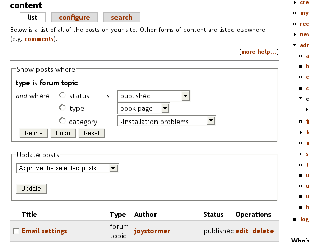
Steven CreditAttribution: Steven commentedAnd here's a screenshot of how it looks.
Comment #25
chrismessina CreditAttribution: chrismessina commentedThis is looking better and better. I'm going to do a UI review of this a post any additional thoughts or comments.
Chris
Comment #26
(not verified) CreditAttribution: commentedAck, I tested this using the bluebeach theme, but there's a small CSS bug with bluemarine, where the header for the operations form is stuck to the right of the filter form. I'll make an updated patch later. In the meantime, comments are much appreciated.
Comment #27
killes@www.drop.org CreditAttribution: killes@www.drop.org commentedI actually prefer the non-JS menu over the JS menu. Not (only) because of the JS but because I prefer radiobuttons over pulldown menus. The argument that the non-JS approach uses more vertical space can be mitigated by redirecting to a #results anchor.
Comment #28
killes@www.drop.org CreditAttribution: killes@www.drop.org commentedComment #29
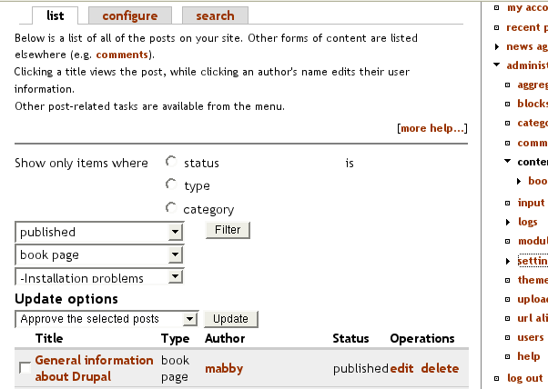
Steven CreditAttribution: Steven commentedHere's an updated patch... I have exams in a week, so I don't have time to finish up the Javascript version, so I removed it (it can be added later easily). However, the non-JS version is still very usable. Changes since last time:
- Uses semantic XHTML (definition list, and yes, they are for more than just definitions, even w3c agrees).
- Merges the various node flags (promoted, published, ...) into one "status" dropdown. This keeps the whole selector shorter, and is better UI-wise IMO.
- Adds drupal_gotos, they were missing.
- Updates node admin watchog messages to properly display the type. The code used t($node->type) which is a big no-no. hook_node_name() is now invoked instead.
- Removes some dead code.
- I rolled Ber's node mass deletion patch in as it affects the same piece of code. Updating either patch for the other separately would be a waste of time. I also added some more improvements to Bèr's code, such as removing the incorrect help from the confirmation page, cleaning up the code style a bit, not loading every node just to display its title and displaying a single drupal_set_message() after the deleting rather than one per node.
The old issue is here: http://drupal.org/node/7743
Comment #30
Steven CreditAttribution: Steven commentedComment #31
Bèr Kessels CreditAttribution: Bèr Kessels commentedThanks for integrating the batch delete patch, Steven!
Comment #32
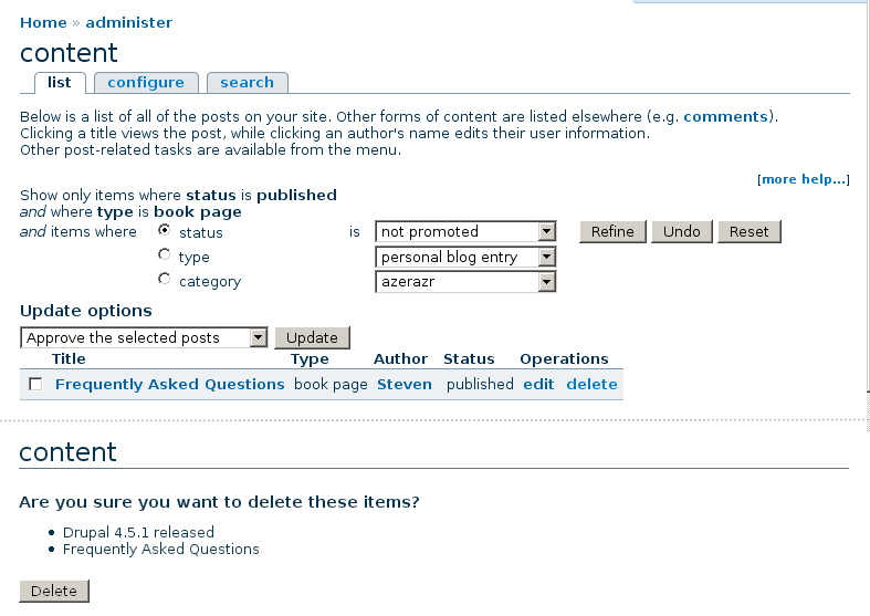
Dries CreditAttribution: Dries commentedIt looks good but:
1. It makes the UI looks cluttered. I suggest visually grouping the varios form elements so it becomes easier for they eye to skip over them.
2. It is too wide. Try using the Chameleon theme with a sidebar on the right at 1024x768 (eg. my laptop's resolution) and you'll find that the form elements wrap, and wrap in an awkward order. See screenshot.
Maybe we should group the form elements using from_group() and make "Show only items where" the form_group()'s title. It would save space.
Comment #33
Bèr Kessels CreditAttribution: Bèr Kessels commentedSteven,
Is there a reason why you do not use theme_box, but hardcode HTML in your forms? If there is none, I will spend some time monday to fix it.
Bèr
Comment #34
Steven CreditAttribution: Steven commentedSimple. There aren't any guidelines on theme box usage :P. Plus, theming the admin interface is probably not a big priority.
Comment #35
chrismessina CreditAttribution: chrismessina commentedI simplified the layout and added some visual separation between elements (the rounded boxes). I imagine that pretty much the same markup as exists now could be used with some slight tweaks.
Probably the most significant change, horizontally, is moving the filter button below the filters.
Comment #36
Steven CreditAttribution: Steven commentedThis way they take up even more space though. I'd like to at least have the user see part of the results table without scrolling. Also, the rounded boxes are definitely a theme thing and don't really belong in core.
The markup would need some changes too, as right now the structure is vertical nested inside horizontal, while yours is horizontal nested in vertical.
I was also wondering about the wording... "Show items where A is B" sounds a bit bumpy. Alternatives "... items whose A is B" "items with A of B", etc.
Comment #37
Dries CreditAttribution: Dries commentedChris' mockup looks better but there is still room for improvement:
1. The titles of the two /form groups/ are not consistent.
2. Removing the (mostly) brain-death help text might help to reduce the visual clutter. The help text is incorrect: clicking the username opens the user's profile page as one would expect.
3. The indentation looks pretty random.
Comment #38
Dries CreditAttribution: Dries commentedLooked some more at this patch:
1. The hardcoded widths in drupal.css should be avoided. They don't match my laptop's resolution and make for akward whitespace on higher resolutions. When I remove some of the hardcoded constants in drupal.css the forms look a whole lot better. Except for the buttons that is, they still wrap but it might not be a problem. IMO, we can't get this right unless we move the buttons under the form.
2. I played with the patch a little and came up with the attached screenshot. It needs refinement but the CSS/markup make it bothersome so this is nothing but of a proof-of-concept. As soon I try to change something the layout freaks out. It took me 15 minutes to 'reverse engineer' the markup/CSS. Personally, I'd rather have something that is a bit easier to change/customize.
Any way, I simplified the help, wrapped the forms in a form_group() and generally forced things to fit my resolution better.
3. The fact there is no Javascript involved makes things a whole lot easier.
Comment #39
Steven CreditAttribution: Steven commentedThe widths are there to avoid IE pushing part of the form down. If you remove them, make sure your modified setup doesn't suffer from the same bugs.
In any case, I don't have the time now to work on this patch further (exams), so if it needs further clean up, one of you guys will have to do it...
Comment #40
Steven CreditAttribution: Steven commentedI committed a modified version of the patch with Dries' UI. I could not avoid the widths as they are necessary in Internet Explorer. The advantage is that the forms line up neatly which helps to keep the page clean and tidy.
Comment #41
Kardboard CreditAttribution: Kardboard commentedCan't seem to patch my node.module. Keeps saying that "hunk fails at" then some number. I'm rather n00bish, and I'm running 4.5.0. Any help would be appreciated!
Comment #42
(not verified) CreditAttribution: commented