

Closed (fixed)
Project:
Drupal core
Version:
9.4.x-dev
Component:
locale.module
Priority:
Normal
Category:
Bug report
Assigned:
Unassigned
Issue tags:
Reporter:
Created:
23 Feb 2022 at 16:41 UTC
Updated:
26 Jul 2022 at 02:04 UTC
Jump to comment: Most recent, Most recent file




Comments
Comment #2
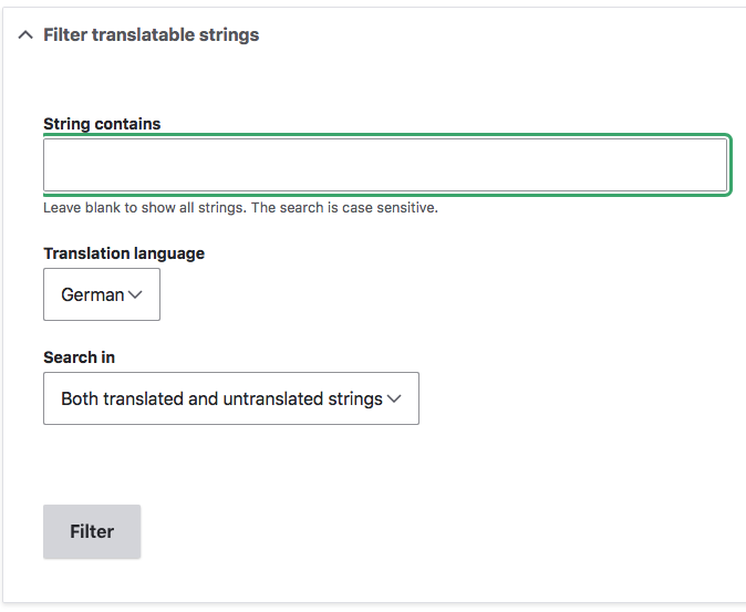
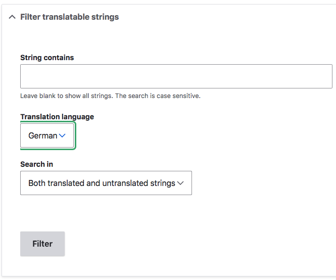
tintoThis issue appears in Chrome v101 too.
It is caused by a single CSS property located in core/modules/locale/css/locale.admin.css, lines 1 to 3:
If you disable line 2, the focus outline works correctly. However, this causes other elements to misbehave: the filter and reset buttons will appear outside of the parent. This is because they have a
floatapplied to them so the parent div does not stretch enough to contain floating child elements (a.k.a. the 'clearfix' problem). I don't understand why the form action buttons need a float to begin with.Additionally, the
overflow: hidden;also disables margin collapse, causing double margins. If you look at the space between Filter translatable strings and the String contains label, and compare it to for example /admin/config/system/site-information, you can see that there is too much margin. Disabling the line mentioned above also fixes this problem.Comment #3
tintoI can try to cook up a patch to fix this but I will need some more time to examine what is the common way Drupal core handles this part:
I'd say there are two options to solve this at the core.locale level:
P.S. Changing the issue component from 'Claro theme' to 'locale.module'.
Comment #4
tintoHere's a patch that seems to solve this issue. Tested this for both Claro and Seven admin themes in Chrome, Firefox, Brave and Safari on Mac OS.
Background info:
The patch basically removes this css:
and adds a 'clearfix':
Adding class
clearfixto the.details-wrapperdiv would render the exact same result, but it seems that the classes for this element are applied at theme level, not by the core.locale module. So, IMO it feels more solid to solve this at the module level, instead of having to alterdetails.html.twigfor each affected theme (i.e. Claro).If anyone disagrees with this approach, please feel free to chime in.
Comment #5
lendudeComment #6
tintoAdding a screenshot with a before/after comparison for patch in #4 in Claro theme (Chrome v101 on MacOS).
Comment #7
smustgrave commentedTested and seemed to work for me.
Comment #8
smustgrave commentedComment #11
lendudeUnrelated fail
Comment #13
lendudeMore unrelated fails
Comment #14
larowlanIf adding the clearfix class resolves this, is there any reason why we can't add it to the details element using '#attributes'?
i.e.
And then we can just remove the offending line of css without adding anything else?
Comment #15
smustgrave commentedSo something like?
Comment #16
larowlanYes, but we still need to remove this bit of css that causes the original issue
If you can do that and verify the original problem is fixed (adding some screenshots would be neat), I think we're golden
Comment #17
smustgrave commentedNo problem
Comment #18
amber himes matz- Followed steps to reproduce and verified issue
- Applied patch in #17, cleared caches, and verified issue is resolved -- all 3 fields in the form now have left border visible after patch applied
- Verified before/after PNGs in #17
- No notes on code (LGTM)
Comment #21
larowlanThanks for the fast turnaround folks.
Committed to 10.1.x, backported to 10.0.x and 9.5.x
Because the risk of regression is low here and this is a user-facing issue, backported to 9.4.x.