On this page
- Table of Contents
- Overview
- The Form API #states property
- Conditional Fields Examples
- States based on boolean form fields (checkboxes)
- Combine multiple fields or values
- States based on multiple values of the same field
- States based on values of multiple different fields
- Complex conditions based on multiple fields and values
- Negate conditions of #states properties
- The State 'required'
- Using checked/unchecked for a checkbox on an entity form
Conditional Form Fields
Drupal's Form API #states property allows to easily show or hide, enable or disable, require or collapse form fields based on values selected or entered in other fields on that form or anywhere else on the page.
Table of Contents
- Overview
- The Form API #states Property
- Conditional Fields Examples
- Combine Multiple Fields or Values
- Negate conditions of #states Properties
- The State 'required'
- Using checked/unchecked for a checkbox on an entity form
- Further reading
Overview
You simply define an ordinary css selector of the target field in the #states property of your form field element. When the value of the targeted field changes, the state of your element will change as well. It does not matter whether that field is on the same form or not.
While you could also use an AJAX Callback to achieve similar functionality the #states property allows creating dependent dynamic fields with little code.
Let's say you have a select field that lets users choose their favourite colour. You won't list all colours on the planet so you add the option "Other" at the end of the list. If a user selects "Other" you want to display a textfield where the user can enter their colour of choice.
The Form API #states property
The FormHelper::processStates() API docs state:
A "state" means a certain property on a DOM element, such as "visible" or "checked". A state can be applied to an element, depending on the state of another element on the page. In general, states depend on HTML attributes and DOM element properties, which change due to user interaction.
Since states are driven by JavaScript only, it is important to understand that all states are applied on presentation only, none of the states force any server-side logic, and that they will not be applied for site visitors without JavaScript support. All modules implementing states have to make sure that the intended logic also works without JavaScript being enabled.
Additionally, field actions that trigger a re-evaluation of state conditions assume user interaction; if other javascript code programmatically updates the values or other properties of a targeted input, you may need to trigger a "user-like" action such as a keyup event.
States that can be applied to a form field element:
- enabled
- disabled
- required
- optional
- visible
- invisible
- checked
- unchecked
- expanded
- collapsed
The following states may be used when checking values of other fields:
- empty
- filled
- checked
- unchecked
- expanded
- collapsed
- value
The following states exist for both elements and remote conditions.
Those might not be implemented in all browsers and may not change anything on the element:
- relevant
- irrelevant
- valid
- invalid
- touched
- untouched
- readwrite
- readonly
When referencing select lists and radio or option buttons in remote conditions, a 'value' condition must be used.
Find out more in the Drupal API Docs for FormHelper::processStates()(..).
A list of all form field elements can be found in the Form and render elements API docs.
Conditional Fields Examples
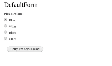
Let's create a select field that let's users choose their favourite colour. At the end of the list add the option "Other". If a user selects "Other" you want to display a textfield where the user can enter their colour of choice.
<?php

namespace Drupal\ajaxfilters\Form;

use Drupal\Core\Form\FormBase;
use Drupal\Core\Form\FormStateInterface;


class DefaultForm extends FormBase
{
  public function getFormId() {
    return 'default_form';
  }


  public function buildForm(array $form, FormStateInterface $form_state)
  {
    // Create a list of radio boxes that will toggle the textbox
    // below if 'other' is selected.
    $form['colour_select'] = [
      '#type' => 'radios',
      '#title' => $this->t('Pick a colour'),
      '#options' => [
        'blue' => $this->t('Blue'),
        'white' => $this->t('White'),
        'black' => $this->t('Black'),
        'other' => $this->t('Other'),
      ],
      // We cannot give id attribute to radio buttons as it will break their functionality, making them inaccessible.
      /* '#attributes' => [
        // Define a static id so we can easier select it.
        'id' => 'field_colour_select',
      ],*/
    ];

    // This textfield will only be shown when the option 'Other'
    // is selected from the radios above.
    $form['custom_colour'] = [
      '#type' => 'textfield',
      '#size' => '60',
      '#placeholder' => 'Enter favourite colour',
      '#attributes' => [
        'id' => 'custom-colour',
      ],
      '#states' => [
        // Show this textfield only if the radio 'other' is selected above.
        'visible' => [
          // Don't mistake :input for the type of field or for a css selector --
          // it's a jQuery selector.
          // You can always use :input or any other jQuery selector here, no matter
          // whether your source is a select, radio or checkbox element.
          // in case of radio buttons we can select them by their name instead of id.
          ':input[name="colour_select"]' => ['value' => 'other'],
        ],
      ],
    ];

    // Create the submit button.
    $form['submit'] = [
      '#type' => 'submit',
      '#value' => $this->t('Sorry, I\'m colour-blind'),
    ];

    return $form;
  }


  public function validateForm(array &$form, FormStateInterface $form_state)
  {
    parent::validateForm($form, $form_state);
  }


  public function submitForm(array &$form, FormStateInterface $form_state)
  {
    // Display the result.
    foreach ($form_state->getValues() as $key => $value) {
      drupal_set_message($key . ': ' . $value);
    }
  }

}
Now let's enhance this example a little bit. Make sure the user can't choose any other colour, after he selected 'Other' and entered a custom favourite colour. To achieve this we also add a #states property to the radios list and tell it, to enable the field only if the value of the custom colour textbox is empty.

  public function buildForm(array $form, FormStateInterface $form_state)
  {
    // Create a list of radio boxes that will toggle the  textbox
    // below if 'other' is selected.
    $form['colour_select'] = [
      '#type' => 'radios',
      '#title' => $this->t('Pick a colour'),
      '#options' => [
        'blue' => $this->t('Blue'),
        'white' => $this->t('White'),
        'black' => $this->t('Black'),
        'other' => $this->t('Other'),
      ],
      // Add the #states property to the radios.
      '#states' => [
        'enabled' => [
          // Enable the radios only if the custom color textbox is empty.
          ':input[id="field_custom_colour"]' => ['value' => ''],
        ],
      ],
    ];

    // This textfield will only be shown when the option 'Other'
    // is selected from the radios above.
    $form['custom_colour'] = [
      '#type' => 'textfield',
      '#size' => '60',
      '#placeholder' => 'Enter favourite colour',
      '#attributes' => [
        // Also add a id to the textbox.
        'id' => 'field_custom_colour',
      ],
      '#states' => [
        // Show this textfield only if the radio 'other' is selected above.
        'visible' => [
          ':input[name="colour_select"]' => ['value' => 'other'],
        ],
      ],
    ];

    // Create the submit button.
    $form['submit'] = [
      '#type' => 'submit',
      '#value' => $this->t('Sorry, I\'m colour-blind'),
    ];

    return $form;

  }
States based on boolean form fields (checkboxes)

The field above (field_override_subject) is of type boolean. The field below (field_subject) is a simple plaintext field.
  // Enable or disable subject field's visibility depending on the
  // state of field_override_subject (bool).
  // Make sure to use the right CSS/jQuery selector. Use your browser's
  // dev tools to find the correct 'name' property of the input field.
  // Here we can see the name attribute is the same as the defined id or name
  // As this pattern uses Javascript to toggle your fields visibility, your
  // browser will likely throw an error if your selector is not correct.

  $form['field_override_subject'] = [
    '#type' => 'checkbox',
    '#title' => t('Toggle Visibility'),
    '#default_value' => 1,
  ];

  $form['field_subject'] = [
    '#states' => [
      'visible' => [
        ':input[name="field_override_subject"]' => ['checked' => TRUE],
      ],
    ],
    '#type' => 'textfield',
    '#title' => t('Field that can be hidden using the above checkbox'),
  ];
Combine multiple fields or values
The #states property also allows to dynamically set a field's state based on values selected in multiple different fields or on multiple values of the same field.
Multiple conditions have to be grouped together in an array. Conditional logic is applied by adding 'and', 'or' or 'xor' in the grouping array. And even multiple groups can again be grouped together for more complex requirements.
Let's have a look at some examples, it's easier than it sounds.
States based on multiple values of the same field
In our example above a textfield is displayed, when the user chooses the option 'Other' from the list of colors. Let's add second option that will also display the textfield and call it 'Custom color'.
  // Create a list of radio boxes that will toggle the  textbox
  // below if 'other' or 'custom' is selected.
  $form['colour_select'] = [
    '#type' => 'radios',
    '#title' => $this->t('Pick a colour'),
    '#options' => [
      'blue' => $this->t('Blue'),
      'white' => $this->t('White'),
      'black' => $this->t('Black'),
      'other' => $this->t('Other'),
      'custom' => $this->t('Custom colour'),
    ],
  ];

  // This textfield will be shown when either the option 'Other'
  // or 'Custom colour' is selected from the radios above.
  $form['custom_colour'] = [
    '#type' => 'textfield',
    '#size' => '60',
    '#placeholder' => 'Enter favourite colour',
    '#attributes' => [
      // Also add a static id to the textbox.
      'id' => 'field_custom_colour',
    ],
    '#states' => [
      // Show this textfield if the radio 'other' or 'custom' is selected above.
      'visible' => [
        ':input[name="colour_select"]' => [
          // User selected 'Other'.
          ['value' => 'other'],
          // Conditional logic. Allowed are the values or, xor, and.
          'or',
          // User selected 'Custom colour'.
          ['value' => 'custom'],
        ],
      ],
    ],
  ];
States based on values of multiple different fields
In this example the textfield for the custom color is only displayed if the user selects the 'Other' option from the field Pick a colour and the 'Yes' option from the field Do you want to enter a custom colour.
  // Create a list of radio boxes with colours.
  $form['colour_select'] = [
    '#type' => 'radios',
    '#title' => $this->t('Pick a colour'),
    '#options' => [
      'blue' => $this->t('Blue'),
      'white' => $this->t('White'),
      'black' => $this->t('Black'),
      'other' => $this->t('Other'),
    ],
  ];

  // Create a list of radio boxes that will only allow to select
  // yes or no.
  $form['choice_select'] = [
    '#type' => 'radios',
    '#title' => $this->t('Do you want to enter a custom colour?'),
    '#options' => [
      'yes' => $this->t('Yes'),
      'no' => $this->t('No'),
    ],
  ];

  // This textfield will be shown when either the option 'Other'
  // or 'Custom colour' is selected from the radios above.
  $form['custom_colour'] = [
    '#type' => 'textfield',
    '#size' => '60',
    '#placeholder' => 'Enter favourite colour',
    '#attributes' => [
      // Also add a static id to the textbox.
      'id' => 'field_custom_colour',
    ],
    '#states' => [
      // Show this textfield if the radios 'other' and 'yes' are
      // selected in the fields above.
      'visible' => [
        [
          ':input[name="colour_select"]' => ['value' => 'other'],
          'and',
          ':input[name="choice_select"]' => ['value' => 'yes'],
        ],
      ],
    ],
  ];
Complex conditions based on multiple fields and values
In this example we want to show the textfield if either 'Other' and 'Yes' or 'Blue' and 'No' are selected. This doesn't make much sense but is good enough for an example.
  // Create a list of radio boxes with colours.
  $form['colour_select'] = [
    '#type' => 'radios',
    '#title' => $this->t('Pick a colour'),
    '#options' => [
      'blue' => $this->t('Blue'),
      'white' => $this->t('White'),
      'black' => $this->t('Black'),
      'other' => $this->t('Other'),
    ],
  ];

  // Create a list of radio boxes that will only allow to select
  // yes or no.
  $form['choice_select'] = [
    '#type' => 'radios',
    '#title' => $this->t('Do you want to enter a custom colour?'),
    '#options' => [
      'yes' => $this->t('Yes'),
      'no' => $this->t('No'),
    ],
  ];

  // This textfield will be shown when either the option 'Other'
  // or 'Custom colour' is selected from the radios above.
  $form['custom_colour'] = [
    '#type' => 'textfield',
    '#size' => '60',
    '#placeholder' => 'Enter favourite colour',
    '#attributes' => [
      // Also add an id to the textbox.
      'id' => 'field_custom_colour',
    ],
    '#states' => [
      // Show this textfield if the radios 'other' and 'yes' are
      // selected in the fields above.
      'visible' => [
        [
          ':input[name="colour_select"]' => ['value' => 'other'],
          'and',
          ':input[name="choice_select"]' => ['value' => 'yes'],
        ],
        'or',
        [
          ':input[name="colour_select"]' => ['value' => 'blue'],
          'and',
          ':input[name="choice_select"]' => ['value' => 'no'],
        ],
      ],
    ],
  ];
Negate conditions of #states properties
Let's say you want to display the custom colour textfield only if the user does not select the 'Other' option. This can be achieved by prefixing the 'value' with !.
    '#states' => [
      // Show this textfield if any radio except 'other' is selected.
      'visible' => [
        ':input[id="field_select_colour"]' => ['!value' => 'other'],
      ],
    ],
Lets' say If you want to display custom colour radio field only if: User does selected at least one option & does not select the 'Other' option.
    '#states' => [
      // Show this radio field if any radio except 'other' is selected.
      'visible' => [
        'checked' => true,
        ':input[name="field_select_colour"]' => ['!value' => 'other'],
      ],
    ],
#Additional Info: By using 'checked' attribute like above example, helps to resolve the issue of dependent field visible by default if user did not select any option.
The State 'required'
The state 'required' is a special case. You can't use 'required' with the field containers, instead you'll have to target the actual input field. Thanks to @tresti88 for his examples in the comments.
Example code by @tresti88. from the comments for the API docs.
// From https://api.drupal.org/comment/62866#comment-62866 .

      $form['my_select_list'] = [
        '#type' => 'select',
        '#options' => [
          'user' => t('User'),
          'group' => t('Group'),
        ],
      ];

      $form['auto_complete_field_0']['#states'] = [
        'visible' => [
          [':input[name="my_select_list"]' => ['value' => 'user']],
        ],
      ];

      $form['auto_complete_field_0']['widget']['0']['target_id']['#states'] = [
        'required' => [
          [':input[name="my_select_list"]' => ['value' => 'user']],
        ],
      ];

      $form['auto_complete_field_1']['#states'] = [
        'visible' => [
          [':input[name="my_select_list"]' => ['value' => 'group']],
        ],
      ];

      $form['auto_complete_field_1']['widget']['0']['target_id']['#states'] = [
        'required' => [
          [':input[name="my_select_list"]' => ['value' => 'group']],
        ],
      ];
Using checked/unchecked for a checkbox on an entity form
When altering a form for an entity, getting checked/unchecked states to properly handle a checkbox requires finding the #type => 'checkbox' element in the form array (top-level field_some_checkbox is a '#type' => 'container'). A short example for a field_some_select driving a field_some_checkbox follows:
<?php

use Drupal\Core\Form\FormStateInterface;

function my_module_form_alter(&$form, FormStateInterface $form_state) {
  $form['field_some_checkbox']['widget']['value']['#states'] = [
    'unchecked' => ['select[name="field_some_select"]' => ['value' => 'a-specific-value']],
  ];
}
- Form API #states by Angus Mak
- Drupal 7 Form API: Using #states with multiple conditionals (AND, OR and XOR) by Slavko Pesic (Still valid for D8and D9.)
- FAPI #states: Fix conditionals to allow OR and XOR constructions (Still valid for D8 and D9.)
- Discussion with many details in the drupal_process_states API docs.
- Drupal 7 API docs for function drupal_process_states with many examples in the comments. (Still valid for D8 and D9.)
- Thanks to Electric Larry and Paper Boy from .lowfidelity HEAVY INDUSTRIES for the screencasts and many of the code samples in this guide.
Help improve this page
You can:
- Log in, click Edit, and edit this page
- Log in, click Discuss, update the Page status value, and suggest an improvement
- Log in and create a Documentation issue with your suggestion
