
Closed (fixed)
Project:
Drupal core
Version:
8.0.x-dev
Component:
Seven theme
Priority:
Normal
Category:
Task
Assigned:
Unassigned
Issue tags:
Reporter:
Created:
7 May 2013 at 21:53 UTC
Updated:
29 Jul 2014 at 22:18 UTC
Jump to comment: Most recent, Most recent file

Comments
Comment #1
oresh commentedFirst attempt. It doesn't cover styles for small version, cause I just couldn't find one.
Also the progressing element and message are inserted in the same element, so it's different from the design.
I hope we change all this stuff in twig ( classes and separating message ) so this patch doesn't cover that.
Comment #2
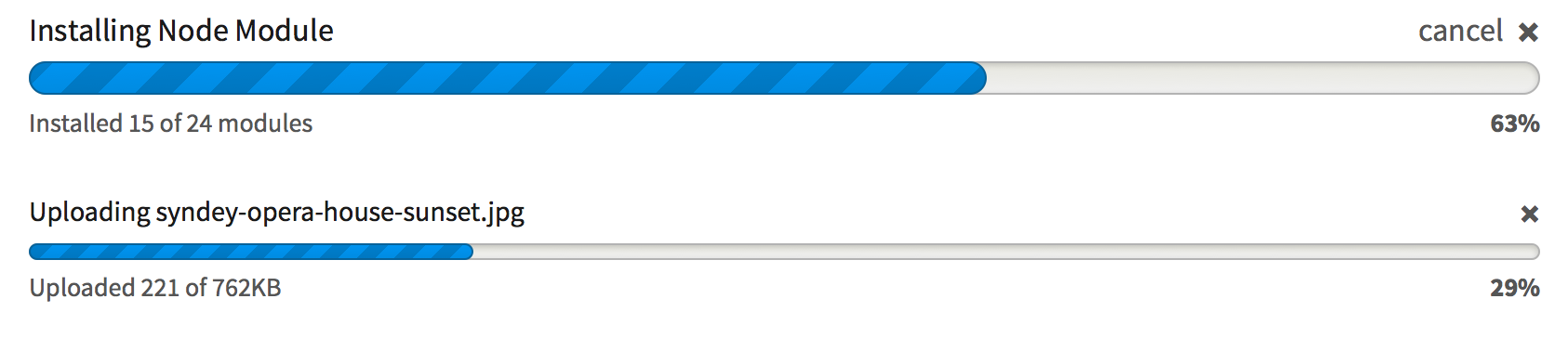
oresh commentedThis is how progress looks on my machine.

Comment #3
kika commentedGreat, ahem, progress! Probably obsoletes #1477550: Bring progressbar to the postmodern era
Comment #4
Bojhan commentedFirst review
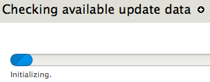
1) The "Initial" state is a little small and does not respect the rounded corners see screenshot below.
2) The height of the progress bar feels a little off, is this the same to the style guide specification? I think we should just implement the large one, by default since you are correct there is no small one in core (except for uploading, but thats probally contrib).
3) Wondering is the design element, of placing the title on top hard to achieve?
Comment #5
lewisnymanI decided that it was easier just to update all the mark up and the classes to match the prototype, that means the CSS in the prototype and this patch are near identical.
In order to split the title and the description up, I had to add a new $label variable to the progress bar theme function, progress JS, and the batch api.
I also added a really cool CSS transition. Really cool.
Comment #7
Bojhan commentedIts trowing an "undefined label" exception.
Comment #8
lewisnymanOk let's try this. We also need to make a decision about how much of this styling goes in system vs seven. I vote all in system.
Comment #9
Bojhan commentedI think most of it belongs in system?
Comment #10
lewisnymanComment #12
swentel commentedShould fix the notices
Comment #13
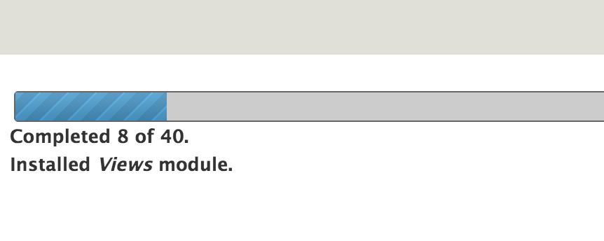
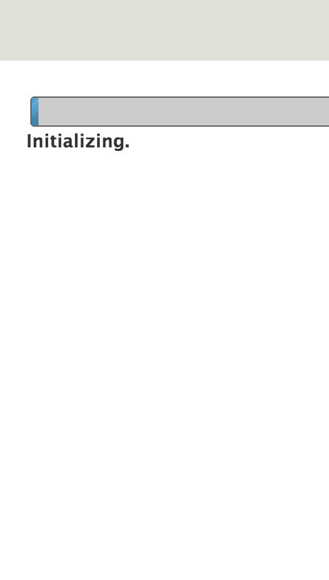
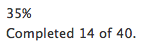
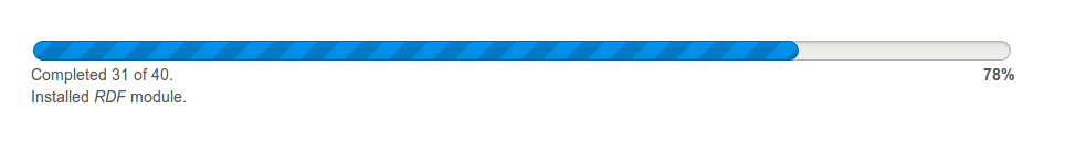
Bojhan commentedThanks swentel for chipping in! This progress bar looks quite sexy. I noticed the "Initialising" state was full width, it should instead only be around 1-5% of the bar
Its kinda hard to replicate, so I made a video at http://screencast.com/t/p8UZN9KS
Comment #14
Bojhan commentedWe probably need something along the lines of http://drupal.org/files/issues/progressbar_5px.patch
Comment #15
lewisnymanOk, I've added a default width for the progress bar. I've also shifted the CSS from Seven into the system CSS files.
Comment #16
lewisnymanOn Bojhans request I changed the initial width to 3%.
Comment #17
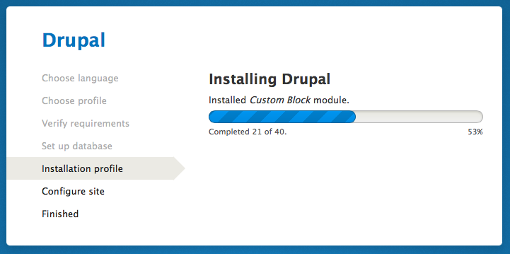
Bojhan commentedThis probably needs a screenshot. Other than that it all looked fine to me, I am ready to RTBC this when it comes back green with some nice screens.
Comment #18
Bojhan commentedWorks!
Comitters please quote designers:
Comment #19
dries commentedCan we get a before screenshot?
Comment #20
Bojhan commentedSure
Comment #21
Bojhan commentedComment #22
ry5n commentedReviewing this now, since I haven’t had a chance yet. Needs a few tweaks but the code looks good, and looks great visually :). I especially love the transition between progress__bar widths. Nice one @LewisNyman!
(Aside: I would like dev credit on this as well, since it was @oresh and I who wrote the new markup and CSS in the Seven sandbox.)
These elements appear to be source-order swapped compared to theme_progress_bar().
Since .progress__close doesn’t exist yet maybe we should leave out the CSS for it. (It was intended for operations that can be cancelled, like file uploads).
Since bg position values in the animation must match the gradient in use, this should go in system.theme.css
Comment #23
lewisnymanCheers Ryan! I've fixed all the above and I added a few more prefixed keyframes to match the animation references
The commit credits should read something like:
LewisNyman, Ry5n, oresh, swentel, Bojhan, YoroyComment #24
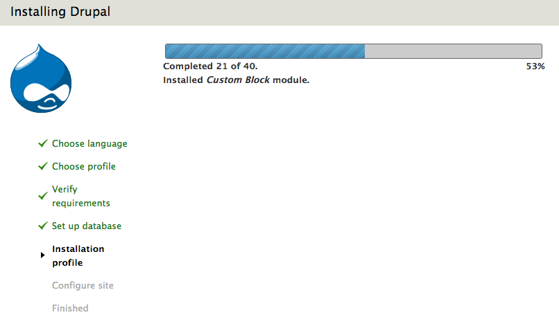
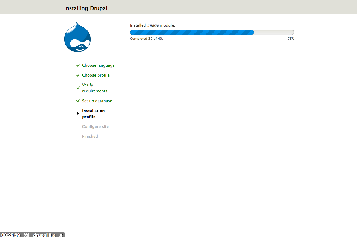
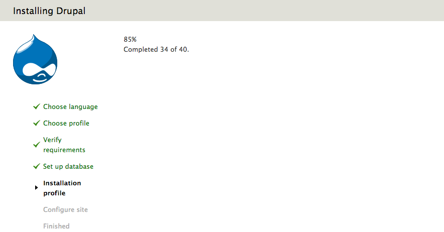
lewisnymanOk I messed up, this should work.
Comment #26
echoz commented#24: 1989480-progress-bar-24.patch queued for re-testing.
Comment #27
echoz commentedI did not show the visual progress bar, just the text.
Comment #28
swentel commentedWorks fine here ...
Comment #29
echoz commentedIt was my Safari cache. All good, visually (awesome!) and code changes from #22 implemented.
Comment #30
Bojhan commentedAwesome, commiters please credit all contributors (including the designers)
Comment #31
dries commentedIs it me or am I the only one that thinks that it doesn't look better than the old bar? I'm happy to commit this if there is consensus that this looks better.
Comment #32
ry5n commented@Dries Everyone I’ve heard from personally has really liked the new look, and we didn’t hear any objections when the new style was proposed. However, since I designed it, I’ll have to let others speak up. :)
If this is going in, I just want to make sure we verify the latest patch has been manually tested by at least two people. Does the progress bar appear anywhere other than the installer? Have we checked that?
Comment #33
echoz commentedIMO it looks beautiful, the radius matching the "pill" shaped button (which I don't prefer but get), "to appear more cheerful" while waiting, using "Drupal Blue" from the color palette, cleaner stripes, and the best part is this formerly used an animated gif, and it now leverages css gradient, css animation and css transition.
Screenshot from manually check updates. Unable to install a module, or find a small progress bar. I'd be glad to conjure up another example if anyone tells me where to find it.
Comment #34
swentel commentedI find it dead gorgeous.
Comment #35
wim leersI also find it very beautiful. Plus, instead of the "progress jumps" that happen without this patch, whenever new progress info arrives, this animates to it much more smoothly.
Comment #36
lewisnymanI've only heard 100% positive feedback from this change. I love it, it feels modern.
Objective view; it's more consistent with Drupal's brand colours, reflects our brand values better, and the improved information heirachy improves "scanability"
Comment #37
ry5n commented@echoz Looks like theme('progress_bar'… is called once in all of core, as part of _batch_progress_page() in batch.inc. It seems that installing modules through the admin UI does not work at the moment, so I am not sure where else we can do manual testing. Given how limited the scope here is, I’ll leave that up to committers.
Comment #38
joelpittetSo pretty! Nice work guys:)
Comment #39
lewisnymanComment #40
lewisnyman#24: 1989480-progress-bar-24.patch queued for re-testing.
Comment #42
lewisnymanRe-rolled this patch to take into account the CSS file organisation changes. I also removed misc/progress.gif.
It just needs a quick test to make sure it applies cleanly and an eyeball.
Comment #43
rteijeiro commented@LewisNyman the #42 patch only removes prefixed css. Is it related to the #24 patch for the new progress bar look and feel?
Comment #44
lewisnymanlooks like i uploaded the wrong patch
Comment #45
lewisnymanComment #46
rteijeiro commentedTested #44 patch and progress bar has been vanished :( (see attached screenshot)
Comment #47
lewisnymanLooks correct for me on simplytest.me? Did you clear your cache?
Comment #48
swentel commentedYeah, works perfectly, let's ship it.
Comment #49
corbacho commentedLooks good!
GIFs
now
http://i.imgur.com/AMfQp36.gif
after
http://i.imgur.com/H3w1qkj.gif
IE9
http://i.imgur.com/zJvftLo.gif
IE9 bar will show non-striped. But let's be fair. IE9 worldwide use today is less than 10%
http://gs.statcounter.com/#browser_version_partially_combined-ww-monthly...
Comment #50
tinycg commentedI like it, even degrades well in IE9 with a nice clean look.
Comment #51
tim.plunkettHere is a screenshot of the current progress bar for comparison.

While I don't think the current progress bar is amazing, I have to agree with Dries.
I think the new proposal looks like something I would have expected in Drupal 5.
The colors are very saccharine and it is rounded to an extreme (very Web 2.0), which makes it look even more dated.
Comment #52
gábor hojtsyI agree with those *supporting* the new look. The new colors are bolder and cleaner, not using this grayish hue which looks washed out to me. Also while this is considered as a standalone change here, it should be understood in the context of the larger scale improvements in https://groups.drupal.org/node/283223 which clean up many of the rounded things in Drupal (and in many cases make them more rounded). I like the new look much better, especially as it fits with the other pieces proposed.
Comment #53
joelpittetAll around great job!
Comment #54
tsi commentedI think the smallest bars are the most stylish, Unless we're putting some text inside the bar, I'd prefer the smaller variant as the default/only one.
Comment #55
tkoleary commentedOn the question of the smalle vs. larger bar I think that both should be available. There are some operations (install. migration, backup etc. that warrant a large bar if only psychologically to indicate "this is a big operation" whereas things like image upload etc. are fine with a small one.
Overall this work is awesome. Kudos to Lewisnyman, Bojhan, ry5n, corbacho and everyone else who has contributed.
Comment #56
rteijeiro commentedYeah, cache issue. Tested in Chrome, Firefox and Opera (no animation).
Looks cool!! Great work!!
Comment #57
yoroy commentedI'd much rather have this *not* be a poll or a popularity contest. Nit-picking individual elements is the best way to end up with a wonky, unbalanced look.
If people think there are issues with this particular design, please review Proposal: A Style Guide for Seven and provide rationale how to make it better fit the overall visual language as it is laid out there.
Comment #58
tim.plunkettThis moves us in the opposite direction, especially with regard to rounded edges.
D7

D8

As someone who spends a good deal of time looking at core's progress bars, I think this is a real shame.
The twitter-bootstrap-ification of core is directly contrary to the other visual improvements that were made.
Comment #59
aturetta commentedI'm sorry, but I must agree with @tim.plunkett & @dries. The shape of the new progress bar is not better than the current one.
I'm not discussing the improvement in markup or CSS, just the shape feels older-style to me...
Comment #60
ry5n commentedI want to second @yoroy in #57. Since we know some of us like this and some don’t, I doubt that more likes or dislikes are going to help resolve this issue. I’d like to suggest we focus on:
- Is the progress bar as designed consistent with the rest of the Style Guide? If you think not, please point out inconsistencies.
- If it is consistent, then the objection is with aspects of the design direction as a whole. Critique on that score should happen on the original g.d.o post. In addition, any critique on the design direction should refer to the Basic Principles we tried to establish and how we translated them to the final design language. We tried very hard to avoid arbitrary decisions and instead make the Seven theme express the qualities that make Drupal what it is.
Comment #61
tim.plunkettg.d.o is not where the Drupal community makes decisions. The issue queue is.
Being told I'm not allowed to voice my dissent here, and that I must instead critique a 4500 word wiki, is not okay.
Comment #63
ry5n commented@tim.plunkett The way I see it, this is basically an implementation issue. If you want to critique the design of this component, it should be either:
a) here, assuming the general direction of the Style Guide is OK
b) elsewhere, if not. If the Style Guide post on g.d.o is not the right place, I don’t know what is.
And lastly, if you want to critique a design system, you should be expected to at least skim the rationale.
Comment #64
cweagansIMO, there was a pretty clear consensus on the style guide. We should implement it and call it good. If, after everything is implemented and you can view the entire vision at once, there needs to be some tweaks to make it more cohesive or something, I think that's a much more appropriate time to start that discussion. I'd also like to note that design by committee is not an appropriate goal here - there's a well defined style guide that a lot of people seem to like and approve of. I think that at this point, we should just run with it.
Comment #65
cweagansAnd for the record, +1 for RTBC - this looks great.
Comment #66
swentel commented@tim.plunkett , actually, those will be changed as well according to the style guide, see https://groups.drupal.org/node/283223#Split_Buttons_and_Dropbuttons
And in the end, I can always patch up Batch video ;)
Comment #67
ParisLiakos commentedjust for the record -1 for me, agreed with #58
Comment #68
dawehnerSo in general if everything would be in a consistent style, the human eye would have no problem at all to adapt. (that's why most like the new style guide in general) but for a single issue the contrast is too much.
What about doing something similar to twig, so get it in just if everything is converted but work on several tasks in parallel.
Comment #69
gddI have to agree wholeheartedly with timplunkett here. Decisions that affect core have never been made on gdo, they are made in issues because that is where core development happens. Discussions that spawn issues are meta-issues. This is the only process we have ever had.
Note this is not a commentary on any design decisions at play, which I have no opinion on, just a rejection of the assumption that these decisions were community vetted in any way the community has ever recognized.
Comment #70
yesct commentedI see some parallels here with the way coding and docs standards are done.
There is a page outside of the issue queue (like a docs page), and changes to the standard are done by filing issues.
Maybe we can move forward here by opening up a meta issue for the style guide,
that will assume the style guide as-is-now is a starting point,
and then sub issues ([policy/nopatch issues]) can be filed to discuss changes to it.
once those are decided, they can get a follow-up to implement the change.
In the mean time, while those policy/nopatch issues have discussion, we can proceed with implementation issues against the current style guide.
I heard some talk the other day about needing a way to better have design discussions, and the meta and sub issue suggestion wont solve that problem, but might get us a bridge between the discussions and the issue queue.
Big issues sometimes use helper issues too, and we might be able to use some of the ideas of helper issues.. where work occurs other places (like maybe in groups wikis), and then get reported back semi-regularly to an issue.
----
On this issue, I propose we view this as implementing the style guide,
and then open a follow-up for more rounded corners discussion.
Comment #70.0
yesct commentedmeta issue added
Comment #71
yoroy commentedSorry for not pointing that out before, but the meta issue exists and is linked in the issue summary above: https://drupal.org/node/1986434
So we once again run into the known issue that our collaboration tools are lacking. From my perspective we did play by the book: hash things out in a peer group on g.d.o., write a blog post calling for feedback. Create a meta issue in the queue and split off manageable chunks of work in seperate issues.
I do feel the style guide has been community vetted. By peers. I don't contribute to discussions around caching, OOP architecture or whatever technical topics. Likewise, it's hard for me as a designer to take "me no like" comments as reasonable design feedback. But maybe YesCTs proposal is the way to go.
Anyway,
The roundness of the progress bar corners have little to do with button roundness, it's not applied here to communicate "I'm clickable" since there is nothing to click on.
Comment #71.0
yoroy commentedadded before screenshots.
Comment #71.1
joelpittetUpdated issue summary. Added meta to related
Comment #71.2
yesct commentedadded gifs and simplytest.me link -yesct
Comment #72
yesct commentedI updated the remaining tasks in the issue summary.
One of the remaining tasks was to do an accessibility review. I dont see a comment saying that was done. Adding the tag. Moving to needs review.
(If it was already done, and I missed it, move the status back and link to the review.) https://drupal.org/contributor-tasks/accessibility-review can help someone to an accessibility review.
I also updated the issue summary with a simplytest.me link to make it easier to try out, and gathered related before and after screenshots and the animated gifs.
Comment #72.0
yesct commentedupdated remaining tasks and took out duplicate meta line in beginning. -yesct
Comment #73
lewisnymanI really don't want to derail this issue but I don't buy that 100% of the action happens in the issue queue. There are many places where strategy and implementation is discussed, IRC, Google Hangouts, Skype, g.d.o, face-to-face, wiki documents, sandboxes.
All issues should reference the decisions and logic that have come before it. We've done that in this issue.
Comment #74
tstoecklerI totally have to agree with @yoroy and @LewisNyman. Almost all of the initial WSCCI patch didn't happen in the queue. Same for SCOTCH. Same for Twig. And due to the fact that we don't have a road map or a set of focus issues it's very easy to miss issues that are in the queue, even. Very often issues get re-opened after commit because people that totally disagree with the entire premise.
Now that's not to say that there isn't a huge problem with our process, but it's completely unfair to blame this on the Design/Seven team.
Comment #75
tkoleary commented@heyrocker
I have do respectfully but strenuously disagree with you on this one.
The reason why design pulled this issue into groups is very simple. The issue queue and the whole process of decision making in Drupal is a system designed by developers for developers using developer tools, paradigms, rules and processes. It has worked quite well and there's nothing wrong with it as long as all we are talking about is development. The problem is that the entire process is antithetical to the way that designers are used to working, sharing, collaborating and coming to consensus.
As yoroy and others have pointed out, even given the artificial environment that we are forced to inhabit, we did follow established rules. I think it's important to note here that if Drupal is really committed to valuing design (recall the comment about no designer being on the stage in the Portland core conversation). We must overhaul the *process* to provide a workflow for design that works for designers.
Comment #76
tkoleary commented@tim.plunkett
"g.d.o is not where the Drupal community makes decisions. The issue queue is.
Being told I'm not allowed to voice my dissent here, and that I must instead critique a 4500 word wiki, is not okay."
As yoroy pointed out this did not all happen in groups there is a meta issue and comment was requested. Consensus has already been arrived at in lengthy discussions. If I were jump in to the whiskey queue right now and say "I think this should all be based on SNMP instead of REST" I would (probably unceremoniously) be told that the time for that decision has passed.
Since every user of a UI has an opinion on the design of the UI and CSS is easy to change there seems to be an attitude that we can continually re-open these discussions. To do so is to invalidate the time, effort and expertise of the designers and the opinions of all of those who cared enough about design to take the time to review and comment on them.
I'd also like to point out that none of the style guide design work was done by me, though I did comment on it. I maintain the Ember admin theme which takes a different approach on many of these design questions. That said I applaud the work that has been done on the style guide and it's implementation by ry5n, bojhan, lewisnyman and yoroy. A comprehensive review and overhaul of the core admin theme was long overdue and they did an awesome job. It's time to stop the critique and get as much of it implemented as we can.
ps. If you really dislike it so strenuously, write your own admin theme. :)
Comment #77
gddActually for large discussions like this one it doesn't even work for developers! I had to resort to gdo many times for architectural discussions related to CMI. The difference is that when those discussions reached agreement (or when I forced agreement on them in one case) I made an issue back here and opened it up for comment because I know the community doesn't watch stuff over there. Sometimes I would timebox these discussions but still nothing was final until it came back here where people *actually work*.
Additionally, while I don't deny that our tools are especially foreign for the design community, I would also argue that making one that works is probably a whole separate topic that should be managed on its own, not three people suddenly deciding to implement a new way of working without any greater discussion in the midst of a reasonably important and wide-ranging issue.
Anyways, I'm bowing out of this, because there is actually good work being done here and I don't want to get in the way of it anymore. I was really more trying to expand on the reasons why some people might be a little taken aback by things and why saying "this decision has already been made outside the issue queue" really rubs people the wrong way.
Comment #78
gábor hojtsyFully agreed with @tstoeckler in #74. Every word.
Anyway this looks like plenty of feedback for Dries to consider.
Comment #79
yoroy commentedIt's a pity something like this should have to be assigned to the project lead to make a decision. The process discussion is absolutely very valid, certainly not constrained to 'design' but not to be solved in here. I'd love to find a good place to continue this discussion.
Dries: it's still rtbc, so you can either commit it or set it to 'needs work'. In case of the latter, try to provide rationale beyond 'not looking better' to give the designers something to work with.
Comment #80
gábor hojtsyIt is moved back to Dries not for any process discussion feedback but because he tweeted asking people to provide visual feedback here and that was his only complaint. So I guess that makes any other core committer impossible to commit this. It would be the same if it would be about changing an API or removing a feature.
Comment #81
yoroy commentedAh ok, thank you.
Comment #82
gábor hojtsy#44: 1989480-progress-bar-42.patch queued for re-testing.
Comment #83
effulgentsia commentedThis issue still has the "needs accessibility review" tag, but is also RTBC. Is the suggestion to delay an accessibility review to a follow up, and if so, why?
Comment #84
dries commentedI had never seen the style guide until earlier today (https://groups.drupal.org/node/283223). In general, I'm very impressed by the style guide work. It would have been better if I could have signed off on that months ago. It seems like we have some process/communication problems on this. Having said that, I'm ok with moving forward with this design guide.
At this stage of the game, every patch that gets committed needs to get us closer to a releasable state. Meaning, if we commit the progress bar patch today, than we should be willing to ship Drupal 8 with none of the other design changes made. We can't create critical or major follow-up issues relative to the style guide. Put differently, we should either be comfortable shipping an incomplete conversion to the proposed style update, or wait to commit a bigger or whole theme update at once.
In terms of process, I'd look towards the Seven maintainer to tell me what style changes need to be bundled as one patch, or what style changes can be committed individually (with no release blocking follow-up). I recommend that we appoint a new maintainer for Seven, as Jeff Burns hasn't been active lately. Once we have a new maintainer for Seven, the new maintainer can decide whether the progress bar can be committed independently. I think ry5n would be a great candidate for this role, if he is willing and able to.
Comment #85
Bojhan commented@Dries Thanks for providing this input. I am sad that you didnt see it before, sadly there wasnt much more we could do within the existing communication platforms (g.d.o, twitter, planet, meetings, irc), we used them all to broadcast our activities.
I have opened #2022927: Add new maintainer for Seven for this. I would recommend lewis, knowing r5yn wanted to take a bit of a break. I dont think many of the design changes are dependant on each other its already pretty inconsistent. But lets move all that discussion to #1986434: New visual style for Seven
Comment #86
gábor hojtsy@Dries: Drupal is already in a transitioning state between different styles, just see the buttons on this attached image (did not embed because not directly related to this issue). All kinds of shapes and colours even for buttons used at the same place for the same main operation :D So if we want to end up with a consistent product (vs. the image shown), I don't think not doing most of the style guide is an option. These are also not API changes, so I think the conventional wisdom is that it is perfectly possible to work on them even if not all of them land before July 1st.
Comment #87
effulgentsia commentedCorrect. July 1 is API freeze, not theme, markup, or CSS freeze. But it is still the case that committing partial work needs to move us closer to rather than farther from a releasable state (i.e., it shouldn't result in knowingly introducing new critical or major issues, or needing to raise the priority of existing issues). I think this specific issue is an isolated enough part of the UI that it's fine to commit on its own, but regardless of the decision on this issue, it would be good to get clarity over in #1986434: New visual style for Seven for how that entire issue needs to be structured in order to satisfy the above requirement.
Comment #88
tkoleary commented@effulgentsia
I think the approach that we should take here is to make an effort to abstract markup changes necessitated by elements found in the new seven style guide from style changes. I believe that there are several of these. Doing this would remove discussion about font, color, spacing icons etc. from the queues (for a while) and focus efforts on creating a flexible, modern armature on which any admin theme can hang.
The seven theme patches themselves can continue to progress (and inform the parallel markup process) and when all of the patches to Seven theme are RTBC it can be committed at once.
I believe this would meet the bar of "[not] knowingly introducing new critical or major issues" since the markup changes don't introduce style inconsistencies and the style changes are unlikely to cause critical bugs.
Comment #89
ry5n commented@Dries Thank you for the offer. Unfortunately I’m not able to take this on at the moment; I’ve left more details in a comment on #2022927: Add new maintainer for Seven.
I was also disheartened when I found out that our efforts to get feedback on the Style Guide had not reached core decision-makers and other key parts of the community. I would have loved to have received all of this feedback (and criticism) earlier. It would be worth looking at how we tried to get the word out, what we could have done differently, and help avoid what happened here in the future.
Thanks to everyone who has offered critique and support for this work.
Comment #90
lewisnymanIt might not be immediately clear that this issue introduces some small changes to the batch api. I guess that means it needs to be committed before code freeze.
Comment #91
lewisnyman#44: 1989480-progress-bar-42.patch queued for re-testing.
Comment #92
alexpottThis change does not make a backwards compatibility break in the Batch API, also, the addition of the label to the theme function is an addition and is acceptable after API freeze.
This does not need to be here :)
Comment #93
alexpottChanging status...
Comment #94
rteijeiro commentedFixed #92
Comment #95
echoz commentedCorrectly removes the line noted in #92. Now needs re-roll (system.module-rtl.css) since #2015789: Remove language_css_alter() (RTL stylesheets) in favor of HTML 'dir' attribute got committed.
Comment #96
rteijeiro commentedRe-rolled. Go for RTBC!!
Comment #97
echoz commentedI also used quotes on the rtl attribute selector on 2 patches earlier today. Lets see what happens with these in combination with #2030925: quote rtl attribute selector, I see more re-roles in our future!
Comment #98
panchoI don't agree we can only buy this in a package or leave everything in the current - admittedly awfully inconsistent state.
I can understand that designers often get severely annoyed by clients starting debates on this and that aspect. Still, such debates are unavoidable, even more in a community. And given the generally appreciative feedback on developing a Style Guide, I don't see the current proposal getting picked to pieces.
While a lot of aspects in the Style Guide are unquestioned improvements, a number of aspects raised questions and divided opinions, apart from some apparent inconsistencies this includes colors, the fully rounded input elements, and more generally the amount of "softness we wish to express" as the Style Guide states it. Also, this is certainly more than a progressive touch-up on Seven as we know it, so if it should be put into place, it should be called Eight or Seven 2.0 or whatever else.
But I don't want to pretend being neutral, and admittedly can only agree with #51:
While I agree that it seems a good idea to bring a bit more friendlyness to the admin backend, this seems to me a clear overdose. Also, friendlyness doesn't necessarily mean softness and expressiveness. For many admins the admin theme is "their everyday workplace". It should be friendly, yet serious, it should convey ease of use but also accuracy. It should be as pleasant when in a good mood as when in a bad mood. Above all it should be decent enough to make the admin feel in control.
Is it too late to join the party? IMHO, the Style Guide has not yet generated enough awareness and involvement. We have more than enough time to give the raised concerns a bit more weight. We even have enough time for a second proposal.
Therefore I'd propose to start with the technical improvements. We can also try to identify aspects that can be split apart without ruining the coherence of the design, or which need a separate and closer examination anyway, for example typography, or iconography. Bojhan made an attempt in #1986434-15, but I believe he thought more of implementation steps than of breaking up discussion into a number of separate tasks.
In any case, we need more general discussion on #1986434: New visual style for Seven, before putting one or the other aspect into place. Therefore sorry, but from my point of view this certainly isn't RTBC.
Comment #99
panchoDidn't mean changing status myself though.
If the maintainers say, it's RTBC, then be it.
Comment #100
dries commentedLewis: Is this RTBC?
Might be good to check whether it still works with the new installer. Possibly provide screenshots.
Comment #101
echoz commentedI did test on the installer, and here's screenshots for both full and narrow viewports.
Comment #102
lewisnyman@Dries This is RTBC. I'm confident this patch won't raise a critical accessibility regression.
I've also tagged this with "styleguide-independent", which means it can be committed on it's own without a visual regression.
Comment #103
tkoleary commented@LewisNyman
Awesome. So much smoother too.
Comment #104
yesct commentedThis issue was RTBC and passing tests on July 1, the beginning of API freeze.
Comment #105
alexpottNeeds a reroll...
Comment #106
Gaelan commentedRerolling.
Comment #107
Gaelan commentedRerolled!
Comment #108
Bojhan commentedTested, and it works.
Comment #109
dries commentedThe comment and tag in #102 was exactly what I was looking for. Thanks! Committed to 8.x.
Comment #110
nod_this changed a js file, tagging accordingly
Comment #111.0
(not verified) commentedtiny url. -yesct