
 Come together with the global Drupal community in Rotterdam, 28 Sept – 1 Oct 2026. Sessions, contribution, connection, and Early Bird savings until 8 June.
This project is not covered by Drupal’s security advisory policy.
Style Guide Admin is a simple module that enables developers to easily create and preview a style guide for any custom Drupal theme from the admin appearance menu.
UPDATE 24/04/24 - Bootstrap SASS Starter Kit is a new starter kit that now includes the required theme-settings.php to get you started. Simply install and enable this module alongside your new theme to get started.
UPDATE 26/03/24 - for Bootstrap 5 users - this module now includes theme-settings.php file to get you started.

Features
- View styled components look on your Drupal site from `/admin/appearance/style-guide`.
- Enables you to add the components and styles that you would like to preview in your custom theme.

Post-Installation
1. Install and enable like any other Drupal module.
2. Add the a hook_form_FORMID_alter following to your theme. Typically this will go in `yourtheme.template` or your theme's `theme-settings.php`. e.g.
use Drupal\Core\Form\FormStateInterface;

/**
 * Implements hook_form_FORMID_alter().
 * @param array $form
 * @param FormStateInterface $form_state
 * @param string $form_id
 * @return mixed
 */
function mytheme_form_style_guide_theme_settings_alter(
  &$form, FormStateInterface $form_state, $form_id = NULL
  ) {
...
}
You are now ready to start adding components (see below for examples). Once
added, New Style Guide components can be viewed by authorised users from
`admin/appearance/style-guide/` and selecting your chosen front end theme.
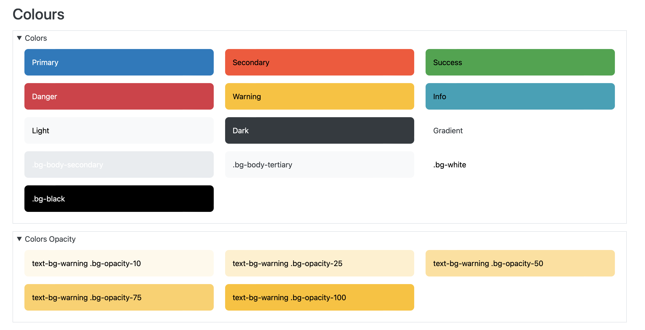
Example 1 - Add colour pallet

This example is based on:
https://getbootstrap.com/docs/5.3/customize/color/#theme-colors
Add the following withing the curly braces of the function you have defined in
the setup (see above). Here we are simply using the `#prefix`
key that renders raw markup and also assigning and passing this as a string to
render the raw markup.
  $content_theme_colours = '<div class="row">

    <div class="col-md-4">
      <div class="p-3 mb-3 text-bg-primary rounded-3">Primary</div>
    </div>

    <div class="col-md-4">
      <div class="p-3 mb-3 text-bg-secondary rounded-3">Secondary</div>
    </div>

    <div class="col-md-4">
      <div class="p-3 mb-3 text-bg-success rounded-3">Success</div>
    </div>

    <div class="col-md-4">
      <div class="p-3 mb-3 text-bg-danger rounded-3">Danger</div>
    </div>

    <div class="col-md-4">
      <div class="p-3 mb-3 text-bg-warning rounded-3">Warning</div>
    </div>

    <div class="col-md-4">
      <div class="p-3 mb-3 text-bg-info rounded-3">Info</div>
    </div>

    <div class="col-md-4">
      <div class="p-3 mb-3 text-bg-light rounded-3">Light</div>
    </div>

    <div class="col-md-4">
      <div class="p-3 mb-3 text-bg-dark rounded-3">Dark</div>
    </div>

  </div>';

  $form['theme_style_guide_colors'] = [
    '#type' => 'details',
    '#title' => t('Colors'),
  ];

  $form['theme_style_guide_colors']['markup'] = [
    '#prefix' => $content_theme_colours,
  ];
Example 2 - Typography (Headings)

This example is based on https://getbootstrap.com/docs/5.3/content/typography/#headings.
Again we are using #prefix to add the required markup.
$content_headings = '<h1>h1. Bootstrap heading</h1>
  <h2>h2. Bootstrap heading</h2>
  <h3>h3. Bootstrap heading</h3>
  <h4>h4. Bootstrap heading</h4>
  <h5>h5. Bootstrap heading</h5>
  <h6>h6. Bootstrap heading</h6>
  <h3>
    Fancy display heading
    <small class="text-body-secondary">With faded secondary text</small>
  </h3>
  <h1 class="display-1">Display 1</h1>
  <h1 class="display-2">Display 2</h1>
  <h1 class="display-3">Display 3</h1>
  <h1 class="display-4">Display 4</h1>
  <h1 class="display-5">Display 5</h1>
  <h1 class="display-6">Display 6</h1>';

  $form['headings'] = [
    '#type' => 'details',
    '#title' => t('Headings'),
    '#group' => 'bootstrap',
  ];

  $form['headings']['markup'] = [
    '#prefix' => $content_headings,
  ];
Example 3 - Form API

Form inputs are sanitised when passing raw html contetn when using form api method such as #prefix. Therefore you will need to recreate them with the form api. This is a great way to explore how form api works in Drupal. This example is based on https://getbootstrap.com/docs/5.3/forms/overview/#overview
$content_form_fieldset_prefix ='<div class="mb-3">';
  $content_form_fieldset_prefix2 ='<div class="mb-3 form-check">';

  $content_form_fieldset_suffix ='</div>';

  $form['forms'] = [
    '#type' => 'details',
    '#title' => t('Forms'),
    '#group' => 'bootstrap',
    '#open' => TRUE,
  ];
  $form['forms']['fieldset'] = [
    '#type' => 'fieldset',
  ];
  $form['forms']['fieldset']['input'] = [
    '#type' => 'email',
    '#title' => t('Email address'),
    '#prefix' => $content_form_fieldset_prefix,
    '#suffix' => $content_form_fieldset_suffix,
    '#attributes' => array('class' => array('form-control'))
  ];
  $form['forms']['fieldset']['password'] = [
    '#type' => 'password',
    '#title' => t('Password'),
    '#prefix' => $content_form_fieldset_prefix,
    '#suffix' => $content_form_fieldset_suffix,
    '#attributes' => array('class' => array('form-control'))
  ];
  $form['forms']['fieldset']['checkbox'] = [
    '#type' => 'checkbox',
    '#title' => t('checkbox with label'),
    '#prefix' => $content_form_fieldset_prefix2,
    '#suffix' => $content_form_fieldset_suffix,
  ];
  $form['forms']['fieldset']['button'] = [
    '#type' => 'button',
    '#title' => t('Submit'),
    '#value' => t('Submit'),
    '#attributes' => array('class' => array('btn', 'btn-primary'))
  ];
Example 4 - Use of Markup class to pass inline styles.
This example overrides utilises Drupal's Markup class to also include a style attribute to override and set css variables. In this example, this allows us to include a style class that would otherwise be sanitised on render.
use \Drupal\Core\Render\Markup;

  $content_links_light_dark = '
<div style="--bb-link-color: #0d6efd; --bb-link-hover-color: #0a58ca;   --bb-link-color-rgb: 13, 110, 253; --bb-link-hover-color-rgb: 10, 88, 202; ">
  <h3>light Link items</h3>
<p><a class="link-opacity-10" href="#">Link opacity 10</a></p>
<p><a class="link-opacity-25" href="#">Link opacity 25</a></p>
<p><a class="link-opacity-50" href="#">Link opacity 50</a></p>
<p><a class="link-opacity-75" href="#">Link opacity 75</a></p>
<p><a class="link-opacity-100" href="#">Link opacity 100</a></p>

<p><a class="link-opacity-hover-10" href="#">Link opacity 10</a></p>
<p><a class="link-opacity-hover-25" href="#">Link opacity 25</a></p>
<p><a class="link-opacity-hover-50" href="#">Link opacity 50</a></p>
<p><a class="link-opacity-hover-75" href="#">Link opacity 75</a></p>
<p><a class="link-opacity-hover-100" href="#">Link opacity 100</a></p>
</div>

<div style="--bb-link-color: #257dfd; --bb-link-hover-color: #5197fd; --bb-link-color-rgb:37, 125, 253; --bb-link-hover-color-rgb:81, 151, 253; ">
  <h3>dark Link items</h3>
  <p><a class="link-opacity-10" href="#">Link opacity 10</a></p>
<p><a class="link-opacity-25" href="#">Link opacity 25</a></p>
<p><a class="link-opacity-50" href="#">Link opacity 50</a></p>
<p><a class="link-opacity-75" href="#">Link opacity 75</a></p>
<p><a class="link-opacity-100" href="#">Link opacity 100</a></p>

<p><a class="link-opacity-hover-10" href="#">Link opacity 10</a></p>
<p><a class="link-opacity-hover-25" href="#">Link opacity 25</a></p>
<p><a class="link-opacity-hover-50" href="#">Link opacity 50</a></p>
<p><a class="link-opacity-hover-75" href="#">Link opacity 75</a></p>
<p><a class="link-opacity-hover-100" href="#">Link opacity 100</a></p>
</div>
';

  $form['content_links_light_dark'] = [
    '#type' => 'details',
    '#title' => t('Content Links Light/Dark'),
    '#group' => 'bootstrap',
  ];

  $form['content_links_light_dark']['markup'] = [
    '#markup' => Markup::create($content_links_light_dark)
  ];

Example 5 - Use of Markup class to render buttons and input tags
This is likely to vary some what from Drupal handles things, but still can be useful to see how elements and components should look and behave.
use \Drupal\Core\Render\Markup;

$content_forms_bs_legend = '<form>
  <fieldset>
    <legend>Legend</legend>
    <div class="form-group row">
      <label for="staticEmail" class="col-sm-2 col-form-label">Email</label>
      <div class="col-sm-10">
        <input type="text" readonly="" class="form-control-plaintext" id="staticEmail" value="email@example.com">
      </div>
    </div>
    <div class="form-group">
      <label for="exampleInputEmail1" class="form-label mt-4">Email address</label>
      <input type="email" class="form-control" id="exampleInputEmail1" aria-describedby="emailHelp" placeholder="Enter email">
      <small id="emailHelp" class="form-text text-muted">We\'ll never share your email with anyone else.</small>
    </div>
    <div class="form-group">
      <label for="exampleInputPassword1" class="form-label mt-4">Password</label>
      <input type="password" class="form-control" id="exampleInputPassword1" placeholder="Password" autocomplete="off">
    </div>
    <div class="form-group">
      <label for="exampleSelect1" class="form-label mt-4">Example select</label>
      <select class="form-select" id="exampleSelect1">
        <option>1</option>
        <option>2</option>
        <option>3</option>
        <option>4</option>
        <option>5</option>
      </select>
    </div>
    <div class="form-group">
      <label for="exampleSelect1" class="form-label mt-4">Example disabled select</label>
      <select class="form-select" id="exampleDisabledSelect1" disabled="">
        <option>1</option>
        <option>2</option>
        <option>3</option>
        <option>4</option>
        <option>5</option>
      </select>
    </div>
    <div class="form-group">
      <label for="exampleSelect2" class="form-label mt-4">Example multiple select</label>
      <select multiple="" class="form-select" id="exampleSelect2">
        <option>1</option>
        <option>2</option>
        <option>3</option>
        <option>4</option>
        <option>5</option>
      </select>
    </div>
    <div class="form-group">
      <label for="exampleTextarea" class="form-label mt-4">Example textarea</label>
      <textarea class="form-control" id="exampleTextarea" rows="3"></textarea>
    </div>
    <div class="form-group">
      <label for="formFile" class="form-label mt-4">Default file input example</label>
      <input class="form-control" type="file" id="formFile">
    </div>
    <fieldset class="form-group">
      <legend class="mt-4">Radio buttons</legend>
      <div class="form-check">
        <input class="form-check-input" type="radio" name="optionsRadios" id="optionsRadios1" value="option1" checked="">
        <label class="form-check-label" for="optionsRadios1">
          Option one is this and that—be sure to include why it\'s great
        </label>
      </div>
      <div class="form-check">
        <input class="form-check-input" type="radio" name="optionsRadios" id="optionsRadios2" value="option2">
        <label class="form-check-label" for="optionsRadios2">
          Option two can be something else and selecting it will deselect option one
        </label>
      </div>
      <div class="form-check disabled">
        <input class="form-check-input" type="radio" name="optionsRadios" id="optionsRadios3" value="option3" disabled="">
        <label class="form-check-label" for="optionsRadios3">
          Option three is disabled
        </label>
      </div>
    </fieldset>
    <fieldset class="form-group">
      <legend class="mt-4">Checkboxes</legend>
      <div class="form-check">
        <input class="form-check-input" type="checkbox" value="" id="flexCheckDefault">
        <label class="form-check-label" for="flexCheckDefault">
          Default checkbox
        </label>
      </div>
      <div class="form-check">
        <input class="form-check-input" type="checkbox" value="" id="flexCheckChecked" checked="">
        <label class="form-check-label" for="flexCheckChecked">
          Checked checkbox
        </label>
      </div>
    </fieldset>
    <fieldset class="form-group">
      <legend class="mt-4">Switches</legend>
      <div class="form-check form-switch">
        <input class="form-check-input" type="checkbox" id="flexSwitchCheckDefault">
        <label class="form-check-label" for="flexSwitchCheckDefault">Default switch checkbox input</label>
      </div>
      <div class="form-check form-switch">
        <input class="form-check-input" type="checkbox" id="flexSwitchCheckChecked" checked="">
        <label class="form-check-label" for="flexSwitchCheckChecked">Checked switch checkbox input</label>
      </div>
    </fieldset>
    <fieldset class="form-group">
      <legend class="mt-4">Ranges</legend>
        <label for="customRange1" class="form-label">Example range</label>
        <input type="range" class="form-range" id="customRange1">
        <label for="disabledRange" class="form-label">Disabled range</label>
        <input type="range" class="form-range" id="disabledRange" disabled="">
        <label for="customRange3" class="form-label">Example range</label>
        <input type="range" class="form-range" min="0" max="5" step="0.5" id="customRange3">
    </fieldset>
    <button type="submit" class="btn btn-primary">Submit</button>
  </fieldset>
</form>';

  $form['forms_bs_legend'] = [
    '#type' => 'details',
    '#title' => t('Forms BS legend'),
    '#group' => 'bootstrap',
  ];

  $form['forms_bs_legend']['markup'] = [
    '#markup' => Markup::create($content_forms_bs_legend),
  ];
Additional Requirements
Custom theme.

Similar projects
https://www.drupal.org/project/styleguide provides a provides a visual testing page for Drupal themes. Quickly compare the display of common elements across your themes, and verify that your new theme addresses all common style elements.
| Attachment | Size |
|---|---|
| Colour Pallet | 519.61 KB |
| Colour swatch | 575.64 KB |
| Typographic Styles | 442 KB |
| Headings and Pills | 278.5 KB |
| Forms | 118.48 KB |
| Tables | 336.24 KB |
| Colour swatch default | 237.97 KB |
Project information
 1 site reports using this module
- Created by 2dareis2do on , updated
 This project is not covered by the security advisory policy.
Use at your own risk! It may have publicly disclosed vulnerabilities.

