


This project is not covered by Drupal’s security advisory policy.
Sub theme of the twitter bootstrap theme providing a number of enhancements.
Installation Instructions
- Install the bootstrap base theme and the strapped themes via drush.
drush dl bootstrap strapped - Install the bootstrap SASS library via drush
drush en library_pack
drush make sites/all/modules/contrib/library_pack/libraries/bootstrap-sass/bootstrap-sass.make --no-core - Install jQuery Update via drush
drush en jquery_update - Copy the starter kit sub-theme 'strapped_subtheme' into sites/all/themes or a respective
sites/*/themesfolder. Once copied, rename the folder to something of your choosing:my_theme. Then make sure you rename the bootstrap_subtheme.info.starterkit file to match the folder name, like:my_theme.info. Be sure to change the name and description properties inside the file as well.
Properties
Use the list below to jump to the required property definition.
#form_type, #title_grid, #element_grid, #title_tooltip, #suffix_tooltip, #prefix_tooltip, #element_columns, #form_type_wrapper, #form_group_wrapper, #form_field_wrapper, #element_inline
#form_type
Used by: All elements
Description: Specify the type of form to be used for the element see http://getbootstrap.com/css/#forms
Values: 'basic', 'horizontal', 'inline'
#title_grid / #element_grid
Used by: All elements
Description: Allows the developer full control to set the grid classes for a field's LABEL and a field's INPUT ELEMENT respectively as per http://getbootstrap.com/css/#grid
Usage Example:
   $form['example_textfield'] = array(
         '#title' => t('Example'),
         '#form_type' => 'horizontal',
         '#title_grid' => array(
             'columns' => array(
                 'md' => 3
             ),
         );
         '#element_grid' => array(
             'columns' => array(
                 'md' => 9
             ),
         );
   );
#title_grid['columns'] / #element_grid['columns']
Description: Specify the column class to apply to the title/element for each of bootstrap's breakpoints.
Values: Array
Possible keys: 'xs', 'sm', 'md', 'lg'
#title_grid['offset'] / #element_grid['offset']
Description: Specify the amount of columns to indent/offset the element for each of bootstrap's breakpoints.
Values: Array
Possible keys: 'xs', 'sm', 'md', 'lg'
#title_grid['push'] / #element_grid['push']
Description: Specify the ordering of the element for each of bootstrap's breakpoints.
Values: Array
Possible keys: 'xs', 'sm', 'md', 'lg'
#title_grid['pull'] / #element_grid['pull']
Description: Specify the ordering of the element for each of bootstrap's breakpoints.
Values: Array
Possible keys: 'xs', 'sm', 'md', 'lg'
#form_type_wrapper
Used by: All elements
Description: By default form elements have a wrapper element with a class denoting the type of form being rendered i.e. 'form-inline', 'form-horizontal' or 'form-basic'. This property allows this wrapper to be excluded from the markup completely.
Values: TRUE, FALSE
#form_group_wrapper
Used by: All elements
Description: By default form elements have a wrapper element with a class of .form-group this property allows you to exclude it if required.
Values: TRUE, FALSE
#form_field_wrapper
Used by: All elements
Description: By default form elements have a field wrapper that contains all of drupal's default filed classes, this property allows that wrapper to be excluded.
Values: TRUE, FALSE
#prefix_tooltip
Used by: All elements
Description: Prepend tooltip to the input element
Usage Example:
    $form['contact'] = array(
        '#title' => t('Contact name'),
        '#prefix_tooltip' => t('This is a prefix tooltip'),
    );

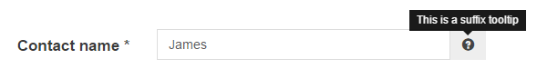
#suffix_tooltip
Used by: Textfield
Description: Append a tooltip to the input element
Usage Example:
    $form['contact'] = array(
        '#title' => t('Contact name'),
        '#suffix_tooltip' => t('This is a suffix tooltip'),
    );
#element_columns
Used by: checkboxes, radios
Description: Use to arrange checkboxes in multiple columns in horizontal form types.
Usage Example:
    $form['checkboxes'] = array(
        '#title' => t('Checkboxes'),
        '#form_type' => 'horizontal',
        '#title_grid' => array(
             'columns' => array(
                'md' => '4'
            ),
        ),
        '#element_grid' =>  array(
             'columns' => array(
                'md' => '8'
            ),
        ),
        '#element_columns' => 3,
    );

Project information
 2 sites report using this theme
- Created by rob holmes on , updated
 This project is not covered by the security advisory policy.
Use at your own risk! It may have publicly disclosed vulnerabilities.


