
 Come together with the global Drupal community in Rotterdam, 28 Sept – 1 Oct 2026. Sessions, contribution, connection, and Early Bird savings until 8 June.
Overview
Mobilizer provides a fast and easy way to create a mobile version of your Drupal 7 website no matter how large or complex it is today. Mobilizer’s easy-to-use GUI makes it simple to customize the layout, add color scheme and prioritize content for a more appealing mobile look.
How it works
- Download the module, then enable and configure it through Drupal’s admin screen.
- Start Mobilizer. Its intuitive GUI enables you to simply point and click to generate a superior mobile customer experience.
- Mobilizer works for any Drupal 7 based website.
- Your new mobile website will support any mobile device such as iPhone, Android, Blackberry, and Symbian on any browser and any screen resolution.
Features
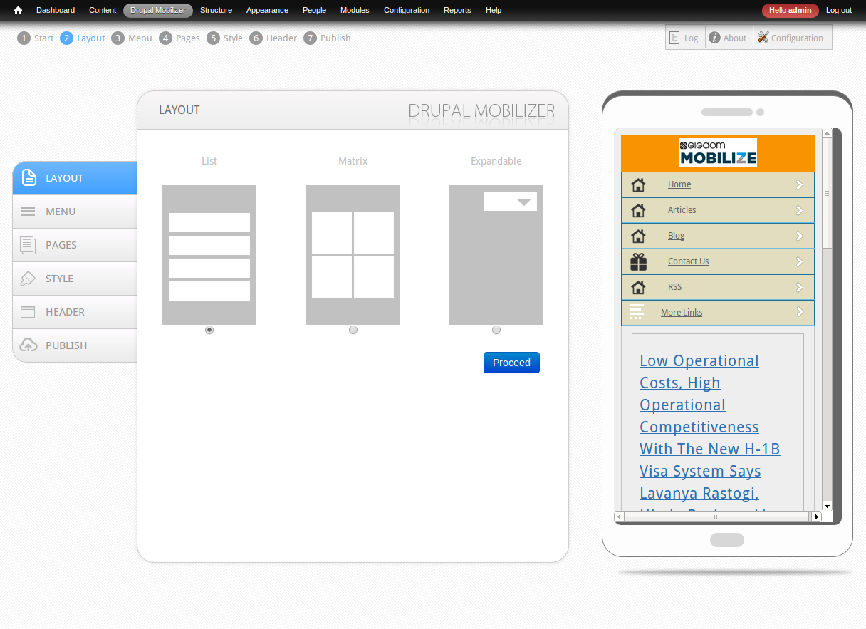
Layout: You can design your mobile website in three different layouts: List, Matrix, and Expandable.
Menu: Enable and edit elements that you like to show in your mobile website. You can show as few menu items as you want, and as many as make sense in your mobile version.
Edit Menu: It gives enormous capability to easily select and adjust page elements, change menu titles, and pick your favorite menu icons— all with just a mouse click. You can also add new pages to your mobile website with the option of in-line editing.
Pages:Manage imported pages from the selected menu system or create new page with the existing options.
Style: Apply different color schemes to your mobile website. Choose your favorite text color, associated link color, font size, and font type to give your website a more appealing look. Plus, you can also set your background image choice. This can be a big help in supporting your branding goals.
Header: Adjust header type, set header image and just scroll to adjust the width. There is also, a left, center and right align option. Just define your important elements, start Mobilizer, and you’re done in minutes!
There is a lot more you can do with Mobilizer:
Add Google Maps to help users find your location and Click-to-Call buttons so that your customers can reach you instantly
Include your social media icons to increase customer interaction and brand loyalty from any mobile device
Enables you to keep one URL for all web, and mobile devices. No m-dot sites or annoying redirects… it just gives your customers a fantastic experience.
Limitations
- Mobilizer admin interface may appear jittery if overlay module is installed.
- Mobilizer admin interface may appear jittery if admin theme is not “seven”.
- Parent menu items are utilized for creating mobile theme menu. Child items are ignored currently.
- Primary links, Navigations, Management, User menu are ignored.
- Earlier defined width, margin, padding is ignored while creating new css.
- Module is currently not usable if all menu items are present only in Primary links, Navigations. This is to be taken care of in future releases.
- Sliders, Image galleries may not work as is.
- Images which are larger than device width will be discarded.
- Page level cache should not be on.
- Following css tags are being reutilized from web theme:
- head, header, body, h1, h2, h3, h4, h5, h6, p, a, a:link, a:visited, a:hover, a:active, ul, ol, ul.menu, ul.menu li, img, a img, table, thead, th, th a:link, td, tr.even, tr.odd, tbody th, tr.info
- ul.main-menu, ul.main-menu li, ul.main-menu li a, ul.secondary-menu, ul.secondary-menu li, ul.secondarymenu li a, ul.primary, ul.primary li, ul.primary li a, ul.secondary, ul.secondary li, ul.secondary li a
Sponsored By : OSSCube
Developers : Bhupendra Singh, Brajendra Singh, Deepak Bhardwaj, Pankaj Chauhan, Rajesh Saini, Ratnesh Kumar
Project information
 53 sites report using this module
- Created by vineet.osscube on , updated
 Stable releases for this project are covered by the security advisory policy.
There are currently no supported stable releases.
