
Closed (fixed)
Project:
Footheme
Version:
7.x-3.0-rc1
Component:
User interface
Priority:
Normal
Category:
Support request
Assigned:
Unassigned
Reporter:
Created:
27 Feb 2015 at 16:20 UTC
Updated:
21 Jan 2016 at 06:00 UTC
Jump to comment: Most recent, Most recent file

Comments
Comment #1
Jeff Burnz commentedThe CSS has an error, a space between 280 and px, it should be 280px.
Please consider using percentages or media queries to account for mobile/smaller screen widths, locking the width using pixels is not going to look good in mobile/smaller screens.
Comment #2
aflores3 commentedThanks for the reply, Jeff.
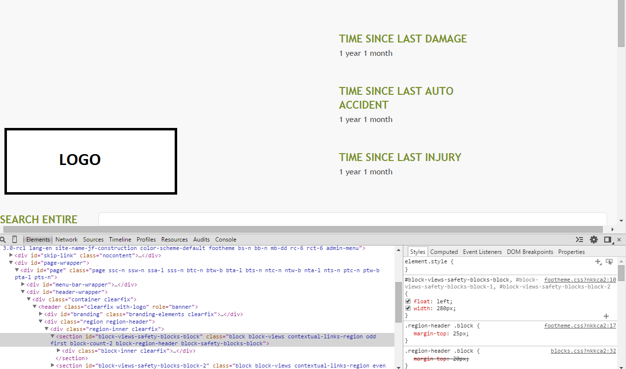
I made the changes to the width, but I'm still having the blocks line up on top of each other.
I've attached a screenshot. Maybe you can see if I'm missing something.
Comment #3
Jeff Burnz commentedThe blocks don't appear to have 280 pixels available to site beside each other, in other words they won't fit at that width, hence why use percentages, smaller heading font size etc.
The actual region-header and #branding are 50%, you could make this split suit you better, say 25/75.
Comment #4
saurabh.dhariwal commented- Please define parent div width.
- For this you can apply below css:
float: left;
display: inline-block;
width: 100%;
max-width: 840px;
- You can also use width directly but it's not good way for responsive.
now you can add your css
#block-views-block-name-block,
#block-views-block-name-block-1,
#block-views-block-name-block-2, {
float: left;
width: 280px;
}
Let me know if any further query for the same.
Thanks!
Comment #5
Jeff Burnz commented#4 this is not necessary for a modern browser, in the old days we did tricks like this especially for IE6/7 when using RTL mode, but today you simply don't need to float the parent and certainly not set display: inline which was an old school way of working around a has-layout bug in IE.