
Closed (won't fix)
Project:
Drupal core
Version:
7.x-dev
Component:
Bartik theme
Priority:
Normal
Category:
Bug report
Assigned:
Unassigned
Reporter:
Created:
9 Jul 2010 at 18:37 UTC
Updated:
19 Jul 2010 at 02:48 UTC
Jump to comment: Most recent, Most recent file

Comments
Comment #1
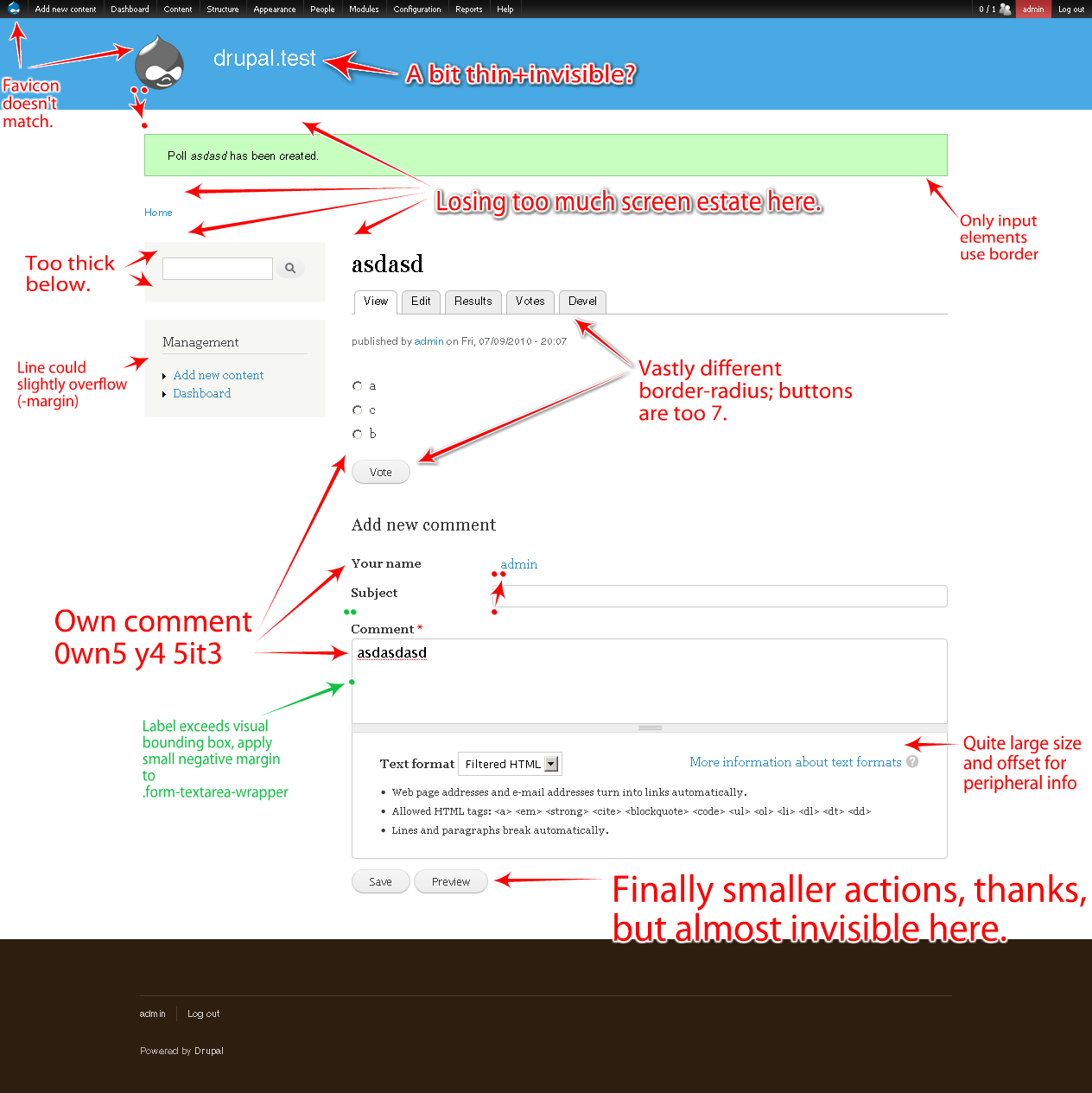
mikey_p commentedA couple of the items don't make much sense to me. Could you are further comments for "Own comment owns y4 5it3" and "finally smaller actions, thanks, but almost invisible" ?
Comment #2
sun:) Sure thing. Those two:
- The font size in input elements is very very large; looks and feels like entering a page heading, not like a comment.
- The form actions (buttons) are smaller than everything else. Thankfully, they are not as giant as in Seven and other things I've seen just recently. But when comparing the overall button size + button font size to other elements on this page in Bartik, the form buttons are not very visible.
Comment #3
webchickSorry, the time for making design reviews to this theme was during the 6 months of its development, and well before it became RTBC. Pushing to Drupal 8.
Comment #4
jensimmons commentedPlease no more killing kittens.
I just spent 2 hours breaking up a 23-item list of code concerns into separate issues; I'm not going to break up any more. Design and theme items need to be broken out into separate issues by the person reporting them, just like anything else in core. I know it takes longer, but that's the only way we can discuss or take action on these ideas.
Comment #5
sunSince, according to webchick in #3, Bartik's stylesheet seems to be set in stone for D7 anyway, and these annotations cannot be fixed later, this issue effectively is by design.
Comment #6
sunBut anyway. Continuing:
I would additionally highly recommend to download + install my markup_test module from http://drupalcode.org/viewvc/drupal/contributions/sandbox/sun/markup_test - as that reveals quite a lot more styling bugs (and also allows to quickly compare with other enabled themes).
Comment #7
sunuhum... also, when comparing that new screenshot with the first, it seems like only the comment form gets rounded corners on form input elements? :) (closely looking at the search box further manifests this)
Comment #8
sunAs mentioned over in #690980: Disabled form elements not properly rendered, disabled form buttons look and behave like enabled ones in Bartik. (visible in screenshot in #6 -- all buttons at the end are #disabled)
Comment #9
sunI wanted to ignore this issue as I don't use any core theme in the first place, but I'm sick of people complaining about Drupal's look out of the box. This happens to be the new default theme.
Comment #10
cweagansI don't see why making little tweaks is a problem. Yes, large changes are probably not good at this point, but the concerns voiced by sun are valid ones. As he said, this is our new default core theme and any concerns with it should be addressed, instead of just saying no and bumping the version.
-The favicon is easy to change. Piece of cake.
-The title font is really slim. Can we put font-weight: bold; on it or something?
-I think the space above $messages is needed, but some of the other space can be compacted (such as above and below the breadcrumb)
-Could we make the search block have no background? I think that would look better. If not, yeah, the padding should probably be reduced.
-The messages look sorta bad without a border. I think that should stay. Just sayin'.
-I think the border-radius thing is a non-issue. Not that big of deal, and I think it looks good.
-The alignment issues...well, that's a no brainer.
Comment #11
webchick1. Because it never ends. Literally. Never.
2. Because every single person has different opinions about the design, such as "The messages look sorta bad without a border."
3. Because these sorts of "meta" issues that are collections of random associated feedback are not remotely actionable. Imagine a bug report against Drupal that combined complaints about whitespace in the DBTNG test function with a typo in tracker.module causing it to fatal error somewhere, with a request to add a new permission to system module.
If you find something that's legitimately a bug with the design (for example, sun's "Stray offset?" above looks like it probably qualifies), then please file a bug report for it. The Bartik maintainers can make a judgment call on whether it's fixable in D7. If you have suggestions for how the design might look better, please file a feature request for it. Since code in HEAD is closed for new features, these get tagged as Drupal 8.
I guess that makes this issue more aptly "won't fix", so adjusting status accordingly.
Comment #12
sunkkkkkk? I was just trying to help and contribute something useful.
♥Speaking of "actionable tasks", I guess a full review + quite large fix of all kind of form elements, disabled and/or stacked, in fieldsets, collapsible or not, via the markup_test module already mentioned earlier, would be such a focused task.
Which would leave us with one other issue to fix the message spacing, search block spacing, and overall header/layout alignment.
Comment #13
webchickLOL. :) ♥ u ☀ :D
Yes, those both sound like reasonable starting points for issues. The spacing one feels a little too kitten-killerish, but we can start there and see how it goes.
Comment #14
jensimmons commentedMy problem with this issue is not the ideas being raised (or at least not all of them) — but with the fact they are all being raised in one issue. Many of these (most?) have been put in separate issues, already anyway.
I know it must be weird for people who are used to Drupal core development being all about PHP and SQL.... but CSS / HTML / UX / design issues are just as important, and need to be handled in the same way as everything else in core. File each one as a separate issue, please. AFTER having looked through the queue to see if the issue has already been raised. (Cause it probably has been, and you can add your ideas / report there.)
Webchick said it well:
Have respect. Follow the same process as you would for other components.
Don't kill the kittens == don't put a pile of stuff into one issue, thinking it will all be fixed in one giant patch. We can't do anything with a giant pile of ideas. And therefore, everything raised in this issue is going to be ignored, until each one is moved to a more appropriate place.