

 Come together with the global Drupal community in Rotterdam, 28 Sept – 1 Oct 2026. Sessions, contribution, connection, and Early Bird savings until 8 June.
Problem/Motivation
The CSS classes for disabled buttons were changed in #1986074: Buttons style update
-    $element['#attributes']['class'][] = 'form-button-disabled';
+    $element['#attributes']['class'][] = 'is-disabled';
...
-    $element['#attributes']['class'][] = 'image-button-disabled';
+    $element['#attributes']['class'][] = 'is-disabled';
...but the bartik CSS it's still using the old CSS classes.
Plus: We have dropped the IE 6/7/8 suport so we don't need anymore the -ms-filter in our CSS
Proposed resolution
We need to replace the old CSS classes in Bartik theme with 'is-disabled'
These styles should be located in buttons.css, not in form.css
Remaining tasks
None
User interface changes
None
API changes
None
Original report by @username
None
| Comment | File | Size | Author |
|---|---|---|---|
| #32 | bartik-disabled-buttons-2400863-32.patch | 1.66 KB | betovarg |









Comments
Comment #1
oriol_e9gComment #2
oriol_e9gComment #3
oriol_e9gSorry, If we are strict we can also remove "filter", IE9 supports opacity.
http://caniuse.com/#search=opacity
Comment #4
oriol_e9gComment #5
nod_"ie8" is an actual tag to help out IE8 module :)
Comment #6
idebr commented@oriol_e9g I was trying to test this issue, but I was unable to find any references to this class. It appears the css class should have been converted to 'image-button.is-disabled' earlier in issue #1986074: Buttons style update, but it never was.
Comment #7
oriol_e9gYou are correct, actually this style is never used.
We have changed the CSS class in #1986074: Buttons style update(https://www.drupal.org/files/issues/seven_buttons_1986074_109.patch)
We can remove the filter and fix the bug.
Comment #8
oriol_e9gOh! I have found the same problem with dissabled buttons, new patch.
Comment #9
oriol_e9gComment #10
emma.mariaOh the issue for this existed already here #1282982: Clean up CSS for buttons in Bartik, but as this one is defined so nicely and has patches to review I will close the other one.
Comment #11
lewisnymanThe code looks good, is there a page or use case we can use to make sure this works?
Comment #12
idebr commented@LewisNyman The only 'image-button' currently in core is the cogwheel on the Field UI. I am not aware of any way to make this button disabled.
@oriol_e9g The classes apply correctly, but the styling suggests there is still an action available. See this screen capture for illustration:

Can you reset the cursor and background-color to its default for disabled buttons? For an example see seven/components/buttons.theme.css:
Obligatory screenshots:
Buttons before:
Buttons after:
Comment #13
lewisnymanAh yes, that will do. These styles should be located in
buttons.css, not inform.cssComment #14
macmladen commentedComment #15
macmladen commentedI will try to resolve this issue by checking what is the current state of this issue in current repository of Drupal 8.0.x for the Drupal global Sprint Weekend 17.01.2015.
First, by searching though whole Drupal 8.x project, it seems that initial post still holds,
form-button-disabledis in Bartik, so it is not referenced anyhere (except if, maybe somehow constructed in code somewhere) — therefore, I can pretty safely assume that CSS may be changed to accommodate new classis-disabledis-disableddoes look more like active test than as state, there isdisabledclass in theme seven but not anywhere else and it is used in parallel withis-disabledin themesevenjust to be safe — this could maybe be adopted inis-disabledappears in following files so it would not be much of a hassle to standardize ondisabledwhich makes more sense to me (but that is the case for reopening #1986074: Buttons style update:Comment #16
idebr commentedComment #17
macmladen commentedI've checked things and done what LewisNyman suggested, moved buttons from
form.csstobuttons.cssso it seems to me it can be tested and committed.Comment #18
idebr commentedThe curly bracket can go on the line with the last selector:
.button.is-disabled: focus {The last 3 selectors are superfluous as they don't override any existing properties
Comment #19
macmladen commentedYou are right, also in
form.cssthere was curly bracket left on next line, both corrected, added background (if I understood well?)Comment #20
macmladen commentedComment #21
idebr commentedThese selectors can still be removed :)
Sorry, I was being unclear. By background reset I mean the item should have no background, eg.
background: none.The cursor property is no longer necessary, since the remaining selectors have no css property for cursor.
Comment #22
macmladen commentedI'm a bit harder to follow but I'll assume I got it right this time :)
Comment #23
lewisnymanWe are affecting all buttons here, I don't think this is an intentional change
Idebr mentioned before that these could be removed
I think we always add a 0 to the beginning of these decimal points
Comment #24
macmladen commentedWith #3 I agree completely, I've missed that out.
As for #2, Idebr didn't say about that specifically but seems logical to remove if the same for image button was removed.
But for #1 I am not so sure. It is affecting but whole selector is affecting and it does make sense as it signifies the change of the state so it should be left there. IF you look at the previous selector in the file
.butonit is very logical that next one (the one you argue in #1) is dealing with states.Can you be more specific with some example why this shouldn't be?
Comment #25
idebr commentedIt appears I was very unclear, terribly sorry about that :(
The background: none should applied to image-button.is-disabled to prevent the background-color from appearing on disabled image-buttons (see the behavior in #8 for reference)
Comment #26
macmladen commentedOK, dear friends I hope this one will fix everything and satisfy everyone :)
First,
background: nonedoesn't clear the assigned color so we needtransparentto override assigned colors.On the other hand I haven't seen how could I make cog or button appear as disabled so I fabricated in browser to simulate and check behavior.
I hope I understood what you all said and made the right patch. This should be fixed and we should move on to more important tasks so let us all make an effort and conclude this ASAP so please be constructive as much as possible with comments and lets close this once,
Comment #27
emma.mariaI tested the current patch and noticed the following things.
There is a double ;; after transparent.
Comment #28
emma.mariaComment #29
macmladen commentedI've rechecked and bit optimized CSS here with disabled buttons.
Please: how do you make those animated screen capture?
Comment #30
emma.mariaWhy did you change these styles? Can you put this back as normal 'a' element links that have the class button need these styles on hover etc.

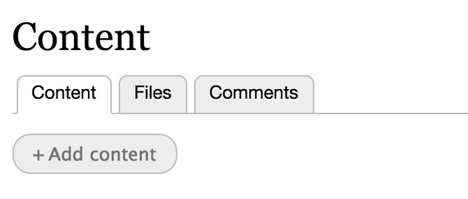
See this example on the admin/content page....
Otherwise the disabled button styles now work great, see latest gif below...
Comment #31
betovargComment #32
betovargFixed background color for hover, active and focus states for buttons, as said on comment #30.
Comment #33
alex-arriaga commentedTesting "+Add content button
1) I visited /admin/content to test the new CSS class.
2) I simulated the disabled state of the button adding the class using Chrome Dev Tools. Please, see next code:
3) Following images are tests I did.
Add content enabled
Add content enabled / hover
Add content disabled
Add content disabled / hover
Testing "Save and Publish" button
1) I went to this path to review the new "is-disabled" class: /node/add/article
2) In the Chrome Dev Tools I added the CSS class to simulate the expected behaviour. Please, see following line:
3) Following images show the manual tests I did.
Save and publish enabled
Save and publish hover
Comment #34
mherchelComment #35
yesct commentedlooks like need the disabled screenshot also (for the preview example)
Comment #36
idebr commentedBeautiful! +1
Comment #37
jclema commentedComment #38
betovargHere is an interdiff between the patches on #29 and #32.
Comment #39
alex-arriaga commentedTesting "+Add content" button
1) I visited /admin/content to test the new CSS class.
2) I simulated the disabled state of the button adding the class using Chrome Dev Tools. Please, see next code:
3) Following images are tests I did.
Add content enabled
Add content enabled / hover
Add content disabled
Add content disabled / hover
Testing "Save and Publish" button
1) I went to this path to review the new "is-disabled" class: /node/add/article
2) In the Chrome Dev Tools I added the CSS class to simulate the expected behaviour. Please, see following line:
3) Following images show the manual tests I did.
Save and publish enabled
Save and publish enabled / hover
Save and publish disabled
Save and publish disabled / hover
Testing "Preview" button
1) I went to this path to review the new "is-disabled" class: /node/add/article
2) In the Chrome Dev Tools I added the CSS class to simulate the expected behaviour. Please, see following line:
3) Following images show the manual tests I did.
Preview enabled
Preview enabled / hover
Preview disabled
Preview disabled / hover
Comment #40
yesct commentedI'm not clear on why this is a bug.
If it is a task, a beta evaluation would be super.
https://www.drupal.org/core/beta-changes
Comment #41
emma.mariaI have looked at the screenshots in #27 and #39 and compared them with head. None of the elements affected by this work are visually different between head and the patch in #32. The code for this work is all CSS code which has been placed in the correct files and meet coding standards. Buttons are functioning correctly when disabled. Plus we checked other states that may have been affected by this work, this is shown in the screenshots in #39. RTBC++
Comment #42
emma.mariaComment #44
dries commentedThank you! Committed at the code sprint in Bogota.
Comment #45
emma.maria