




Overview
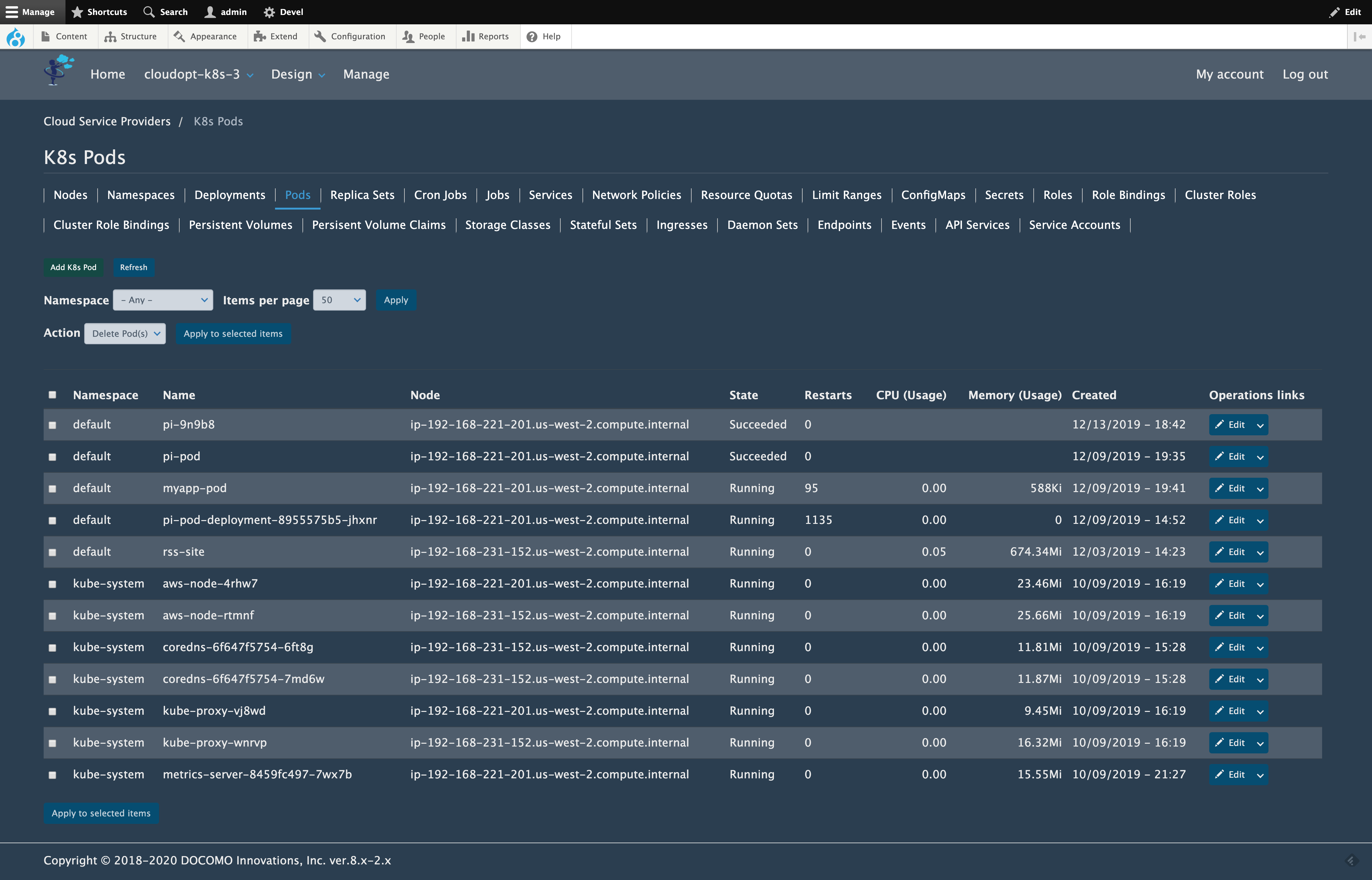
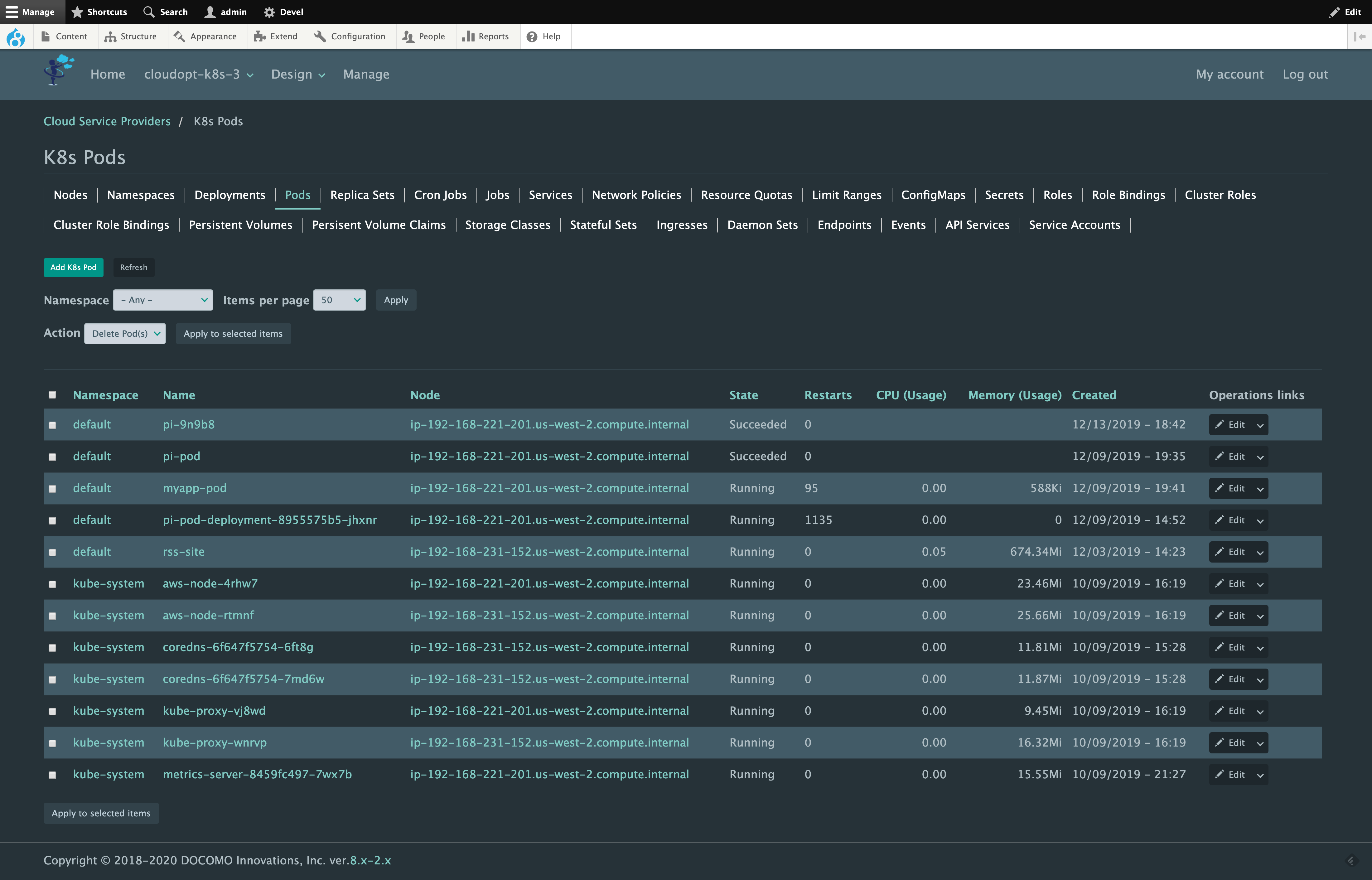
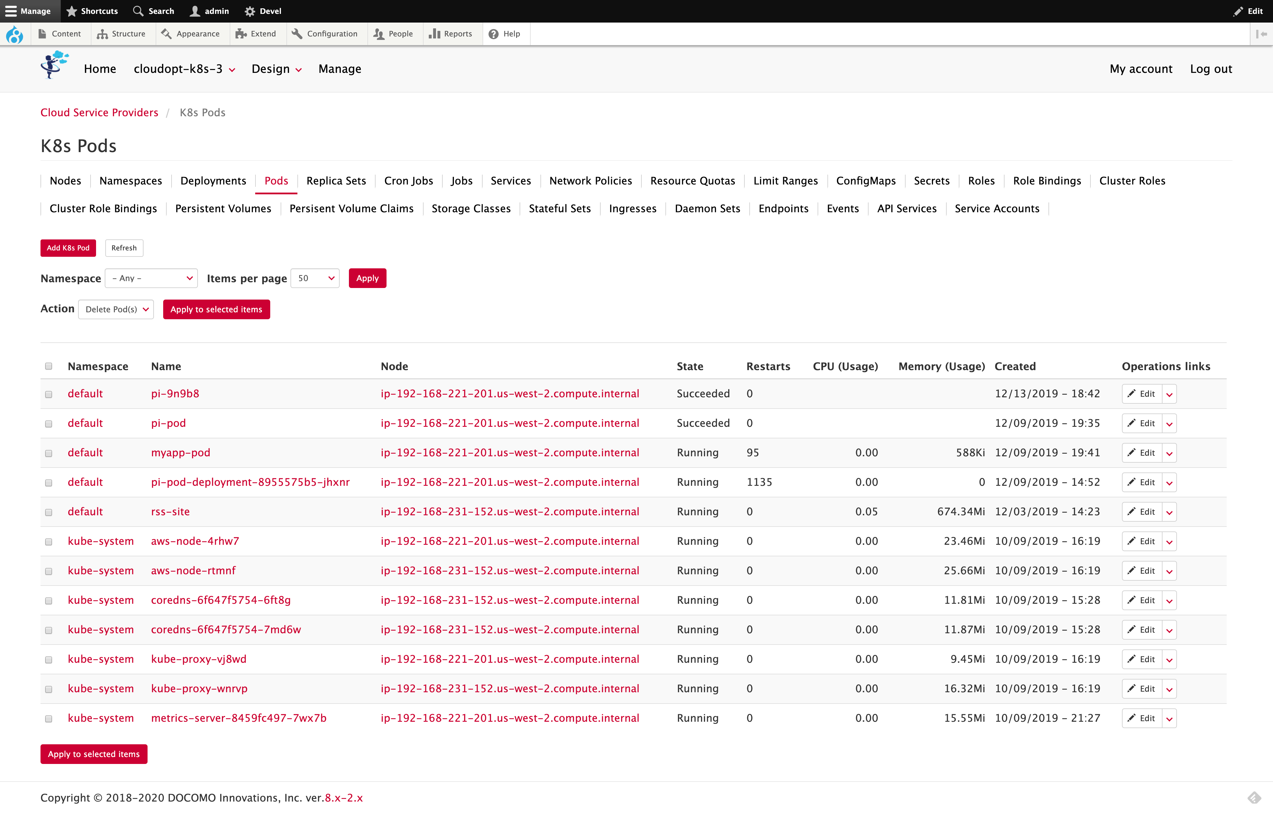
Bootstrap Cloud is a Bootstrap 5 sub-theme designed for the Cloud module. It combines responsive navigation, seven visual variants, and configurable typography for cloud management interfaces and other Drupal sites. The Cloud module is not a required dependency.
Features
- Seven visual variants:
- Configurable typography: font family, five font sizes, and six line-spacing options, including control of table row height.
- Bootstrap 5 navigation: responsive menus with improved resizing behavior and an opaque fixed navigation bar in the Pixie Dark variant.
- Views mini-pagers: horizontal previous and next controls without list bullets, with consistent borders across variants.
- Vanilla JavaScript: theme scripts use Drupal behaviors without declaring a jQuery dependency. Other parts of a Drupal site may still use jQuery.
Live examples
- i Services uses Bootstrap Cloud in production.
- Pixie Dark variants in production: These sites use the related Pixie Dark theme project.
Documentation and support
Read the Bootstrap Cloud documentation for installation, configuration, block placement, JavaScript customization, updates, and troubleshooting.
Report bugs and request improvements in the issue queue. Include the theme and Drupal versions, selected variant, and steps to reproduce the problem.
Installation
- In your Drupal project directory, run:
composer require 'drupal/bootstrap_cloud:^7.1' - Go to Appearance and install Bootstrap for Cloud as the default theme.
- Open the theme's Settings page and choose the visual variant, font family, font size, and line spacing.
Requirements
- Drupal core
^10.6 || ^11.3. - The Bootstrap5 base theme,
^4, installed automatically by Composer.
Supporting organizations:
Project information
- Ecosystem: Cloud, Cloud Orchestrator, Rigel, Copyright Footer, Façade, Pixie Dark
 14 sites report using this theme
- Created by yas on , updated
 Stable releases for this project are covered by the security advisory policy.
Look for the shield icon below.


