As part of the ongoing fundraising efforts, the Drupal Association recently added affiliate blocks to http://drupal.org/hosting and http://drupal.org/paid-services
We would like to make sure that they "fit" with the design of Drupal.org in general, that they are visible enough to be valuable, but not so visible as to be distracting. Some feedback on them so far (in no particular order)
1) Move it above the page title when on a node view so that it doesn't appear like it is part of their content
2) Left align the block title
3) make the block background white (and perhaps more than just the background, like the header and borders) to make it blend/fade a bit more with the page content
4) make the header smaller and perhaps the body text smaller.
5) use something like h3 or h4 for the title instead of h2
6) perhaps remove the second sentence to reduce the height of the add
7) Alternate suggestion - use the same mechanism the front page uses for the 3 blocks at the top, but don't go over the nav bar.
So there's a small (fixed height) logo mentioning it's an add, with a link to find out more and then the ad (that stretches).
More suggestions or +1/-1 on these ideas are very welcome here. As is css/template code to fix it (once we've decided).


Comments
Comment #1
drummI can implement changes. A graphical mock-up needs to be made so we can see and agree on the changes.
Comment #2
femrich commentedI think the affiliate blocks (adverts) need to be clearly segregated from user (editorial) content. The current layout not only places the ad at the top of the content region, but actually individual entries by placing them between the head and the body.
I won't go into why this is a problem, as I think it's pretty obvious and I've gone into it elsewhere. Let me just suggest:
1) Ads should be clearly differentiated from content, both in terms of design and in terms of placement.
2) The content area should be for user content only, not for ads.
3) Ad blocks should go in sidebars, preferably, and given prominence in the sidebar relative to their contribution.
4) If a sidebar absolutely is not prominent enough (though I think it is), a different region for affiliate blocks must, must, must be clearly separate from content. In other words, above the page title is not much of an improvement unless there is a border, different width, or something else to set content apart from the advert region.
Just my $0.02...
Comment #3
JohnForsythe commentedI strongly second the suggestions listed in reply #2.
--
John Forsythe
Comment #4
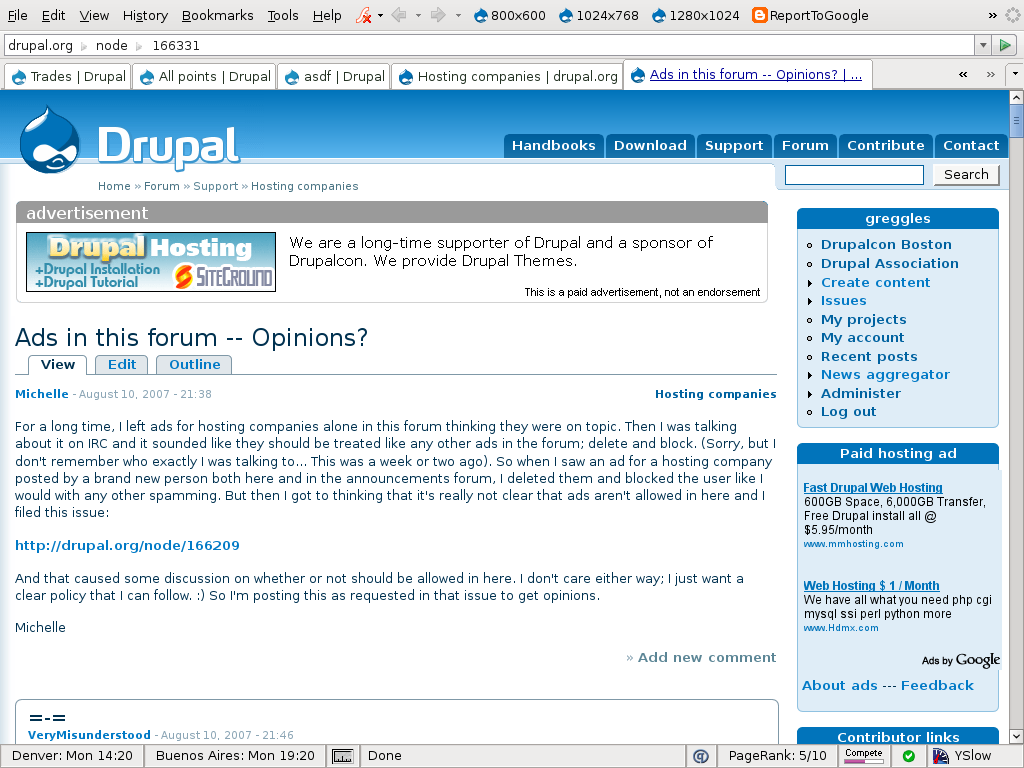
michelleI've been finding the ads rather jarring having them right in the post like that. I just assumed it was designed to be in your face as ads tend to be. At least they're just on the hosting forum. I'm not against ads on d.o or anything but I do hope they don't eventually find their way into all content like that.
Michelle
Comment #5
gregglesThanks for the feedback everyone.
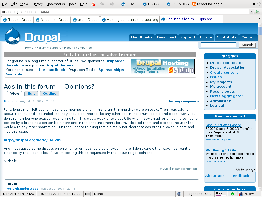
Here are some mockups where I tried to make sure that it's clearly separated from the user content, styled differently than other blocks on the site to help indicate that this is not normal content (though not so differently that it looks crazy) and hopefully it blends better into the page.
I didn't take the specific advice from Adrian (who made the comments I pasted in to start the thread) about making the text smaller since that wasn't particularly easy for me to do. If other folks agree with that (nobody else mentioned it specifically so far) then I can try to do that.
Feedback or your own mockups are very welcome.
Comment #6
michelleI like the white and that looks much better.
Michelle
Comment #7
femrich commentedI can't read the text in the png's so am assuming it's just the layout at issue. I think all of these are improvements over the "in the text" approach, but still problematic in terms of the issues I raised above. (And even more problematic when I consider Michelle's comment #4 above and the possibility -- shudder -- that these ads might leech out to other areas of drupal.org.
Frankly, the ad is jarring and out of place, both graphically and in terms of its placement smack up against content. Perhaps adding a blue horizontal bar below the ad would help, but I'm not sure if any above-the-content solution will fix the fundamental issues I've raised.
What about placing it just above or just below the user block in the sidebar? That seems plenty prominent, would still get attention, and yet would clearly separate the content from other elements on the page.
Comment #8
greggles@femrich - yes, the text was the same as yesterday (note that it was changed from "they" to "we" to remove the unintended appearance of endoresement).
Please, folks, when you provide feedback it would be helpful to make concrete suggestions. I've tried to find them inside your post, femrich, and here's what I've got:
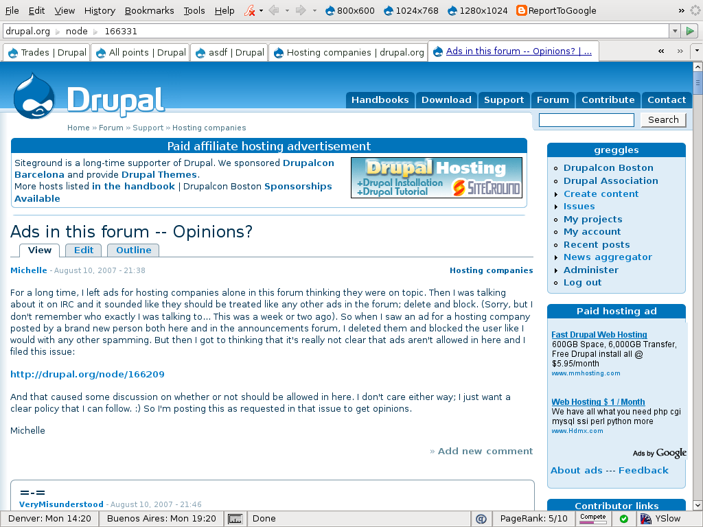
It's already inside a blue box - you want a blue horizontal bar in addition? That feels like a lot of separation to me. I've tried it out in a mockup attached.
This is certainly a possibility but I think we should continue the experiment with it at the top for a bit longer.
Any specific ideas or was this more of the argument for the sidebar idea.
Comment #9
gerhard killesreiter commentedI'd like to see the region for the ads to be above the page title, not below it. I believe it needs to be moved into page.tpl.-php for this.
Comment #10
femrich commented@greggles: let me preface this by saying thanks for the work on this task. I suspect on this issue from time to time (if not constantly) I might sound rigid and demanding. I have strong feelings on this and I recognize that other people may have different, reasonable opinions. I'll try to present my suggestions in a concrete fashion from here on out.
Now to the points you extracted above:
I hope this clarifies things a bit. Again, thanks for the work on this, and thanks for considering suggestions/differing views.
Comment #11
Amazon commentedHi, let me throw my two cents in.
There's no intention to move ads to all content areas of the site. We are committed to keeping the ads relevant and useful, and they wouldn't be if they were everywhere.
Alternate proposals have been to have http://drupal.org/hosting become like http://wordpress.org/hosting. The wordpress page brings in significant revenue but doesn't leave much room for community discussion. So we are looking for a balance between a dedicated page linked from the home page, or from primary navigation, and the header ad you see in the hosting forum.
Many people have suggested that ads only appear in the right hand side. One concern is that it would push the blocks even further down the page and make it even more difficult to use the navigation block. Google adwords is a nice advertising program because it allows for an open marketplace and for targeted placement of ad words ads directly on Drupal.org. This allows even the smallest hosting providers to participate in Drupal.org advertising. It's also nice that volunteers like myself don't have to spend a lot of time managing the ads. However, the real revenue comes from affiliate ads. So we'd like to have both to allow for lots of revenue, from affiliates, and ads from businesses with smaller advertising benefits.
Cheers,
Kieran
Comment #12
femrich commentedThanks for the clarifications, Kieran.
My idea for the sidebar ad was not to push navigation down, down, down. Rather, assuming that what's wanted is one primo ad spot (in the current version at the top of the content page), I was thinking to create one spot in the sidebar, just below (preferably) or just above (perhaps) the navigation block, and my thinking was that would not be too much of a problem. Of course, now that I see your post I'm betting that users with extra privileges see a lot more blocks in the sidebar than I do, and that might be irksome for them.
Comment #13
michelleThere's more opinions on ads to be found here: http://drupal.org/node/166331
Michelle
Comment #14
femrich commentedp.s.: See the drupal books block ad in the sidebar of the handbooks page for an example of what I think is acceptable, useful, and consistent with the mission and atmosphere of drupal.org: http://drupal.org/handbooks
This is the approach I was trying to suggest.
Comment #15
drummHas this come to any sort of conclusion? Do design changes need to be implemented?
I have two suggestions:
* Move it above the page title.
* Make the border light gray instead of blue. The design should be clearly different from the usual blocks.
Before implementing anything, I would like to see approval from the main contact the advertisers have with us. As far as I know, this is only Amazon/Kieran.
Comment #16
drummHere is a mockup of my suggestions.
Comment #17
michelleI like the look of drumm's. Did a doubletake at Greg's name on it. LOL
Michelle
Comment #18
Amazon commentedGreg Knaddison and I are both working with advertisers. This design looks good. Please go ahead, unless anyone has any objections. It will be nice to have this on http://drupalcon.org
Kieran
Comment #19
femrich commentedFrom the png, I don't see that this does anything to improve on the issues raised about Greg's previous designs, and I strongly object to an over the title solution without even looking at a sidebar mock-up.
Comment #20
JohnForsythe commentedI still see some major problems with this ad. We shouldn't be mixing Drupal.org content into advertising blocks. The wording is still ambiguous, and there is no indication that this isn't a paid recommendation.
So, let's make it clear this is what it is: no beating around the bush. Simplify the title to "Advertisement", and left-justify it. Keep the image on the left. No talking about the company in the third person. No linking back to official Drupal pages inside their ad. Simple disclaimer makes sure we are not misleading users. I am willing to compromise on the position of the ad if we make these other points clear. Here is my proposal (see attachment). I hope you'll agree it's much cleaner, and represents a fair, ethical standard.
Comment #21
michelle"there is no indication that this isn't a paid recommendation"
Why would there be? It's pretty clear that it _is_ a paid ad. It says "Paid affiliate hosting advertisement" right across the top of it.
"No talking about the company in the third person"
What difference does that make? Now we're getting picky about how the companies word their ads?
"No linking back to official Drupal pages"
Why? It's useful information.
"disclaimer makes sure we are not misleading users"
I don't see anything misleading about it.
"Here is my proposal"
If I saw that ad I'd be thinking. "What have you done to support Drupal? What themes have you provided? Links would be nice."
Michelle
Comment #22
Amazon commentedFemrich: can you link to the sidebar mock-up you are suggesting?
"the page title is not much of an improvement unless there is a border, different width, or something else to set content apart from the advert region."
Does Neil's latest meet this criteria? If not, what needs to be improved?
John:
1) Ad on the left seems reasonable.
2) What's the difference between "paid affiliate hosting advertisement", and just "advertisement" as a block title?
3) I agree that linking to the advertisers user profile for contributions sets a valuable standard. What's the objection? SEO?
4) We are reviewing BBB and a minimal security review for the affiliates. Isn't that a form of endorsement, and shouldn't we talk about it?
5) I can understand the third person comes across as an endorsement. How do others feel about it?
Kieran
Comment #23
JohnForsythe commentedKieran:
1. I agree :)
2. Why use 4 words when one will suffice? Let the ad tell you what it's about. Our job is just to inform the user that this is an advertisement. The longer the title is, the less likely it is to be read. The word affiliate has many meanings, and certainly could be misinterpreted. Let's follow Joomla's lead here.
3. It's very important to maintain a separation between advertisement and official content. In a newspaper, you will never see an advertisement that says "also check out the local political news on page 4". Why? Because it blurs the line between page 4 and the advertiser. Is the advertiser running the politics section? Do they have editorial influence? For the same reason, we must not mix content into advertisements on Drupal.org. If for-profit corporations avoid it, certainly Drupal, as a non-profit group, should also avoid crossing this line.
4. I thought this was not supposed to be an endorsement. Is it a conflict of interest for a non-profit to be endorsing a for-profit? What are the legal implications? Could Drupal.org be sued if something goes wrong? My suggestion to better research advertisers was to help protect Drupal.org and its users. Actively endorsing companies exposes Drupal to a lot of new risks, much more than simply allowing them to advertise. If Drupal is going to begin selling endorsements I think we need to have a large community meeting about it.
5. I think we agree that talking in the third person confuses who is doing the selling. It's important that advertising appears as a message from the advertiser and not from Drupal.org. Drupal.org's opinion is not for sale, and we must do our best to make that clear.
Here is a question to ask when making any decision about advertising on Drupal.org: Are we willing to risk misleading users in order to bring in more sales for our advertiser? I believe that none of us would say "yes" to that. So let's evaluate this project on that basis. If there is room for clarification, let us clarify. If we could better inform our users of the nature of Drupal's relationship to the advertiser, let's do that, too.
Comment #24
femrich commentedKieran: I did link to it when I referred to it before, but here's the link again: http://drupal.org/handbooks
I have also attached two screenshots.
The ad appears in a block in the right sidebar of the handbooks page. I think it is good looking and quite prominent on the page, and also that it does not have a negative impact on the page overall. For me, that kind of approach would be perfectly acceptable for the ad we are considering now.
I'm not sure who Neill is, but I'm assuming that's drumm. The color scheme in that design has a dual effect. On the one hand, the grey is a change of color, and a distinct color could offset the ad from the surrounding page. But the grey is so light (unfortunately) that the still-ultra-thin hairline box around the ad actually is less visible than in previous designs, and so less of a dividing line between ad and non-ad.
Look, let me be clear:
1) Overall I don't like the idea of an over-the-content ad at drupal. Such ads I have seen seem intrusive and out of keeping with the nature of drupal.org. I much prefer a sidebar position and I want to see this option given some consideration in this discussion. I don't have the skills to do a mock-up, but would greatly appreciate someone putting one together to give us something more concrete to discuss. At the very least, someone taking a little bit of time to do this would be a gesture of goodwill I would appreciate.
2) Of the over-the-content ads I have seen, none has incorporated the specific suggestion I made to thicken the border around the ad in order to create more of a separation between ad and content. I'd like to see that happen.
3) If there is a good reason why an over-the-content solution should be greatly preferred (is this a money issue? Are advertisers insisting on over-the-content, or setting differing payment scales for OTC vs sidebar?) then that information should be part of the discussion here.
4) I'm a reasonable person. If we are able to see mockups responding to 1 and 2 above and to have a discussion addressing their merits (and other issues related to the decision) and to reach a decision that responds evenly to that discussion, then I will accept that.
Regarding use of the third person, I also think this has an endorsement-like tone. Ad copy should be worded clearly to reflect the fact they are an advertiser speaking about the advertiser's services.
Thanks to the attention y'all are putting to this.
edit: hmmm... I tried to attach two screenshots. Trying again now...
Comment #25
drummI am working on the theme changes, but there is this subpixel rounding thing making the primary links horizontal bar move 1 pixel up. And I am tired.
Comment #26
femrich commentedThis thread has been silent for almost a week now, though the irritating ads persist without substantive change to major concerns raised here. What's going on? If there is no movement on this, I suggest drupal.org should remove the banner ads in question until the concerns raised in this thread are directly and explicitly addressed.
Comment #27
drummSorry for the delay.
As I mentioned earlier, this made another bug evident. The rounding to pixels in the local tasks decided to round the other way and make those look bad.
The attached patch is ready for browser testing, which I can do when I am at my office. The supporting images are already checked in.
Comment #28
drummI am Neil Drumm.
The exact shade of gray I used for the header is the minimal for contrast on white, as determined by http://www.hp.com/hpinfo/abouthp/accessibility/webaccessibility/color_to.... The 1px border is lighter in the same ratio as the other blocks. I didn't notice before, but the blue 1px borders are lighter than the blue block headers.
The text and such can be changed by either Greg or Kieran, so I will stay out of those discussions. If another round of mocks is made and approved, I can implement it. What we have so far is a clear improvement, so I'll go ahead with pushing it live once I know it works in all browsers.
Comment #29
femrich commentedHello Neil. I am Frederick Emrich. I do appreciate that you must be putting significant energy into this. I'm betting there is frustration on your end, and I can appreciate that as well.
I'm feeling a bit frustrated myself. I'm confused about what your last message about "pushing it live" means. Do you mean that once he browser bug is dealt with, then you will post the latest draft of the ad? Or do you mean your latest posted draft of the ad (which I observed didn't significantly address the points I raised above, and would not characterize as a significant improvement as far as those issues go) will "go live" on drupal.org?
And a final question here (for all involved in the discussion): Are we going to see a sidebar mockup for comparison? If not, why not?
Comment #30
drummKeiran and Greg are heading up the ads and I do not want to do anything without their approval since this can affect any advertising contracts. My interest is primarily implementation.
I just put up the last agreed-to changes. More changes can happen later. The block is a different color, helping distinguish it from other contents, and is no longer between the page title and content.
Someone has to actually make a sidebar mockup before we can discuss it.
Comment #31
femrich commentedOkay, as I understand it, the purpose of this thread is for discussing specific suggestions about ways to improve affiliate block advertising (i.e. specific design suggestions rather than general approaches to adverts) in order to create a better advert. I also understand there are a couple of people who are "working with advertisers" and some who have taken on the task of designing mock-ups to implement the suggestions in the thread.
Early on in the thread, I made two specific suggestions that I have not seen addressed directly in discussion nor implemented in mock-ups. I present them again here in order of my priority and preference:
Neill is correct, no one has created a sidebar mock-up for us to discuss. I don't have the skills, though in #24 above, I submitted both a link (http://drupal.org/handbooks) and two pngs of an existing sidebar ad at drupal.org that I think would be a perfectly good model for the ad block under discussion in this thread.
Not to dump this on you, Neill, but if the purpose of the thread is to create designs (for discussion) based on suggestions in the thread, then I ask, Would someone with the requisite skills please create such a mock-up? Or in not, at least can we discuss the merits of a sidebar solution based on the examples I provided?
And, as a corollary to this, If there is some reason that an over-the-content solution is greatly preferred by the ad mavens (Kieran? Greg?) (i.e. existing contract locked-in, different prices for ads, and so on), Would you (Kieran, Greg, or whoever knows) please have the grace to indicate so in this thread so that we know the limitations to which our suggestions are subject?
The closest I've seen to the ad mavens directly addressing this issue is Greg's reply #8 above: "This (i.e. a sidebar ad) is certainly a possibility but I think we should continue the experiment with it at the top for a bit longer."
My response to that now (I've said the same in other ways already in this thread): There's been a lot of time put into the above the content option. Let's also consider a sidebar solution and discuss each on its merits.
Finally, regarding my second (and less preferred) suggestion to thicken the border around the ad: this not only has not happened, but the lighter color of the hairline box around the latest ad I've seen makes the division between ad space and content space even less clear than before. I don't consider this an improvement.
I'm sure my frustration is clear here. If there is some problem with considering a sidebar ad, please tell us what that problem is. Otherwise, let's consider it...
Best regards to all...
Comment #32
gregglesI believe that we are currently free to test any placement we want.
In order to get a good set of sample data we need to make changes and wait until we get enough feedback and data to see the results. I think that we've got enough feedback (at least there hasn't been any new feedback about the style of the ads for a while now, though I am concerned about the person who had a bad experience with civicrm). And, at almost a month, we are getting a fair amount of data about the kind of clickthru performance we can expect from an ad in that location.
Neil - if you are waiting on an "ok" from Kieran/me to implement your changes you've got my OK.
Comment #33
drummGreg- already implemented it yesterday, and fixed a subtle IE7/Vista bug today.
As I mentioned before, I'll spend more time on implementation if I have clear changes that need to be made. Mock-ups are best for this so everyone knows exactly what is happening.
Comment #34
damien tournoud commentedThis seems not to be relevant anymore.