
Closed (fixed)
Project:
dreditor_clemens
Component:
dreditor_1115636 (Templates and Macros)
Priority:
Normal
Category:
Feature request
Assigned:
Unassigned
Reporter:
Created:
21 May 2011 at 14:09 UTC
Updated:
22 Feb 2012 at 15:40 UTC
Jump to comment: Most recent, Most recent file


Comments
Comment #1
clemens.tolboom[edit: emptied]
Comment #2
clemens.tolboomComment #3
clemens.tolboomComment #4
clemens.tolboomComment #5
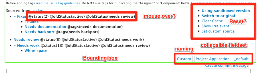
clemens.tolboomChanged text 'Clear Cache' into 'Reset'.
Comment #6
skilip commentedSubscribing and crosslinking
#1165700: Little improvements for the UI,#1030816: Hide patch review panel with an Escape keypress?
Comment #7
clemens.tolboomThis still needs some fixes:
- bounding box: this is a dreditor issue ... I could try and fix is in this sandbox though
- the menu is now collapsed by default ... ugly on chrome as it slides from left ?!?
- projects are now button.
Comment #8
clemens.tolboom@skilip
What do you think of the current version?
You need to install it through FF or Chrome through http://drupalcode.org/sandbox/clemenstolboom/1125712.git/blob_plain/refs...
Comment #9
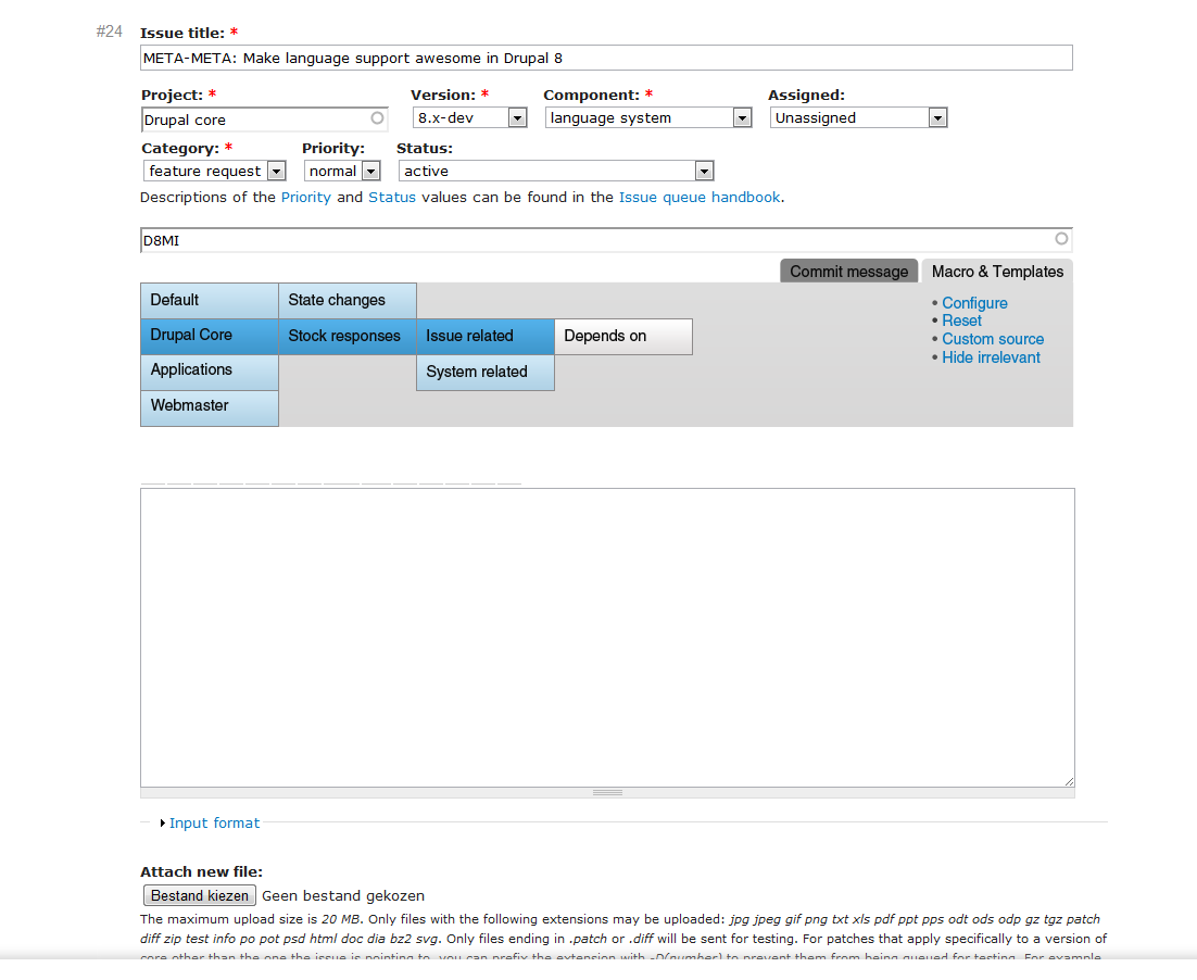
clemens.tolboom@skilip what do you think of the current UI on http://drupal.org/node/1120672
The button bar is now above the menu items and top level menu
Comment #10
clemens.tolboomComment #11
Bojhan commentedAlright, so Clemens Tolboom asked me to give some feedback. I used it for a little and I am impressed with the direction its taking, obviously this is very much an expert tool but it felt something that I could definitely improve my more triage tasks with.
A few things that come to mind, one is the current disconnect between whats happening on the right and that what is shown on the left. The navigation for these macro's is quite prominent, which helps if you are doing triage for everything but for many like me who only work in core and an occasional contrib, the prominence of stuff like project applications and webmasters macro's is quite distracting.
So what I have done is 1) To design something that creates less disconnect between initiating the different states (macro and commit message). 2) To centralize the navigation from each section to the subsections more (e.g. no jarring drop down, but a vertical approach to everything) 3) Unify the style and positioning a bit to create more calmness.
So an idea of how this would look, in a not collapsed state. Just two buttons.

Then collapsed.

Comment #12
clemens.tolboomI like the new design as it is more consistent, less cluttered.
What I forgot to mention to @Bojhan is the the coloring of the current implementation. Greyed items indicate subtrees ... cf projectapplications as good example.
For more UX feedback I created #1345614: Merging toggle buttons to a more consistent UX
Note that after implemented #1133108: UI list of projects this will reduce the leftmost column to mostly 3 items: _default, current project (when available), custom (when configured)
As a result of the irc we conclude Page http://drupal.org/node/1120672 needs more details about the philosophy about this _project_ centric triage.
@Bojhan I see you renamed the labels which is not trivial as these are mapped onto the current issues project. I'd like to keep this.
Comment #13
Bojhan commented@Clemens The colouring does use trees, it has white for when there are no child's.
I just changed the titles, because the currents one are quite confusing. I am sure we figure out how to change it.
Comment #14
clemens.tolboom@Bojhan you are right about the coloring scheme ... my mistake :p
We can reserve some mappings:
_default => default
drupal => drupal core
But it has to stop somewhere. I prefer sooner than later as it is a maintenance burden :p
Comment #15
Bojhan commentedI think that's acceptable.
Comment #16
clemens.tolboomCurrent version contains now tabs.
The merging of different sources of 'Macro & Templates' is still not done.
Color need more though as shades of grey is a little hard ... see http://drupalcode.org/sandbox/clemenstolboom/1125712.git/blob_plain/refs...
Comment #17
clemens.tolboomComment #17.0
clemens.tolboomFixed image.
Comment #18
clemens.tolboomI 'declare' this issue fixed. For color suggestions please #1432914: Better coloring scheme (and other UX)
Comment #19.0
(not verified) commentedUpdated issue summary.