
Closed (fixed)
Project:
Drupal core
Version:
7.x-dev
Component:
Seven theme
Priority:
Normal
Category:
Bug report
Assigned:
Issue tags:
Reporter:
Created:
5 Oct 2010 at 02:06 UTC
Updated:
3 Jan 2014 at 02:04 UTC
Jump to comment: Most recent, Most recent file

Comments
Comment #1
yoroy commentedAs designed:

Currently:

With patch:

Comment #2
yoroy commentedretitling for clarity
Comment #3
dries commentedThis looks better to me. Marking RTBC but waiting a bit longer before committing this.
PS: can't you just remove the font-family line?
Comment #4
yoroy commentedFont-weight you mean? No, since the barebones 'unstyled styling' as applied by browsers themselves is bold, so we have to explicitly override it with a font-weight: normal;
Comment #5
jacineNot sure why there was ever a
font-weight: boldin the first place. :/Good catch yoroy.
Comment #6
webchickThis feels like a straight-forward bug fix to me. If you view Seven theme without the overlay, the headings are thin, as indicated in the mock. It doesn't make sense that adding the Overlay to the mix would change the design of the underlying theme.
Since this is a fairly prominent user-facing change, and we're just on the cusp of beta, committed to HEAD.
Comment #7
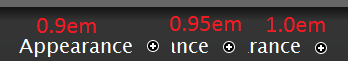
aspilicious commentedHmmm srry to reopen this but now the add to shortcut button is misaligned, my eye doesn't like that.
should be adjusted to 0.95em or 1.0em or something like that. I'm not sure how to find the right em so I didn't made a patch yet.
Comment #8
yoroy commentedCare to post a screenie of the difference?
Comment #9
aspilicious commentedHopefully the screenshot makes things clear.
I don't think this solution is theme proof but I couldn't test because Bartik doesn't have a "add to shortcut" button :s
Comment #10
aspilicious commentedNew picture with line to see the difference better
Comment #11
aspilicious commentedWoow... checked some other browsers...
This looks browser specific :s
Comment #12
Jeff Burnz commentedSome browsers render fractional pixels very well (Firefox is good), some do not - so maybe a browser will render the fractional pixel up a point, then jump to the next full pixel, this is why aligning things with relative values is extremely difficult to achieve across browser.
So.... this will never look right because the icon is 12px high, whereas a lowercase character in the title is 11px high (by default). Firefix might render .5 of a pixel and align it vertically centered where it will look OK (never perfect) but it will differ between browsers, no matter what.
Upshot of this long winded explanation - change the icon to be 11px high.
Comment #13
David_Rothstein commentedI can't tell from the issue description if it was intentional or not, but just wanted to point out that this patch changed a lot more than the page title in the overlay. Headings throughout Seven (both inside and outside the overlay) were changed by this patch. You can see this a bit in the above screenshots, or especially in the attached before and after shots of admin/index...
If the intention was actually to only fix the inconsistency between the page title in/out of the overlay, then we need a different fix (one targeted at the fact that the title HTML in the overlay has totally different classes/IDs than outside the overlay).
Comment #14
Jeff Burnz commentedHmm, just looked at the patch, yes thats very global font weight setting, the patch needs to roll that back and just set the weight of the page title when in the Overlay i.e. in Sevens style.css :
Comment #15
yoroy commentedYeah, sorry, my patch was a bit too rigorous :\
Comment #16
Jeff Burnz commentedI would roll a patch but I a have workspace issues and could be unreliable, fixing Eclipse now... grrr....
Comment #17
corbacho commentedAs David Rothstein pointed out in the screenshots, the patched affected to more headings.
I attach a screenshot to compare font-weight normal / bold in different headings I found (not as many as I thought)
I agree with yoroy that #overlay-title should be font-weight:normal (as #page-title , i.e when is out of the overlays) . But bold fonts fit very well bold for h2 and h3 headings.
Offtopic: How do you do to put screenshots embedded and not attached?
Comment #18
corbacho commented.
Comment #20
corbacho commented#17: h1_update.patch queued for re-testing.
Comment #21
aspilicious commentedCorbacho I think you mis understood the issue, this is purely for changing the overlay title's font weight.
I got a patch that implements #14 and a screenshot.
Comment #22
David_Rothstein commentedOn a first glance @corbacho's patch actually looks right to me. I'm not sure we want to split up the overlay styling between Seven and the overlay.module (like #21 does).
It may be true that the overlay module shouldn't be styling its title at ALL (and leave that up to theme), but if so we should fix that in a separate issue.
Comment #23
David_Rothstein commentedUnless, I guess, we are making some distinction that it's OK for the overlay module to set the title's font-size, padding, etc (i.e. anything remotely "layout-related") but other aspects are left up to the theme.
To me that seems like a distinction that doesn't 100% hold up, though. As we saw above, changing the font weight also apparently affected the placement of the add-to-shortcuts icon, etc...
Comment #24
Jeff Burnz commentedI prefer if Seven does this, not Overlay - Overlay should only provide the most basic CSS - so that it will actually function. Themes should supply the "design", not modules, and while this is far from consistent in D7 (D8 will get a lot of work to this end) we need to stop special casing for core themes in core modules because it creates more work for designers building their own themes.
Comment #25
David_Rothstein commentedHold on a second. Again, it's not about what we want in the future - it's about what we currently have.
Currently, the Overlay module does this for the title:
Not to mention this for the tabs:
Note that the tabs already have "font-weight" specifically set.
Regardless of where all this should live in the future, the question is whether this should be a Seven-only change now. I don't think that makes sense on its own, because the practical effect would be that as you switch your admin theme away from Seven, the overlay title would by default switch from normal to bold (but the tabs always stay bold, which isn't really consistent).
Now maybe if we also remove the "font-weight: bold" from the tabs and leave font-weight to inherit entirely from the theme in both cases it would make some sense, but that's also expanding this issue more than seems healthy :)
Comment #26
Jeff Burnz commentedOverlay should do none of that, except maybe for the title color since that might be needed to make it "function".
We need to clarify something here - its not Overlays design that calls for font-weight normal, its Seven's design that requires this. What you want to do is impose Sevens design requirement on all themes, which is wrong.
Look at the name of this issue - it not Overlays headers should not be bold, its Sevens headers should not be bold.
Comment #27
corbacho commentedI see it more clear now. I agree with aspilicious and Jeff Burnz that overlay module shouldn't declare "font-weight" properties at ALL.
This way, any custom theme could override EASILY all the headings with this declaration:
h1,h2,h3,h4,h5,h6 { font-weight:bold }But if my patch will go in, a third theme that wants to override all the headings, will have to add an extra css rule for h1#overlay-title. Not a good thing, so I prefer aspilicious patch.
David says "as you switch your admin theme away from Seven, the overlay title would by default switch from normal to bold".
Not necessarily to bold. It would switch from normal to whatever your theme declare for h1,h2,h3,h4.. (being consistent in this way).
BUT, by following this logic, I totally agree with David_Rothstein that it's not at all consistent to declare "font-weight:bold" in the overlay module then or round corners. Or "text-transform: uppercase;" for #overlay-tabs;
Comment #28
yoroy commentedI realize now that my initial report was too vague and too broadly stated. We're always uncovering deeper lying issues it seems, which is good but lets keep this focussed on fixing the boldness of the overlay title in Seven. I think I prefer the band-aid fix over a refactoring of overlay CSS :)
Comment #29
Jeff Burnz commentedTotally a band aid fix, and as David says its beyond the scope to fix this properly (too late for D7), so a band aid it is.
Comment #30
David_Rothstein commentedOK, I am still somewhat dubious about changing the font-weight in one place but not the other, but I guess it's also true that would be no worse than it was before the original patch committed here...
Also, the overlay title inherits its font weight from "h1" (which we can reasonably expect most themes to want) whereas the overlay tabs inherit it from a generic "ul > li" (which themes probably would not want) so there is some logic in keeping it different for that reason too; to fix it properly we'd also have to change the underlying HTML. That we can save for some other time :)
Comment #31
webchickOk, thanks for the reasoned discussion. I can get behind fixing theme display bugs in the theme and not in the module.
Committed #21 to HEAD. Thanks!