
 Come together with the global Drupal community in Rotterdam, 28 Sept – 1 Oct 2026. Sessions, contribution, connection, and Early Bird savings until 8 June.
Assigning this a status of "Major" because it occurs during installation and could contribute to a bad first impression.
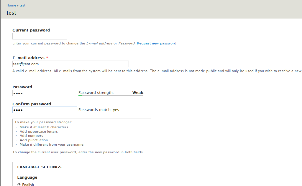
On the "Configure Site" page of the installation process using the default installation profile the "Passwords match" string is out of alignment with the "Password strength" box. See the attached image for an example.
| Comment | File | Size | Author |
|---|---|---|---|
| #15 | 876282_core_password_layout_glitch-2.patch | 3.12 KB | amateescu |
| #15 | FF3.6-install-after.png | 28.99 KB | amateescu |
| #15 | IE8-install-after.png | 28.7 KB | amateescu |
| #15 | FF3.6-user-edit-overlay-seven-after.png | 22.02 KB | amateescu |
| #15 | IE8-user-edit-overlay-seven-after.png | 21.12 KB | amateescu |

Comments
Comment #1
damienmckennaLooking at the output of this section of the installation problem the "Password strength" and "Passwords match" blocks are presented in completely different DOM structures, so making them match fit neatly will be slightly more tricky than it should be.
Comment #2
damienmckennaThis might be a dupe of #370835: Improve password checker in the Stark theme..
Comment #3
tim.plunkettThere were a lot of changes made to the password checker that are spread out among several issues:
#199870: Usability: Even better password strength experience
#331893: Add colouring (and description) to password checker
#592018: Re-organize styles across stylesheets from system.module and separate presentational and behavior-supporting styles
The .password-strength and .password-confirm fields grew further apart in styling and structure with each patch. This patch reconciles those differences, and also fixes several RTL issues. The scope of #370835: Improve password checker in the Stark theme. is much wider; that issue discusses stylistic changes, this just consolidates the current style.
Comment #4
bleen commentedafter applying the patch in #3 ... this is wat I get in both Chrome 6 & FF 4b6:

Comment #5
tim.plunkettI wrote this with the installer in mind, I forgot to check this against Bartik, which has two small differences from Seven/Garland.
The 20.73em width in there is compensate for the different font-size. 17em (width) / 0.82em (font-size) = 20.73em.
I removed the width: auto to mirror the other core themes.
Comment #6
tim.plunkettEverything moved around after #885228: CSS Files are in major need of clean up!. I'll need to reroll.
Comment #7
sun.core commentedA "small layout glitch" stretches the meaning of the major priority a bit too far.
Comment #8
amateescu commentedIn my attempt to fix #909446: Password-o-meter not clearing input field, tim.plunkett pointed out that the whole password strength/confirm stuff should be fixed in core first, so here is a patch for core and bartik.
This is not just a reroll because tim's patch had some display problems in IE 6 and 7 and I had to do a lot more work to get them inline with the others.
Basically, the js change means that I shifted the position of
div.password-confirmto be the first child of its parent instead of the last, matching the position ofdiv.password-strengthand to get consistent styling with float: right.The rest of the patch builds upon #5 to get a consistent layout across all browsers.
Tested in IE 6,7,8, FF 3.6, Chrome, Opera on Windows 7 and XP. I tested the installer, the user profile edit page with Seven (with and without overlay) and the user profile edit page with Bartik (again, with and without the overlay).
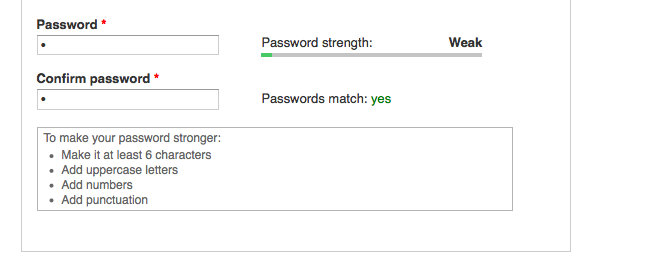
'Before' screenshots are in the issue description and in #909446: Password-o-meter not clearing input field, so i'm going to attach only 'after' screenshots from FF 3.6 and IE8. The result is the same in every other tested browser.
Also, bumping back to major because this affects both the installer and D7's default theme.
Comment #9
tim.plunkettThis is not only a bug fix (#password-strength-text to .password-strength-text) but a needed visual fix.
Comment #10
webchickBased on those screenshots, the Seven elements appear to be way too crampy next to the textfields compared to their Bartik equivalents. Damien's original image shows the closest element at least twice as far away from the textfield as the screenshots in #8. We should make them consistent, IMO.
Also, this is in absolutely no way major.
Comment #11
tim.plunkettI agree this isn't major, but it's not just for the user edit pages.
It's also on the installer, which is very visible, and it'd be good to put our best foot forward.
But enough quibbling about status, this patch works fine for me, and I don't quite understand that screenshot, because it looks great to me, in both Chrome and FF (Mac).
Chrome:

Firefox:
Comment #12
bleen commentedI see the same as tim in #11
Comment #13
David_Rothstein commentedOn FF 3.6 Linux, I do see the cramped spacing (as shown in #8). However, I see it without this patch too. It must have something to do with monitor size or who knows what. I haven't tracked it down, but it really seems like a separate bug unrelated to this patch.
I'd move it back to RTBC, but I haven't reviewed this myself at all :)
Comment #14
tim.plunkettBased off #13, and further cross-browser cross-monitor testing, I would consider this patch an improvement on all accounts, and any further "cramped spacing" is seen both before and after the patch. Code looks good, and result looks great in most circumstances.
Comment #15
amateescu commentedWell, sorry for leaving this issue behind for so long. Here's a reroll which fixes the spacing in seven and bartik. New set of screenshots attached.
Comment #16
tim.plunkettComment #17
tim.plunkettMissed the tag.
Comment #18
Bojhan commentedLets get this in, before we break it again.
Comment #19
dries commentedCommitted to 7.x and 8.x. Thanks!