
Need to style <pre> and <code> tags with a monospace font at least :)
| Comment | File | Size | Author |
|---|---|---|---|
| #51 | ie6.jpg | 43.06 KB | rschwab |
| #51 | ie7.jpg | 56.49 KB | rschwab |
| #51 | ie8.jpg | 55.11 KB | rschwab |
| #50 | bartik-827528-50.patch | 1.36 KB | jensimmons |
| #49 | bartik-kbd.png | 34.48 KB | amateescu |


Comments
Comment #1
Jarek Foksa CreditAttribution: Jarek Foksa commentedPlease also add
white-space: pre-wrapto those elements. This should prevent them from growing outside of the containing box, at least on modern browsers.Comment #2
tlattimore CreditAttribution: tlattimore commentedHere is a simple patch that gives
some simple styling. Nothing really special, just the pretty standard block of code look. Screenshot attached.Comment #3
Jeff Burnz CreditAttribution: Jeff Burnz commentedWe should add style for the other likely candidates:
<pre>, <kbd>, <samp>, <var>Comment #4
tlattimore CreditAttribution: tlattimore commentedJeff, could you elaborate on how you think these tags should be styled. Honestly, I have never really messed with styling any of these other than
<pre>. And most of the time, on<kbd>, <samp>, and <var>; The browser default seems to be sufficient to provide the emphasis needed to convey what these tags are for.Comment #5
Jeff Burnz CreditAttribution: Jeff Burnz commentedWell, your usage is not my usage - that's the main reason. Just because you don't use them doesn't mean I won't be using them. Seems pretty trivial to provide styles for most HTML elements, can't really see your point about browser default styles. From what I recall Corolla does a lot for these more rare elements (indicative of the high level of detail Jarek has applied to the theme) and its awesome to have something that looks great, not just boring browser default.
Comment #6
tlattimore CreditAttribution: tlattimore commentedJeff, your comment seemed very blunt, and I am not sure why. I was not demeaning your request to style the other elements, I just have never done so, and therefore don't know really how? You are absolutely, a high level theme like Bartik should have attention to detail on things like this, it's what makes a theme really shine. We should go above and beyond default styling. I just wanted a point of reference for a direction to take. Thanks for the tip-off about Corolla, I will check it out and see what I can glean from it.
Comment #7
tlattimore CreditAttribution: tlattimore commentedWoh! Just checked out Corrolla's styling of those tags. It's really nice! Thanks for pointing it out, Jeff. Gave me some ideas of what I can do for these 'special' tags styles.
Comment #8
Jeff Burnz CreditAttribution: Jeff Burnz commentedI didn't mean to sound blunt, sorry about that, I think my words just came out sounding that way - lol. Yeah, Corolla has some nice styles.
Comment #9
ipwa CreditAttribution: ipwa commentedChanging padding and spacing to standard Bartik sidebar block style, adding additional code selectors
<pre>, <kbd>, <samp>, <var>, and adding standard Bartik border to tlattimore's patch.Screenshot: http://skitch.com/ipwa/dkdg5/test-localhost
Comment #10
jensimmons CreditAttribution: jensimmons commentedComment #11
Jeff Burnz CreditAttribution: Jeff Burnz commentedSending this for review, probably needs some work since its been a while.
Comment #13
reglogge CreditAttribution: reglogge commentedHere's a patch incorporating and Bartifying some ideas from Corolla. Screen attached.
I'm against giving code et.al.
display: blocklike in #9. Most of the time they will be used inline. So if someone needs a special style for displaying whole chunks of code, he can always wrap it in adivand style this.As a font-stack I chose
"Lucida Console", "Lucida Sans Typewriter", "Nimbus Mono L", "Courier new", monospace- Courier is ugly as hell and with the relative font-size it blends in nicely with Bartik's Georgia.Comment #14
Jeff Burnz CreditAttribution: Jeff Burnz commentedI tend to agree with the code styles, we can't really set them to display block since they are by default inline elements, we'd be making a pretty big assumption about their usage if we did that.
There's also a whole legion of modules to improve handling of code blocks such as Code Filter.
Only thing I'd like to add is a special case for when code is inside descriptions as this will end up too small (e.g. on admin/config/search/clean-urls), if we can add a reset like:
Not entirely fussed on the outset border for kbd, I think this looks a little out of place in Bartik.
Could we use rgba - for an added design touch?
Comment #15
jensimmons CreditAttribution: jensimmons commentedI'm going to look at this as soon as I can. Meanwhile, I'm bumping this to major. It's not major for Drupal in general — but looking at the list of Bartik bugs that are left, it's one of the more major ones. The Bartik teams needs to easily see what is the highest priority for us. I say this one is in the top 5 of what's left.
Comment #16
jensimmons CreditAttribution: jensimmons commentedoh.
Comment #17
eugene.samoylenko CreditAttribution: eugene.samoylenko commentedSee the screenshot.
Comment #18
moshe weitzman CreditAttribution: moshe weitzman commentedScreenshot looks RTBC to me.
Comment #19
markabur CreditAttribution: markabur commentedRe the patch in #17:
- The font names should be properly capitalized.
- There should be a monospace fallback font.
- Font size should be expressed in ems (like the rest of Bartik).
Personally I'm not a big fan of setting pre to inline in one place and then changing back it to block a few lines later, but I'll let others chime in about that. (In general I think it's confusing to put in css rules that you know are wrong, even though they're going to be fixed by some other rules that get loaded later.)
Comment #20
tim.plunkettI'm not sure why the patch in #17 completely ignored the patch in #13.
Either way, the font stack needs some work, and I defer to jensimmons on that decision.
Comment #21
Jeff Burnz CreditAttribution: Jeff Burnz commentedWe need re-roll the patch in #13, with the minor addition of a font-size reset for
.description code {}as per #14. The patch in #17 is way off the mark despite what it looks like.Comment #22
reglogge CreditAttribution: reglogge commentedHere is a reroll of #13 with the additional
from #14.
Comment #23
EvanDonovan CreditAttribution: EvanDonovan commentedLooks strange to me on Safari/Mac.
Here is a screenshot from before the patch: https://skitch.com/evandonovan/rbqb5/code-text-sample
And here is a screenshot afterward: https://skitch.com/evandonovan/rbqdx/pre-code-text-patched
The font seems small on the text, and the text also seems grainy and hard to read. Also, I'm not sure that the rounded corners on the <kbd> are necessary, but I don't actually use that tag, so I'm not quite clear on the purpose.
Comment #24
EvanDonovan CreditAttribution: EvanDonovan commentedInterestingly, by contrast, it looks great on Firefox/Mac. The fonts are anti-aliased and the sizing is better.
Witness the following screenshot: https://skitch.com/evandonovan/rbqrq/pre-code-text-firefox
Comment #25
reglogge CreditAttribution: reglogge commentedGood catch. It seems that Lucida Console is not a default font on the Mac (but I had it installed). That't why you got the ugly courier which renders differently in Firefox and Safari. I added Andale Mono to the font stack, so that on the Mac this one gets called.
We now have the following fonts:
- Mac (OS X): Andale Mono
- Windows (XP, Vista, 7): Lucida Console
- Linux (Ubuntu): Nimbus Mono L
with Courier New and finally monospace as fallbacks.
Screenshots for Safari/FF (Mac) and FF (Win XP) are attached.
Comment #26
reglogge CreditAttribution: reglogge commentedbot won't start....
Comment #27
Jeff Burnz CreditAttribution: Jeff Burnz commentedI wonder if we should include Melno (before Andale Mono) - its the default monospace font for Snow Leopard and all versions since and had a lot of work done to improve legibility - pre Snow Leopard OSX will fall back to "monospace" which would be Monaco. Thoughts?
Actually I just checked what we are using so as a comparison our current monospace stack looks like this:
Note that Consolas needs Clear Type enabled else it can look a bit rough. Melno is optimized for Quartz rendering so whats why we include it, and its the new default monospace for OSX (replaced Monaco sometime in 2009 I think).
Comment #28
EvanDonovan CreditAttribution: EvanDonovan commentedAll right - that makes the font look better: https://skitch.com/evandonovan/rbwbk/pre-text-new-safari. However, is it just my Mac, or is the monospace font text almost half as small as the regular body text in Safari? (Note that Firefox doesn't have a problem.)
I am using Firefox 3.6.3, Safari 4.0.5, and Mac OS X 10.4.11. My screen resolution is 1440x960.
Comment #29
Jeff Burnz CreditAttribution: Jeff Burnz commented@28 - check what the default monospace font and font-size are for each browser, they might be different, certainly that looks very small. Also check the calculated values to see exactly which font is actually being used and what the calculated font size is.
Comment #30
EvanDonovan CreditAttribution: EvanDonovan commentedOn Safari: Times 16 & Courier 13.
On Firefox: the same.
On Safari, the computed font size is 10px for the <pre> text.
On Firefox, the computed font size is 12.85px for the <pre> text.
I can see the font-family declaration in both browsers but I don't know how to check which of the fonts is actually being used.
Comment #31
EvanDonovan CreditAttribution: EvanDonovan commented@Jeff Burnz: Does the information in #30 help clarify? If not, what else do you need?
Comment #32
dcrocks CreditAttribution: dcrocks commentedThere are 3 articles that point to the solution and discuss the problem:
http://en.wikipedia.org/wiki/User:Davidgothberg/Test59
http://meyerweb.com/eric/thoughts/2010/02/12/fixed-monospace-sizing/
http://getsatisfaction.com/typekit/topics/safari_fonts_too_small
The solution is adding sans serif to the end of the statement. eg
/* Fix so
<tt>, <code> and <pre>tags get normal text size also in some versions of Firefox, Safari, Konqueror, Chrome etc. */tt, code, pre {
font-family: monospace, sans-serif;
}
/* Fix so
<source>tags, and .css and .js pages, get normal text size also in some versions of Firefox, Safari, Konqueror, Chrome etc. */div.mw-geshi div,
pre {
font-family: monospace, sans-serif !important;
}
Comment #33
EvanDonovan CreditAttribution: EvanDonovan commentedIf that seems somewhat hackish, here is an alternative: have it be
'Courier New'at the end of the stack, see http://en.wikipedia.org/wiki/MediaWiki_talk:Common.css#Teletype_style_fi...Comment #34
Jeff Burnz CreditAttribution: Jeff Burnz commentedGood sleuthing peeps, I learnt something new! Looks like we have a fix here, someone want to roll a patch so we can test? Heres the wikipedia diff for reference http://www.mediawiki.org/wiki/Special:Code/MediaWiki/69336, I think we can still use our nice font stacks and just end with "Courier New" and test.
Comment #35
tim.plunkettAdded in a missed -khtml-border-radius.
35a is the patch from #25 with the Courier New swap.
35b is the patch from #25, with the stack from #27, and the Courier New swap.
I wasn't sure if that list in #27 was the proposed stack or just a list of the monospaces per system.
No commit credit please, I had nothing to do with this issue.
Comment #36
EvanDonovan CreditAttribution: EvanDonovan commentedNeither patch worked properly on Safari/Mac v. 4.0.5 with the "Courier New" declaration at the end. The second one's font stack also seemed to be wrong, since the font that rendered looked grainy and didn't actually seem to be a monospace font.
The following font stack worked, despite being technically incorrect:
font-family: "Andale Mono", "Lucida Console", "Nimbus Mono L", monospace, sans-serif;If you want the fonts from the second stack, the following also worked:
font-family: Consolas, "Lucida Console", "Andale Mono", Melno, "Nimbus Mono L", "DejaVu Sans Mono", monospace, sans-serif;I think that it is just that Andale Mono, not Melno, is the monospace font on older Macs (like mine, which runs 10.4).
Comment #37
EvanDonovan CreditAttribution: EvanDonovan commentedBumping down to needs work, so a decision can be made between those two.
Comment #38
markabur CreditAttribution: markabur commentedNote that the correct spelling is "Menlo" (probably named after after Menlo Park, CA, which isn't far from Apple HQ).
Comment #39
jensimmons CreditAttribution: jensimmons commentedBTW, I'm working on a few other details on this — like what happens when you put code inside pre.... (which is common!)
And I'll make a decision on the font stack...
Comment #40
Jeff Burnz CreditAttribution: Jeff Burnz commentedPre Snow Leopard the default monospace font was Monaco, here's a bit of a write up about Apples change from Monaco to Menlo - http://bit.ly/LR3yc
Comment #41
EvanDonovan CreditAttribution: EvanDonovan commented@Jeff Burnz: Ah, Monaco - I don't think that was in the stack, but my computer does have Andale Mono. That might not always be the case though.
@jensimmons: Thanks for making the final call on this.
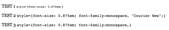
Comment #42
dcrocks CreditAttribution: dcrocks commentedInteresting: all you have to do is place any string after monospace, eg., "monospace,monospacehack" at the end of the string and the size is computed correctly. Actually, even ',' will do.
Comment #43
dcrocks CreditAttribution: dcrocks commentedAdded sample with 'pre'
Comment #44
dcrocks CreditAttribution: dcrocks commentedWell, it no longer seems to work just with ',', and I don't seem to be able to write more than 2 lines of code without some error, but here is a clean example.
Comment #45
jensimmons CreditAttribution: jensimmons commentedOk, here's my patch. I switched the font stack to this:
And I made some adjustments to the font sizing — specifically so that when you nest one of these elements inside another, it doesn't get smaller and smaller and smaller. :P
Comment #46
EvanDonovan CreditAttribution: EvanDonovan commentedWhat is the commented-out line of font-family for?
Comment #47
jensimmons CreditAttribution: jensimmons commentedThat was still in there? That was a mistake — or rather, a part of the process that wasn't supposed to be in the patch. :P
Rerolling....
Comment #48
rschwab CreditAttribution: rschwab commentedI would have RTBC'd, but since I'm just walking into this I decided to err on the side of nitpicky, and point out that its conceivable a <var> tag could end up in a <code> tag.
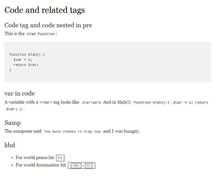
Attached patch addresses that possibility, but is otherwise the same as #45, which implemented #1, #14, and the maintainers font picks. Screen attached to show the problem.
Comment #49
amateescu CreditAttribution: amateescu commentedI did my usual round of testing on this (IE 6-8, FF, Chrome, Opera - LTR & RTL) and I think that <kbd> should have a display: inline-block to avoid some problems I found in IE 7-8 and Opera.
Patch takes off from #49 and it's RTBC if Jen's is ok with it.
Comment #50
jensimmons CreditAttribution: jensimmons commentedOh, I wanted to make the background color on this transparent, to better support the variations in background color that sites might have given the existence of the color module. So I took the patch in #49 (yeah teamwork!) and changed the background to transparent gray (with the solid gray as a fallback for IE6, 7 & 8).
It now looks like this:

Comment #51
rschwab CreditAttribution: rschwab commentedTransparency css code looks correct. Attached sample screens from our favorite browser versions 6-8. The only possible change I would make is to remove the background-color declarations from pre and add them to the identical code declaration a few lines up. But that would only save us a few bytes at the cost of -slightly- less clear code. So RTBC!
Comment #52
tim.plunkettRTBC +1 from me!
Comment #53
webchickCommitted to HEAD. Thanks!