
Closed (fixed)
Project:
Drupal core
Version:
4.7.4
Component:
theme system
Priority:
Normal
Category:
Bug report
Assigned:
Unassigned
Reporter:
Created:
6 Jul 2006 at 17:23 UTC
Updated:
6 Dec 2006 at 10:45 UTC
Jump to comment: Most recent file


Comments
Comment #1
drummFloats and clears are one of the most common drupal.css complaints (they conflict with various 3 column layouts). I'm quite hesitant to add more. And the non-meaningful markup isn't very good either.
I'd rather have something simpler and less likely to break, and this technique documented for theme developers to add as needed.
Comment #2
m3avrck commentedI agree about the markup issue but Dries asked me to look into this issue and propose a patch since many people were complaining about it. The way it works currently in core is the simplest, with relatively minor CSS involved and it works great *most* of the time. This patch fixes those other instances.
I'm perfectly happy *not* committing this patch and/or committing it on a per-theme level, instead of in the drupal.css. Or just leaving it as a handbook page.
My original patch that went into to change those links way back when, did remove most of the CSS to make it more flexible. This patch would be putting some of that CSS back in.
Comment #3
m3avrck commentedAlso, the non-meaningful markup is needed, the way the current drupal.css and core is setup, you need those ugly <br class="clear" /> , no way around that, unless of course drupal had a built in clearing class for CSS (another patch I'm working on).
Comment #4
dwwi don't have enough CSS-fu to comment meaningfully on the details of the implementation, but i'd sure love to see this fixed. for example, even on a fairly wide screen, the navigation links at the bottom of http://drupal.org/node/321 are a complete tangled mess, practially impossible to make sense of.
m3avrck tells me in IRC that in 5.x there's a happy new clearing class in drupal.css, so there should be an even cleaner way to do this in 5.x. i know it's getting a little late in the release cycle, but i'd sure love to see this cleaned up before 5.0 final. ;) any chance of that?
Comment #5
m3avrck commentedUpdated patch for HEAD.
Comment #6
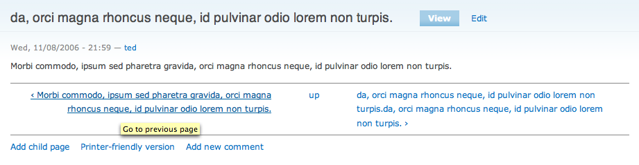
m3avrck commentedHere's a before picture:
Comment #7
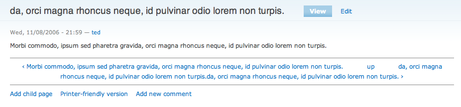
m3avrck commentedHere's how it looks *after* this patch is applied.
Comment #8
dwwtested on a fresh HEAD test-site. before, looks terrible, as expected, in both garland and bluemarine. after, looks great. those screenshots aren't lying. ;) patch looks totally fine, and since it's making use of the happy-new clear-block CSS class, i can't see what could possibly be the objection to this implementation for 5.x and beyond.
personally, i'd love to see this backported to 4.7.x, but doubt that's going to happen, since the CSS would have to be more treacherous. so, i'll be happy to see this in 5.0-beta2 at least. ;)
thanks ted, once again, you rock!
Comment #9
Tobias Maier commented+1 for this it is a real improvement
If you want to see a real life example how ugly such a long title looks like in the navigation
have a look at this one of my sites:
http://www.badewannenmaier.de/leistungen/badewannenaustausch-ohne-fliese...
Comment #10
Tobias Maier commentedComment #11
drummCommitted to HEAD.
Comment #12
dwwkilles: any chance of a backport? the patch in the initial post should be good to go (though i'm not marking RTBC since i haven't personally tested it yet)...
Comment #13
dwwtested nav_0.patch from the original post, and it works great. already fixed in HEAD.
the
<br class="clear" />stuff is standard for 4.7.x (and is already used in node.module).RTBC.
Comment #14
killes@www.drop.org commentedapplied
Comment #15
dwwthanks!
Comment #16
(not verified) commented