
Closed (fixed)
Project:
Drupal core
Version:
7.x-dev
Component:
filter.module
Priority:
Normal
Category:
Task
Assigned:
Issue tags:
Reporter:
Created:
25 Aug 2009 at 06:15 UTC
Updated:
3 Jan 2014 at 00:29 UTC
Jump to comment: Most recent, Most recent file

Comments
Comment #1
sunWe also want to remove the obsolete "configure" menu router item. ;)
Comment #2
sunBetter title.
Comment #3
sunFixing Garland.
Comment #4
sunComment #5
sunGreen == enabled. Pretty trivial when you work in the actual UI.
Comment #6
sundmitrig01 requested to hide the filter settings for disabled filters. jQuery-FUN! :)
Comment #7
sunImproved docs and removed stale (failed) approach of assigning a CSS id.
Comment #8
sundmitri requested to remove my rants from the patch. I didn't expect that to happen so early. ;)
Comment #9
TheRec commentedSubscribing. (I might review/test whenever this will stop getting 10 patch every minutes :P)
Comment #10
yoroy commentedIt would really help if you outline the problem first before presenting a solution.
What is wrong, why is it wrong? What do you propose? How does it improve the current situation?
Really, what are you fixing? It's not as obvious as you make it look here.
Comment #11
sunUsing a more sane approach to wrap and show/hide filter settings.
Comment #12
sunProblem
Cause
Note: Stopping here. This had a reason, and only now I understand why: we *must* store filter settings normalized in a {filter_filter} table - otherwise, a 'settings callback' (which uses system variables currently) has not sufficient information to generate a system variable name out of the format. Therefore, filter configuration was stored on a separate page, so the internal format id was already present. Using this new approach, the setup of the format and the filter settings are on the same page, so there is no format id to attach the settings onto.
Solution
Comment #13
joachim commentedTBH, I find the proposed UI confusing too.
There's a ticky box with the same name as the filter -- is that the master ticky box to enable that filter, or is it just one of that filter's options?
If it's the master ticky box, I can see that for accessibility it needs to have the same name as the filter, but it needs some indication that it's the master switch.
Some of the current UI confusion could be cleared up a lot more simply -- just add in the missing operations to the list of formats at admin/settings/filters, so it's:
| Full HTML | No roles may use this format | edit - configure - rearrange - delete |
Oh, and make it so that the 'configure' link doesn't go to a tab called 'edit'!
Comment #14
webchickSo I totally agree with sun that the way this works right now is horrifically confusing. There are no less than 3 settings pages for filters:
admin/settings/formats/1: Turn individual filters on and off.
admin/settings/formats/1/configure: Configure individual settings for these filters that have been turned on.
admin/settings/formats/1/order: Re-order them.
So some consolidation and general sense-making here would be nice. But what I don't like is the idea of cramming in a last-minute UX change in the hopes we make it better. This set of screens is the "one-stop-shop" for making your site at best output completely garbled text, and at worst horribly insecure. It's worth taking the time to sit down and really think about how best to present these settings to a user so that instances of this happening are far fewer.
Comment #15
webchickOne thing in particular that would help tremendously is a "preview" of sorts. So people could see the effect the filters they'd organized would have on a piece of text. I am really not sure how best to present this though.
Comment #16
amc commentedGreen for enabled is good, but the tabs should also say "enabled" or "disabled" or have some color-independent indicator (for colorblind folks, etc). Besides, in #4 screenshot it's difficult to tell which ones are green.
Comment #17
dropcube commentedAnother possible approach is to have a draggable (sortable) table, with the filters, and the filter configurations below, using vertical tabs. The user could enable/disable, arrange (order) and configure filters in the same screen. It's not required to have another 'Configure' or 'Reorder' tab. The configure option is just a shortcut to activate the settings tab for the filter.
Comment #18
amc commentedWell, if we're going to have a table then there's no reason to put the configuration in a separate section -- we can use #492834: Hover operations for flooded state screens. See http://drupal.org/files/issues/harmonicas.jpg for a screenshot. I think something similar is being discussed at #538904: D8UX: Redesign Modules Page.
Comment #19
sun@all: Please continue to discuss this. I'm happy to revise the implementation. I'm not sure about the current state of harmonicas, but if it is somewhere near 90%, I can also try to help roll that in. If it is not, then we should find a solution that works without harmonicas, perhaps something like dropcube suggested in #17.
@dropcube: I've marked this issue postponed, because I realized that it requires the configuration for each filter to be stored in the database for each format (as I already mentioned in IRC). All the 'settings callback's of input filter implementations use variables currently, so they require the text format id upfront to build a system variable name out of it. When creating a new text format, there is no format id yet, so filter settings cannot be stored. Do we have an issue for that already? It seems like we could re-purpose #555870: Remove {filter} table.
Comment #20
yoroy commentedGood to see the actual problem discussed first. Please continue with outlining the problem.
Is there docs for which combinations/orderings of filters are insecure somewhere?
I don't have a clue what to watch out for, you may assume a lot of users aren't either. How can we guide users towards safe solutions without shouting #FAIL! errors at them?
As webchick pointed out, there's at least 3 things going on here, could we make some kind of workflow for these?
admin/settings/formats/1: Turn individual filters on and off.
admin/settings/formats/1/configure: Configure individual settings for these filters that have been turned on.
admin/settings/formats/1/order: Re-order them.
Thanks for continuing the discussion indeed.
Comment #21
sunFYI: #559658: Store filter settings per format in {filter} is RTBC now. So better get some discussion/traction on here...
That said, I absolutely disagree with webchick that even a simple improvement, which would merge those 3 pages into one page, could have a negative impact. I'd say it is the opposite: You enable/disable filters here, you configure them there, and you re-arrange them elsewhere. Ensuring and maintaining security that way? No way.
First and foremost, people get the whole configuration wrong, because they don't have a clue about the connection of those pages. I'd bet that some don't even know that those "Configure" and "Re-arrange" tabs actually exist on their site.
The status, configuration, and order of filters is highly important. And, all 3 factors have a major impact on the effective filter result.
However, there is no clear path a user follows to setup filters in a text format. In the current UI, you first need to enable filters to configure them (which is a security issue when the text format has already been granted to user roles). During configuration (on a separate page), you find out that the order is wrong. But you need to store the configuration to get to the "Re-arrange" page. And if you find out that you need to change the configuration again, or you forgot to enable or disable another filter, .... you go nuts.
Ideally, yes, there would be a preview of some example markup, filtered live via AJAX to show-case the effect of all applied filters, their configuration, and their order. However, I doubt this will be doable until code-freeze. But, to achieve that in any way (core or contrib), the whole configuration must live on the same page, so we are actually able to gather all data for a preview.
IMHO, there is no unthoughtful way to change this configuration. I can't even think of ways to make it worse (aside from moving the user role assignment somewhere else, so you'd have 4 instead of 3 configuration pages). Whatever we do here, it will improve the situation.
Comment #22
dropcube commentedI completely agree with sun, these pages are probably one of the most confusing UIs in Drupal, and is used to manage one of the most important factors to maintain the website secure. I think, a one page configuration similar to the proposed t #17, will improve the usability and security of the site. The user should be able to see all the configuration options that should apply to maintain text filtering secure. I can continue the patch from #17 once #559658: Store filter settings per format in {filter} gets in.
Comment #23
sunSorry, just what I have on disk right now. Too tired to figure out what's wrong.
Most probably the additional 'format' key in $form can be reverted...
Comment #24
yoroy commentedPlease provide mockups or sketches or screenshots for the solutions you're proposing here. We need some visual explorations before we can make a choice on the right direction.
Comment #25
dropcube commentedUpdated patch.
- Fixed filter_format_save() to save the format structure easier.
- Advances in the implementation of the screen proposed in #17, it's almost complete.
- Fixed warning/notices.
- Added helper function to build the settings form for each filter.
Comment #27
sun- Added JS magic.
- Fixed further PHP notices.
Comment #29
dropcube commentedThis way, settings of disabled filters will be lost. We should modify filter_list_format to retrieve the configuration for ALL the filters in some cases, not only the enabled.
See filter_list_format() in the attached patch.
The attached CSS moved above, along with attached js.
I'm on crack. Are you, too?
Comment #30
dropcube commentedWe have two options to present the filters table:
1) Without the status (Enabled?) column, just with a checbox near the filter name and description.
2) With a "Enabled filters" column with checkboxes.
Screenshots for the two options attached. We should discuss which would be the better way.
Comment #31
dries commentedI agree that the current UI in Drupal 6 is pretty broken, and that this patch could be a big step in the right direction. I'm not sold on the 'green' vertical tabs -- that introduces a new pattern that makes me a bit nervous. Intuitively, I seem to prefer dropcube's approach in #17. I haven't tried or reviewed the patch yes, just tagging it for now.
Comment #33
dropcube commentedThe screenshots with the two options commented above in #30
Comment #34
dropcube commentedCurrently, other UI use a separated column with checkboxes to enable/disable the items. For example, the UI at admin/structure/menu-customize/management
Comment #35
sunPlease note that other existing interfaces in core cannot be compared to this one.
I specifically went with the checkbox (left), because the checkbox would be far away of the user's flow on the right. You enable, sort, enable, sort, configure, sort, disable, sort, ...
Comment #36
sun@Dries/webchick: Does this have a chance to get in after 9/1 ? I still have some other monster issues on my plate, and I'm not sure whether we'd directly find a consensus on the ProperInterfaceToGo™ even if we would make this patch work over the weekend. If required, we could prepare the API changes separately, so we'd only tackle the interface in here.
--
That being said, I tinkered: It's not good that enabled and disabled filters are loosely contained in the same table. I thought about using tabledrag groups (like the Block admin UI), so filters could be moved from "Disabled" to "Enabled". But then again, that might still be confusing.
So, I just reconsidered - the ProperInterfaceToGo™ may be:
1) A simple, #type = 'checkboxes' list of filters to enable.
2) A (for new formats initially empty) tabledrag. Enabling a filter in 1) creates a new table row. Disabling a filter removes its table row. Only enabled filters can be sorted.
3) Either something like harmonicas (uncollapsing a new row below each filter in the table) or the current approach of vertical tabs (automatically hiding tabs for settings of disabled filters) to configure the settings of all enabled filters.
Comment #37
sunRe-rolled for changed IA.
Comment #39
sunI just tried to split the (rather simple) API change in filter_list_format() into a separate issue, but then figured that it doesn't really make sense without the other changes of this patch.
Anyway: #570930: Allow to retrieve all filters (including disabled) in a text format
Comment #40
David_Rothstein commentedSubscribing.
I tend to agree that the UI is really bad as is, but trying to figure out how to put it all on one screen without overwhelming the user is also really difficult... I'm not sure that vertical tabs really work for this.
Maybe it would be best to focus first on just merging the edit/enable and rearrange tabs? That seems like it's definitely a good idea. Worst case, the inline "configure" links like shown in #17 could take you to a separate page for configuring each particular item - it's not ideal since there is important information buried in there, but it would still be better than the current situation.
Comment #41
mcrittenden commentedSubscribe.
Comment #42
sunPlease test this patch. Makes more sense to me.
Comment #44
sunRe-rolled against latest HEAD. Note that this patch also contains a required clean-up from #582378: Filter System clean-up.
From a security and UX and contributed module maintainer perspective, I would highly prefer this UI instead of the current.
Note that Seven's CSS styles are totally broken. If you review/test, then I highly recommend testing in Garland instead.
Speaking of tests - this patch still contains no test updates, so the bot will of course come back red.
Comment #46
sunRe-rolling this patch against HEAD and reviewing it, I realized that it also contains quite some bugfixes.
So either we get this done or I need to extract those fixes into a separate issue. Or both. wuhuhuh.
Note that this is still not only a UX improvement, but also a security improvement.
Comment #48
sunThis one should pass the tests. Good to see that one can't simply change the filter administration. :)
Comment #50
sunComment #52
sunThis will pass tests, now for real.
Comment #53
dave reidAdding tag
Comment #54
sunRe-rolled against HEAD.
Comment #56
sunerrr, what? Re-rolled against HEAD.
Comment #58
sunNot sure what is going on here.
Comment #59
sunRe-rolled against HEAD and fixed a couple of JS bugs.
This still looks very nice and should be ready to fly.
Comment #60
sunI extracted all other bugfixes into #653864: Bugs in filter administration and tableDrag, which has been committed.
Re-rolled against HEAD.
Comment #61
Bojhan commentedI believe the overview page requires only a few more touches, its merely the text.
I like that I can enable filters, but I am unaware of all that happens below the fold. I believe we could make the filters move somewhat more to the top - by fixing the labels to represent what is beign said in the descriptions (its fine that it shows up somewhat less in the text formats description)
I am utterly confused by this solution as expressed earlier, why do we need to expose two element of which both are dependent on the interaction chosen above.
Comment #62
David_Rothstein commentedBojhan: For small text changes to the overview page (e.g., your first screenshot), see #504076: Improve Text Format Admin Description
Comment #63
sunIncorporated all of the (doable) suggestions. Also revamped the help text on the page, which I forgot to update.
Additionally, revamped the form structure, and I'm proud to announce that doing so revealed a critical bug in vertical tabs: #657668: Vertical tabs break Form API
That patch needs to be contained in this one until the bug has been fixed.
Comment #69
sunSame patch, with entirely revamped vertical tabs from that other issue. Which of course doubles the size of this patch :(
Comment #70
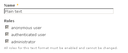
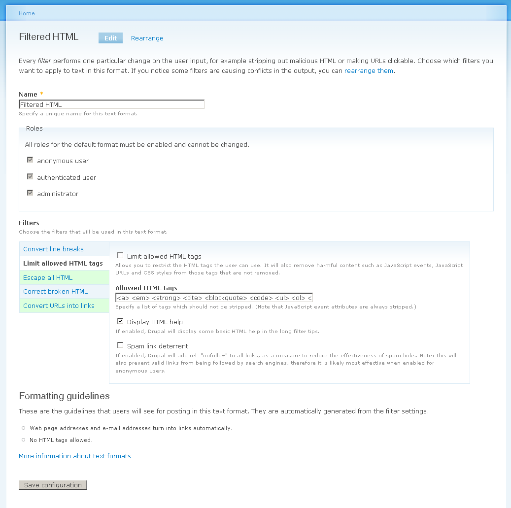
sunScreenshots:
Comment #71
sunAlso posting a screenshot of the special case of the filter fallback format:
Comment #72
dries commentedThis is a massive improvement. Great job, sun.
- "Escape all HTML and make it visible instead of being effective" could be very confusing. Most non-developers don't know what 'escaping' means. It would be better if we could describe the effect, rather than the technique.
- Personally, I'd remove the formatting guidelines preview. Who cares? It is not like I can edit them.
- Most importantly, the breadcrumb seems to be missing. After you configured a text format, I can't go back.
Comment #73
sunyeah, it's indeed much more understandable than what we have currently. :) Hopefully, this will resolve a lot of security issues with regard to text format and filter configuration.
1) I also felt uneasy about the current label when I reworked them. How about "Display any HTML as plain text" ? (KISS)
2) Like webchick suggested earlier, we'd ideally have some AJAX preview of the formatting guidelines here. However, that is not easily doable, not even with the revamped filter API, so I guess it makes sense to drop the preview, and perhaps let contrib come up with a working solution we might want to incorporate into D8. I can see how the current preview is confusing, because it always displays the last saved state instead of what's in the form. So +1 for removing the preview.
3) Most of the breadcrumbs are very broken currently. This is almost resolved in #576290: Breadcrumbs don't work for dynamic paths & local tasks, but that patch would also be a lot easier if #631550: Stale + improper logic for MENU_VISIBLE_IN_TREE and MENU_VISIBLE_IN_BREADCRUMB would have landed already. The latter still awaits review, although I bumped it literally for weeks, and I'm not sure what else I can do.
Comment #74
sunChanged that filter label and removed the formatting guidelines preview.
Comment #75
dries commentedAlright, let's go ahead with this patch. Thanks for making those last changes, looks great now. Committed to CVS HEAD.
Comment #76
sunAwesome!
A bit unfortunate, but well, this patch contained a required fix for vertical tabs, which I split off into #657668: Vertical tabs break Form API and originally wanted to have committed separately. CVS annotate will now show this issue as source. If anything is wrong with the revamped vertical tabs implementation, then please re-open aforementioned issue, not this one.