
The mocks for theme Seven have a treatment for fieldsets which displays the fieldset legend's inside the fieldsets. This is all nice and dandy and can be done with a span added into the legend to get browsers behave and obey our positioning. (See http://www.sitepoint.com/article/fancy-form-design-css/5/ for some fine tips).
The mocks show fieldsets this way (from http://d7ux.org/content):
The looks after the patch and the current looks of fieldsets (before patch) is as follows:
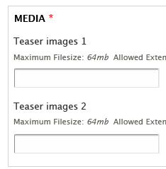
Now this would be all to good, but we have this little problem with collapsed fieldsets. This is how they look on a block configure form for example:

Even if we just fix this by not applying the margin to collapsed fieldsets, the label would jump in and out. We can call for the collapsed fieldsets to look like on the Meta tab (with a summary and More button as seen on http://www.d7ux.org/content/), but then how can we require all fieldsets to provide that?
| Comment | File | Size | Author |
|---|---|---|---|
| #22 | drupal-HEAD_seven_legends.patch | 1.5 KB | dboulet |
| #19 | d7-seven-fieldset-bugs.gif | 9.66 KB | Alan D. |
| #13 | fieldset-legend-v3.patch | 3.13 KB | Bojhan |
| #11 | fieldset-legend-v3.patch | 3.13 KB | Gábor Hojtsy |
| #9 | fieldset-legend-v2.patch | 2.44 KB | Gábor Hojtsy |


Comments
Comment #1
Bojhan CreditAttribution: Bojhan commentedVery interesting, I think its unlikely that we can go down the path of requiring every single fieldset to supply a summary. I am not even sure, if the proposed solution is any better then the current implementation. Because we somehow, make fields less important - which was exactly not the idea.
Comment #2
Gábor HojtsyWell, we can have them have the border all around and include the legend text inside and have the "More" action link at the end which would open up the fieldset (but do not have a summary). That would make you open/close fieldsets with an action link at the bottom right instead of the top. That would make fieldsets consistent with what was called pseudo fieldsets so far on the Meta page.
Comment #3
Bojhan CreditAttribution: Bojhan commentedSo I spoke with Mark about the current proposal, and it has some difficulties that we have yet to solve. For example the current collapsed state implementation - would mean in order to collapse a field in the administration area - you need to move to the complete right (while you are working on the left).
Where as field sets right now are used, for collapsing, grouping and more - we found out this interaction might not be very sufficient in the future. So the current proposal is to aim for something such as http://www.welie.com/patterns/showPattern.php?patternID=collapsible-panels . Which has several advantages, it moves the action of expanding to the left. It exposes the label, and it allows the same visual grouping as proposed by Mark if expanded ( we might add a color background to the fieldset title, but not required.
Comment #4
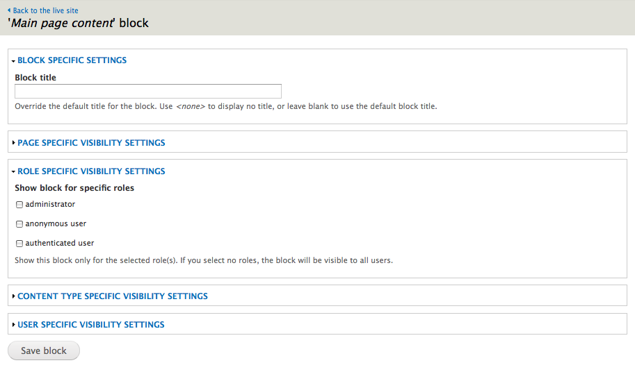
Gábor HojtsyHere comes an updated patch then. Body fieldset still looks as above on the AFTER screenshot. Collapsible and collapsed fieldsets now hot the look explained by Bojhan. An example screenshot with a block configure screen:
Comment #6
Bojhan CreditAttribution: Bojhan commentedThis is starting to look really nice! This will probably require some extensive reviewing, since we by default can't do fieldsets in fieldsets in core.
I attached a few issues I saw with spacing, but I wasn't able to find the CSS to fix it.
Comment #7
Gábor HojtsyAttached a test file for testing fieldsets. This is taken directly from Acquia Marina and contains an enormous number of fieldsets in all kinds of nasty nests. Just drop the file as theme-settings.php to a theme in D7 and get the fieldsets on the theme settings form. Not that this would be fieldset use we'd like to advocate, but it was an easy quick example.
Also, thanks to how I devised this fieldset test, I figured out that theme setting pages were not actually working due to a callback inherit expectation that was not fulfilled anymore.
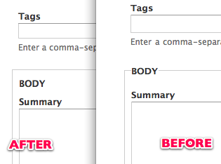
Here is one screenshot before and two screenshots after the patch, so you get how it looks.
BEFORE:
AFTER:
Comment #9
Gábor HojtsyAh, huh, scratch the patch in #7, that was totally the appearance page patch from #491214: implement the top level Appearance / Choose Theme admin page. That settings page issue only crept into my dev environment due to that patch, so no need to fix it here. Back to the v2 patch above.
Comment #11
Gábor HojtsyThe issue with the patch was that the simpletest tests did not use asText() on the fieldset label when comparing (but did use it elsewhere), so the test groups were not identified properly. With added asText(), we can use markup inside the legend as the patch does, and the correct label name is identified still.
Also, tried to address the alignment issues raised by Bojhan. Hope this will be all right.
Comment #12
Gábor HojtsyNote that the reason I work on this so closely is that this would lay down the UI element for the node meta tab too, so we'd have a consistent UI across the collapsible/collapsed areas.
Comment #13
Bojhan CreditAttribution: Bojhan commentedA 1px fix.
Comment #14
yoroy CreditAttribution: yoroy commentedI applied the patch in #13. here's a before/after in Firefox on OS X:
before:

after:

Looking good.
Comment #15
Dries CreditAttribution: Dries commentedI really like how the the fieldsets look when collapsible -- both collapsed and unfolded. However, when they are not collapsible, the fieldset title is black and it somewhat looses some of its emphasis/readability compared to the blue fieldset titles. It also looks a bit funny when you have collapsible and non-collapsible fieldsets on the same page. I might be bike shedding here, but I wanted to point that out nonetheless.
Comment #16
Bojhan CreditAttribution: Bojhan commentedTotally bike shedding. :P It does lose some of its emphasis, but I am unsure how much of that is fixable with our solution.
Comment #17
markboulton CreditAttribution: markboulton commentedLooks good to me.
Comment #18
Dries CreditAttribution: Dries commentedCommitted to CVS HEAD. Thanks.
Comment #19
Alan D. CreditAttribution: Alan D. commentedMoving this issue from Initial D7UX admin theme#131.
I haven't traced the patch queue, so this may be resolved, but the fieldsets on IE8 & IE8 in IE7 mode are all messed up. The following screenshots show this. The autocomplete was a cut n paste from taxonomy module into the dblog module.
Running windows xp sp3 / drupal 7 straight from head 13-08-2009. They appear fine in FF3.5
The CVS tags were:
style.css,v 1.9 2009/08/12 23:51:19
template.php,v 1.2 2009/08/12 11:32:07
I posted a related issue about the autocomplete part of this issue for the Garland theme here: http://drupal.org/node/171953#comment-1919258
Comment #20
Alan D. CreditAttribution: Alan D. commentedForgot to change the status
Comment #21
dboulet CreditAttribution: dboulet commentedMarked #578260: Fieldset link overlap with the tableheader in Internet Explorer 7 / IE 7 as a duplicate.
Comment #22
dboulet CreditAttribution: dboulet commentedThe only way that I found to have the fieldset legends appear consistently in all browsers was to add conditional styling that adds
fieldset legend a, fieldset legend span { top: 0; left: 0; }in IE only. I know this is an ugly solution, but I thought I'd post a patch to get some ideas rolling.Comment #24
mrfelton CreditAttribution: mrfelton commented@dboulet:, that is better for ie7, much better... but not perfect. When the fieldset is closed, about 95% of fieldsets top border is missing. In FF it's perfect.
Comment #25
dboulet CreditAttribution: dboulet commentedIE bugs are being worked on in another issue, see #676800: Fieldsets break design badly.
Comment #26
dboulet CreditAttribution: dboulet commentedNow that browser compatibility has been sorted out, setting status back to fixed.