Problem/Motivation
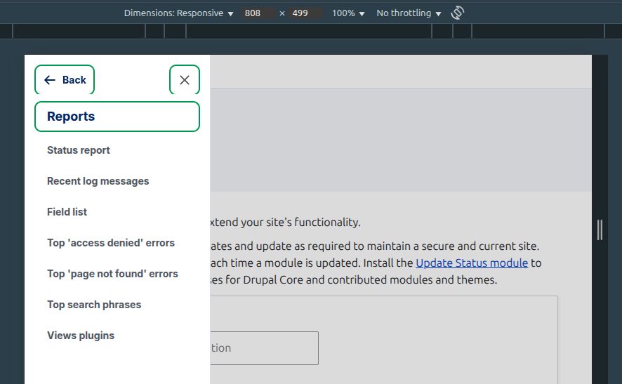
In the mobile breakpoint (< 1024px), the Navigation sidebar has some spacing issues at the top where the logo, close button and back button sit.
Steps to reproduce
- Install Drupal standard profile
- Enable Navigation module
- Adjust your browser to the mobile viewport (< 1024px)
- Expand the Navigation sidebar
Expected result
The spacing should follow the same spacing that is used at the desktop breakpoint, however, the spacing is pretty squishy, which doesn't make room for the hover / focus styles:

In addition, when you click on a menu item with children and the drawer opens, the Back link and Close link hover styles are cut off:


Proposed resolution
Adjust spacing to match the Desktop breakpoint.
Remaining tasks
MR
Testing and review.


 Show commands
 changes




Comments
Comment #4
keshav patel commentedThe MR contains 1000+ changes which are outside of this issues scope.
Please raise correct MR.
Comment #5
shweta__sharma commentedComment #6
rinku jacob 13 commentedi will work on this issue
Comment #7
rinku jacob 13 commentedComment #10
rinku jacob 13 commentedI have created a new merge request on a new branch and made adjustments to remove the tight space between the toolbar header logo and the titles.
I also updated the backlink hover style.
Could you please review the merge request?
Comment #11
rinku jacob 13 commentedComment #12
finnsky commentedPlease check css linter.
Comment #13
nod_Comment #14
rinku jacob 13 commentedWhen I tried to create the first MR, the issue was on the 11.1.x branch. so i created MR according to that .Now, the branch has changed to 11.x, so I will create a new branch and merge request for this issue. I believe the merging is happening on the 11.x branch
Comment #17
finnsky commentedit affects popover globally.
https://gyazo.com/2ba673f49f6a35e1040bac2059a43f06
Comment #18
rinku jacob 13 commentedHello @finnsky , Thanks for the review. I noticed the error and I'm currently working on fixing the issue.
Comment #19
rinku jacob 13 commentedComment #20
rinku jacob 13 commentedhi , I thoroughly investigated the issue, and it appears that the problem occurred due to the stacking order of the popover being higher than that of the admin toolbar. To fix this, I modified the stacking order of the popover without altering the existing --admin-toolbar-z-index-popover. Instead, I introduced a new variable named --admin-toolbar-z-index-popover-wrapper and set its value to 98, since the admin toolbar's z-index is 99. Could someone please confirm if I'm on the right track or if any modifications are needed to my MR?
Comment #21
rinku jacob 13 commentedComment #22
rinku jacob 13 commentedComment #23
finnsky commentedNow another thing cutted
https://gyazo.com/8144ef07472d3a461ab478946704ba81
Comment #24
sandip commentedI am working on it.
Comment #25
sandip commented@finnsky, Please review the changes. I am attaching before and after images.
Comment #26
divya.sejekan commentedApplied Patch MR!11387. The spacing between the logo and the menu in mobile view is fixed .
But there is a issue when we navigate to the shortcut menu link with child links , Blue bar can be seen at the top
Attching the screenshot for the issue.
Moving the issue to need work.
Comment #27
sandip commentedHi @divya.sejekan thanks for the testing but it seems you are testing it in Gin theme. Now in gin it is overriding padding-block-start value that you can see in the attached image. As i changed the padding-block-start to padding-block so the padding would come for both top and bottom. So i think we can fix that in Gin. I am attaching the image for better understanding. I am again moving this to NR to hear your thought.
Comment #28
sandip commented@divya.sejekan, see if we remove the override part that is coming from Gin then it is working fine. This is why i think the issue you mentioned is Gin specific issue. Please see the attached image here.
Comment #29
divya.sejekan commented@sandip Yes as you said I was using Gin theme , I switched to claro them, here it works fine . But tried with default Admin theme. Here the blue bar is visible. Can you have a look once and see if the issue is reproducible.
Comment #30
sandip commented@divya.sejekan, as i mentioned in #27 and #28, Gin is overiding
padding-block-startinadmin-toolbar-headerclass of naviation module. I also attached the image in #28 for clarity. We should make a issue there in Gin to remove the override part from Gin. Can you please go through the comments #27 and #28 and attached images once.Comment #31
smustgrave commentedWith Gin moving to core should we find a solution for both?
Comment #32
sandip commentedYes we just need to remove this below css from Gin codebase that is overriding padding-block value.
As I mentioned in my comment #28 with an attached image.
I think it would be better to fix it in Gin otherwise maybe we have to use
!importanthere.Comment #33
finnsky commented@sandip hi!
thank you for work here!
Could you please close and reopen MR to restart Tugboat test instance?
Comment #34
sandip commentedActually i am not getting the option to close this MR maybe @rinku jacob 13 requested the MR so he should have the option to close and reopen. @rinku jacob 13, Could you try it from your side once?
Comment #39
sandip commentedH @finnsky, I created another MR to restart tugbot instance but still it is not creating. I closed and reopened it but still no result.
Comment #40
finnsky commentedHello!
Now everything works, but in my opinion not as it should.
Previously there was a variable var(--admin-toolbar-sidebar-header); which controls the content indent. Now you have removed it. While leaving it in other places. Either remove it everywhere or leave it here.
The decision to move the content away from the header is obviously a design decision, so I can't decide anything here.
Comment #41
smustgrave commentedSo I'm not sure anyone keeps an eye on that tag? I could be wrong just don't see it often and not sure who the design team is.
Comment #42
jensdn commentedThis is my first contribution. I'm working together with /u/kevinvdw , /u/hans_tys.
We are going to assign it to the right person who can make the design decision.
Comment #43
rachel_norfolkHa ha - I was mentoring Jensdn and others on an issue and was just about to tell them all about the Needs... tags only to discover finnsky had already added it!!
This issue is free again for review :-)
Comment #44
ckrinaLooks good to me on a design perspective based on the screenshots I found several comments before. As long as it applies to only submenus and it doesn't change the main navigation bar itself, it's OK on a design perspective.
I'll leave the RTBC for whoever reviews the code.
Note: For the next time, when an issue is tagged to get a design or UX review it needs to have clear before&after files (of the same exact area to review that clearly states) on the same comment or clearly saying which ones are the screenshots to look at. Please do not underestimate how complicated is for a designer (or someone not coding all day) to review issues and understand the context.
Comment #45
smustgrave commentedThanks @ckrina for taking a look.
I did a rebase now and I'm not seeing the issue.
Comment #46
sandip commented@smustgrave I cheked after rebase but the issue is still there in latest 11.x. Whenever there is a focus on Back button or close button it is overlapping with the below section. Can you please check it once if it persists on your local.
If anyone is up here for review then please see this before and after images for better clarity.
Before:
https://www.drupal.org/files/issues/2025-06-17/Screenshot%20from%202025-06-16%2016-05-18.png
https://www.drupal.org/files/issues/2025-03-04/mobile_hover_style_cut_off.png
After:
https://www.drupal.org/files/issues/2025-06-17/Screenshot%20from%202025-06-17%2011-24-41.png
Comment #47
finnsky commentedI think there shouldn't be any difference between desktop and mobile.
Comment #48
finnsky commentedI think it's correct now.
- I reverted to using a variable.
- Removed the negative margin for the first block. It was incorrect (10px instead of 12px), and it turns out it's unnecessary now.
This means we always have 16px between the logo and the buttons.
Comment #49
finnsky commentedComment #50
finnsky commentedComment #51
smustgrave commentedAppears to have a stylint issue
Comment #52
finnsky commentedFixed! Please review!
Comment #53
finnsky commentedComment #54
smustgrave commentedSorry appears to need a rebase.
Comment #55
finnsky commentedRemoved wrong rebase item and fixed linter. Please review!
Comment #56
finnsky commentedComment #57
smustgrave commentedRebase seems fine.
Comment #58
catchMR has merge conflicts.
Comment #62
finnsky commentedI was easier to move fix in new branch.
Please review.
Comment #63
finnsky commentedComment #64
smustgrave commentedRebase to new MR seems fine.
Comment #65
needs-review-queue-bot commentedThe Needs Review Queue Bot tested this issue. It no longer applies to Drupal core. Therefore, this issue status is now "Needs work".
This does not mean that the patch necessarily needs to be re-rolled or the MR rebased. Read the Issue Summary, the issue tags and the latest discussion here to determine what needs to be done.
Consult the Drupal Contributor Guide to find step-by-step guides for working with issues.
Comment #66
finnsky commentedComment #71
smustgrave commentedClosed all the MRs lets see if that helps.
Comment #73
lauriiiThere's some conflicts in the MR. Feel free to move it back to RTBC after a rebase.
Comment #74
finnsky commentedComment #75
smustgrave commentedMoving back
Comment #79
lauriiiThank you! Committed!