Problem/Motivation
When a module is added and or installed you currently have for one the prominent spinner in the center of the module card as the center of attention and at the same time you have the add/installation stage label in the lower right corner of the card replacing the View Commands drop button. that label happens also to have animated periods appended.
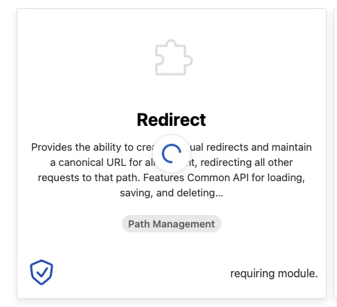
you have two areas of interest getting updated/animated at the same time. me as the user, in a case where the adding of a module took unexpectedly longer, was therefore visually drawn between the animated spinner and the animated label at the bottom. my eyes had to switch between the spinner, to see if it is still spinning (and the process is still running), and between the stage label (to see if the label has changed), repeatedly. visually the more or less constant jump is demanding in my case and a source of stress.
Steps to reproduce
- apply the patch in #3312289: Svelte UI for install controllers
- got to /admin/modules/browse
- press the drop button in one of the module cards and click either add or install the module
Proposed resolution
i wonder if it would make sense to unify the two components by moving the rather large and prominent spinner from the center of the card down to the button area and prepend it inline to the label as well as removing the animation of the periods at the end of the label? that way the information would be more compact and everything in one place.


Comments
Comment #2
tim.plunkettPostponing on #3312289: Svelte UI for install controllers, until that's in and we're sure of how it will operate, we should wait on this. I think that is true of many of the follow-ups opened for the UI installer, those should be postponed as well.
Comment #3
tim.plunkettComment #4
dwwThe blocker is in, seems this could now proceed, no?
Comment #5
chrisfromredfinMoving to core-mvp; I agree with the proposed resolution... move the spinner inline with the text that's changing.
Comment #6
chrisfromredfin(fix title typos)
Comment #7
earthday47Comment #8
earthday47Comment #10
earthday47Happy to report that I have a merge request in place to address this. The throbber was already in the right container, it just needed to have some classes and styles adjusted.
Attached is how it's looking. I don't have package manager working all 100% yet but the GIF shows it stepping through most of the states.
Comment #11
earthday47Comment #12
fjgarlin commentedThanks for this, it looks great!
Code looks good but you might need to recompile your files. See the message: "Svelte compiled files do not match. Running yarn build and commiting the changs should fix this." in here: https://www.drupal.org/pift-ci-job/2686160
Comment #13
rkollerawesome! I've applied the patch and tested in microsoft edge on macos. there are two details i've noticed.
1. the inline spinner is sort of jumpy and brings in some turbulence (not sure if that is the correct term in english). depending on the length of the state label the inline spinner is changing its position. would it make sense to orient to the longest string for the positioning of the spinner and have a fixed position for it? that way the spinner as well as the starting point of the state label string are sort of steady. it would be less visual input/change and easier to grasp for the eyes and brain? but having a fixed position and orienting to the longest state label has the downside in the context of translations. :/
2. on high contrast mode the spinner is hard to distinguish (grey on black has a low contrast) and sort of looks like there are three independent circular segments instead of a single one.
Comment #14
earthday47@rkoller thanks so much for testing!
1. I agree that having it left aligned to the max width of the button area would be better, but would also introduce extra white space that may look off.
Left aligning the throbber is how I've seen it used in other places for Ajax links so I think that would be consisten with other experiences.
One option is to move it above the text, right-aligned. (Breaks convention?)
Another option is to animate the width of the text so it more smoothly resizes. Might be the lowest friction option
2. I will make some style updates for high contrast mode (possibly related indirectly to work in #3364776 )
Comment #15
rkoller1. i agree in regards of introducing extra white space. for short state labels it might look already off for english. other languages might have even shorter strings and more white space. but i would probably still lean towards left aligning the throbber (for LTR). above or right aligned i am not sure about. only with left aligned you have the spinner and the start of the status message in close proximity both other option require eye movement.
and in regards of "animating the width of the text" i don't know how it would look like and how to envision it.
2. cool! and true sort of related to #3364776: Fix display issues in "dark mode"
3. and talking of LTR i found another detail i've quickly tested to confirm. for RTL the spinner is still centered with the pre patch styling. the changes in the MR are only available for LTR.
Comment #16
earthday47@rkoller I recreated the Edge + high contrast mode testing environment, however I found that when I combined "Enable automatic dark mode" + forced-colors the borders and spinner become a gray tone... but without "automatic dark mode" it doesn't happen. And any attempt at overriding with CSS was unsuccessful. This will need a closer look.
We've got the dark mode task, but also opened a new issue for high contrast. https://www.drupal.org/project/project_browser/issues/3368315
MR is rebased, so with that new task I'm hoping we can get this task reviewed and approved.
Re 3 -
> for RTL the spinner is still centered with the pre patch styling. the changes in the MR are only available for LTR.
I wasn't able to reproduce this one... test again using the newly rebased branch?
Comment #17
earthday47Comment #18
chrisfromredfinComment #23
chrisfromredfinA nice lil' bit o' usability, here!