Problem/Motivation
When the Image tab gains focus, there is insufficient change in contrast to indicate that focus has been achieved. This is a violation of WCAG 2.1 1.4.1 A Use of color
Steps to reproduce
1. Install Drupal 9.3.12
2. Login as admin
3. Go to /admin/config/content/formats/manage/full_html?destination=/admin/config/content/formats
4. Select CKEditor as the text editor
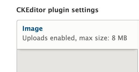
5. Use the tab key to move the focus to the Image tab.
Expected results:
On focus, the word Image either gains an underline (preferred) or else the difference between focus and unfocused is at least 3:1 in contrast.
Actual result:
On focus, the word Image changes from #004F80 to #2073BF, a contrast change of 1.75:1.
3277559 focused.png shows the tab label Image having focus
3277559 unfocused.png shows the tab label Image not having focus
While it is true that the user can't accomplish anything by activating the focused location, it still needs to be clear for orientation where the focus is.
Proposed resolution
Increase the contrast between focused and unfocused to 3:1. However, there also needs to be 3:1 contrast between unfocused and surrounding text that is not a (potential) link.
If it is not possible to achieve both contrasts - which is often a result in multi-color situations - then the correct solution might be to underline on focus, even though clicking the link would not achieve anything in this particular case.


Comments
Comment #2
charles belovUnfocused:


Focused:
Comment #3
rootworkTagging as Novice, great issue to work on
Comment #4
manojkumar_97 commentedComment #5
manojkumar_97 commentedBefore Patch:


Contrast ratio:

After Patch:


Comment #6
charles belovComment #7
charles belovI've updated my comment #1 to include my images as well as label which is which re unfocused vs. focused.
I've also updated the original issue. This may be more complicated than simply fixing the contrast between focused and unfocused. I'm realizing as I view the proposed solution that there may not be sufficient contrast between "CKEditor Plugin Settings" and unfocused "Image" to make it obvious to people with color perception issues or low vision that "Image" is something that can gain focus.
Since there are three colors that need to have a 3:1 ratio from one to another, that is, "CKEditor Plugin Settings", unfocused "Image", and focused "Image", it may not actually be possible to achieve that. That means there may need to be a different solution, such as underlining "Image" on focus. But in this case, clicking/pressing enter for Image won't achieve anything, since it's not a link when that tab is the active tab. (This would be clearer on pages where there are more than one active tab.)
So, before we jump into a solution in code, I'd like to see some discussion as to what the best practices solution would be.
Comment #8
charles belovComment #9
mgiffordThere would be other ways to provide visual cues that a tab has focus. Whether it is adding a vertical line between the sidebar & body, or including a corner on the top right of the Image cell.
I've seen SC 1.4.1 used more when red, green or yellow are used to highlight process states. Having different brightnesses of any one of those colours is usually ok.
Maybe SC 1.4.11: Non-text Contrast is better? I'm not sure.
Anyways, which SC it falls under isn't critical. Having an additional visual indicator would help everyone know which tab has focus. I'm in favour of enhancing this.
Comment #11
ashishsingh27 commentedHi,
I am adding a patch with the vertical border on right side to highlight the focused state and have added #eee color on hover state.
Also, Attaching the after patch image for reference.
I think this works for the required change to provide visual cues that tab has focus.
Comment #12
lucasscHi!
I tried apply patch in #11 against 9.5.x-dev and received the following message:
I'll work on this.
Comment #13
lucasscRerolled #11
Comment #15
lucasscComment #16
diegorsComment #17
lucasscHi!
Sorry, I forgot to explain what I did in the reroll. As it was a simple patch, I just copied the content to a new patch from 9.5.x-dev.
Attaching interdiff.
Comment #18
diegorsThe patch works correctly in drupal 9,5.x
the test works on the local machine:
Comment #19
sonam.chaturvedi commentedVerified and Tested patch#13 on 9.5.x-dev.
Patch applied successfully.
Before Patch:

Focused:
Unfocused:

After Patch:

Unfocused:
Focused:

Contrast:

Comment #20
rootwork@sonam.chaturvedi can you try uploading those screenshots again?
Comment #21
sonam.chaturvedi commentedThanks @rootwork for highlighting that. I have uploaded the screenshot again as part of my previous comment.
Comment #22
longwaveThe Seven theme has been removed from Drupal 10 core. I confirmed that this issue only affects Seven and no other themes included with Drupal core, so I am moving this to the contributed Seven project.
Comment #23
roberttabigue commentedHi @longwave,
It seems the patch #13 when applying it to the Seven contrib theme 1.0.0-alpha1 as a Default theme and with Drupal core version of 9.5.6 is not reflecting/working on my end.
Moving this to "Needs work" and please see the attached screenshot for reference.
Thanks.
Comment #24
avpadernoComment #27
avpadernoComment #28
avpadernoComment #29
avpadernoThe blue bar should be on the left side, not the right side, similarly to what happen with the node edit form.
These are the vertical tabs without any change.
The background of the selected vertical tab should be the same background used for the vertical tab content, as in the last screenshot.
(I changed the screenshots for better ones.)
Comment #30
charles belovIn that second image, is there a reason one of the inactive tabs has a white background? (Image resize)
Comment #31
avpadernoThe mouse was hovering that item.
Comment #32
charles belovI have tested the patch in Firefox and I believe the focus and active tab indicators give good contrast.
Comment #33
avpadernoComment #34
avpadernoComment #37
avpadernoComment #38
avpaderno