Problem/Motivation

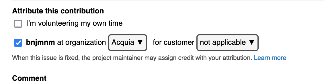
When choosing to credit an organization/customer, selecting them is done by clicking on a link. This is semantically incorrect and an accessibility bug, as the expectation for a link is to take the user to a new destination. To accurately convey purpose to assistive tech, the links here should semantically be buttons, either by changing the tag (preferable, but understandable if it isn't feasible) or by adding aria attributes that correctly convey the element purpose.
Since they don't function as links, these should not be styled as links either, and the gray box surrounding them isn't enough to trigger a visual distinction (particularly since it only has a 1.09:1 contrast ration against the default background color). Two new contributors I worked with recently assumed the links would take them to another destination, as opposed to allowing them to choose an organization and/or customer.
Something like this would visually convey the purpose of these controls more clearly
Steps to reproduce
Proposed resolution
- Either change the
<a> tags to button, or add aria attributes to properly convey the element purpose to assistive tech. This is a fairly unambiguous accessibility need
- Add visual styling to better distinguish these from links, ideally something that is intuitively understood as something that would reveal additional options .
Remaining tasks
User interface changes
API changes
Data model changes


Comments
Comment #2
drummThanks for the notes, we should be able to get this improved.
My thinking on the current styling was to not make it too prominent, so it reads like a sentence, and doesn’t take attention away from more-important elements. Not sure if I even like this idea, but could have the more button-like style on focus/hover.
Comment #3
hooroomooAs a new contributor who never thought to click on these links, I agree that a drop-down would be a better visual indicator that would make users recognize that organization options would be presented. (referring to Nielsen's usability heuristic of recognition over recall)
I personally feel like changing the styling to something more easily recognizable such as a dropdown wouldn't take any more attention away from other content, but I also understand if it isn't feasible, just wanted to share my perspective as a new Drupal user.
Comment #4
Theresa.GrannumIn my perspective as a new Drupal contributor and user, I agree these changes would be helpful and encouraging to new contributors. In my experience, when creating new issues this step was easily skipped. I also did not receive notification or re-direction to attribute my contribution prior to submitting.
Once pointed out, I was unsure on the appropriate steps to attribute credit and searched for an error in my account settings after being unable to locate this option. I believe the visual indicator will gravitate new contributors attention to this step and better distinguish it's purpose. Hoping this provides further insight into this issue.
Comment #5
drummChanging this to a button works well.
Comment #6
bnjmnm#5:
+1
Comment #8
drummThis has been fixed & deployed.