

Active
Project:
Drupal core
Version:
main
Component:
theme system
Priority:
Normal
Category:
Task
Assigned:
Unassigned
Issue tags:
Reporter:
Created:
29 Jun 2020 at 09:07 UTC
Updated:
24 Aug 2026 at 07:08 UTC
Jump to comment: Most recent, Most recent file






Comments
Comment #2
jwilson3To clarify the original intent was to only change the naming convention for lighter darker shades of gray, not the entire system. Several of the design systems I referenced on #3154539 still use named color variables for the majority of their colors, but use decimal system for their shades of gray. I don't see why it makes sense to change the scope of this to affect the entire system, instead of scoping this to just the neutral color palette. The rule is if two colors have the same Hue but a lighter or darker shade/tone (aka, Lightness and Saturation in the HSL colorspace) then it makes sense to name the variables with a simple color name combined with a decimal gradation.
Comment #3
saschaeggiYes that's basically the goal here :)
Slightly updated the title accordingly.
Comment #4
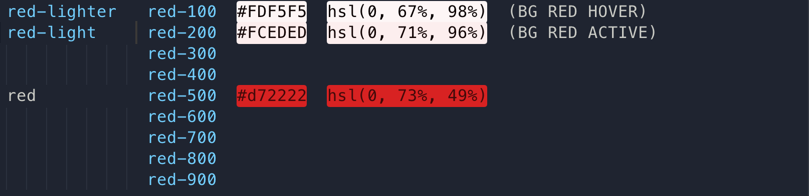
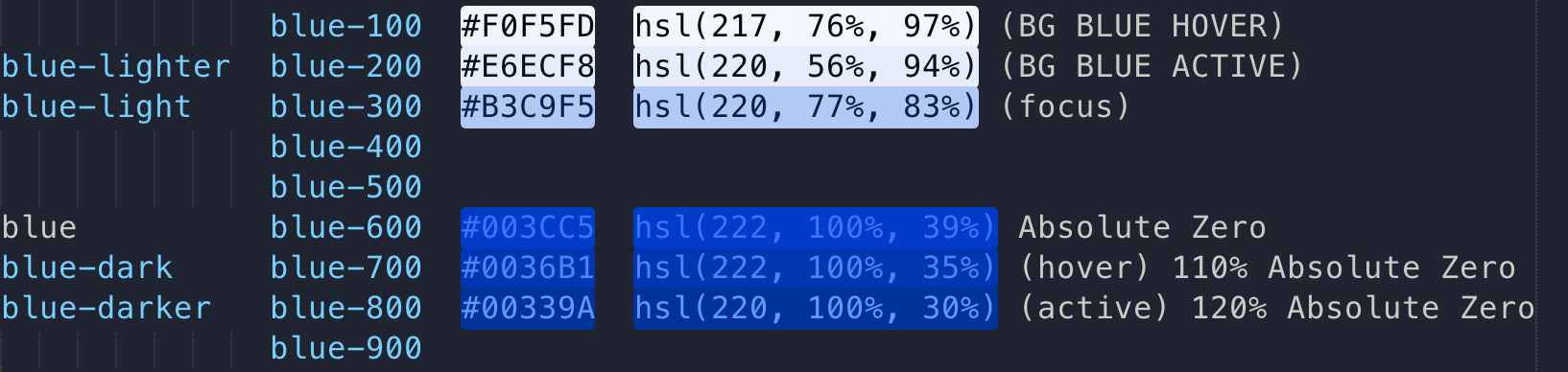
jwilson3I suppose besides the grays there are (currently) two other colors where the rule above applies in the Design System.
Reds and blues.
So you were correct to change the scope. My apologies.
Comment #5
effulgentsia commentedFWIW, I agree with doing this for greys and I guess looking at #4, maybe also blues. What would be the benefit of doing it for colors that only have 2 shades as opposed to using names for those like "light" and "dark"?
Comment #6
jwilson3I guess you're talking about the red there, and I totally agree that there is no benefit to a duodecimal suffix, and could in fact be argued that it would be harmful (for reasons outlined in my next paragraph). However, it is also worth pointing out that a
-lightand-darksuffix would be way better than trying to give the two shades different proper names. The light and dark suffix serve to provide context that there are other tones that can be used. But I should also point out that in Comment #4 above I didn't screenshot the original red color in the design system. So to clarify, there are actually 3 shades of red, not 2.This line of thinking brings up the deeper question: what happens when the design needs to be expanded from 2 shades to 3? to 5? to 7? AFAIK, there is no hard & fast rule to convert to a duodecimal system after say 4 tones, but its more just about what feels natural. If you're dealing with a color named
--color-blue-300in the CSS code, it provides contextual information before diving into the color system that there *are* more colors to work with.Comment #7
jwilson3Comment #8
jwilson3Comment #9
jwilson3Copying point 3 from #3154539-8: Implement new Gray scale on Claro here for more context and the research that was done. I proposed a duodecimal system there for the grayscale and also switching to HSL colors, which would make it more clear that all the colors in a tone group have the same hue.
You put the 100 level scale there to allow for future expansion if it were ever needed. This would vastly improve themers experience, maybe designers too.
Of the 11 design systems I checked, 8 of them standardize around a decimal system for their neutral color variables.
The 3 design systems that I looked at that broke from this trend were:
It is clear that the reason these outliers do not use a decimal system is because they don't have a complete grayscale, but only offer a few select neutral tones. Because we're adding several more grays here, it makes sense to switch to a duodecimal system.
Comment #10
effulgentsia commentedLooks like Bootstrap has "gray" as an alias for "gray-600" and has "gray-dark" as an alias for "gray-800". Would it feel natural for Drupal's design colors to evolve in a similar way? Such as:
Comment #11
jwilson3I like that direction. However, given that red has only two lighter tones and no darker tones, it might make sense to move to decimals later. I'm not entirely sure. What if the transition to decimal factors on more than two additional shades in either direction (lighter/darker) from the original color?
Such as:
Some initial analysis comparing the current hex codes, converting them to HSL colorspace, and mapping them to decimals, reveals that the conversion to decimal is not an exact science when there are "holes" between shades.
I ended up basically using my eye to make judgement calls on where to leave space between missing colors for the blues that are currently defined, to leave space for more mid-tones, if they were needed.
The other thing that this process turns up is that there would eventually get to a point where you start adding in swatches and tones, and have inconsistency with the legacy color-light and color-lighter. For example, if the reds were expanded at a future date, you would end up with red, red-light and red-lighter with different levels of white mixture between red and blue.
Then there is the problem of creating -light but then the second color tone you add is actually between original and -light! so you'd break BC to move -light to the new color and -lighter to what -light was originally.
Not sure where this leads us, if anywhere, really. But the problems here suggest an easier path would be to work out the color tones in a numeric gradation scale for all primary and secondary colors beforehand, like several design systems linked above do. Not sure we should do that or not, because it might be bloat and overload. But even if we don't go that far, it may make sense to align all the colors in HSL space and use similar luminosity (brightness) and saturation (flatness) percentages across all hues (if that makes any sense).
Comment #12
jwilson3Forgot to upload the neutrals, to complete the thought 👆.
Also, here is the code for quick copy/paste.
Comment #13
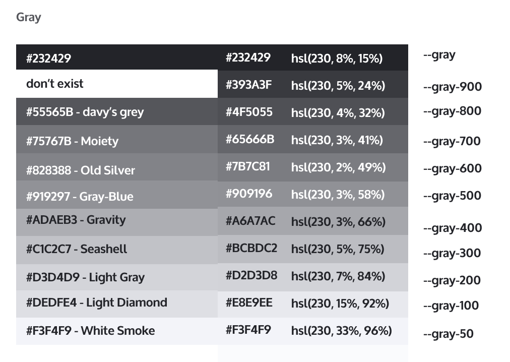
ckrinaThanks @jwilson3! We've discussed this proposal for a while and we've gone back and forward on this for a while. Basically the problem is that the current Gray scale is not based on a 10% variation from color to color and we couldn't name
gray-100andgray-756, just saygrey-700when it's really 73%. So we either changed the color or we got stuck with a non-percentage naming.So I'm proposing to change the Gray colors (again, I know sorry!) and try to find a proper color scale for Blue too, and use the naming you're suggesting because it'll make the code easier to use and more scalable. Also, we'll have to come up with a more complete blue scale since we've already seen the need to a more complex scale than the one we already have (like in [#3171729).
So here's what I propose: on the left, the old scale. On the right, the new one:
Obviously this means we'll have to do proper accessibility review to most of the components to be sure we're not introducing any regression.
Any thoughts before we move forward with the blue scale?
Comment #14
jwilson3Nice work taking this forward @ckrina and core Claro team. In addition to aligning the colors to a 10% +/- gradation (smart!), and the a11y regression testing (very smart!), I will be interested to see how designers end up aligning some of the more drastic color swatch changes.
The ones that stands out the most are
MoietyandLight Diamond, which I could envision they'll have to play with a bit manually. For instance, since Light Diamond is kind of in between 100 and 200 in terms of lightness, I can see sending some instances to--gray-100and others to--gray-200.Thank you for pulling the trigger on this!
Comment #17
ckrinaI've just created an issue for the Blue scale that needs some thoughts: any idea welcome. #3251709: Define Blue scale for Claro
Comment #18
ckrinaWhat would you think about coming up with a color scale for each secondary color as it has been done in https://designsystem.digital.gov/design-tokens/color/system-tokens/? (Credits to @ana-barcelona that referenced me this, and also referenced by @jwilson3 in a previous comment)
Also, FYI the work for the dark mode/dark regions is going to happen in #3251278: [META] Designs for dark background layers and its color palette, where we should discuss if the color scales should be the same or not.
Comment #20
ckrinaComment #21
jwilson3Just following up here that the point about 10% mapping directly to the Luminosity percentage in the HSL colorspace being directly connected to the 100-point scale, might not be required. I would consider the exact percentage less important than a relationship between the two adjacent colors in the scale. For practical purposes, 100 is lighter than 200, but not necessarily exactly the same lightness difference between 200 and 300.
It might be worthwhile considering help from a tool like https://accessiblepalette.com/ to create consistent luminosity across all base colors in the palette.
Here is a super-quick proof of concept:
https://accessiblepalette.com/?lightness=98.2,93.9,85,76.2,67.4,57.8,48,...
I expect this would require additional manual review and tweaking to take into consideration WCAG against dark mode.
Comment #26
quietone commentedThe title says this is for all themes so moving to the theme system.