Hello,
First, thanks for your hard work on the module. I am updating from 2.0.0-rc6 and I saw the impressive changelog.
I tried updating from 2.0.0-rc6 to 2.0.0 and then to the last dev version, which is the 2.1.0, because this new version was published while testing and writing the issue.
I see that the pixel gif had been replaced by an SVG image. Ok, no problem.
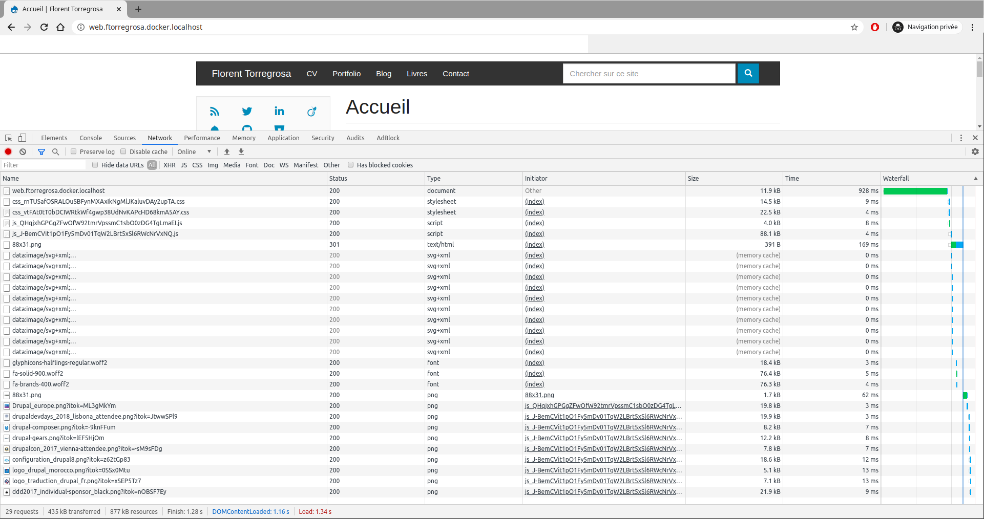
But I also see that the images at the bottom of the page for example are now downloaded at the page loading, after the SVG, but without waiting for the user to scroll down.
I attach screenshots to compare between local (blazy updated) and online behavior. I will wait before deploying the updates.
I also attach my blazy settings.
If more debug information are needed do not hesitate to ask.
Thanks for any help.


Comments
Comment #2
gausarts commentedThank you.
Is it about the latest release 2.1.0 today?
I suspected it is about Chrome native lazy loading. However it was already delayed: #3120696: Delay native lazy loading till one is hit
If still an issue try adding a wall of text, and let me know. Also be sure to give enough few test cases, above, the below fold, etc.
SVG was in by request for quite a while #2838131: Use SVG as placeholder image.
Comment #3
grimreaperThanks for your very quick reply.
Yes it is about the 2.1.0.
Before creating the issue, I had also tested with Firefox and I had the same behavior. Now sometimes depending on conditions, cache or not, slow network or not, I see the loading placeholder. That's ok for me, if you say it is because of browser behavior, also I saw that you are transitioning to native lazy load, which is great. And thanks for the links to the related issues.
But I found a new problem with responsive image. And as I am also updating Slick, I had not the time to isolate precisely the source of the problem.
When with:
Blazy: 2.0.0-rc6
Slick: 2.0.0
I have for example the following HTML (source, not interpreted) (https://florent-torregrosa.fr/portfolio/groupe-pomona-sites-branche):
And with
Blazy: 2.1.0
Slick: 2.2.0
The problem is in the "data-srcset" attribute, after the update there is only one image style left. Which is the correct one according to the final width of the image.
So no problem? Yes, but no...
With max 650*650, there is a reduction of image quality... I tried creating a new image style max 845*845 (because image width is 848px on desktop), but there is still this a loss of image quality.
Before the update it is the max_2600*2600 image style which is used, resized in CSS to a 848px width. So even if the image is big, it is correctly displayed.
I don't know if this is for this kind of situation that it is possible to define "multiplier" on responsive image styles?
I tried looking in src/Blazy.php::preprocessResponsiveImage() without success. And as said above in the comment, as I am also updating Slick, I had not the time to isolate precisely the source of the problem.
Thanks for any help.
Comment #4
gausarts commentedThank you.
So the initial issue "Image downloaded even if at the bottom of the page" is fixed as assumed about native lazy load?
> I don't know if this is for this kind of situation that it is possible to define "multiplier" on responsive image styles?
You are right, there is a change between rc6 and 2.1.
The latter considers device pixel ratio correctly:
https://git.drupalcode.org/project/blazy/-/blob/8.x-2.1/js/dblazy.js#L110
The older version doesn't take device pixel ratio into account, just window width:
https://git.drupalcode.org/project/blazy/-/blob/8.x-2.0-rc6/js/blazy.loa...
So your observation is correct.
As mentioned elsewhere, Responsive image integration is never done/ finalized till 8.x-2.x rc7, or around last February precisely where the integration got a bit of my love:
https://git.drupalcode.org/project/blazy/-/blob/8.x-2.1/docs/TROUBLESHOO...
Solutions: consider to take device pixel ratio into account from now on.
Let me know your findings.
Comment #5
grimreaperThanks again for your detailed reply!
I took the decision to rethink completely my image styles and responsive image styles to adapt to my usage of Bootstrap 3. I was previously using the ones provided by the standard install profile.
I read an article explaining srcset, etc. https://www.alsacreations.com/article/lire/1621-responsive-images-srcset... (french sorry), because as thinking about image styles and responsive image styles, I forgot regularly how it works exactly.
But sorry, I think I found a new bug or a new misunderstanding.
With Blazy, I have the following output:
With the native responsive image formatter, I have the following output:
The problem I have with the Blazy formatter is:
max_850w is an image style with a scale to 850px of width effect. So it should be "850w" at the end. The "290w" is because of the fallback image style's width.
I tried to track down the origin of the problem and found BlazyUtil::imageUrl():
This is putting width and height in $settings which is then transmitted to preprocess_responsive_image callbacks, so the width is no more calculated. Or maybe I am not seing correctly.
So it is a bug or still me misunderstanding something?
Comment #6
gausarts commentedDoes it work if you remove the check:
if (empty($settings['_dimensions'])) {If not might be somewhere else.
Comment #7
gausarts commentedIs the above setup as below? If not, please try and let me know:
Just 2, not 3 for now.
Just for Blazy, compare Aspect ratio Fluid and None. The latter basically remove the above-mentioned check you suspected without touching code.
Assumed Picture with similar ID.
If you are looking for Picture integration, it is here:
https://git.drupalcode.org/project/blazy/-/blob/8.x-2.1/src/Blazy.php#L336
Other places are only relevant for Aspect ratio, or CSS fixes, not the essentials.
Comment #8
grimreaperThanks again for you reply!
The latter or the first? Because
$settings['_dimensions']is set when "Aspect ratio" is not set.Changing the setting has no impact because in this configuration, transformDimensions() is still calls from somewhere else and the result is still not correct.
If I comment the line
$settings = array_merge($settings, self::transformDimensions($style, $settings));, then there is an impact and I have the same result as the native responsive image formatter.If this may help, with aspect ratio none, and no code modified in Blazy or Core:
With the native responsive image formatter, in core/modules/responsive_image/responsive_image.module::_responsive_image_build_source_attributes(),
$variables['width']and$variables['height']are the ones calculated from the original image, and so the function computes srcset correctly.With Blazy, when going into core/modules/responsive_image/responsive_image.module::_responsive_image_build_source_attributes(),
$variables['width']and$variables['height']are the ones from the responsive image's fallback image style's dimensions applied to the original image (in my case, max 290px width). So the function computes srcset incorrectly.I am tempted to write an automated tests to show the problem, but I don't see examples in core for this kind of tests. I saw that test setup in Blazy had been made easy, but not for the responsive image formatter in core. And also, that would require to grab the generated HTML.
Or maybe documenting steps from a fresh standard Drupal install?
Comment #9
gausarts commented> The latter or the first? Because $settings['_dimensions'] is set when "Aspect ratio" is not set.
The latter. The opposite. Aspect ratio
Fluidsets this_dimensionshere:https://git.drupalcode.org/project/blazy/-/blob/8.x-2.1/src/BlazyManager...
> If I comment the line ...
Sounds like this optimization section doesn't work out well for Responsive image.
Perhaps we should exclude it till further improvements/ corrections, like so:
if (empty($settings['_dimensions']) && empty($settings['responsive_image_style_id'])) {We don't need to take the lines out to still support regular images since no issues were reported so far for regular images.
Does it work at your end?
Comment #10
grimreaperTested with:
not "responsive_image_style_id" ;)
Works like a charm! Thanks a lot!
I felt obliged to find the root cause to definitely prove that there is a problem but if you are ok with this kind of quick fixes, I am ok too. I am not very well aware of all the stuff Blazy does, so not very efficient in debugging this issue.
Do you want me to make a patch for that?
Comment #11
gausarts commentedI couldn't reproduce this, yet. But I trust serious efforts better than my lacking of time.
Feel free to patch. Thanks.
Comment #12
grimreaperHere is the patch.
First, thanks for the compliment.
Second, do not blame yourself, I think you spend a lot of time to give free support. So as said in my previous comments. Thank you for the help!
Comment #13
grimreaperUpdating issue title and category.
Comment #14
jhmnieuwenhuis commentedGreat Job,
blazy-responsive_image_regression-3135220-12.patch also solved my issue #3135744
And i no longer need to use aspect ratio fluid, that was also causing problems for me.
Thanks so much!!
Regards,
Hans
Comment #15
gausarts commentedPlease allow some delay to get back on this. Thanks.
Comment #16
lindsay.wils commentedHello.
I believe I found a similar issue here with the wrong srcset being output after I updated to 2.1.
I have a responsive image style setup with sizes="100vw" and then multiple image styles for different breakpoint sizes, 320,480,640,800,1024,1280,1440,1920. I have the display mode set to Blazy and this responsive image style selected with no other settings.
The final output markup I am getting is only showing srcset values up to 800, then whatever style was chosen as the fallback. I then tested turning off the lower 4 image styles and just choosing the larger 4, but then the srcset output would only include whatever size was selected as the fallback.
After applying this patch however, the issue is resolved.
I hope this information helps you with any debugging on the issue.
OUTPUT PREVIOUS TO PATCH
OUTPUT AFTER PATCH
Comment #18
gausarts commentedCommitted. Thank you for contribution!
Comment #19
grimreaperThanks for the commit! :)
Comment #21
benabaird commentedIs there any timeline on getting a new release tagged with this fix in? This is pretty major, as it breaks using the responsive image option within blazy.
Comment #22
auxiliaryjoel commentedI notice users in this comment thread asking if there was a fix available.
I'm wondering if there's been any updates to make this reliable?