![Switch CSS management for [Varbase Media Header] from LESS to SCSS with Gulp as the task manager and make use of the (RFS) Responsive Font Size SCSS library](/files/issues/2019-09-09/Switch%20CSS%20management%20for%20%5BVarbase%20Media%20Header%5D%20from%20LESS%20to%20SCSS%20with%20Gulp%20as%20the%20task%20manager%20and%20make%20use%20of%20the%20%28RFS%29%20Responsive%20Font%20Size%20SCSS%20library.gif)
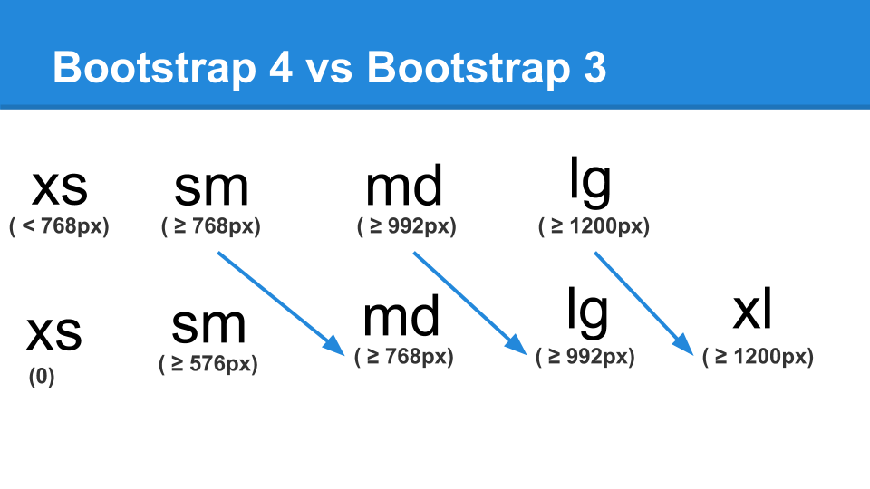
Shifted the Bootstrap breakpoints to work with Bootstrap 4
// Grid breakpoints ( Bootstrap 4 )
//
// Define the minimum dimensions at which your layout will change,
// adapting to different screen sizes, for use in media queries.

$grid-breakpoints: (
  xs: 0,
  sm: 576px,
  md: 768px,
  lg: 992px,
  xl: 1200px
) !default;
Bootstrap 4 vs Bootstrap 3
Varbase Media Mapping Bootstrap 3 into Bootstrap 4
Switched BS3 XS max ( < 768px) to BS4 SM max ( <767.98px)
Switched BS3 SM min ( >=768px) to BS4 MD min ( >=768px)
Switched BS3 MD min ( >=992px) to BS4 LG min ( >=992px)
Switched BS3 LG min ( >=1200px) to BS4 XL min ( >=1200px)
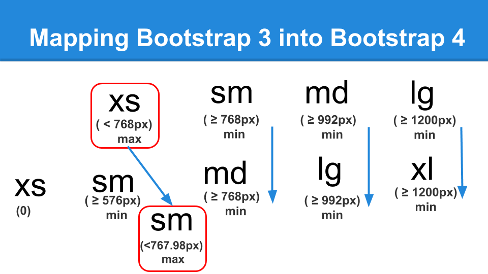
Switched Custom Varbase Media Header variables of md to lg in Bootstrap 4
// Varbase Media Header container height.

$vmh-container-v-padding: 60px;

$vmh-container-min-height: 300px;
$vmh-container-max-height: 300px;

$vmh-container-min-height-lg: 300px;
$vmh-container-max-height-lg: 300px;

$vmh-container-top-margin: 0px;
$vmh-container-bottom-margin: 10px;

// Varbase Media Header fallback container background color.
$vmh-fullback-container-background-color: #338ec7;

// Varbase Media Header content text general style.
$vmh-content-text-color: #fff;

// Varbase Media Header title style.
$vmh-title-color: #fff;
$vmh-title-font-size: 30px;
$vmh-title-font-size-lg: 58px;

// Varbase Media Header breadcrumb style.
$vmh-breadcrumb-color: #fff;
$vmh-breadcrumb-font-size: 12px;
$vmh-breadcrumb-font-size-lg: 14px;


![Switch CSS management for [Varbase Media Header] from LESS to SCSS with Gulp as the task manager and make use of the (RFS) Responsive Font Size SCSS library.gif](https://www.drupal.org/files/issues/2019-09-09/Switch%20CSS%20management%20for%20%5BVarbase%20Media%20Header%5D%20from%20LESS%20to%20SCSS%20with%20Gulp%20as%20the%20task%20manager%20and%20make%20use%20of%20the%20%28RFS%29%20Responsive%20Font%20Size%20SCSS%20library.gif)
Comments
Comment #2
rajab natshahComment #3
rajab natshahComment #4
rajab natshahComment #6
rajab natshahComment #7
rajab natshahComment #8
rajab natshah