Originally submitted on Github
Problem/Motivation
Recent interviews and research exposed pain points around Drupal's admin experience of looking and feeling dated, especially compared to our competitors, and universally cited that choosing a more modern-looking admin theme instantly led to Drupal being better-perceived by said users.
There was an amazing community effort to Create a Style Guide For Seven that vastly improved its look + feel compared to the original, but Design best practices and Drupal functionality have moved on since then.
Proposed resolution
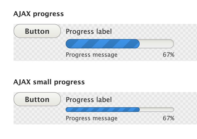
Implement new progress bar styles to create a favorable first impression of Drupal for evaluators and a better user experience for site authors. No functional differences.

Specs:
https://www.figma.com/file/OqWgzAluHtsOd5uwm1lubFeH/Drupal-Design-system...
Remaining tasks
- Update patch styling to include time inputs
- Accessibility review
- RTL review (Right to left)
User interface changes
All progress bar styles will be changed, no functional differences.
Test Pages
/node/add/article
/user/1/edit?destination=/admin/people
/admin/modules/update (click on Check Manually)
/install.php
Manual step:
Move through the install process until you hit the progress bar




Comments
Comment #2
saschaeggiNeeds design work
Comment #3
saschaeggiComment #4
saschaeggiComment #5
saschaeggiThis is ready for implementation :)
Comment #6
shaalI created an initial patch for progress bar style update.
Desktop (big):

Mobile (small):

Comment #7
huzookaRe #6:
progress.module.cssin the info.yml.progresselement. Please fix.progress__percentageand.progress__description!Screenshots attached.
Comment #8
finnsky commentedHello all!
It was easier for me to create new patch. i rewrited classy progress.css but keeped stable progress.module.css since it contains all required for rtl.
Also i added states variables and implementations. I think it is better to use this component for password strength field.
Comment #9
finnsky commentedComment #10
finnsky commentedSorry i forgot to add
Comment #11
thejimbirch commentedComment #12
brianperryReviewed the latest patch noticed that the progress element still had overflow issues with elements below it. Rolled a new patch that contains a fix for the overflow issues along with the rest of the styling (which looked good from my perspective.)
Comment #13
huzookaComment #14
huzookaComment #15
huzookaScreenshots attached.
Comment #16
huzookaRe #12:
I only ask for adding
vertical-align: top;to.ajax-progress(and remove the re-definedinline-blockdisplay of.ajax-progress-throbber).Nothing else.
Excellent (and elegant) work!
Comment #17
kostyashupenkoComment #18
kostyashupenkoComment #19
huzookaRe #18:
This is too much.
This makes throbbers worse than before... Please take it back!
Comment #20
kostyashupenkoComment #21
kostyashupenkoComment #22
huzookaScreenshots look nice :)
Comment #23
finnsky commentedRe #16
@huzooka according to BEM principles alignment of ajax-progress__button and ajax-progress__progress-bar elements should be managed on level of ajax-progress block. so it is not really related to progress bar block.
From: https://en.bem.info/methodology/quick-start/#block
The block shouldn't influence its environment, meaning you shouldn't set the external geometry (margin) or positioning for the block.
so progress-bar itself shouldn't contain any alignment. but we may and seems have to add it on ajax-progress__progress-bar element. So maybe it is not the problem of this issue?
Comment #24
huzookaComment #25
huzookaFix based on the principles highlighted in #23.
No aligns anymore :)
Comment #26
lauriiiNice progress so far! 👏 Thank you everyone for pushing this forward!
This is leading into wrong text color. The documented text color is Davy's Gray (#545560).
There's still some inconsistencies with the vertical align.
Comment #27
huzooka@lauriii Well we have to decide how deep we want to follow BEM principles. I think that @finnsky is right (see #23), but only visually I still prefer the aligned version.
Comment #28
huzookaRe #26: note that on the attached screenshots the throbber is aligned to the baseline, and that's not a bad situation imho.
Comment #29
ckrinaComment #30
huzookaComment #31
huzookaRe-rolled the patch form #25.
Screenshot attached.
Comment #32
lauriiiThis hopefully fixes the vertical align issues.
Comment #33
huzookaTesting #32.
Comment #34
huzookaIE and Edge are rendering the throbber really ugly.
Comment #35
huzooka...well, IE11 and Edge.
Comment #36
lauriiiWe probably actually don't need the svg at all. In my opinion, this looks better in all browsers, including high contrast (even though the empty space of throbber isn't completely empty). This way we also don't have to worry about this browser compatibility issue.
Edit: for some reason, the interdiff isn't showing the file spinner.svg deletion but it can be found from the actual patch.
Comment #37
huzookaRe #36:
Excellent catch! I agree that we don't need the SVG at all.
But the full-screen throbber does not follow the design definition anymore:
Comment #38
huzookaI'll fix this!
Comment #39
huzookaThe throbber on IE and Edge is a bit worse than without the patch from #36 or the attached one...
Comment #40
huzookaWe need to fill the progress bar with the text color in high contrast mode:
Comment #41
lauriiiFixed the IE 11 problem raised in #39. I also customized the ajax markup to make it follow BEM standards.
Comment #42
huzookaI'm reviewing this.
Comment #43
lauriiiAdded missing compiled JavaScript file to the patch.
Comment #44
huzookaOnly one thing:
Now that we are able to use BEM structure, I'd use a modifier for the fullscreen throbber, e.g.
.ajax-progress__throbber--fullscreen.Comment #45
huzookaRe-rolled patch from #43, no other changes applied.
We noticed a weird issue with the throbber that happens only on high-contrast Edge and only with an RTL language.
Comment #46
lauriiiThis fixes the shakiness on throbber in high-contrast Edge RTL.
Comment #47
huzookaComment #48
huzookaI increased the size of the full screen throbber to work around it's shaking animation in Safari on a non-retina display and fixed a minor RTL issue.
The attached screenshots were generated before the RTL margin of
.ajax-progress--throbberwas fixed.Nothing else.
I think this is ready for committing!
Comment #49
lauriiiI think we should remove this property. Because of this, the progress bar is leaking 2px out of the container when it is at 100%.
The styleguide doesn't define color for this state. I think we could use the same color as we use for the fair state until we get more information from the design team.
Comment #50
huzookaI'll fix these.
Comment #51
huzookaAddressing #49, and on top of those, I also changed the border-color of the fair state.
Comment #52
lauriiiSorry, I didn't notice this earlier 🤦♂️This leads into #228572, but according to the designs this should be #26a769.
Comment #53
huzookaComment #54
huzookaIt seems that the color palette was changed. We don't have celadon green anymore, but we have lightning green instead of that.
I updated the variables and completely removed celadon green.
Comment #55
lauriiiWe should update this to use the new lightning green color 🤠
Comment #56
huzookaComment #57
huzookaMaybe this time?..
Comment #58
lauriiiThank you everyone! This looks great ✨Committed and pushed!
Comment #60
lauriiiNot sure what has moved this back to needs review 🤷♂️