
Closed (fixed)
Project:
Drupal core
Version:
8.6.x-dev
Component:
media system
Priority:
Normal
Category:
Task
Assigned:
Unassigned
Issue tags:
Reporter:
Created:
7 Jan 2018 at 14:21 UTC
Updated:
3 Mar 2018 at 17:14 UTC
Jump to comment: Most recent, Most recent file


Comments
Comment #2
marcoscanoIncluded the generic icon that was missing from the other issue.
After checking, and as far as I can see, we are never going to use the
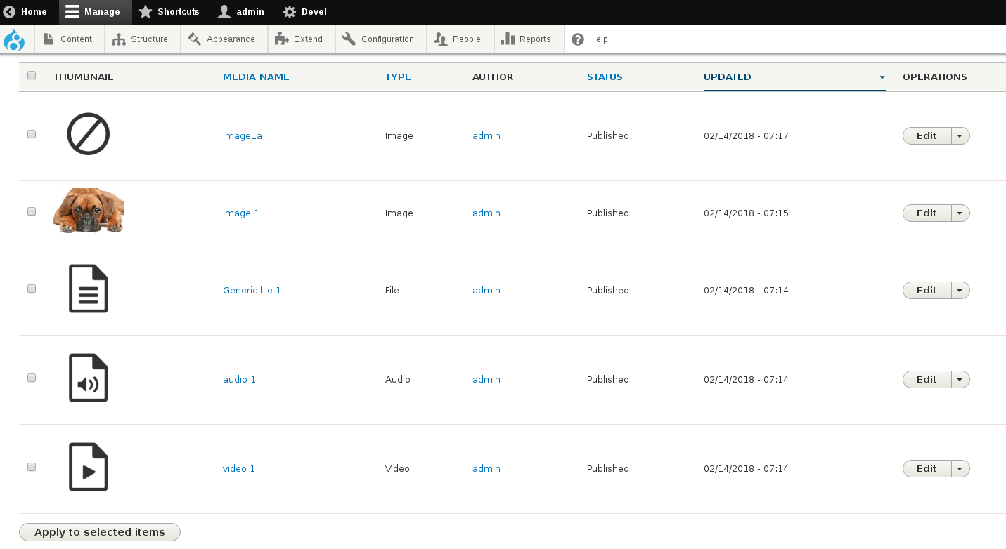
no-thumbnail.pngfile. It's only being referred to from theImagesource, but inside\Drupal\media\Plugin\media\Source\Image::getMetadata()we don't use the annotation info, because we return the real thumbnail of the file uploaded. So I removed it altogether.Added screenshots to the IS.
Comment #3
chr.fritschThe new icon is looking good.
I think removing no-thumbnail.png is not a good idea. It could be used in the following use-case:
In this situation, the generic.png will be used, because Image extends File. So the annotation from File will be inherited to Image. So I think we should have a dedicated image.png for that.
Comment #4
marcoscanoShouldn't this be forbidden?
I recall some discussions about making the source field locked in #2831936: Add "File" MediaSource plugin and #2274433: Do not allow to alter Locked field via UI, but TBH I don't remember if this is a legitimate use case or not. Even if it is, an argument could be made that this "broken" image media inheriting a "generic" icon is not a big problem, because the media has no content itself?
Comment #5
chr.fritschCurrently, it's not. I just did that 😇
It's true, it's not really wrong, but I guess an image thumbnail would be a bit nicer.
TBH, I don't have strong opinions because it's a super rare use-case.
Comment #6
marcoscano@evankay produced improved versions of the icons:
https://www.dropbox.com/sh/m4w5ltbzlmd277b/AACoErnURWWZ1pZlKUQVATt4a?dl=0
which include also the "no-thumbnail.png" icon. I'll be updating the patch shortly.
Comment #7
marcoscanoHere we have some options to hopefully reach a final decision ;)
First, I've given up on the idea of eliminating the
no-thumbnail.pngicon, because we already have it, and it may become useful in the future.Then, following a slack conversation, @evankay suggested that other icons, with lighter background, could be more suited for these icons from a design perspective:
I tend to agree, so I have produced patches that use each of the icon sets prepared for this. Here we go:
Current state of 8.5.x HEAD:
Option 1 - Current grey background
Option 2 - Blue with white background
Option 3 - High contrast
Option 4 - Grey with white background
Opinions?
If a backender opinion counts :), I personally prefer Option 2 (blue).
Also, and kudos to @evankay for helping out with the icons! Thanks!
Comment #8
marcoscanoTagging for our UX experts' opinion as well.
Comment #9
gábor hojtsyIMHO gray with white background blends in best with this default theme. Take that as a personal opinion, not a "UX expert" ;) As a core reviewer, I would say we need to ensure accessibility of the icons, so whatever color difference there is, it needs to be checked with that in mind: https://www.drupal.org/node/464500
Comment #10
gábor hojtsyAlso as a core maintainer, I would add that whatever icons we add, we need source files, so someone else can produce icons for other media in the future in the style without reverse engineering. Given the icons are PNG not SVG, we need the source files somehow.
Comment #11
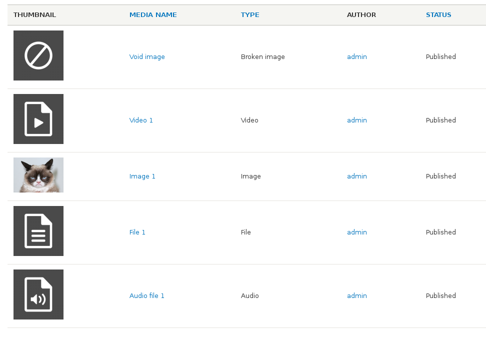
marcoscanoUpdated IS screenshot with the one that shows all icons.
Comment #12
evankay commentedProviding the source file (Sketch) and SVG versions is not an issue. Will share this via Slack.
Comment #14
seanbI think the transparent background looks better than the gray background. If we use the text color for the icons (I think that is #333 in the seven theme) the colors won't be an issue.
I personally really like the look of the blue ones, but given that is also the color of links, users might think the icons are clickable.
@evankay, could you upload the source files to this issue? I can't find them in Slack anymore.
Comment #15
evankay commentedSource file for the icons (Sketch app)
https://www.dropbox.com/s/oc249tmoq9tbgkb/drupal-media-icons.sketch?dl=0
Comment #16
gábor hojtsyGrey on white it is then? :)
Comment #17
Jeroen Witte commentedI've changed the 'grey on white' color to match the text color (#333 is correct indeed).
New file + exports can be found here: https://www.dropbox.com/s/ulp1t6itrw9wpp8/Drupal-media-icons.zip?dl=0
Comment #18
mycw1991 commentedComment #19
nitebreedI prefer the grey on white as well
Comment #20
mycw1991 commentedAdded patch based on the file exports of @Jeroen Witte .
Comment #21
mycw1991 commentedComment #22
jefuri commentedSweet! Added a screenshot of the result. Setting this to RTBC.

Comment #23
jefuri commentedComment #24
seanbThe icons in #20 are the same color as the text, so the accessibility concern in #9 is not an issue for that one. The icons are a little more "in your face" than the lighter gray ones. If the gray ones from #7 are good enough in regards to accessability, maybe those would be a little better. Not sure who should make the final call on this.
I guess it should be either 2934960-7-grey-white-bg.patch or 2934960-19-grey-white-bg.patch.
Setting back to needs review for usability/accessibility.
Comment #25
andrewmacpherson commentedThe icons in #22 look fine for accessibility - is it just those 4?
Some things I'm curious about:
I'm happy to sign off on screenshot #22 for core theme accessibility.
Comment #26
seanbThanks Andrew!
The icons from #22 are #333 (same as the text color in seven) so that is a ratio of 12.63:1.
The grey icons from #7 are #9B9B9B with a ratio of 2.78:1.
If we want a ratio of 7:1 we need at least #595959. This color gray is pretty dark, so to me there is no real benefit of using this new grey color over reusing the text color #333. For a 4.5:1 ratio we could use #767676, but I think we should stay on the safe side.
I guess #22 should be the one?
Comment #27
andrewmacpherson commented#333 is great- a ratio of 12:1 against white is comfortably over the line for accessibility.
I'm happy to go as light as 7:1 using #595959 grey on white, though.
Comment #28
yoroy commentedWe discussed this during one of the ux meetings/hangouts. Verdict: we prefer the dark grey on white from #20, for which the screenshot in #22 is now missing.
Design wise these are ok. I'd like to see a follow up issue to explore a "broken" icon that commicates less "error" more "broken".
Tasks:
- create a follow up for the broken file icon
- somebody please upload a new screenshot of the patch in #22
Then this is rtbc and I might even be able to commit this one :)
Comment #29
marcoscanoFollow-up created: #2944631: Improve media icon that represents "No thumbnail available"
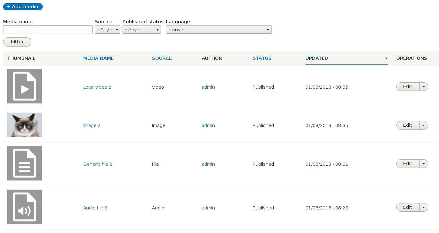
Screenshot for patch in #20 (also added to the IS):
Note for the record: If someone is trying to get the "broken" icon to show up with just vanilla core Media, once this icon represents something "broken", you need to break something in order to get it visible :) The easiest way to do so is to comment the following line in
\Drupal\media\Plugin\media\Source\Image::getMetadata():and then create an image media asset.
Comment #30
seanbFollow-up is created, screenshot is uploaded. I guess we are done here :)
Comment #31
gábor hojtsyAssigning :)
Comment #32
xjmDoes this need to be assigned to @yoroy? I think #28 already signs off on what's here, right?
Comment #33
gábor hojtsyI wanted to give him a great improvement to commit that he seemed to be after :) It does not *need* to be committed by @yoroy.
Comment #34
xjmI pinged @yoroy just in case. :) Just eager myself since this cleans up a bit of visual technical debt I allowed in for #2924631: Media sources for local video and audio support. I'll wait at least until tomorrow morning though.
Comment #35
gábor hojtsyI also pinged him at the same time I assigned it to him in committer chat.
Comment #36
yoroy commentedUpdating committer credit.
Comment #38
yoroy commentedCommitted 0e6031f and pushed to 8.6.x. Thanks!
Comment #40
yoroy commentedAnd once more for 8.5: committed c94a751 and pushed to 8.5.x.