Motivation
Currently commerce uses the standard Drupal menu system to present the various areas of the system. Because of the complexity of the various settings and forms, a proposal for adding some icon support and proper weighting/categorization would be a nice UI improvement.

Attached are a few examples of what other ecommerce platforms are currently doing in their UI's.
Proposed resolutions
Build a page template that will split up the UI into categories and navigation items/tabs with icon support.
User interface changes
Add a nicer looking UI to the main commerce page. Add category support for menu items.
API changes
Not defined yet.
Data model changes
Not defined yet.




Comments
Comment #2
aaronchristian commentedA few ideas I've had floating around for a little while now.
Tile based menus (in d8's core seven theme).
Dasboard:
Dasboard w/ Modal:
Comment #3
sumanthkumarc commentedAwesome, looks like we can get inspiration from status reports page :)
Comment #4
sumanthkumarc commentedAlso, we could embed help links and other resources in the above to docs.commerce.org or other docs, as webform module does. This would help users go straight to the help rather than first raising a support request.
Comment #5
aaronchristian commentedBased on our slack channel discussion it looks as though we may be looking into building some sort of graphical representation of various elements of drupal commerce. I'll be posting an updated mockup sometime this evening to get the ball rolling on building a true dashboard experience.
Comment #6
aaronchristian commentedMade a few revisions to the last design.
I simplified the look of the tiles and added in a few more UX focused elements.
Contributed modules could create their own groups or hook into the "Plugins & Extensions" section.
Feedback welcome!
Quick Add Modal:
Comment #7
sumanthkumarc commented@AaronChristian awesome job.
Comment #8
luksak@AaronChristian wow, this is looking great!
An optiomal widget that shows unfulfilled orders wold be nice as well!
Mabey some aggregated data would be useful as well. Some commerce_reports widgets? But I guess that is a differnt issue.
Comment #9
bbuchert commentedLove it! Maybe the icons could be reused in the quick add modal.
Comment #10
aaronchristian commentedAwesome thank you guys for the feedback!
@sumanthkumarc, as always, thank you!
@Lukas von Blarer great idea. I've actually mocked that up as well, I added the designs here: https://www.drupal.org/node/2891258.
@bdichgans, good idea. My only concern would be around groups with a bunch of sub-screens where you can add many options like in the stores configuration group.
However, I will mock that up and see how the presentation looks. The idea of keeping it cohesive is definitely ideal, but not sure about the complexities of adding that to the modals. Perhaps some backend dev's could weigh in on that.
Comment #11
goz commentedGood job, i really love it !
Only one suggestion is to keep configuration and content separated to not be confusing. Commerce has a lot of entities and concepts, so we should expose only commerce contents items first and then configuration items in another page, like commerce 2.x does.
Comment #12
bojanz commentedYou also need to account for unknown modules adding their own items (such as shipping), you won't have any applicable icons there, so you'd need to assign a generic one. Even if there were icons for the most popular contribs, such a case is always possible, and needs to be designed for.
Comment #13
aaronchristian commentedThanks for your feedback @GoZ, will take this into account and figure out the best presentation for this sort of functionality.
@bojanz, I have a few ideas around grouping and iconsets. I can't remember where i saw this, but if an icon wasn't provided they used a letter (ie. could be the modules name "S" for Shipping or something. Then had it inside of a circle to mimic an icon-style. I think we could do that here as well. This would at least give it a cohesive look as default icons sometimes never get updated.
During sprint week we have Anders or Jay ready to work on iconsets so we'll try to get them a large list to cover for potential contrib modules.
Hopefully with a new core option we could expose icons right when you build out your menu items. Probably some technical complexities around this but could be done for sure.
Comment #14
gauravjeet commentedPatch creates a template that splits up the Commerce dashboard into multiple groups. Styling needed - I have added classes as required.
Comment #15
gauravjeet commentedTODO:
- add modal popup
- add group weight
- Add '+Quick Add', as needed
Comment #16
gauravjeet commentedPatch in #15 somehow missed the twig file. Here it is.
Comment #17
hubbs commentedPatch #16 is good. I'll get started with some styles.
Comment #18
aaronchristian commentedNice work guys!
Comment #19
hubbs commentedAlright, I made some progress on the styling of this, building on @gauravjeet 's patch.
Some things to note:
* updates gauravjeet's template file to follow BEM methodology.
* adds
css/commerce.dashboard.cssfor styles.* adds
js/dashboard.jsfor generating the default icon based on the title first letter.* adds
icons/dashboarddirectory with some initial icons.Still lots left to do, but it's a good start. Here's a screenshot.

Comment #20
hubbs commentedWhoops. Wrong patch file. This is the correct one. :S
Comment #21
rszrama commentedI've reviewed this thread, and while it appears there was a fair amount of real-time discussion about the approach, I'd like to offer some pushback here and some suggestions.
First, let me reiterate what GoZ said above. We shouldn't be mixing content and configuration into tiles like the proposed screenshots. We've always very carefully ensured that Orders, Products, Promotions, etc. - the actual content of the store - were easily accessible at the primary menu level while configuration tasks that are rarely referenced are placed beneath that menu.
Second, I kinda feel like the whole thing should really be the interface for the Configuration page itself. It makes sense to have a wizard there with more expansive tool tips and the like on a page like that. A tile based UI like Drupal uses elsewhere would be perfect for grouping configuration menu items, too ... like putting the "structure" menu items in a single group (Order types, Product types, etc.). I probably wouldn't try to use icons.
Last, the main Commerce dashboard should itself be sales oriented with quick links to Orders, Products, Promotions, etc. This is the same in most eCommerce platforms. I often reference it against Shopify, and it's in that spirit that we began developing our reports dashboard. Given that, I think we should retitle this issue to "Improve the Commerce configuration UX" and focus on that while leaving admin/commerce alone for now.
Comment #22
bojanz commentedAdded the first two issues:
#2897929: Move Stores to admin/commerce/config
#2897928: Rename the Tax Types menu entry to Taxes
Moving stores to confugration further reduces the main screen, which now has only Orders / Promotions / Products / Product Attributes / Configuration.
Comment #23
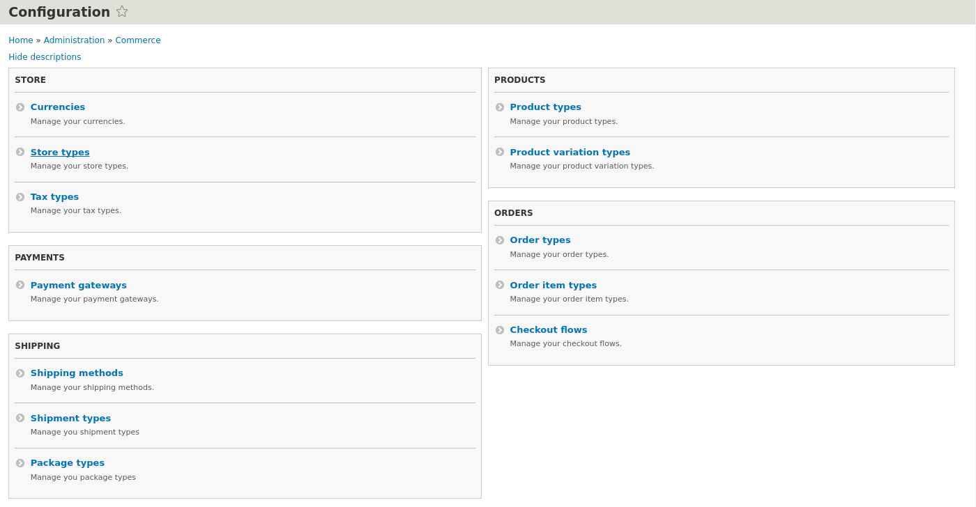
bojanz commentedI had a call with Ryan about this, where we iterated on the idea to have the configuration menu have the same tiles that the Drupal configuration menu has.
Here's a proposed structure.
Left column:
Right column:
Note that the ordering of items is not alphabetic and aims to put more frequently used items first under each group.
Comment #24
bojanz commentedCurrent version. Still missing the Stores link under "Store".
1) I really dislike the redundancy of the item descriptions, but I can't think of anything smarter for now.
Suggestions welcome. Removing them is an option, but would feel a bit alien compared to admin/config.
2) I renamed the "Stores" group to "Store", feels like it makes more sense, since it's more of a global site-wide thing. It breaks the convention a bit (since other groups are plural), but I'm not sure it matters much. It would also be weird to have "Stores" under "Stores", and we'd have a URL collision.
3) The configuration link on admin/commerce now has the description "Configure Commerce and related modules." which still sucks. Help?
Comment #25
rszrama commented1. So, re: the item descriptions, I don't see harm in having them, but I agree that if they just restate the name of the menu item, they aren't really useful. I also wonder if we can get away with hiding descriptions by default. To rewrite them, we can describe the default or common actions you would perform in each menu:
2. Since the group names don't actually appear in the menu hierarchy, I don't mind them being a bit redundant and including "Configuration" or something similar. They could all be "Store configuration", "Product configuration", etc. Even without a suffix, "Payment" works better than "Payments", so then "Store" will look less out of place.
3. How about something that gets at the combination of settings / structure? "Configure your store settings and structure."
Comment #27
bojanz commentedIterated on Ryan's descriptions, and committed.