
 Come together with the global Drupal community in Rotterdam, 28 Sept – 1 Oct 2026. Sessions, contribution, connection, and Early Bird savings until 8 June.
Problem/Motivation
Followup from #2831760: Introduce a "Modal form" mode for adding Paragraphs.
The add buttons between paragraphs clutter the UI, so they should NOT be displayed all the time.
Proposed resolution
Display the add buttons between paragraphs only on hover.
Adding a paragraph somewhere in the middle of the document is currently a pain: Add at the end and drag & drop.
We can easily improve the editing UX now. We only need to make sure this issue is not additionally cluttering the UI.
So let's only make the add/+ button visible when the mouse is near it.
Not sure about exact label and effects:
We could start with a light visible "+" button that expands to an "+ Add Paragraph" on hover.
IMHO the add buttons between the paragraphs should be horizontally centered.
I would still keep the last button on the left (unconditionally visible with full label) like it is now to better identify the effective level where we add a Paragraph.
Remaining tasks
User interface changes
The proposal should be updated to represent the current evolution and effective issue goal of the UI.
| Comment | File | Size | Author |
|---|---|---|---|
| #40 | para_add_in_between_edit.png | 175.56 KB | mtodor |
| #37 | show_add_widget-2877927-37.patch | 10.4 KB | nils.destoop |
| #29 | add_in_between_patch_29.png | 141.88 KB | mtodor |
| #29 | 2877927_29.patch | 10.38 KB | mtodor |
| #27 | show_add_widget-2877927-27.patch | 23.13 KB | yasmeensalah |

Comments
Comment #2
ginovski commentedComment #3
ginovski commentedComment #4
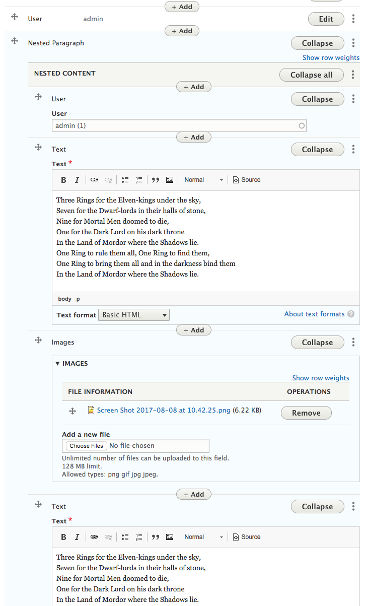
samuel.seide commentedHere is a patch that adds in paragraphs inline, with a default Add button at the bottom of the paragraphs, as well as hidden add buttons that show when you hover between paragraphs.
Comment #5
miro_dietikerWe are ready to continue work here after the modal is committed.
I'm promoting this now since adding a paragraph somewhere in the middle of the document is currently a pain.
We can easily improve the editing UX now. We only need to make sure this issue is not additionally cluttering the UI.
So let's only make the add/+ button visible when the mouse is near it.
Not sure about exact label and effects:
We could start with a light visible "+" button that expands to an "+ Add Paragraph" on hover.
IMHO the add buttons between the paragraphs should be horizontally centered.
I would still keep the last button on the left (unconditionally visible with full label) like it is now to better identify the effective level where we add a Paragraph.
Comment #6
yasmeensalah commentedThis is a work in progress patch file to have something as you can see in the following gif image

Comment #7
miro_dietikerNice start. :-)
It already takes some extra space and visual weight. Please further reduce button opacity while not hovering.
The idea was also to play with shortening the button label. It could be a simple "+" that expands with the hover.
I really think that the horizontal centering should only be done by the additional buttons. The last one (each that exists now) should remain left aligned with this issue. Otherwise UX is horrible with nested paragraphs. There is an issue that should then offer a combined Add button for nested Paragraphs. Once we have this, we can center the button.
Comment #8
johnchqueIn #2831760: Introduce a "Modal form" mode for adding Paragraphs I added the buttons between paragraphs with a minimum impact in the ui. Maybe we could use them? :)
Comment #9
yasmeensalah commentedAdded (Onhover) function and align the last button to the left

Comment #10
yasmeensalah commentedComment #14
miro_dietikerVery nice work.
I'd like to have some more feedback of others to the visual proposal!
But that's actually not a blocker. We can also consider that with further improvements.
One small thing: The buttons are blue, but the text is black and not well readable. We have to invert the button label on blue.
Pinging team for JS review. And then let's get it in when tests pass! :-)
Comment #15
miro_dietikerOh, i see you also ran into the typical weight issues and sure, reordering...
We are short before committing the drag & drop mode that fixes many related issues.
#2825575: Introduce a Drag & Drop Mode
I guess there will be quite a bit of refactoring and likely feedback how to improve code.
It's pretty clear this will go in after drag & drop that after a huge amount of work on the finishing line. Sorry for reroll / refactoring extra work.
Comment #16
johnchqueUnrelated change.
I like the new visual approach but is it me or when hovering the "+" button text becomes to "Add paragraph" that's strange.
The margin below the button makes all the paragraph content go lower, that needs to be fixed also.
BTW at first, I thought we were going to use the "small" core class in the button so it becomes smaller and clutters the UI less.
Comment #17
miro_dietikerYeah, the effect from "+" to "Add Paragraph" is jumpy.
We could try some CSS transition that does an ease-in on the label and keep the "+" in front of the "Add Paragraph".
But that's muche more easy said than done, quickly tried it a bit...
A partial solution found is this https://codepen.io/anon/pen/xalDc
Comment #18
alexej_d commented@miro_dietiker a good solution would be to animate max-width of the text from 0 to 99em or a similar size.
Comment #19
miro_dietikerI guess max-width to auto would work as well, combined with no-wrap. So yeah, let's do it. :-)
Comment #20
yasmeensalah commentedAccording to your feedback:
- Changed the text color on hover to be white
- Changed the effect for converting the text from "+" to "+ Add Paragraph" using max-width
Comment #21
miro_dietikerSuper cool work.
@yasmeensalah if you provide an update, please also provide an interdiff. We can then better see what changed since your last upload.
I'm super eager to get this in right after drag&drop. :-)
Now we need to write tests here too.
Let's not waste too much time: The drag&drop refactors a lot of tests. We should start on top of that work.
Comment #22
johnchqueReally cool stuff, some code review:
No space before comma.
Wrong indentation.
Some extra space between "+" and "Add".
Since this is a "submit" element, I think the button class is added automatically. Instead IMHO we should add the class "button--small" which makes it a bit smaller than usual. ;)
Let's use 80 chars length in comments, I think we can get more in the first line, just break the line when run out of space.
Besides that looks cool (didn't check all the js though). Also eager to get this in. :)
Comment #23
berdirThis and #2825575: Introduce a Drag & Drop Mode have a single trivial merge conflict when applying both patches. They disagree on an empty line.
So no reason to postpone one on the other. I'd expect more conflicts with the autocollapse issue, that is changing a lot in various callbacks, but I think we can live with having to reroll either of those two issues.
I'm not sure yet I understand why we need all this template logic again after we worked hard on removing it in the initial dialog issue.
I would expect that the only thing that we need is to know the position, based on a hidden delta element.
Maybe I'll figure something when I get further down, maybe this is an unclean rebase after we removed that?
I think we already add the library outside, so we don't have to repeat that on every add button.
Yes, as far as I see this adds a ton of code back that we got rid off in the original issue and I believe we should be able to do the same here.
Comment #24
mtodor commentedThis looks really nice!
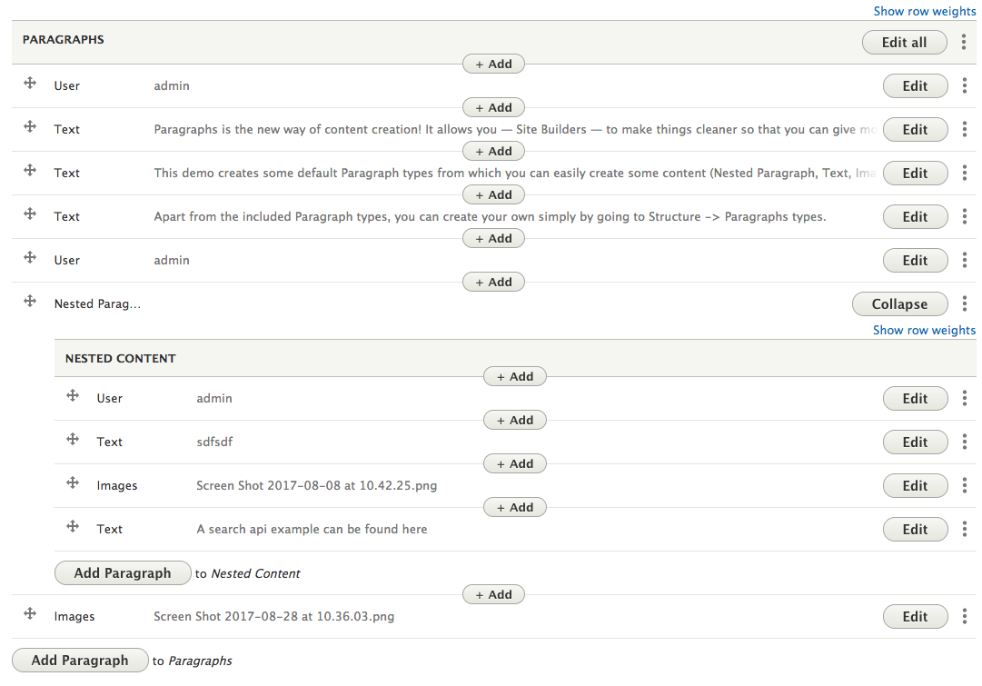
We are partially using this functionality in Thunder and one problem we have is styling of paragraphs and add buttons in admin theme. Since buttons are inside a table cell, it's difficult to style them to be between rows (we have used some minus margins, etc. and that's not nice solution). So I tried another approach, to actually add spanned rows for add buttons between paragraph rows. Since the main functionality of add buttons is to open a modal dialog and it's required only in the front-end, I have made everything in JS, to add rows after the table is rendered, etc. It looks really good and way cleaner, but there is one challenge to solve -> drag-drop is a bit tricky since it should not be allowed to swap draggable row with row dedicated for add button. I have found the solution for that too and I have seen that also drag-drop handling will be changed with #2825575: Introduce a Drag & Drop Mode.
So, long story short. What do you think about that approach - to have dedicated rows added by JS for "add in between" buttons?
I just want feedback to see, is that direction ok or not.
Comment #25
yasmeensalah commentedUpdated the patch to work with the latest dev version
Comment #26
miro_dietiker@mtodor I'm not sure what is worse: an added row or some negative margins.
For instance, if you want to indicate some zebra in admin UI, added pseudo-rows are a pain. It's also a pain accessibility wise - or needs to be investigated.
It seems to me, the add button does not need to be inside the flow of a regular row and can somehow be on some layer on top. That would make absolute positioning / z-index / whatever needed pretty OK.
But i'm not sure. From Berdir' feedback, it seems that we should first similarly rework this patch to its clean minimum core functionality.
About drag & drop: Once we have a separate Drag & drop mode, it might make sense to offer a widget option to remove permanent drag & drop handles completely from the items table. We're not sure where this is leading us exactly.
Comment #27
yasmeensalah commentedUpdated the patch to work with paragraphs latest dev version, and fixed some drupal coding standards
Comment #28
miro_dietikerIn a previous patch, we worked hard to remove all this template clone stuff.
This part needs to be reworked to the nice and simple approach we committed.
Comment #29
mtodor commentedI have provided the patch with the approach explained in #24.
It's a clean patch based on current dev branch. If someone has time, it would be nice to evaluate it and give feedback, is this approach fine or it's not an acceptable solution.
Short description of patch
You will find in patch following method
ParagraphsWidget::createEntityPosition()- it's used to create place for new paragraph entity and it has a lot similarity withParagraphsWidget::duplicateSubmit(). That part can be refactored so that same function is used to modify user input for duplicate and add-in-between featuers (difference is only delta+1 for duplicate). I just left it separated for easier feature evaluation.Problematic part is drag-drop handling and you can find the code for that in
paragraphs.modal.jsmainly functionDrupal.paragraphsAddModal.addInBetween.adjustDragDrop. Core drag-drop table lacks a bit functionality, some callback forisValidSwapand proper handling of that, because now swap always works between successive rows.Styling
CSS styling is mainly for removing of row height. But I think it can be reconsidered to have full row height for a button and that can be nicely styled, then button text can be richer and also full width on mobile devices can be used. Additionally, that row can be used in future to display directly paragraph type icon buttons to add new paragraphs without modal dialog.
When it comes to zebra styling, it's not a problem, since
oddandevenclasses on row are awlays used for that and they are not affected with new functionality.I have provided also a screenshot with the patch.

Comment #30
mtodor commentedComment #34
miro_dietikerCool update. I see the code is much more slim, but some parts start to feel like workarounds.
We recently discussed that we want to use popper.js to implement the sticky header and other UI improvements. We previously discussed tether.js, but popper.js seems to be even better. That said, if we need to do UI tweaking such as attach an element to some item just for UX, this could be a nice approach?
Can you elaborate what would be the limitations of such an approach or what is exactly not possible with special positioning of the button?
I'd be happy to better understand the options and their impact before committing us to an approach.
Comment #35
mtodor commented@miro_dietiker I think everything depends on how you want to style your paragraphs.
If you want to have always collapsed paragraphs, then sticky buttons on borders between paragraphs are fine and I don't have anything against that. Maybe that would be the cleanest solution if popper.js can work nicely with Drupal drag-drop functionality.
As I have said, it depends on the styling of paragraphs. If you want to have open paragraphs, then buttons on the border is not a nice solution because UI get's cluttered and it's difficult to differentiate paragraph forms one from another - in that case, it's better to have some separator between them and row separation with a different background is a nice solution. Additionally, you can put add buttons inside and they will be easy distinguished from actual paragraph forms. There is always a solution with styling margins and borders for rows to make space for floating elements, but that's quite ugly when you start drag-dropping them.
There is also one more thing, that's getting more and more important, and that's mobile and tablet support. And in that case, all small buttons and mouse-over functionalities are useless. And buttons should be full width and also bigger height and to style that with some floating elements is a bit difficult, I think.
With the proposed solution from me, the only problematic issue is drag-drop because we have to go around Drupal implementation of that. But if Drupal core implementation would properly support hooking of external validation for drag-drop, then it would be also a clean solution.
Anyway, we have already put this functionality to use in Thunder and we are also working on the new sorting functionality. It's really useful for long sorting tables. It's still work in progress, but you can see how it works so far and how we used space provided by add in between rows: https://www.drupal.org/node/2828106#comment-12249930
Comment #36
demonde commentedWorks fine for me.
Only "Add" does not seem to be translatable since it is written in .js
<input class="paragraph-type-add-modal-button button--small js-show button js-form-submit form-submit" type="submit" value="+ Add">'Comment #37
nils.destoop commentedIdd, I was using this patch, and the clients wants a complete backend in Dutch.
In attachment an updated patch.
Comment #38
mtodor commentedI investigated popper.js and also custom solution option.
Here are my findings:
popper.js
Pros:
Cons:
custom solution (with placing button elements in paragraphs cell)
Pros:
Cons:
In case of the custom solution, it's possible to adjust position manually (programmatically), but it's difficult to react on all resize changes that happen on the table. There is one solution that could be used - it's adding of empty (invisible) iframe after table and react on iframe window resize. That solution picks up all resize actions on table element and it's quite simple.
After checking all facts, my proposal is to go with custom solution, mainly because we don't benefit from popper.js that it would justify adding new dependency and it requires hooking in Drupal table row swapping, what is also not nice.
@miro_dietiker I would like to get feedback before I start with implementation.
Comment #39
pivica commentedI am pretty concern about design proposal in comment #29. Adding '+ Add' button in the middle of components is super overloading UI. When paragraphs are in edit mode its look a bit better but in collapse mode, it looks as too many stuff is happening in a very small space.
Can we at least show this '+ Add' buttons on hover and hide them initially? That would help a lot with UI clutter.
Do we have some alternative to this design proposal?
Having split controls position does not help, we have:
- drag control on the left,
- main button controls section on the right,
- and now add button control in the centre middle.
How about adding '+ Add' button on the right side where the rest of the controls are? I know it will not cover a case when you want to add a new component on the top, but in that case, you can easily add a component on second place and then just drag&drop it to the first place. I don't see this as a big problem and it will also make this implementation much easier.
Any additional pros/cons to this approach?
Comment #40
mtodor commented@pivica - thank you for feedback.
Let's try to keep it sorted so that we can reference facts easier:
1. Adding "+ Add" button is overloading UI
2. UI is not so much overloaded in edit mode, but it's in collapsed mode
3. Show "+ Add" on hover
4. Move add in between button to other action buttons (together with duplicate)
1. I agree with you. It will overload UI, but I'm not sure is "on hover" solution for that or it would better to make some UI redesign. For example, no one considered the idea of making bigger space between paragraphs so that they are better separated and distinguished (#35). And then using that space for "add in between" button or even directly icon buttons with paragraph types in future.

2. I totally disagree on this. If you look at screenshot provided in #29, I think it's way more obvious what's going to happen, when you click on one of the available buttons when paragraphs are in the collapsed mode in comparison with this screenshot, where paragraphs are in edit mode.
That's why we are using the full row with bigger height to better indicate where one paragraph ends and a new one begins.
3. Maybe it's my own opinion, but I really dislike hover for several reasons: it's hidden functionality and you have to find it by moving mouse around and it should work with keyboard tabbing and so on; another problem is that you have to provide different behaviour for tablet/mobile devices, since on hover is not possible on touch devices and then users have to learn different behaviours for tablet and desktop. I agree that on hover would make UI less cluttered, but still, there has to be a nice indicator of available functionality.
4. We want add in between, to make the user experience better. With actions on rights side, an additional click is added, also it's hidden functionality behind toggle button and then to make it clear for users, we should add two actions (add before and add after). Drag-drop would not be the problem here since it would be possible to add paragraphs always before and adding a paragraph to end would be covered with a default "Add Paragraph" button at the end. In general, we should not consider drag-drop since one of the reasons for this feature is to avoid drag-drop.
If I would compare what is better solution "hover" or "new action" to avoid UI overload, I would rather suggest "hover" instead of "new action", since "new action" should always be something that is related to actual paragraph and not some action related to parent component, like in this case. But it would be nice to consider and think about some UI design changes.
Comment #41
danielen commentednice patch at #29, also #37! Thanks
I see a little bug. I remove a paragraph and add a new paragraph in the middle of the collections:
Problem: The paragraph is not at my desired position.
It's wrongly positioned at the bottom.
I think the problem is in public static function createEntityPosition in the foreach Loop.
But I currently don't unterstand 100% the reason for the foreach Loop.
Comment #42
miro_dietikerSpent quite some times recently to understand how this button fits into our UI evolution.
Here's where our learnings are:
The idea is this:
Let's get some feedback before implementing this.
Comment #43
miro_dietikerI want to add some reflection on thoughts about the decision process:
I was originally very convinced that the use case and semantics should be to "Add after" previous Paragraphs, like the current existing "Add Paragraph" is basically the same after the last Paragraph. That however would not allow us to add a Paragraph at the very beginning. Also we already had the extensible action element that currently displays top right, putting it far from the Paragraphs end, making it a bad candidate for an action related to the bottom of each Paragraph. Even worse, adding another special case for the very first item (resulting in two actions related to that very specific first paragraph "Add before" + "Add after" was very unsatisfying and at the same time, adding such a key feature without answering how to add a Paragraph at the first position was inacceptable due to expectations of potential redesign and breaking solutions built on top of it.
The "Add before" is convincing because it covers all cases and the action button position is near to the expected user interaction point. Using the action button is also the best we can do as we are not adding more UX patterns (i'm concerned that adding more UX patterns leads to UI overload and user confusion) and in the sense of the element design - being an a standardised element of optional actions and an extension point. We made the step to define this as an own element to have less independent buttons that are placed in multiple locations under random conditions (settings, permission) that are making customization hard. The idea is that customization should focus on altering the element as a whole or maybe moving elements out of the actions if there is need.
Also, the contrib ecosystem is huge and we want to make sure that anything that hooks into the entity and field system and offers additional functionality also still works with Paragraphs. Thus adding helper-rows of potential empty "Add" rows that break the semantics of the table row count is inacceptable. It addy many special cases to any type of client side JS and we plan to do much more in the future to improve the editing UX in speed and functionality.
Following our principles helped us down the road. We dropped significant complexity from the Paragraphs widget while adding functionality, de-cluttered the UI in general, removed the need for case-specific settings, outperformed field collections with our UX, improved mobile UX, and added JS driven functionality with 20% of the original proposed code while re-adding easy customizability.
This is the only way how we can keep the Paragraphs UI evolving. Adjustments to the widget should be possible with an absolute minimum risk to break JS code. JS complexity is slowing the Paragraphs project down. The "Drag & drop" mode is a great example how we addressed the situation: I would love to have this functionality always available, but the user requirement can be covered with a separate UI component with own rules separated from the regular UI behavior, supporting the integrity of the regular UI situation, and also requiring us to deal with the situation complexity only under a very specific condition. If you want to contribute other parts of the widget, you don't need to understand what that code does. The library only kicks in under a special condition, it is completely optional, and if anything breaks in that JS it only breaks its specific mode. And if everything breaks, it allows us to easily disable/drop that JS as a whole to survive, without any influence to any other JS backed functionality.
Here we go. Hopefully we can welcome the "Add before" action soon. :-)
Comment #44
miro_dietikerComment #45
mtodor commentedI have added sub-task for adding of the hidden field for "Modal" mode #2944372: Introduce hidden field for addition position of paragraph.
Comment #46
miro_dietikerSo the child task went in.
It's time to reroll this issue. The JS button only need to fill out the value and hit the add button.
For the default Paragraphs UI, we would prefer to see the button inside the "..." element.
One problem of adding the button in JS (to the "..." element) would be that the "..." element is only output if there is at least one operation.
At least when we add a setting to enable / disable certain actions, it's possible that the element is empty again in many cases.
Needs some investigation.
Comment #47
miro_dietikerThis was now implemented as "add above" feature and its bugfixes / improvements:
#2946514: Add paragraph before button
#2954149: Reset add position when cancelling modal
#2954148: Consistently name the "add above" feature
You can now opt-in to the "Add above" button through widget settings.
The functionality then hides behind the "..." button per paragraphs instance.
For people that like the overloaded UI, they can add the additional module provided by Thunder team.
https://www.drupal.org/project/paragraphs_features
Please create follow-up issues if an item got lost.