
 Support for Drupal 7 is ending on 5 January 2025—it’s time to migrate to Drupal 10! Learn about the many benefits of Drupal 10 and find migration tools in our resource center.
Problem/Motivation
UI for mobile device is not looking nice.
Proposed resolution
We should fix that.
Remaining tasks
User interface changes
API changes
Data model changes

| Comment | File | Size | Author |
|---|---|---|---|
| #38 | interdiff-2868225-34-37.txt | 1.27 KB | pivica |
| #38 | ui-responsive-improvements-2901549-37.patch | 17.62 KB | pivica |
| |||
| #37 | 2868225-ui-responsive-improvements--matterial--collapse-icon.png | 46.49 KB | pivica |
| #30 | 2868225-ui-responsive-improvements--tablet--edit.png | 45.69 KB | pivica |
| #30 | 2868225-ui-responsive-improvements--tablet--colapse.png | 47.48 KB | pivica |


Comments
Comment #2
miro_dietikerThe screen is a bit misleading as the black-white error message is a core issue and a separate thing.
The problem here is that the summary is completely invisible. I guess the summary will need a full width line on mobile.
And then all other elements simply look ugly and are not well positioned...
That's a serious regression compared to before.
What's the status of the classic widget? I hope it still looks fine.
Comment #3
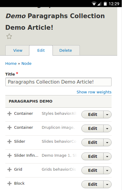
fourg6x CreditAttribution: fourg6x at Cheeky Monkey Media commentedI've created a patch to address this. On mobile displays, the summary now displays below the Title and Buttons. See screenshot below:
Comment #4
fourg6x CreditAttribution: fourg6x at Cheeky Monkey Media commentedComment #5
fourg6x CreditAttribution: fourg6x at Cheeky Monkey Media commentedMy apologies, just spotted something that needed updating, new patch added.
in file
css/paragraphs.admin.css, class.js .paragraphs-dropbutton-wrapperadded:Comment #6
krina.addweb CreditAttribution: krina.addweb at AddWeb Solution Pvt. Ltd. commented@fourg6x, Thanks for your patch but your both patch didn't solve the issue for me. it still shows the layout issues after applying the patch as I checked it over simplytest.me. PFA & let me know your views on it.
Comment #7
fourg6x CreditAttribution: fourg6x at Cheeky Monkey Media commentedI'm investigating this further. What version of Drupal did you test with?
Comment #8
fourg6x CreditAttribution: fourg6x at Cheeky Monkey Media commentedI used simplytest.me utilizing Branch 8.x-1.x with Paragraphs installed and https://www.drupal.org/files/issues/ui_for_mobile-2868225-4.patch applied, and it seems to be working for me. This only takes place at 600px viewport width or less (following other breakpoints the module is using for the admin UI)
Comment #9
miro_dietikerHm this only touches .admin.css. I guess that's the old widget. This should also apply to the new one.
Comment #10
toncic CreditAttribution: toncic at MD Systems GmbH commentedHere is how classic widget looks like.
I think we should do changes in .scss files not only in .css.
Comment #11
miro_dietikerAh yeah, so classic is pretty OK compared to the new one.
Yes, let's get it done in scss cleanly.
This is also changing some elements. We should not forget that our current mockup-updates will show some need for icons.
Hope we don't need to move things around multiple times.
Comment #12
fourg6x CreditAttribution: fourg6x at Cheeky Monkey Media commentedI'll get this cleaned up. Thanks for the clarification.
Comment #13
fourg6x CreditAttribution: fourg6x at Cheeky Monkey Media commentedI've sorted out the button issue via the attached .patch. Changes have been made to the .scss files (my apologies, I glossed over the .scss files as they are amid .css files in the same directory).
If you guys think the summary being cut off ('faded out on its right margin') is acceptable for mobile displays (only so much you can do on a small screen, anyway), I'll do without adjusting the order of these elements appearing which sounds like the best course of action to avoid future conflicts.
If interested in seeing how the summary does adjust, you can see a working example of this via my previous patch,
ui_for_mobile-2868225-4.patchif viewing the classic widget. The result places the summary below the Title and Buttons on viewport < 600px).Comment #14
fourg6x CreditAttribution: fourg6x at Cheeky Monkey Media commentedComment #15
fourg6x CreditAttribution: fourg6x commentedHas anyone from this thread checked if the new patch corrects the issues with the UI? Thanks,
Comment #17
miro_dietikerRerolling after the recent refactoring.
So yeah, this looks a bit better, but i still get horizontal scroll bars.
Additional inputs:
The idea of the mobile display was to wrap the summary to the second line.
Also, the second button beside "Edit" should be reduced to a "..." symbol only.
Both things are also discussed in other issues though.
Comment #18
ketikagrover CreditAttribution: ketikagrover commentedThis issue is not fixed.please check the screen shot.
screen resolution is 320x480
Comment #19
miro_dietiker@ketika did you clear the CSS cache after applying the patch? It looked way improved for me after applying he patch.
We need to define how specific we want to be here and what broader mobile improvements we want to make in follow-ups.
The title of the issue reads more like a META while the issue more is fixing a smaller part of the general meta subject.
Mind that there are two widgets and the issue is mixing both with some screenshots..
Comment #20
fourg6x CreditAttribution: fourg6x at Cheeky Monkey Media commentedI can add the changes I had done to the classic widget in ui_for_mobile-2868225-4.patch which sets the description below the title/buttons on mobile. This requires some minor markup change though. There's really no sensible way to do it in css unless we re-order a few of those elements.
Would you like me to make those same changes to the new widget?
Comment #21
fourg6x CreditAttribution: fourg6x at Cheeky Monkey Media commentedI agree @miro_dietiker. Should we create separate issues, one that addresses specifically stylistic changes to the New Widget vs. another to change the markup for the Classic Widget such that the summary content on mobile displays falls to the second line below the title and Edit button? For the classic widget this was achieved already via ui_for_mobile-2868225-4.patch.
No markup has been modified/re-ordered for the New Widget, although it is required in my opinion if we want the summary to fall neatly below the title line on mobile displays.
What direction would you like me to take?
Comment #22
miro_dietikerFeel free to propose altered markup for the experimental widget. I would fully focus on the new one. Here i would see the current mobile situation a bug as it was previously better and we introduced the regression accidentally.
We splitted the new widget hard to allow severe changes there. But in contrast, we do not want to alter the classic widget for any feature. And i consider different wrapping of elements (such as summary in second line on mobile) a feature. Also classic bugfixing should keep the output element structure whenever possible.
Comment #23
miro_dietikerSo let's focus here on experimental improvements. Plz open a separate and related classic bug issue if the classic is inacceptable currently.
Comment #24
pivica CreditAttribution: pivica at MD Systems GmbH commentedChanges in #2829677: Implement a new render element for a collapsible button will be committed soon and this will change the look and functionality of the dropdown button. Attaching a new look for small screens.
Now we have more horizontal space to use for other components. Note that new actions button is probably a bit too small got mobile screens and fingers, but its easy to increase it for small screen with something like:
or to any other desired dimension. And for the bigger screens, we can add media breakpoint with smaller values. With this changes actions c look like this:
Comment #25
johnchqueWhy does the "Edit" button looks like that? Follow-up?
Comment #26
pivica CreditAttribution: pivica at MD Systems GmbH commentedNo it's not a follow up - that messed up Edit button is one of the reason why this issue is called 'UI for mobile devices is not looking nice' ;)
Comment #27
johnchqueNot sure if it's about time to change the "Edit" button by the pen core icon.
Comment #28
miro_dietikerIMHO we should create a meta issue to discuss mobile UX and connect related issues.
For instance we have an issue about the change indication.
Also we said from the other issue with the "..." button, we need a follow-up to convert "Collapse all" button to the "..." as well.
Then the summary line should go to some second line on mobile.
But we also have some issue that wants to add more icons.
Examples: If the edit button is missing (such as no permissions), a lock should be displayed instead.
Examples: Some plugins might provide an icon (right next to the other icons, mostly prepending the summary) instead of a text summary.
The combination of all these things are not yet properly outlined anywhere.
Comment #29
miro_dietikerThe issue to add icons to the summary was committed.
Time to fix mobile experience. I think these things are remaining here:
- Make "Edit" button smaller on mobile - buggy touchicons tweak.
- Convert Edit button to an edit icon button for mobile.
- Display the summary on second line on mobile.
Comment #30
pivica CreditAttribution: pivica at MD Systems GmbH commentedHere is a brand new patch that is built against #2901549-9: Introduce default actions for paragraph_actions dropdown patch - so you need that one first and then this one if you want to test and check how it works.
All the stuff from previous comment @29 is done including a bunch of other improvements.
I've tested this in Chrome emulator and also on mobile Android Chrome and it works pretty well ;)
Attaching screenshots:
Mobile edit variation:

Mobile collapse varition:

Tablet collapse variation:

Tablet edit variation:

Comment #32
miro_dietikerYayy, cool stuff.
The collapse icon looks very uncommon.
The edit icon looks too big on mobile. The common pattern is to allow a clickable area outside the icon instead of making the icon huuuge. ;-)
Still that mobile thing looks so much overloaded and almost no rooms for icons.. we will need space to visualise layout, style, ... :-)
It makes much more clear that we should get rid off the drag handles as they steal so much space. At least on mobile. But a follow-up.
Comment #33
poornananda CreditAttribution: poornananda as a volunteer commentedPretty usable for mobile use-case.
My feedback is:
Comment #34
pivica CreditAttribution: pivica at MD Systems GmbH commentedNew patch build against latest dev. One minor change only - fix for the action drop-button flickering on hover for some browsers.
Comment #35
pivica CreditAttribution: pivica at MD Systems GmbH commented> The collapse icon looks very uncommon.
Agree but finding in short amount of time the good looking collapse icon is not easy at all. This one is from https://useiconic.com/open/. If somebody has a better proposition please bring it on.
> The edit icon looks too big on mobile.
Actually, @poornananda is right here, they could be even bigger. We are currently on 36px and recommendations are from 40 to 48px. Tested this on my mobile and it works pretty nice even with the thumb finger.
> Pretty usable for mobile use-case.
All recommendation from @poornananda make sense, i guess we will create one follow up issue for this additional UI improvements and fixes.
Comment #36
miro_dietikerHow about again looking at material.io?
https://material.io/guidelines/components/expansion-panels.html#expansio...
They use v ^ arrows that are pretty clear / common to me.
Or should we even use the details arrows from Drupal? (However those are always client side interaction)
So i guess we should keep the button look..
Comment #37
pivica CreditAttribution: pivica at MD Systems GmbH commented> How about again looking at material.io?
Yeah, good idea, i checked matterial but i was just searching for collapse string and missed this arrows.
New patch with updated icons and a screenshot:
Comment #38
pivica CreditAttribution: pivica at MD Systems GmbH commentedPatch was not good, fixed version.
Comment #40
miro_dietikerCommitted, awesome :-)
Comment #41
pivica CreditAttribution: pivica at MD Systems GmbH commentedCreated follow-up for proposalsi in comment 33 #2904402: Improvements in UI.