
Closed (fixed)
Project:
Drupal core
Version:
8.5.x-dev
Component:
Seven theme
Priority:
Normal
Category:
Bug report
Assigned:
Unassigned
Issue tags:
Reporter:
Created:
23 Mar 2017 at 14:49 UTC
Updated:
22 Jan 2018 at 17:39 UTC
Jump to comment: Most recent, Most recent file


Comments
Comment #2
agomezmoron commentedHi,
Can you please add an screenshot?
Cheers!
Comment #3
benqwerty commentedAttached image of possible hover / focus effects and a patch.
This assumes that the yellow background has been removed - see #2857933 Change background color of dialog close button.
Comment #4
pfructuoso commentedIt works for me in branch 8.4.x using Chrome 57.0.2987.110 and Firefox 52.0.1
Comment #5
mgifford@tar_inet can you provide a screenshot?
Comment #6
benqwerty commentedAttached screenshot.
Comment #7
duaelfrI asked myself about it while looking at the live commit of #2857933: Change background color of dialog close button yesterday.
The code looks great.
The result is consistent with the Seven style guide.
I did some manual testing on the following environments (thanks to browserstack):
Congratulations!
Comment #8
lauriiiThanks for pointing out this accessibility issue. Even though the patch fixes the problem described here, I'm not quite sure if the solution is done according to the Seven style guide. I'm especially worried about the blue border on the hover. I have assumed the blue shadowings in the style guide has been there to indicate default browser behavior.
Let's see if we could get some insights from someone who has been involved with the Seven style guide.
Comment #9
agomezmoron commentedI checked it on different browsers like https://www.drupal.org/node/2857933
Tested on:
Chrome
58.0.3029
57.0.2987
Firefox
52.0.1
52.0
51.0.1
51.0
51.0.2
51.0.1
50.0
And working consistently.
IMHO it can be moved to RTBC
Comment #10
ckrinaI'm not a Seven style guide expert, but it looks like most of the hover states covered so far in the style guide are fields or text with the mentioned blue border style. But the only icon that I see with a specific custom state is not this generic blue: the icon itself changes.
So what I would suggest is to change the icon itself instead of adding a squared shadow around the
divcontainer. Maybe using a shadow around the ex itself would be enough (just a quick idea without testing).Comment #11
Bojhan commentedThe question is; can we just change color or do we need additional indicators.
If its additional, we should probally look a bit at how other platforms do this - I havn't seen platforms solve this eloquently yet.
Comment #12
mgifford@Bojhan, more is often better. In this case there is also an X which we are highlighting. Using color should be fine as we're just drawing attention for the user as to where the focus is.
Comment #13
andrewmacpherson commentedI like the approach here, but the blue border and box-shadow colours are a poor contrast against the grey header background of our dialogs:
https://leaverou.github.io/contrast-ratio/#%2340b6ff-on-%236b6b6b
https://leaverou.github.io/contrast-ratio/#hsla%28203%2C%20100%25%2C%206...
Technically, this isn't a WCAG 2.0 violation - SC 1.4.3 Contrast (Minimum) specifically relates to text, so this change does get through our accessibility gate.
WCAG 2.1 (currently a working draft) proposes a new success criterion for minimum contrast of hover and focus styles, so it's likely we'll have to improve our hover/focus styles later on.
As far as I remember, the Seven style guide only has examples of the blue shadow against light backgrounds.
Comment #14
andrewmacpherson commentedRe #11 - I'd prefer a shape change (the border), not just a colour change.
The CSS in
core/themes/seven/css/components/jquery.ui/theme.csscurrently suppresses the default focus style from the browser.We should provide something in place of this to indicate focus. The border does a good job.
Comment #15
andrewmacpherson commented#7 and #9 don't mention Opera, so I confirmed it looks the same in Opera 44 (Linux).
Comment #17
andrewmacpherson commentedFor #13 we need a stronger colour contrast. The supporting material for the new WCAG 2.1 Success Criterion "User Interface Component Contrast" does mention focus styles.
Since the close button "X" is white, the easiest thing to do would be to use a white border. This will provide a contrast of 5.3:1 which will pass WCAG 2.1 User interface contrast.
The #40b6ff-on-#6b6b6b from patch #3 only provides a contrast of 2.4:1
Comment #18
Bojhan commentedCan you show a screen?
Comment #19
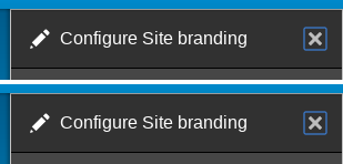
benqwerty commentedPatch and screenshot for hover/focus white border.
Comment #20
mgiffordJust putting up @benqwerty's screenshot more prominently.
Comment #21
duaelfrCode OK
Screenshot OK
Contrast OK
Tested on Chrome 60, 61 and 62, Firefox 52 and 57, IE 11, Edge 16
Let's move this forward!
Thanks all for your work :)
Comment #22
xjm@andrewmacpherson, hm, are we sure about the white border? It may provide enough contrast with the blue button, but does it provide enough contrast with the gray background? I can't even see it in the screenshot in #20. (Is it even there?)
Comment #23
xjmOh ah, the border is on the
[x]button, not the submit button. Sorry!Comment #24
xjmOne other question though. These pixel counts don't seem to add up to the old values. Can we provide side-by-side before and after screenshots of just the area around the button to confirm the placement isn't changing?
Comment #25
xjmComment #26
duaelfrIt has moved a bit but it makes its left and top margins more consistant now that they are really visible.
(Blue outline is added by Chrome's default styles)
Comment #27
andrewmacpherson commentedIndeed it has moved a little bit, and I agree that the new position looks a bit neater. An accidental win?
Cross-browser checking for all our supported browsers would be a good idea.
Great work everyone!
Comment #28
andrewmacpherson commentedThis style will also be of benefit to the settings tray module.
Need to confirm whether the existing patch here does this, or whether more work is needed (or a settings-tray follow-up). It came up while doing a11y of settings tray with tedbow
Comment #29
duaelfr@andrewmacpherson Sadly the current patch does not affect Settings Tray (see screenshot).
I think it should be handled in a follow-up so we can RTBC this one and move on.
(Crossbrowser check has been made in #21)
Comment #30
andrewmacpherson commentedI agree, best as a follow-up. I spoke with tedbow about it, who explained that settings tray has an unusual CSS reset approach to theme it. So it sounds sensible to keep these.issues separate.
Comment #31
xjmI posted #2934499: Adjust foccus styling for the Settings Tray [x] close button to match the dialog system, which is postponed on this issue. So agreed that it can be handled in a separate issue -- let's just get a final review here.
Thanks!
Comment #32
andrewmacpherson commented@xjm Thanks for writing the follow-up issue.
Okay, I'll RTBC this one:
Last time we had RTBC was #23.
So back to RTBC.
Comment #34
xjmAlright, I tested this one more time. Looks great!
Committed and pushed to 8.5.x. Thanks!
Comment #35
tedbowThis issue fixed Seven but did not fix this for other core themes like Bartik.
If you use the front end theme for editing content the ckEditor image dialog for instance will use the dialog system but not be affected by this fix.
Should be make an issue for this?
Comment #36
xjm@tedbow, shouldn't they inherit from Classy and Stable unless they have their own overridden styles?
Comment #37
tedbow@xjm yes they would inherit but testing bartik there is no border for hover state for dialogs.