
 Support for Drupal 7 is ending on 5 January 2025—it’s time to migrate to Drupal 10! Learn about the many benefits of Drupal 10 and find migration tools in our resource center.
Problem/Motivation
As described in: #2825570: [META] Introduce new action elements UI is cluttered, it needs to be cleaned. We should add a collapsible render element that adds the buttons originally hidden.
Proposed resolution
Create completely new render element without default action, with custom CSS and JS. The goal is not to use dropdown button from the core. Design and the approach for Edit button will be discussed in a follow-up.
Remaining tasks
User interface changes

API changes
Data model changes
| Comment | File | Size | Author |
|---|---|---|---|
| #73 | implement_a_new_render-2829677-73.patch | 10.41 KB | pivica |
| |||
| #71 | interdiff-2829677-70-71.txt | 1.19 KB | pivica |
| #71 | 2829677-71-final-lool.png | 34.49 KB | pivica |
| #70 | interdiff-2829677-69-70.txt | 7.01 KB | pivica |
| #70 | implement_a_new_render-2829677-70.patch | 16.97 KB | pivica |
| |||


Comments
Comment #2
Ginovski CreditAttribution: Ginovski at MD Systems GmbH commentedComment #3
Ginovski CreditAttribution: Ginovski at MD Systems GmbH commentedInitial patch, not sure how to add the icon and the button is still not showing in the form.
Comment #4
Ginovski CreditAttribution: Ginovski at MD Systems GmbH commentedComment #7
miro_dietikerPromoting to major as it helps us to remove emphasis from the button clutter.
Comment #8
Ginovski CreditAttribution: Ginovski at MD Systems GmbH commentedStill needs work, created render element and added it in the form.
I am not sure how make the element a dropbutton with icon as the collapsing button and with the options passed in '#actions'.
Comment #9
miro_dietikerNot much to review yet. We will need to provide own markup, CSS and likely JS for this.
See DropButton.php and dropbutton.js and all related assets.
Comment #10
Ginovski CreditAttribution: Ginovski at MD Systems GmbH commentedAdded some functionality. Created dropbutton, displaying buttons when clicked.
The button list needs some css changes.
Screenshot of the dropbutton:

Screenshot when clicked and displaying the list of buttons:

Comment #13
miro_dietikerNice progress. :-)
I think we need some button like area
[v]since the arrow displayed solely like this is usually for an expanded element.Comment #14
Ginovski CreditAttribution: Ginovski at MD Systems GmbH commentedOkay, fixed the buttons, now they are working.
@drobnjak will continue on the CSS part.
Comment #17
drobnjak CreditAttribution: drobnjak at MD Systems GmbH commentedAdding CSS style to the button. Not everything is working properly, especially dropdown list of buttons. I will continue working on CSS and JS here. Screenshot provided.
Comment #18
johnchqueI think we should follow core style? So that might mean that that button should have round borders? Doesn't it work with adding the class button to it? If the background disappears we can add some element inside the button to add the icon in there.
Comment #19
miro_dietikerThere is no core style for such a thing.
The only iconised button in the style guide is the "X" that was not adopted by core.
The label based buttons with rounded corners are no precedence for an iconized button. In fact, a squared button would then get a circular border. I find this confusing. Also the clickable (round) area would IMHO be too small. It's also a bad fit for vertical extension of the expanding menu.
Anyway, our proposals are mockups and not meant for 1:1 implementation. There should be an iteration of detail design work with expert feedback and a qualified decision.
Comment #20
drobnjak CreditAttribution: drobnjak at MD Systems GmbH commentedUpdating this issue with some new proposal. Since the expected URL is to keep remove button to the far right, there is a problem of how to display collapsible button together with actions inside it. To be more precise, question is where to display it, especially in closed mode, since there is a summary displayed.
In my opinion to keep it left, next to remove button is viable but not UX optimal. In the image attached, hover over a paragraph is displayed. In the case of hover, summary is faded away and actions from collapsible button are displayed (in this case we have add to library, duplicate and edit). Paragraphs are not taking the whole page so there will be no problem in overview of all of the paragraphs with summaries.
Also we are reducing clicks needed for desired action to a single one, increasing UX efficiency.
Comment #21
realityloopPatch reroll
Comment #22
realityloopJS file was missing from last patch
Comment #23
realitylooprenamed paragraphs_collapse to paragraps.collapse in js and css files to better reflect naming structure used in existing files
Comment #27
realityloopHad accidentally gathered some extra files in previous commits.
Comment #28
realityloopI think that clicking the [x] (remove icon) should prompt to see if you are sure, it's currently too easy to remove something when you don't mean it.
Comment #29
realityloopremove button wasn't getting list-style set to none, which was a problem when using paragraph _browser
Comment #30
Ginovski CreditAttribution: Ginovski at MD Systems GmbH commented@realityloop, we are working on a new approach, see comment #20, will upload an initial patch soon.
Comment #31
Ginovski CreditAttribution: Ginovski at MD Systems GmbH commentedAdding patch the new example UI for the buttons.
It would look somewhat like:

Comment #32
Ginovski CreditAttribution: Ginovski at MD Systems GmbH commentedScreen with hover:

Comment #33
miro_dietikerGoogle apps use a vertical 3 dots instead the triangle to expand the menu.
The triangle is misleading as it is used for fieldset expansion and i think we should use a different sign such as vertical "..."
Alternatively a different sign could be a gear or some tool outline but i think the google one is fine.
Comment #34
drobnjak CreditAttribution: drobnjak at MD Systems GmbH commentedAdding "hamburger" icon style approach. Drupal already has this icon, and vertical three dots would need to be additionally created.
IMO this approach suits better and is more visible, since it will be next to the remove button. Android is using this icon to expand.
Only problem could be that icon is already been used by "Manage" in admin option, but the function of both are to expand and show or hide other options. Screenshot below.
Comment #35
johnchqueNot totally sure with this approach, I would vote for creating a new icon for it. As in android this hamburger button is only used once in a screen and it is added for main actions of the whole page, adding it per-item looks like we are cluttering the UI again. :)
Can we instead, for now, create mockups with a three dot vertical/horizontal different approaches or maybe even use the black triangle that is used for collapsible actions as for Menu settings in the last screenshot you added.
After we have clear how we gonna implement this, we should start with the implementation.
Comment #36
tduong CreditAttribution: tduong at MD Systems GmbH commentedI also would prefer to have another kind of icon instead of the hamburger menu icon (as also @yongt9412 said, it sounds more like a single main collapsible menu icon).
Also about the gear icon, I feel like it is more related to configs/settings stuff, not content stuff.
I was looking for other cases, but the only more appropriate icon that I could imagine here is the google three dots as mentioned above, maybe more as the vertical one, by looking for "more (action) icon" here http://www.w3schools.com/icons/google_icons_navigation.asp.
Still the "triangle approach" seems better to me, but something like the "expand_more" from the link mentioned.
Another option I can think about is the "+" from WhatsApp.
Comment #37
realityloopPretty sure that @miro_dietiker meant this for the icon in his response at #33
https://material.io/icons/#ic_more_vert
Comment #38
drobnjak CreditAttribution: drobnjak at MD Systems GmbH commented@realityloop yes, I wrote up there that vertical three dots icon should be additionally added.
@yongt9412 @tduong @miro_dietiker
Here are the mockups of 4 different cases (All 3 modes included):
IMO, confirm removal button highly depends on this issue and the approach we decide to implement.
P.S. When the user is in the closed mode, and clicks edit, paragraph expands and offers option to collapse in the same manner as edit before expanding. For the first case I left collapsible button in 'edit' mode on purpose, while three other cases are without it. This is to also suggest the possibility to keep collapsible button in 'edit' mode, although I think it is not needed there.
Comment #39
realityloopMy vote is for "Remove inside collapsible" option
Comment #40
drobnjak CreditAttribution: drobnjak at MD Systems GmbH commentedRe-rolled patch and added new icon. Next step will be to change submit buttons into

<a>tags and since it is a major step I am uploading patch before it. This step will also include CSS updates. Icon will be further moved to paragraphs module since it is paragraphs specific for now.Screenshot provided.
Comment #41
drobnjak CreditAttribution: drobnjak at MD Systems GmbH commentedCleaned the code, realized that there is no need to change submit to link type. Moving towards the design on the mock-up. Currently it is working properly, although there is one more thing to fix - alignment when the paragraph is in "open" mode.
Screenshot for this situation is provided.
Comment #42
miro_dietikerI think and / or propose
- The labels shouldn't be centered.
- We will need to add icons to each line. There's an issue for that.
- We should set right: 0 to make it expand to the left.
Also not so sure about boldness in the menu. And i think it needs enough/more vertical padding to be touch friendly.
Comment #43
drobnjak CreditAttribution: drobnjak at MD Systems GmbH commentedRe-rolling after the sass implementation. Addressing the changes from comment #42. Screenshot provided.

Comment #44
miro_dietikerPlease update the issue summary including an image about the goal.
Comment #45
drobnjak CreditAttribution: drobnjak at MD Systems GmbH commentedUpdating with the current goal of this issue.
Comment #46
miro_dietikerI do (start to) understand the concerns of Markcarver about this UI proposals. As it looks like this is similar to the drop button and a default action Edit.
Note though that those are intentionally two separate elements.
Depending the settings, the edit button will be completely removed in that area.
We should also have mockups that show these cases to make the issue more clear.
Markcarver proposed to still use the dropbutton element (claiming that the "..." icon is identical to the v icon) and we could reach the same goal with an empty first action element. I didn't test that approach yet and it seems strange to me, but we should be careful with adding own elements just for UI representation.
What he said though is that the element requires to provide its own CSS (attached, separate library, atomic) since it needs to work in a different theme too... Are we handling this properly?
Comment #47
miro_dietikerThis would be important now, but won't apply after all our changes.
Anyone helping to bring us a better DropButton? :-)
There are some more updated mock-ups in #2851672: Display icons in collapsible action button actions
We should update the summary here.
Comment #48
VladimirMarko CreditAttribution: VladimirMarko commentedComment #49
johnchqueTrying this. :)
Comment #50
johnchqueFound some time and somehow works, didn't know the code had changed that much. For now it only works when the original dropdown is also displayed.
Created libraries for the element and it works with icons, they are not amazingly displayed but anyway, they are there. :)
Don't know when I gonna find time for this again. :)
Edit: The three dot icon was added next to remove for testing purposes. :)
Comment #51
johnchqueComment #52
miro_dietikerDon't forget, it should be scss, not pure css.
Comment #53
johnchqueNow with scss :) and fixed some css for making it look more like the mockups. :)
Comment #54
johnchqueIcons can be added in a follow-up. ;) Now looking more like the image in the IS.
Comment #55
miro_dietikerTested a bit.
If i click on multiple buttons, the old one doesn't disappear. If you look at the dropbutton, it has a timeout that collapses the button if the mouse is out.
The buttons are not fully clickable if they vary in text length.

I tested how to make the ... more look like a button and ended with these tests. The ... seemed a bit too large.

I know, Material design doesn't propose the additional button border / background, but in Drupal all buttons are like this.
Also they seemed a bit too large and i wanted to test if horizontal or vertical ... work better.
One problem here is that the element now is lacking accessibility features. It has no label in its collapsed version. It is also no more posible to navigate to the element with the keyboard. Fixing accessibility can be a follow-up for the experimental widget, but is a release blocker.
You are accidentally also changing the "Add" button for Paragraphs. It should remain untouched - it looks broken now.

Don't unbind. Use a jquery.once to avoid multiple registrations. Otherwise extensibility (with sometimes unknown sequence) is at risk.
Took me a few seconds what's going on with the confuding buttons / #buttons name.
Let's rename $value to $button and extend that instead of #button. Put it to 'button' and delete #button.
Is it paragraph_ or paragraphs_? I remember we are messy with our prefixes...
paragraphscollapse => paragraphsCollapse?
Comment #56
miro_dietikerWhat i like though a lot is the resulting compact UI with a separated edit action.

IMHO we can keep it like this: Edit can be a separate action and doesn't need to be the default action of the extra operations.
I'm not fully confident of the "Collapse" button that then hides inside the "..." after Edit was clicked.
If collapsing is the goal of an edit action, it should be a well visible button.
The autocollapse feature (if enabled) though will make this less relevant.
I guess we need to refine mock-ups and create full story boards (for the different variations of use) to make this rock.
Comment #57
miro_dietikerAh before we do too much custom stuff for the "..." item, we should check exact Material Design definitions and also look at other admin themes that pick up this pattern, such as https://www.drupal.org/project/material_admin
Comment #58
johnchqueGonna work on this.
Comment #59
johnchqueInterdiff became too big.
- Made the visual changes, now the button is fully clickable inside the element.
- Renamed everything to be more uniform on labels and naming.
- Now just using the element where needed without changing add buttons.
- JS still needed, not sure how to make it hide itself when is not hovered, tried with onmouseleave but it just works when hover once the elements inside.
- Agree with @miro_dietiker about taking the "Collapse" button outside. IMHO that can be a follow-up.
So the only thing needed IMO is to use better js to hide the element when needed. :)
Comment #60
johnchqueDidn't notice this. Now should be better.
BTW I was thinking that after this issue we could change the "Edit" button by a edit icon of Drupal.
Comment #61
miro_dietikerYou can create a new issue about the iconization. We should first discuss how core handles these things.
This seems like an odd use. The element is still present in the render array and not yet printed. Why do we need the original element on build if we then skip it?
Core Dropbutton also has JS: core/misc/dropbutton/dropbutton.js
Using focusOut / hoverOut, ...
For visual changes, please a screenshot update. Also one for mobile.
Comment #62
pivica CreditAttribution: pivica at MD Systems GmbH commentedReviewing CSS and JS and will check also can we reuse core Dropbutton JS lib.
Comment #63
pivica CreditAttribution: pivica at MD Systems GmbH commentedHere is a new patch, refactored SASS code, simplified HTML a bit for dropdown and improved class naming there. Did some other smaller cleanup here and there.
I am not sure why we call this element 'collapsible' in the code, something like 'dropdown' button should be more appropriate.
Here is a screenshot:
Didn't find time for this but we definitely need to improve this
We should check core lib first and see can we reuse it.
I've tried to do something like this
And do sorting later in prerender. The dropdown is rendered nice but Ajax fails - somehow for each button (collapse, remove...) when you click on it you will get a popup 'Select Images'?
Then I tried previous code and just to remove return statement from
to
And the same bug happened. Super strange but I don't have more time to debug this. Also, this logic is copied from above ParagraphsWidget::buildDropbutton() so there is some reason why this weird code exist here. Not sure how can this be cleaned for now.
Comment #64
johnchqueYes, I also got the same problem, no idea why the ajax doesn't work when just adding the render element. That's why I copied the logic from the other render element.
Thank you for reviewing and refactoring. :)
Comment #65
miro_dietikerOK let's rename this to Submenu instead of collapsible.
(Material design names it a Menu component.)
Still not truly happy with the name... :-) Or how about Actions?
Rest such as autoclose into follow-ups.
Also IMHO we should create some kind of hover response on the "..." icon in a follow-up.
Comment #66
miro_dietikerDiscussed and decided:
collapsible => actions
For every occurence, across all filenames over element name, variables, methods ... :-)
Comment #67
pivica CreditAttribution: pivica at MD Systems GmbH commentedI'm taking this. Will do refactor to new name 'actions' and will check can we reuse core JS lib for dropdown.
Comment #68
pivica CreditAttribution: pivica at MD Systems GmbH commentedAs discussed here is an updated 3 vertical dots icon (bit smaller), instead of editing current one i've just reused https://material.io/icons/#ic_more_vert. Updated CSS/SCSS for the new icon and added hover effect.
Here are the screenshots of the new icon before and after.
Before

After

Comment #69
pivica CreditAttribution: pivica at MD Systems GmbH commentedFrom previous comment #66:
Here is a patch.
Comment #70
pivica CreditAttribution: pivica at MD Systems GmbH commentedAnd finally here are UX improvements for JS.
I've added focusout event handling and decided not to implement mouseout timer close event. How the core is handling this for core dropdown button feels just wrong and then I've checked Facebook and Bootstrap dropdown functionality and they are closing dropdown only on focusout event.
Also, I improved accessibility for screen readers - now our toggle element is an actual button and not a generic div element so it can get focusin event over tab navigation.
Did some additional naming refactorings. Changed 'paragraph-actions' class to 'paragraphs-actions' - module is called paragraphs and I guess it makes sense that we use 'paragraphs' for name space and not 'paragraph'.
All the follow-up suggestions are already resolved in this and previous patches so no need to create them.
An idea for a new follow up issue - how about we convert the root 'Collapse All' dropdown to paragraphs actions render element also?
Comment #71
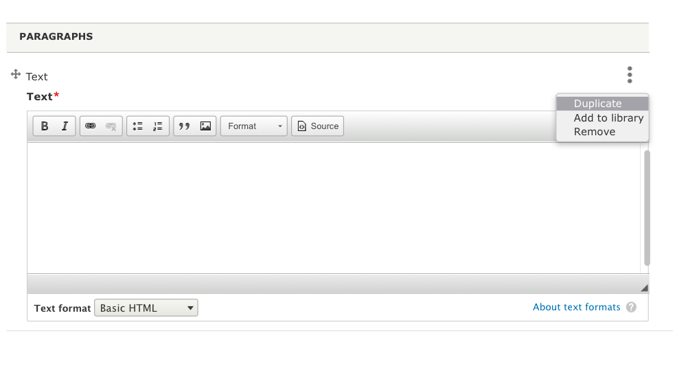
pivica CreditAttribution: pivica at MD Systems GmbH commentedAnd some final small layout tweaks for a toggle button. Attaching latest look:
Comment #72
johnchquePatch is reverting the latest commit.
Comment #73
pivica CreditAttribution: pivica at MD Systems GmbH commentedNot sure what went wrong, anyway new patch rebased against latest 8.x-1.x version.
Comment #74
johnchqueJust tested it and works nicely!
One thing I noticed is that the button does not collapse after few seconds as the core one. I would vote for discussing that in a follow-up if we want to add that, cause the last patch shows only one button at a time (when another one is opened, the last one closes) and when clicking outside the box it also closes, which is great!
Besides that I would vote for RTBC.
Comment #76
miro_dietikerAwesome work and committed as-is. This is a major milestone for our UX.
Hm, should it be paragraphs_ or paragraph_? Typically this is the module name prefixed.
But we also have other elements and namespaces that are sometimes singular and sometimes plural. We should discuss what we still can rename ASAP and handle in a follow-up.
Back to needs work to create follow-ups. Please close when created.
Also some related UX tasks need a re-roll now.
Comment #77
pivica CreditAttribution: pivica at MD Systems GmbH commentedYeah i wrote about this already in comment 70:
It's true we are breaking Drupal core pattern here, but I never liked that 'on hover out collapse behaviour' for core drop-downs and it seems that it is a very rare pattern - check facebook, google web apps etc and you will not see this. Also, this can be problematic on touch screens because we don't have native hover events. So me personally are very against this kind of a pattern.
@yongt9412 if you would like to discuss more then please create a follow-up and we will move this discussion there ;)
Discussed this with Miro, he agrees, here is a follow-up issue #2900874: Convert the root 'Collapse All' dropdown to the new paragraph_actions element.
Yeah, i think we should use module name here. We have multiple messes in PHP but also in CSS and HTML - sometimes we use single and sometimes plural. Because the name of the module is in plural i guess this rule is stronger and we should use plural probably everywhere. Created follow up #2900879: Rename paragraph strings to paragraphs where appropriate (single vs plural).
Closing this issue now. @yongt9412 feel free to create a follow-up for a hover discussion if you want.